SlideShare une entreprise Scribd logo
1  sur  1
As band members can be
viewed, their costume
shall also display the
genre.
The use of colour helps
to display the genre, as
they are bold, contrasting
colours which break the
norm considering colour
schemes, which the punk
genre does too (breaking
norms). There is also use
of many different bold
colours, which makes it
look messy, disorganized
and busy, which the punk
genre is known for. There
is an even distribution of
band members, which
does make it looks slightly
organised; making it more
appealing to the eye. The
colours of the band text
are red and white; which
are simple colours and as
it is informative to provide
band names and they
would determine whether
or not someone would
cosume a music magazine,
they need to be as easy to
view as possible, which
they are by using a simple
colour scheme, and they
stick out which is crucial.
The magazine name is a
bold, sans- serif font,
which makes it stick out
and seem like a bold
statement. It’s also easier
to read, which is
important, as the colour
used in this instance is
difficult to view.

The route of the eye.
The first things that are
recognisable are the deals
that can be won from
buying the magazine and
the name of the magazine.
Firstly, it is very important
that a target audience
notice the name of the
magazine, as it is typically
a name that shall appeal to
the target audience, and
will draw the attention of
those who have already
consumed the product. In
this instance, the title of
the magazine is called, ‘Big
Cheese’, which can be
considered a rather
immature and humorous;
which suits the personality
of the target audience, as
they are young and known
to be rather frolicsome.
Secondly, deals are
important for an audience
to see, as they are there
specifically to attract
customers. They are
typically prizes and
opportunities that the
target audience would
Most likely be interested in. The next thing that the audience would notice would
be the word ‘punk’, which as they have probably been attracted by the magazine
name and the deals, they are likely to relate to that word. After which, they may
notice the names and the faces of bands/ band members, which would interest
them if they are part of the genre, as they would probably recognise the popular
bands mentioned.
The final route of the eye begins with the word ‘plus’, which implies that there is
a lot of content for the audience to digest, making it appear worth the money that
the target audience would need to spend. There is then a list of names at the
bottom of the page and the right hand side, which also suggests that there is a lot
in the magazine that the target audience would be interested in.

Language such as ‘special’, ‘win’, ‘collectors’, etc. makes the magazine seem a lot more important, as the
audience may feel as if they are missing out on something big if they do not purchase the product.
This magazine would be the type that ‘Damaged’ would be found in, as they suit the mood of this magazine
and they are of the appropriate genre. When designing my replica magazine cover, I should take into
account many things that are displayed on this cover, such as bold fonts, a bold colour scheme that is still
appealing and readable, attractive deals and the importance of the route of the eye, and just how much it
can determine the number of magazines sold.

Contenu connexe

Tendances (20)

Emily new
Emily newEmily new
Emily new
 
Nme contents
Nme contentsNme contents
Nme contents
 
Q1 media
Q1 mediaQ1 media
Q1 media
 
S and w
S and wS and w
S and w
 
Media Evaluation Question 1.
Media Evaluation Question 1.Media Evaluation Question 1.
Media Evaluation Question 1.
 
Media Evaluation Question 1.
Media Evaluation Question 1.Media Evaluation Question 1.
Media Evaluation Question 1.
 
Media Evaluation Question 1.
Media Evaluation Question 1.Media Evaluation Question 1.
Media Evaluation Question 1.
 
Media Evaluation Question 1.
Media Evaluation Question 1.Media Evaluation Question 1.
Media Evaluation Question 1.
 
EDM Magazine Analysis
EDM Magazine AnalysisEDM Magazine Analysis
EDM Magazine Analysis
 
Plan B Magazine Ad
Plan B Magazine AdPlan B Magazine Ad
Plan B Magazine Ad
 
Nme Magazine Analysis
Nme Magazine AnalysisNme Magazine Analysis
Nme Magazine Analysis
 
Media evaluation music mag ew
Media evaluation music mag ewMedia evaluation music mag ew
Media evaluation music mag ew
 
Focus group home magazine
Focus group home magazineFocus group home magazine
Focus group home magazine
 
evaluation
evaluationevaluation
evaluation
 
Attitude complete
Attitude completeAttitude complete
Attitude complete
 
Contents planning
Contents planningContents planning
Contents planning
 
Target audience analysis
Target audience analysisTarget audience analysis
Target audience analysis
 
Content page
Content pageContent page
Content page
 
Evaluation question 2 media
Evaluation question 2 media Evaluation question 2 media
Evaluation question 2 media
 
Working title complete
Working title completeWorking title complete
Working title complete
 

Similaire à Route of the eye punk

All analysis
All analysisAll analysis
All analysis
Amber_
 
All analysis
All analysisAll analysis
All analysis
Amber_
 
Written evaluation
Written evaluationWritten evaluation
Written evaluation
david_escoo
 
Analysis of magazine covers
Analysis of magazine coversAnalysis of magazine covers
Analysis of magazine covers
SineadPaige
 
Music magazine front cover analysis
Music magazine front cover analysisMusic magazine front cover analysis
Music magazine front cover analysis
bj05077281
 
Liiar analysis own work
Liiar analysis own workLiiar analysis own work
Liiar analysis own work
shannoncammish
 

Similaire à Route of the eye punk (20)

Magazine analysis
Magazine analysisMagazine analysis
Magazine analysis
 
Magazine analysis
Magazine analysisMagazine analysis
Magazine analysis
 
Mediaaaaaa
MediaaaaaaMediaaaaaa
Mediaaaaaa
 
Neck deep kerrang analysis
Neck deep kerrang analysisNeck deep kerrang analysis
Neck deep kerrang analysis
 
Evaluation – question 5
Evaluation – question 5  Evaluation – question 5
Evaluation – question 5
 
Evaluation – question 5
Evaluation – question 5Evaluation – question 5
Evaluation – question 5
 
Magazine analysis- Media Coursework
Magazine analysis- Media CourseworkMagazine analysis- Media Coursework
Magazine analysis- Media Coursework
 
Evaluation – question 5
Evaluation – question 5Evaluation – question 5
Evaluation – question 5
 
Drafting textual analysis
Drafting textual analysisDrafting textual analysis
Drafting textual analysis
 
All analysis
All analysisAll analysis
All analysis
 
All analysis
All analysisAll analysis
All analysis
 
Written evaluation
Written evaluationWritten evaluation
Written evaluation
 
Music magazine analysis
Music magazine analysisMusic magazine analysis
Music magazine analysis
 
Market research
Market researchMarket research
Market research
 
Neck deep kerrang analysis
Neck deep kerrang analysisNeck deep kerrang analysis
Neck deep kerrang analysis
 
Analysis of magazine covers
Analysis of magazine coversAnalysis of magazine covers
Analysis of magazine covers
 
Music magazine front cover analysis
Music magazine front cover analysisMusic magazine front cover analysis
Music magazine front cover analysis
 
Evaluation
EvaluationEvaluation
Evaluation
 
Liiar analysis own work
Liiar analysis own workLiiar analysis own work
Liiar analysis own work
 
Signs & Signifiers Textual Analysis of Music Magazines
Signs & Signifiers Textual Analysis of Music MagazinesSigns & Signifiers Textual Analysis of Music Magazines
Signs & Signifiers Textual Analysis of Music Magazines
 

Plus de Ellie Fleming

Plus de Ellie Fleming (20)

How i edited my images
How i edited my imagesHow i edited my images
How i edited my images
 
Stuart hall encoding decoding
Stuart hall encoding decodingStuart hall encoding decoding
Stuart hall encoding decoding
 
Ethnomethodology
EthnomethodologyEthnomethodology
Ethnomethodology
 
Phenomonology
PhenomonologyPhenomonology
Phenomonology
 
Documents
DocumentsDocuments
Documents
 
Labelling theory
Labelling theoryLabelling theory
Labelling theory
 
How I linked my products
How I linked my productsHow I linked my products
How I linked my products
 
Shot listing planning
Shot listing  planningShot listing  planning
Shot listing planning
 
Product comparisons
Product comparisonsProduct comparisons
Product comparisons
 
How I used iMovie
How I used iMovieHow I used iMovie
How I used iMovie
 
Promotional Package Analysis
Promotional Package Analysis Promotional Package Analysis
Promotional Package Analysis
 
Props and costume
Props and costumeProps and costume
Props and costume
 
Damaged poster
Damaged posterDamaged poster
Damaged poster
 
History of punk
History of punkHistory of punk
History of punk
 
Brand identity
Brand identityBrand identity
Brand identity
 
Screenplay
ScreenplayScreenplay
Screenplay
 
History of punk
History of punkHistory of punk
History of punk
 
Risk assessment
Risk assessmentRisk assessment
Risk assessment
 
Presentationpitch
PresentationpitchPresentationpitch
Presentationpitch
 
Punk thing
Punk thingPunk thing
Punk thing
 

Route of the eye punk

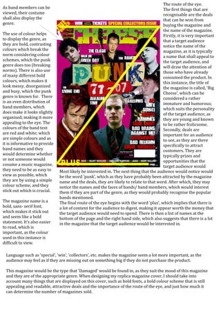
  • 1. As band members can be viewed, their costume shall also display the genre. The use of colour helps to display the genre, as they are bold, contrasting colours which break the norm considering colour schemes, which the punk genre does too (breaking norms). There is also use of many different bold colours, which makes it look messy, disorganized and busy, which the punk genre is known for. There is an even distribution of band members, which does make it looks slightly organised; making it more appealing to the eye. The colours of the band text are red and white; which are simple colours and as it is informative to provide band names and they would determine whether or not someone would cosume a music magazine, they need to be as easy to view as possible, which they are by using a simple colour scheme, and they stick out which is crucial. The magazine name is a bold, sans- serif font, which makes it stick out and seem like a bold statement. It’s also easier to read, which is important, as the colour used in this instance is difficult to view. The route of the eye. The first things that are recognisable are the deals that can be won from buying the magazine and the name of the magazine. Firstly, it is very important that a target audience notice the name of the magazine, as it is typically a name that shall appeal to the target audience, and will draw the attention of those who have already consumed the product. In this instance, the title of the magazine is called, ‘Big Cheese’, which can be considered a rather immature and humorous; which suits the personality of the target audience, as they are young and known to be rather frolicsome. Secondly, deals are important for an audience to see, as they are there specifically to attract customers. They are typically prizes and opportunities that the target audience would Most likely be interested in. The next thing that the audience would notice would be the word ‘punk’, which as they have probably been attracted by the magazine name and the deals, they are likely to relate to that word. After which, they may notice the names and the faces of bands/ band members, which would interest them if they are part of the genre, as they would probably recognise the popular bands mentioned. The final route of the eye begins with the word ‘plus’, which implies that there is a lot of content for the audience to digest, making it appear worth the money that the target audience would need to spend. There is then a list of names at the bottom of the page and the right hand side, which also suggests that there is a lot in the magazine that the target audience would be interested in. Language such as ‘special’, ‘win’, ‘collectors’, etc. makes the magazine seem a lot more important, as the audience may feel as if they are missing out on something big if they do not purchase the product. This magazine would be the type that ‘Damaged’ would be found in, as they suit the mood of this magazine and they are of the appropriate genre. When designing my replica magazine cover, I should take into account many things that are displayed on this cover, such as bold fonts, a bold colour scheme that is still appealing and readable, attractive deals and the importance of the route of the eye, and just how much it can determine the number of magazines sold.