
Recommandé
Contenu connexe
Plus de elliekaye
Plus de elliekaye (20)
Dernier
Dernier (20)
Front Cover Analysis
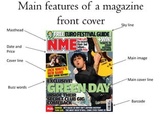
- 1. Main features of a magazine front cover Sky line Masthead Date and Price Main image Cover line Main cover line Buzz words Barcode
- 3. Front Cover Analysis MASTHEAD The masthead for NME catches the audiences attention because it is big, bold and all in capitol letters. The red in the masthead is the brightest colour on the cover and therefore is one of the things that stands out the most. It is also larger than any of the other fonts on the cover and the contrast from the white background to the red masthead makes it bolder. FREEBIES They tell the audience on the front cover that they get a free euro festival guide because the audience will then feel they are getting more out to the magazine if they buy it. They have out this right at the top of the page so that it is one of the first things that you will see. HEADLINE Other than the masthead this is the largest font on the page because this is what they want the audiences to see. The colour also helps with this because it is one of the brightest colours on the page so it stands out from the darker colours in the background.
- 4. Front Cover Analysis MASTHEAD The Masthead is partially red which is the brightest colour on the cover, this makes it catch the audiences attention. The main image is in front of the masthead but for this magazine it is alright because it has already established a well known identity therefore is easily recognised by the audience even when they cannot see the whole masthead. CENTRAL IMAGE This main image of the rapper Eminem helps to attract Vibes’ target audience because he is the kind of person that they would be interested in hearing about. He stands out more than anything on this page because he is in front of the masthead, the largest most central thing on the font cover and because of the contrast between his black top and the white background. The way in which he is stood also reflects the magazine audiences. He is standing straight with his arms folded which is a very defensive position. He is also looking directly at you. STYLE The three main colours in this are Red, Black and White. This stands out to the audience because of the contrast between the three colours. This magazine consistently uses the same font and either red, black or grey text. This helps to keep the magazine looking simple but effective.
- 5. Front Cover Analysis DATE AND PRICE Rolling stone follows the codes and conventions of magazines by having the date and price of the magazine in the top right hand corner of the front cover. MASTHEAD A large proportion of this masthead for Rolling Stone is covered by the main image, however this does not have a negative effect because the magazine has already established an identity and is consequently recognised by its audience. HEADLINE The headline ‘Johnny sings’ is the main article and is therefore the largest font after the masthead. It is also black which is a darker colour than any of the other font on the cover, this makes it stand out. SUB-HEADINGS Rolling stone have followed codes and conventions for magazines by having the sub headings along the left and right hand side of the magazine, they are also in similar fonts and colours which makes it look more professional.
- 6. Front Cover Analysis BUZZ WORDS This magazine has used buzz words like ‘exclusive’ this suggests that this magazine is the only one to cover that story MAIN IMAGE The main image of this Q magazine is of three people. This does not follow the codes and conventions of magazine covers, because usually you had have one person as the main image or people who are related in some way e.g. In a band. The people on this front cover are all very different and would be categorised into different music genres: pop, rock and rap. Even though this magazine cover does not target a particular audience it will still attract people because they will see the person they like on the cover and what to find out more. HEADINGS The headings on the left hand side are big and bold so they attract the audiences attention.
- 7. Front Cover Analysis HEADING This heading is bright and central so it catches the audiences attention. Because some of the writing from the heading is in red and some in white it makes some words more noticeable than others, such as ‘insane’ which is in red, the words before and after it are in white therefore it is more noticeable. Also the use of the word ‘insane’ makes it seem more informal. FLASH The flash on the left hand side is telling the audience that they can win £4100, this will make people want to buy this magazine so they can get a chance to win that money. This is more eye-catching because it is in a flash and because it is in a different colour to the rest of the magazine. BARCODE AND PRICE NME follows codes and conventions when it comes the barcode and price, their barcode is always at the bottom left hand side of the cover and the price is always under the title which is always on the left hand side at the top. STYLE This NME cover stands out, mainly because of the colours used. There are three main colours on this, these are black, red and white. This stands out to the audiences because of the contrast between the colours.
- 8. Front Cover Analysis MASTHEAD The masthead for this Kerrang cover is covered by the main image but as well as some other magazines it is now reputable and is consequently recognised by their target audience. It also has lines through it which makes it look as if it has been smashed, this reflects on their target audiences , tastes in music and personalities. MAIN IMAGE The three men on the front cover are the main thing that the magazine wants us as the audience to look at. They are all looking directly at you which makes you feel more involved. However they want your focus to be mainly on the man in the middle because he is in front of the masthead whereas the other two men are behind the masthead, he is also wearing white so he stands out from the black background while the others are wearing black and blend in to the background