SlideShare une entreprise Scribd logo
1  sur  12
Q Front cover analysis
The masthead is large and stands out in front of the
picture and has a significant icon which readers will
recognize. The main cover ling also has a slight shadow
behind it which also helps it stand out as well as a bold
typography. The stylistic handwritten typology across the
main image incorporates with the artist on the front as
Ed Sheeran is a singer/songwriter. The main image is
large and it covers some of the text while other
coverlines cover the image. The theme of the magazine is
black, white and red which works nicely and compliments
the photograph. The barcode is easily seen at the bottom
left of the page with the date and issue number. The
artist is represented as a serious musician as his guitar is
also included in the image. The photo looks as if to be
natural and he looks relatable as he isn’t posing for the
camera. Ed Sheeran appeals to a larger audience ranging
from teenagers to young adults. The magazine captures
this with a dignified and simple photo, his fans and
regular readers aren’t struck with a controversial photo.
The genre of the magazine is pop/rock which could
appeal to many young people mostly. However the bands
included , for example Pink Floyd, can also appeal to
older generations as they have been a well known band
for many years. The features I like about this magazine
cover is the colour scheme as it compliments itself well
and corresponds with the picture. I also really like the
photograph is brought in front of coverlines as well as
coverlines being brought in front of the image. This gives
a variation of the articles and the image which helps the
reader look at all the parts of the page.
Q Contents page analysis
The contents page for Q is a
double page spread. This gives the
magazine the ability to spread out
the articles and add pictures to
make the page more interesting.
The masthead is larger and eye-
catching, there is a black border
around which also helps it stand
out. On right side page there is the
issue number which is clearly
marked. Towards the left third of
the left page there is a list of the
contents of the magazine. There is
a large image of the well-known
cartoon from the band The
Gorillaz. There are a range of
pictures across the pages with
corresponding page numbers from
the magazine.
On the right third of the right page, there is more lists of the contents of the page. Under each coverlines there is more
information about each article, this is helpful to the reader as they are able to understand what each article is about. The
composition of the page works well as there is a lot of things to look at the for reader as well as lot of information about
the contents. The magazine appeals again to younger generations and slightly older generations as bands like The Gorillaz
as well as the Sugababes, it appeals to a wide range of people. The elements of pop and rock are fulfilled. This is also
shown through the colour scheme as it fun and dark, it compliments the rock/pop image. I like the fact that they have
used pictures as well as cartoons and an interesting layout. I will use the idea of using pictures of the bands/artists being
featured in the magazine on the contents page. Adding information under the coverlines also is beneficial to the reader as
they can find out more info about each topic.
Q Double page spread analysis
The masthead is clear marked at
the top left of the page, rule of
thirds is used which works well
for the composition. There is a
large image of the artist featured
which covers two-thirds of the
page. The name of the artist is
stated on top of the image. The
red and black scheme is used as
the questions are written in red
whereas the answers are written
in black. This is a good
presentation of the text and it
differentiates the questions &
answers. The artist is presented
to be relaxed and relatable, this
is due to image of him on a bed
with his guitar. It adapts to his
personality. The reader will be
interested in this artist are they
are shown a large image of who
he is. His music applies to the genre of the magazine as he is an indie rock/pop artist this will appeal to the
audience of the magazine. The magazine represents this article well as it in depth with its writing and includes
text boxes which also stand out in front of the text. Using interesting quotes from the interview also draws the
reader in and interests them. I really like this feature of the magazine and would use this in our magazine
interviews, it is a good feature which engages the reader. By also including the text box of what album the
artist is loving, this also engages the reader and gives them a sense of being involved with the artist. They
would be able to then go and listen to the album that the artist is loving. I also really like the feature of using
two different coloured typography to show the questions and the answers.
Kerrang front cover analysis
The masthead is large and bright red. Its typography is
a particular style which is recognizable to audiences.
The main image is a widely known singer in a band
called Bring Me The Horizon. The colour scheme
complements each other, the main title stands out in
front of the black background. ‘HOT SHOTS!’ is eye-
catching and the reader is drawn to the coverline.
There is also a range of articles on the page, at the
bottom quarter of the magazine there is a few
segments of the magazine highlighted. The artist is
presented as being interesting and eye-catching due
to the bright colours of the magazine. The magazine is
represented as being exciting and full of energy. The
audience of the magazine is satisfied as the audience
tends to be rock music fans. The magazine is aimed at
all ages ranging from young people to older adults
which enjoy rock/ punk music as bands like current
like You Me At Six as well as bands for older
generations. The genre of the magazine is rock/punk
music and it is shown through the colours used and
the articles presented. The bright red, orange and
yellows could be associated with loud music and fire.
This brings the idea of the magazine being exciting. I
like how the front cover is quite filled this is a good
feature as it makes the magazine look really appealing
and interesting. I like how the image weaves in and
out of the coverlines and is quite large.
Kerrang contents page analysis
The masthead for the contents page is larger and bright,
the black helps the typography stand out in front of the
yellow. The issue number and cover date is clearly
stated at the top of the page. The contents of the
magazine is presented on the right-side of the page. The
contents has been split into sections for example live
reviews, features and albums. This helps the reader as
they can find exactly what they are looking for in the
magazine. The image/colour scheme continues through
the magazine which gives an appealing look to the
audience. The page appeals to the audience as it is
aimed for rock fans due to its colour schemes. The
article about Metallica appeals to older audiences also
which helps the magazine appeal to a larger audience.
The competition to win the shows, this increasing the
audience sense of solidarity. It also helps the reader
more interactive. I think it’s a really good feature of
having the contents split into sections. I would think
about using this idea for my magazine and I think it is
really beneficial for the reader. Another good feature is
using a competition to interact with the audience. By
including a picture of the product this will interest the
reader more and they know what they could win. There
is a lot of detail within the writing and it also briefed for
the quick summary for the contents.
Kerrang Double-
page spread Analysis
The proportion of photos
to writing is favoring in
pictures. There is large
main image takes up the
majority of the page and
fades into black on the
second page. By including
a large image this
emphasizes who the
article is about. It contains
the lead singer of the
band My Chemical
Romance. There is a large
masthead stands out in
front of the black
background, with its white
and red colour. The
typography is also eye-
catching. It lives up to the
bands image. The band is classed as rock which would appeal to the audience as the magazine is aimed at rock fans.
This is represented through the harsh black and white effect of the photo, which also compliments the bright red
colour of the text. There is a warm tone to the images as well which ties it all together. There is also a range of
pictures at the bottom of the page which gives the reader something to look at. There writing about the band as well
as about their new music. The page is split into sections which is effective and gives the reader a more interesting
way to read about the band. I like this feature as it makes the page more interesting and interactive. By including
captions to the photos as well is a good feature as it gives more context to the images. I would think to use this in my
magazine.
Rolling stone Front cover analysis
The artist on the front cover is widely popular
rapper called Jay-Z. He is presented as being a
serious artist and could even been seen as quite
intimidating. This represents his image as an
artist, the image shows him being serious and
dignified. The main image covers the masthead
which shows his is an important segment in the
magazine. The masthead however still stands out
due to its signature typography and its bold red
colour. The magazine appeals to people who like
genres such as rock, rap, and hip-hop as well as
pop. It contains a variety of music, this helps
cover a wider audience and readers. The
coverlines showcase some of the articles included
in the magazine, ‘50 greatest hip-hop songs of all
time’ intrigues the reader as they can find out
about new music. This also increases interaction
with the audience. Also by including questions on
the front page this intrigues the reader to find out
the answer. The magazine is represents itself as
being a serious and insightful magazine including
many genres of music. The magazine will appeal
to the audience as the colours aren’t too bold and
flashy, however the bold title still captures the
audience. I like the feature of having the
coverlines on the left-third of the cover, this
separates the articles from the main image. The
date and the issue number is also stated clearly at
the top of the cover. I really like the lines which
are used to differentiate the articles on the left.
Rolling stone contents page analysis
The contents page is compacted onto one page.
The features are presented on the left-third of
the page. They are split into sections of the
magazine e.g. features, rock&roll and 2012 year
in review. There is also a section which shows
previous covers of the magazine as they all share
the same article. There is also information under
each title which gives more detail to what the
article is about. Overall the contents page is quite
plain however it includes all the information
needed for the contents. The artist represented
on the front covers are shown to be serious and
sophisticated. This shows the magazine covering
a range of artists which come under this category.
The bright yellow compliments the red colours
which stand out from the black and white. The
coverlines of the segments are in bold which also
helps the reader understand the name of the
segments. This is a good feature and I would
think about using this feature in my magazine.
The features are also numbered which is relevant
to the pages the feature is on. I would use this
feature in my magazine. Overall this isn't the best
contents page I’ve seen, as it lacks an interesting
element to it. To improve I would have added
more pictures.
Double page spread
This article focuses on the
artist Lady Gaga, a popular
pop singer. She is widely
known. On the left page there
is a photo which takes up the
whole page. Whereas on the
other page there is the article.
There is a larger capital ‘L’
which is to represent the first
letter in ‘Lady Gaga’. It is bold
and in bright red which stands
out over the black and white
writing. I think having the
bright red L adds a nice
element to the page and
draws attention from the
reader. The artist is presented as being seductive and provocative, due to her being mostly naked and
having jewelry and her hands to cover herself. This is quite a bold imagine and most interest readers as she
could be seen as quite controversial. The capital letters in the text are also larger than the rest of the text.
This makes the text interesting and differentiates between the paragraphs. This is a good feature which I
would think about using in my magazine. I think by separating the image of the artist and the text about
the artist, this helps interest the reader. By making the picture black and white this gives a sophisticate
feeling to the photo and this is complimented by the black and white writing. The bold red L stands out and
makes the page more vibrant and stand out more.
NME front page analysis
The front cover of the magazine is really
vibrant and eye-catching. The masthead for
NME is bold and the typography is simple
and easy to understand. The date of the
magazine is clearly stated above the
masthead. The main image presents a music
producer and Dj, Mark Ronson. He is widely
popular and has become very popular in the
music industry. The magazine’s genre is
alternative, rock and indie music and
generally appeals to younger generations.
Mark Ronson is presented as quirky and
interesting, the image is quite fun and
comical. Complimented with the orange
coverlines and bright colours of the
magazine, this appeals to the reader. Other
coverlines are in black which compliments
the banner across the top of the page.
Overall the composition works well and
compliments each other. I think the colour
scheme used works really well. I would think
about using a fun colour scheme which
compliments each other in my magazine
cover.
NME contents page analysis
This contents page has a colour scheme of
black, white and red. The red stands out against
the black and white masthead. The date is also
stated under the masthead. The features in the
magazine is set into different sections along the
right-third of the page. This is beneficial for the
reader as they can pinpoint which article they
want to reader about. The image shows a well
known indie rock band called the Arctic
Monkeys. This would fit the criteria of the
genre of the magazine and appeal to the
audience as it is aimed at young people and
those who enjoy indie rock music. The image
shows the main singer preformed on stage, this
shows they are growing in popularity as the
article talks about how they have preformed in
New York compared to their earlier
performances in Yorkshire. By having a larger
feature on the band, this highlights that fans of
the band will feel satisfied with the article on
them. By including a question this also
increases the interaction with the reader. I like
this feature of having the articles spilt into
sections. The colour scheme works well and the
typography of the text is simple and
understandable.
NME double page
spread analysis
The double page spread is
about The Vaccines. The
page has an old/dated
look to it, the photo has
been edited with a yellow
tint to it. This is continued
onto the right page as the
background is tinted a
similar colour. However
the page is modernized by
the blue lines being
spread across the page.
The image takes up two-
thirds of the two pages.
This emphasizes their
Important and that the article is talking about them. The band is presented as serious musicians as they
are pictured with serious emotion and with their musical instruments. The bright blue is continued
through the text as the capital letters of the sentences are in that same shade of blue as well as a quote
which is relevant to the band. This blue contrasts with the dated background/image and stands out to the
reader. This band appeals to the audience as they are an indie rock which is included in the genre of the
magazine. I like the feature of including a colour theme within the page, this pulls the composition of the
double page spread together. The composition of the image works well as there is a symmetry within the
members of the band. I would think about using the colour scheme feature in my magazine.

Contenu connexe

Tendances

My magazine research
My magazine research My magazine research
My magazine research adinewenner
 
My magazine research
My magazine researchMy magazine research
My magazine researchadinewenner
 
Media research 2
Media research 2Media research 2
Media research 2abbiestone
 
Lo 3 proposal 1 template
Lo 3 proposal 1   template Lo 3 proposal 1   template
Lo 3 proposal 1 template Harrison Cole
 
Analysis of ‘kerrang’ music magazine
Analysis of ‘kerrang’ music magazineAnalysis of ‘kerrang’ music magazine
Analysis of ‘kerrang’ music magazineAS Media Column E
 
Media research 2
Media research 2Media research 2
Media research 2abbiestone
 
Ashleigh's media coursework powerpoint
Ashleigh's media coursework powerpointAshleigh's media coursework powerpoint
Ashleigh's media coursework powerpointpsyckraze
 
Media research 2
Media research 2Media research 2
Media research 2abbiestone
 
My analysis of 4 Contents Pages
My analysis of 4 Contents PagesMy analysis of 4 Contents Pages
My analysis of 4 Contents PagesKieran Hadfield
 
2nd Magazine Idea
2nd Magazine Idea2nd Magazine Idea
2nd Magazine Ideatmcenaney
 
Magazine analysis
Magazine analysisMagazine analysis
Magazine analysisLoftusg1
 
Double Page Spread Analyses
Double Page Spread AnalysesDouble Page Spread Analyses
Double Page Spread AnalysesKieran Hadfield
 
Feature Article Analysis
Feature Article AnalysisFeature Article Analysis
Feature Article Analysisjessicahooker6
 
Music magazine reaserch and ideas annabel lucey
Music magazine reaserch and ideas annabel luceyMusic magazine reaserch and ideas annabel lucey
Music magazine reaserch and ideas annabel luceybell101
 

Tendances (20)

My magazine research
My magazine research My magazine research
My magazine research
 
My magazine research
My magazine researchMy magazine research
My magazine research
 
Media research 2
Media research 2Media research 2
Media research 2
 
Lo 3 proposal 2
Lo 3 proposal 2 Lo 3 proposal 2
Lo 3 proposal 2
 
Lo 3 proposal 1 template
Lo 3 proposal 1   template Lo 3 proposal 1   template
Lo 3 proposal 1 template
 
Test
TestTest
Test
 
Analysis of ‘kerrang’ music magazine
Analysis of ‘kerrang’ music magazineAnalysis of ‘kerrang’ music magazine
Analysis of ‘kerrang’ music magazine
 
Media research 2
Media research 2Media research 2
Media research 2
 
Front Cover Analysis
Front Cover Analysis Front Cover Analysis
Front Cover Analysis
 
Ashleigh's media coursework powerpoint
Ashleigh's media coursework powerpointAshleigh's media coursework powerpoint
Ashleigh's media coursework powerpoint
 
Media research 2
Media research 2Media research 2
Media research 2
 
Front Covers
Front CoversFront Covers
Front Covers
 
My analysis of 4 Contents Pages
My analysis of 4 Contents PagesMy analysis of 4 Contents Pages
My analysis of 4 Contents Pages
 
u13 LO2
u13 LO2u13 LO2
u13 LO2
 
Rate cards
Rate cardsRate cards
Rate cards
 
2nd Magazine Idea
2nd Magazine Idea2nd Magazine Idea
2nd Magazine Idea
 
Magazine analysis
Magazine analysisMagazine analysis
Magazine analysis
 
Double Page Spread Analyses
Double Page Spread AnalysesDouble Page Spread Analyses
Double Page Spread Analyses
 
Feature Article Analysis
Feature Article AnalysisFeature Article Analysis
Feature Article Analysis
 
Music magazine reaserch and ideas annabel lucey
Music magazine reaserch and ideas annabel luceyMusic magazine reaserch and ideas annabel lucey
Music magazine reaserch and ideas annabel lucey
 

En vedette

Analysis of billboard magazine cover
Analysis of billboard magazine coverAnalysis of billboard magazine cover
Analysis of billboard magazine coverasmediaf12
 
Music Magazine Analysis
Music Magazine Analysis Music Magazine Analysis
Music Magazine Analysis Alexandrav223
 
Questionnaire results analysis
Questionnaire results analysisQuestionnaire results analysis
Questionnaire results analysisVictoria Cowburn
 
Billboard Magazine Analysis
Billboard Magazine AnalysisBillboard Magazine Analysis
Billboard Magazine AnalysisAaliyah195
 
DPS - Codes and Conventions
DPS - Codes and ConventionsDPS - Codes and Conventions
DPS - Codes and ConventionsJordan Robson
 
Task 2, Billboard Magazine Analysis
Task 2,  Billboard Magazine AnalysisTask 2,  Billboard Magazine Analysis
Task 2, Billboard Magazine Analysisbansalr1
 
My Music Magazine Analysis
My Music Magazine AnalysisMy Music Magazine Analysis
My Music Magazine AnalysisJordan Robson
 
Analysis of music magazines front covers
Analysis of music magazines front coversAnalysis of music magazines front covers
Analysis of music magazines front coversmarwasaroya
 

En vedette (9)

Analysis of billboard magazine cover
Analysis of billboard magazine coverAnalysis of billboard magazine cover
Analysis of billboard magazine cover
 
Music Magazine Analysis
Music Magazine Analysis Music Magazine Analysis
Music Magazine Analysis
 
Music magazine analysis
Music magazine analysisMusic magazine analysis
Music magazine analysis
 
Questionnaire results analysis
Questionnaire results analysisQuestionnaire results analysis
Questionnaire results analysis
 
Billboard Magazine Analysis
Billboard Magazine AnalysisBillboard Magazine Analysis
Billboard Magazine Analysis
 
DPS - Codes and Conventions
DPS - Codes and ConventionsDPS - Codes and Conventions
DPS - Codes and Conventions
 
Task 2, Billboard Magazine Analysis
Task 2,  Billboard Magazine AnalysisTask 2,  Billboard Magazine Analysis
Task 2, Billboard Magazine Analysis
 
My Music Magazine Analysis
My Music Magazine AnalysisMy Music Magazine Analysis
My Music Magazine Analysis
 
Analysis of music magazines front covers
Analysis of music magazines front coversAnalysis of music magazines front covers
Analysis of music magazines front covers
 

Similaire à Music Magazine analysis

Hannah Wood Music Magazine Analysis
Hannah Wood Music Magazine Analysis Hannah Wood Music Magazine Analysis
Hannah Wood Music Magazine Analysis hannahwood88
 
Deconstructions of rock magazines
Deconstructions of rock magazinesDeconstructions of rock magazines
Deconstructions of rock magazinesShahEman
 
Music Magazine Collarge2
Music Magazine Collarge2Music Magazine Collarge2
Music Magazine Collarge2alex
 
music magazine anaylsis
music magazine anaylsismusic magazine anaylsis
music magazine anaylsisalex
 
Magazine Double Page Spread Research
Magazine Double Page Spread ResearchMagazine Double Page Spread Research
Magazine Double Page Spread ResearchLynley Sykes
 
Magazine anaylisis
Magazine anaylisisMagazine anaylisis
Magazine anaylisissineadjen
 
Magazine anaylisis
Magazine anaylisisMagazine anaylisis
Magazine anaylisissineadjen
 
Final powerpointt
Final powerpointtFinal powerpointt
Final powerpointtkirstyy94
 
Presentgggation1
Presentgggation1Presentgggation1
Presentgggation1tjjones2
 
AS Level Media Music Magazine Production Treatment
AS Level Media Music Magazine Production TreatmentAS Level Media Music Magazine Production Treatment
AS Level Media Music Magazine Production Treatmentmarkodjuricic
 
Magazine Research Analysis
Magazine Research AnalysisMagazine Research Analysis
Magazine Research AnalysisTRUDY
 
AS Media Evaluation
AS Media EvaluationAS Media Evaluation
AS Media Evaluationgibson8955
 
Magazine research info
Magazine research infoMagazine research info
Magazine research infotomhogan123
 

Similaire à Music Magazine analysis (20)

Hannah Wood Music Magazine Analysis
Hannah Wood Music Magazine Analysis Hannah Wood Music Magazine Analysis
Hannah Wood Music Magazine Analysis
 
Deconstructions of rock magazines
Deconstructions of rock magazinesDeconstructions of rock magazines
Deconstructions of rock magazines
 
Analysis
AnalysisAnalysis
Analysis
 
Music Magazine Collarge2
Music Magazine Collarge2Music Magazine Collarge2
Music Magazine Collarge2
 
music magazine anaylsis
music magazine anaylsismusic magazine anaylsis
music magazine anaylsis
 
Magazine Double Page Spread Research
Magazine Double Page Spread ResearchMagazine Double Page Spread Research
Magazine Double Page Spread Research
 
Magazine anaylisis
Magazine anaylisisMagazine anaylisis
Magazine anaylisis
 
Magazine anaylisis
Magazine anaylisisMagazine anaylisis
Magazine anaylisis
 
Evaluation
EvaluationEvaluation
Evaluation
 
Final powerpointt
Final powerpointtFinal powerpointt
Final powerpointt
 
Evaluation
EvaluationEvaluation
Evaluation
 
Presentgggation1
Presentgggation1Presentgggation1
Presentgggation1
 
Rock sound
Rock soundRock sound
Rock sound
 
Evaluation
EvaluationEvaluation
Evaluation
 
AS Level Media Music Magazine Production Treatment
AS Level Media Music Magazine Production TreatmentAS Level Media Music Magazine Production Treatment
AS Level Media Music Magazine Production Treatment
 
Magazine research
Magazine researchMagazine research
Magazine research
 
Magazine Research Analysis
Magazine Research AnalysisMagazine Research Analysis
Magazine Research Analysis
 
AS Media Evaluation
AS Media EvaluationAS Media Evaluation
AS Media Evaluation
 
Magazine research info
Magazine research infoMagazine research info
Magazine research info
 
Music Magazine draft
Music Magazine draft Music Magazine draft
Music Magazine draft
 

Dernier

办理伯明翰大学毕业证书文凭学位证书
办理伯明翰大学毕业证书文凭学位证书办理伯明翰大学毕业证书文凭学位证书
办理伯明翰大学毕业证书文凭学位证书saphesg8
 
Dubai Call Girls O528786472 Diabolic Call Girls In Dubai
Dubai Call Girls O528786472 Diabolic Call Girls In DubaiDubai Call Girls O528786472 Diabolic Call Girls In Dubai
Dubai Call Girls O528786472 Diabolic Call Girls In Dubaihf8803863
 
定制(ENU毕业证书)英国爱丁堡龙比亚大学毕业证成绩单原版一比一
定制(ENU毕业证书)英国爱丁堡龙比亚大学毕业证成绩单原版一比一定制(ENU毕业证书)英国爱丁堡龙比亚大学毕业证成绩单原版一比一
定制(ENU毕业证书)英国爱丁堡龙比亚大学毕业证成绩单原版一比一ra6e69ou
 
Mastering Wealth with YouTube Content Marketing.pdf
Mastering Wealth with YouTube Content Marketing.pdfMastering Wealth with YouTube Content Marketing.pdf
Mastering Wealth with YouTube Content Marketing.pdfTirupati Social Media
 
Unlock Your Social Media Potential with IndianLikes - IndianLikes.com
Unlock Your Social Media Potential with IndianLikes - IndianLikes.comUnlock Your Social Media Potential with IndianLikes - IndianLikes.com
Unlock Your Social Media Potential with IndianLikes - IndianLikes.comSagar Sinha
 
fraud storyboards powerpoint media project
fraud storyboards powerpoint media projectfraud storyboards powerpoint media project
fraud storyboards powerpoint media project17mos052
 
VIP Moti Bagh Call Girls Free Doorstep Delivery 9873777170
VIP Moti Bagh Call Girls Free Doorstep Delivery 9873777170VIP Moti Bagh Call Girls Free Doorstep Delivery 9873777170
VIP Moti Bagh Call Girls Free Doorstep Delivery 9873777170Komal Khan
 
Top Astrologer, Kala ilam specialist in USA and Bangali Amil baba in Saudi Ar...
Top Astrologer, Kala ilam specialist in USA and Bangali Amil baba in Saudi Ar...Top Astrologer, Kala ilam specialist in USA and Bangali Amil baba in Saudi Ar...
Top Astrologer, Kala ilam specialist in USA and Bangali Amil baba in Saudi Ar...baharayali
 
AI Virtual Influencers: The Future of Influencer Marketing
AI Virtual Influencers:  The Future of Influencer MarketingAI Virtual Influencers:  The Future of Influencer Marketing
AI Virtual Influencers: The Future of Influencer MarketingCut-the-SaaS
 
Music Video Codes and Conventions 2 .pptx
Music Video Codes and Conventions 2 .pptxMusic Video Codes and Conventions 2 .pptx
Music Video Codes and Conventions 2 .pptxjenrobinson12
 
Call Girls In Dwarka ⏩7838079806 ⏩Escort Service In Patel Nagar Delhi
Call Girls In Dwarka ⏩7838079806 ⏩Escort Service In Patel Nagar DelhiCall Girls In Dwarka ⏩7838079806 ⏩Escort Service In Patel Nagar Delhi
Call Girls In Dwarka ⏩7838079806 ⏩Escort Service In Patel Nagar Delhidelhiescort
 
O9654467111 Call Girls In Shahdara Women Seeking Men
O9654467111 Call Girls In Shahdara Women Seeking MenO9654467111 Call Girls In Shahdara Women Seeking Men
O9654467111 Call Girls In Shahdara Women Seeking MenSapana Sha
 
Add more information to your upload Tip: Better titles and descriptions lead ...
Add more information to your upload Tip: Better titles and descriptions lead ...Add more information to your upload Tip: Better titles and descriptions lead ...
Add more information to your upload Tip: Better titles and descriptions lead ...SejarahLokal
 
When-technology-and-Humanity-Cross-1.pptx
When-technology-and-Humanity-Cross-1.pptxWhen-technology-and-Humanity-Cross-1.pptx
When-technology-and-Humanity-Cross-1.pptxReaper61
 
Protecting Your Little Explorer at Home!
Protecting Your Little Explorer at Home!Protecting Your Little Explorer at Home!
Protecting Your Little Explorer at Home!andrekr997
 

Dernier (20)

looking for escort 9953056974 Low Rate Call Girls In Vinod Nagar
looking for escort 9953056974 Low Rate Call Girls In  Vinod Nagarlooking for escort 9953056974 Low Rate Call Girls In  Vinod Nagar
looking for escort 9953056974 Low Rate Call Girls In Vinod Nagar
 
办理伯明翰大学毕业证书文凭学位证书
办理伯明翰大学毕业证书文凭学位证书办理伯明翰大学毕业证书文凭学位证书
办理伯明翰大学毕业证书文凭学位证书
 
Dubai Call Girls O528786472 Diabolic Call Girls In Dubai
Dubai Call Girls O528786472 Diabolic Call Girls In DubaiDubai Call Girls O528786472 Diabolic Call Girls In Dubai
Dubai Call Girls O528786472 Diabolic Call Girls In Dubai
 
定制(ENU毕业证书)英国爱丁堡龙比亚大学毕业证成绩单原版一比一
定制(ENU毕业证书)英国爱丁堡龙比亚大学毕业证成绩单原版一比一定制(ENU毕业证书)英国爱丁堡龙比亚大学毕业证成绩单原版一比一
定制(ENU毕业证书)英国爱丁堡龙比亚大学毕业证成绩单原版一比一
 
Mastering Wealth with YouTube Content Marketing.pdf
Mastering Wealth with YouTube Content Marketing.pdfMastering Wealth with YouTube Content Marketing.pdf
Mastering Wealth with YouTube Content Marketing.pdf
 
Unlock Your Social Media Potential with IndianLikes - IndianLikes.com
Unlock Your Social Media Potential with IndianLikes - IndianLikes.comUnlock Your Social Media Potential with IndianLikes - IndianLikes.com
Unlock Your Social Media Potential with IndianLikes - IndianLikes.com
 
fraud storyboards powerpoint media project
fraud storyboards powerpoint media projectfraud storyboards powerpoint media project
fraud storyboards powerpoint media project
 
VIP Moti Bagh Call Girls Free Doorstep Delivery 9873777170
VIP Moti Bagh Call Girls Free Doorstep Delivery 9873777170VIP Moti Bagh Call Girls Free Doorstep Delivery 9873777170
VIP Moti Bagh Call Girls Free Doorstep Delivery 9873777170
 
FULL ENJOY Call Girls In Mohammadpur (Delhi) Call Us 9953056974
FULL ENJOY Call Girls In Mohammadpur  (Delhi) Call Us 9953056974FULL ENJOY Call Girls In Mohammadpur  (Delhi) Call Us 9953056974
FULL ENJOY Call Girls In Mohammadpur (Delhi) Call Us 9953056974
 
Hot Sexy call girls in Ramesh Nagar🔝 9953056974 🔝 Delhi escort Service
Hot Sexy call girls in Ramesh Nagar🔝 9953056974 🔝 Delhi escort ServiceHot Sexy call girls in Ramesh Nagar🔝 9953056974 🔝 Delhi escort Service
Hot Sexy call girls in Ramesh Nagar🔝 9953056974 🔝 Delhi escort Service
 
Top Astrologer, Kala ilam specialist in USA and Bangali Amil baba in Saudi Ar...
Top Astrologer, Kala ilam specialist in USA and Bangali Amil baba in Saudi Ar...Top Astrologer, Kala ilam specialist in USA and Bangali Amil baba in Saudi Ar...
Top Astrologer, Kala ilam specialist in USA and Bangali Amil baba in Saudi Ar...
 
AI Virtual Influencers: The Future of Influencer Marketing
AI Virtual Influencers:  The Future of Influencer MarketingAI Virtual Influencers:  The Future of Influencer Marketing
AI Virtual Influencers: The Future of Influencer Marketing
 
Music Video Codes and Conventions 2 .pptx
Music Video Codes and Conventions 2 .pptxMusic Video Codes and Conventions 2 .pptx
Music Video Codes and Conventions 2 .pptx
 
Call Girls In Dwarka ⏩7838079806 ⏩Escort Service In Patel Nagar Delhi
Call Girls In Dwarka ⏩7838079806 ⏩Escort Service In Patel Nagar DelhiCall Girls In Dwarka ⏩7838079806 ⏩Escort Service In Patel Nagar Delhi
Call Girls In Dwarka ⏩7838079806 ⏩Escort Service In Patel Nagar Delhi
 
Enjoy ➥8448380779▻ Call Girls In Noida Sector 93 Escorts Delhi NCR
Enjoy ➥8448380779▻ Call Girls In Noida Sector 93 Escorts Delhi NCREnjoy ➥8448380779▻ Call Girls In Noida Sector 93 Escorts Delhi NCR
Enjoy ➥8448380779▻ Call Girls In Noida Sector 93 Escorts Delhi NCR
 
O9654467111 Call Girls In Shahdara Women Seeking Men
O9654467111 Call Girls In Shahdara Women Seeking MenO9654467111 Call Girls In Shahdara Women Seeking Men
O9654467111 Call Girls In Shahdara Women Seeking Men
 
Add more information to your upload Tip: Better titles and descriptions lead ...
Add more information to your upload Tip: Better titles and descriptions lead ...Add more information to your upload Tip: Better titles and descriptions lead ...
Add more information to your upload Tip: Better titles and descriptions lead ...
 
When-technology-and-Humanity-Cross-1.pptx
When-technology-and-Humanity-Cross-1.pptxWhen-technology-and-Humanity-Cross-1.pptx
When-technology-and-Humanity-Cross-1.pptx
 
young call girls in Greater Noida 🔝 9953056974 🔝 Delhi escort Service
young call girls in  Greater Noida 🔝 9953056974 🔝 Delhi escort Serviceyoung call girls in  Greater Noida 🔝 9953056974 🔝 Delhi escort Service
young call girls in Greater Noida 🔝 9953056974 🔝 Delhi escort Service
 
Protecting Your Little Explorer at Home!
Protecting Your Little Explorer at Home!Protecting Your Little Explorer at Home!
Protecting Your Little Explorer at Home!
 

Music Magazine analysis

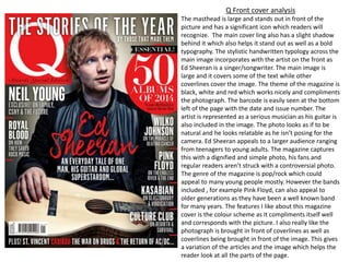
  • 1. Q Front cover analysis The masthead is large and stands out in front of the picture and has a significant icon which readers will recognize. The main cover ling also has a slight shadow behind it which also helps it stand out as well as a bold typography. The stylistic handwritten typology across the main image incorporates with the artist on the front as Ed Sheeran is a singer/songwriter. The main image is large and it covers some of the text while other coverlines cover the image. The theme of the magazine is black, white and red which works nicely and compliments the photograph. The barcode is easily seen at the bottom left of the page with the date and issue number. The artist is represented as a serious musician as his guitar is also included in the image. The photo looks as if to be natural and he looks relatable as he isn’t posing for the camera. Ed Sheeran appeals to a larger audience ranging from teenagers to young adults. The magazine captures this with a dignified and simple photo, his fans and regular readers aren’t struck with a controversial photo. The genre of the magazine is pop/rock which could appeal to many young people mostly. However the bands included , for example Pink Floyd, can also appeal to older generations as they have been a well known band for many years. The features I like about this magazine cover is the colour scheme as it compliments itself well and corresponds with the picture. I also really like the photograph is brought in front of coverlines as well as coverlines being brought in front of the image. This gives a variation of the articles and the image which helps the reader look at all the parts of the page.
  • 2. Q Contents page analysis The contents page for Q is a double page spread. This gives the magazine the ability to spread out the articles and add pictures to make the page more interesting. The masthead is larger and eye- catching, there is a black border around which also helps it stand out. On right side page there is the issue number which is clearly marked. Towards the left third of the left page there is a list of the contents of the magazine. There is a large image of the well-known cartoon from the band The Gorillaz. There are a range of pictures across the pages with corresponding page numbers from the magazine. On the right third of the right page, there is more lists of the contents of the page. Under each coverlines there is more information about each article, this is helpful to the reader as they are able to understand what each article is about. The composition of the page works well as there is a lot of things to look at the for reader as well as lot of information about the contents. The magazine appeals again to younger generations and slightly older generations as bands like The Gorillaz as well as the Sugababes, it appeals to a wide range of people. The elements of pop and rock are fulfilled. This is also shown through the colour scheme as it fun and dark, it compliments the rock/pop image. I like the fact that they have used pictures as well as cartoons and an interesting layout. I will use the idea of using pictures of the bands/artists being featured in the magazine on the contents page. Adding information under the coverlines also is beneficial to the reader as they can find out more info about each topic.
  • 3. Q Double page spread analysis The masthead is clear marked at the top left of the page, rule of thirds is used which works well for the composition. There is a large image of the artist featured which covers two-thirds of the page. The name of the artist is stated on top of the image. The red and black scheme is used as the questions are written in red whereas the answers are written in black. This is a good presentation of the text and it differentiates the questions & answers. The artist is presented to be relaxed and relatable, this is due to image of him on a bed with his guitar. It adapts to his personality. The reader will be interested in this artist are they are shown a large image of who he is. His music applies to the genre of the magazine as he is an indie rock/pop artist this will appeal to the audience of the magazine. The magazine represents this article well as it in depth with its writing and includes text boxes which also stand out in front of the text. Using interesting quotes from the interview also draws the reader in and interests them. I really like this feature of the magazine and would use this in our magazine interviews, it is a good feature which engages the reader. By also including the text box of what album the artist is loving, this also engages the reader and gives them a sense of being involved with the artist. They would be able to then go and listen to the album that the artist is loving. I also really like the feature of using two different coloured typography to show the questions and the answers.
  • 4. Kerrang front cover analysis The masthead is large and bright red. Its typography is a particular style which is recognizable to audiences. The main image is a widely known singer in a band called Bring Me The Horizon. The colour scheme complements each other, the main title stands out in front of the black background. ‘HOT SHOTS!’ is eye- catching and the reader is drawn to the coverline. There is also a range of articles on the page, at the bottom quarter of the magazine there is a few segments of the magazine highlighted. The artist is presented as being interesting and eye-catching due to the bright colours of the magazine. The magazine is represented as being exciting and full of energy. The audience of the magazine is satisfied as the audience tends to be rock music fans. The magazine is aimed at all ages ranging from young people to older adults which enjoy rock/ punk music as bands like current like You Me At Six as well as bands for older generations. The genre of the magazine is rock/punk music and it is shown through the colours used and the articles presented. The bright red, orange and yellows could be associated with loud music and fire. This brings the idea of the magazine being exciting. I like how the front cover is quite filled this is a good feature as it makes the magazine look really appealing and interesting. I like how the image weaves in and out of the coverlines and is quite large.
  • 5. Kerrang contents page analysis The masthead for the contents page is larger and bright, the black helps the typography stand out in front of the yellow. The issue number and cover date is clearly stated at the top of the page. The contents of the magazine is presented on the right-side of the page. The contents has been split into sections for example live reviews, features and albums. This helps the reader as they can find exactly what they are looking for in the magazine. The image/colour scheme continues through the magazine which gives an appealing look to the audience. The page appeals to the audience as it is aimed for rock fans due to its colour schemes. The article about Metallica appeals to older audiences also which helps the magazine appeal to a larger audience. The competition to win the shows, this increasing the audience sense of solidarity. It also helps the reader more interactive. I think it’s a really good feature of having the contents split into sections. I would think about using this idea for my magazine and I think it is really beneficial for the reader. Another good feature is using a competition to interact with the audience. By including a picture of the product this will interest the reader more and they know what they could win. There is a lot of detail within the writing and it also briefed for the quick summary for the contents.
  • 6. Kerrang Double- page spread Analysis The proportion of photos to writing is favoring in pictures. There is large main image takes up the majority of the page and fades into black on the second page. By including a large image this emphasizes who the article is about. It contains the lead singer of the band My Chemical Romance. There is a large masthead stands out in front of the black background, with its white and red colour. The typography is also eye- catching. It lives up to the bands image. The band is classed as rock which would appeal to the audience as the magazine is aimed at rock fans. This is represented through the harsh black and white effect of the photo, which also compliments the bright red colour of the text. There is a warm tone to the images as well which ties it all together. There is also a range of pictures at the bottom of the page which gives the reader something to look at. There writing about the band as well as about their new music. The page is split into sections which is effective and gives the reader a more interesting way to read about the band. I like this feature as it makes the page more interesting and interactive. By including captions to the photos as well is a good feature as it gives more context to the images. I would think to use this in my magazine.
  • 7. Rolling stone Front cover analysis The artist on the front cover is widely popular rapper called Jay-Z. He is presented as being a serious artist and could even been seen as quite intimidating. This represents his image as an artist, the image shows him being serious and dignified. The main image covers the masthead which shows his is an important segment in the magazine. The masthead however still stands out due to its signature typography and its bold red colour. The magazine appeals to people who like genres such as rock, rap, and hip-hop as well as pop. It contains a variety of music, this helps cover a wider audience and readers. The coverlines showcase some of the articles included in the magazine, ‘50 greatest hip-hop songs of all time’ intrigues the reader as they can find out about new music. This also increases interaction with the audience. Also by including questions on the front page this intrigues the reader to find out the answer. The magazine is represents itself as being a serious and insightful magazine including many genres of music. The magazine will appeal to the audience as the colours aren’t too bold and flashy, however the bold title still captures the audience. I like the feature of having the coverlines on the left-third of the cover, this separates the articles from the main image. The date and the issue number is also stated clearly at the top of the cover. I really like the lines which are used to differentiate the articles on the left.
  • 8. Rolling stone contents page analysis The contents page is compacted onto one page. The features are presented on the left-third of the page. They are split into sections of the magazine e.g. features, rock&roll and 2012 year in review. There is also a section which shows previous covers of the magazine as they all share the same article. There is also information under each title which gives more detail to what the article is about. Overall the contents page is quite plain however it includes all the information needed for the contents. The artist represented on the front covers are shown to be serious and sophisticated. This shows the magazine covering a range of artists which come under this category. The bright yellow compliments the red colours which stand out from the black and white. The coverlines of the segments are in bold which also helps the reader understand the name of the segments. This is a good feature and I would think about using this feature in my magazine. The features are also numbered which is relevant to the pages the feature is on. I would use this feature in my magazine. Overall this isn't the best contents page I’ve seen, as it lacks an interesting element to it. To improve I would have added more pictures.
  • 9. Double page spread This article focuses on the artist Lady Gaga, a popular pop singer. She is widely known. On the left page there is a photo which takes up the whole page. Whereas on the other page there is the article. There is a larger capital ‘L’ which is to represent the first letter in ‘Lady Gaga’. It is bold and in bright red which stands out over the black and white writing. I think having the bright red L adds a nice element to the page and draws attention from the reader. The artist is presented as being seductive and provocative, due to her being mostly naked and having jewelry and her hands to cover herself. This is quite a bold imagine and most interest readers as she could be seen as quite controversial. The capital letters in the text are also larger than the rest of the text. This makes the text interesting and differentiates between the paragraphs. This is a good feature which I would think about using in my magazine. I think by separating the image of the artist and the text about the artist, this helps interest the reader. By making the picture black and white this gives a sophisticate feeling to the photo and this is complimented by the black and white writing. The bold red L stands out and makes the page more vibrant and stand out more.
  • 10. NME front page analysis The front cover of the magazine is really vibrant and eye-catching. The masthead for NME is bold and the typography is simple and easy to understand. The date of the magazine is clearly stated above the masthead. The main image presents a music producer and Dj, Mark Ronson. He is widely popular and has become very popular in the music industry. The magazine’s genre is alternative, rock and indie music and generally appeals to younger generations. Mark Ronson is presented as quirky and interesting, the image is quite fun and comical. Complimented with the orange coverlines and bright colours of the magazine, this appeals to the reader. Other coverlines are in black which compliments the banner across the top of the page. Overall the composition works well and compliments each other. I think the colour scheme used works really well. I would think about using a fun colour scheme which compliments each other in my magazine cover.
  • 11. NME contents page analysis This contents page has a colour scheme of black, white and red. The red stands out against the black and white masthead. The date is also stated under the masthead. The features in the magazine is set into different sections along the right-third of the page. This is beneficial for the reader as they can pinpoint which article they want to reader about. The image shows a well known indie rock band called the Arctic Monkeys. This would fit the criteria of the genre of the magazine and appeal to the audience as it is aimed at young people and those who enjoy indie rock music. The image shows the main singer preformed on stage, this shows they are growing in popularity as the article talks about how they have preformed in New York compared to their earlier performances in Yorkshire. By having a larger feature on the band, this highlights that fans of the band will feel satisfied with the article on them. By including a question this also increases the interaction with the reader. I like this feature of having the articles spilt into sections. The colour scheme works well and the typography of the text is simple and understandable.
  • 12. NME double page spread analysis The double page spread is about The Vaccines. The page has an old/dated look to it, the photo has been edited with a yellow tint to it. This is continued onto the right page as the background is tinted a similar colour. However the page is modernized by the blue lines being spread across the page. The image takes up two- thirds of the two pages. This emphasizes their Important and that the article is talking about them. The band is presented as serious musicians as they are pictured with serious emotion and with their musical instruments. The bright blue is continued through the text as the capital letters of the sentences are in that same shade of blue as well as a quote which is relevant to the band. This blue contrasts with the dated background/image and stands out to the reader. This band appeals to the audience as they are an indie rock which is included in the genre of the magazine. I like the feature of including a colour theme within the page, this pulls the composition of the double page spread together. The composition of the image works well as there is a symmetry within the members of the band. I would think about using the colour scheme feature in my magazine.