
Recommandé
Contenu connexe
Tendances
Tendances (20)
Similaire à Double Page Spread Processes
Similaire à Double Page Spread Processes (20)
Dernier
Dernier (20)
Double Page Spread Processes
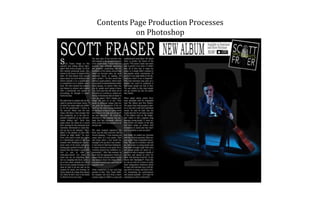
- 1. Contents Page Production Processes on Photoshop
- 2. This is the original photo that is the background image of the right-hand side page.
- 3. To edit this image I followed the same methods as the contents page main image. I removed the ‘messy’ parts of the background with a black brush tool and then changed the saturation and colour balance. I then placed it on a black A3 sized page which was split into left and right page to prevent me putting anything where the guttering of the magazine would be.
- 4. Just like on the plan, I added the text “S F’ as the artist’s name initials in a large font previously used in the contents and front page for consistency. This time I used it with a low opacity so you can read the article over the top of it.
- 5. Using the Eraser Tool I cut through the text layer. Before I cut through it I had to ‘rasterize’ it which meant I wouldn’t be able to change the format of the text without starting the layer again so I had to make sure it was completely right.
- 6. Next I placed the album artwork that I made in the corner with a white box in the background to show the shape of the square.
- 7. I added the other text in by changing the fonts properties but keeping the same font as used in the other pages.
- 8. Here I added more text but also the iconic, well-known iTunes logo to market the album more by telling you exactly where you can get it.
- 9. Finally I removed the filler text and added the article which is an interview about the artist, Scott Fraser’s, career. I used the same serif font but in a slightly wider format so it is easier to read. I think the traditional newspaper-look reversed would attract my target audience. I also made the first letter of the article larger as is it done in many other magazines.
- 10. My finished double-page spread.