3. Laura Mulvey theory in her essay ‘visual pleasure and
narrative cinema’ in which she discusses and
identifies voyeurism and fetishistic. Example of over
objectified artists include Rhianna, in her music video;
Stay she is in a bath tub, this may have been in order
to portray her as innocent and to some extent weak.
This fits in with our male dominance in society as
even though she is the lead singer and the main focus
she has been portrayed as vulnerable to the males
gaze whilst the male is casually sitting down and not
sexualized in anyway. This satisfies the males gaze as
the focuses of the shot are close ups and therefore
objectifies Rhianna as well as doesn't arouse anything
abnormal.
• This is Rhianna's decoupage called Loud.
The most noticeable feature of the
digipack is the use of the colour red,
which connotes sexual desire and
romance.
• The use of roses adds to the symbolism of
love, which is the general theme in most
of Rhianna's songs
• This allows for the audience to understand
the artists purpose.
• The font is simple because Rhianna is a
popular figure, so they focused on the
picture of her rather than her name, to
show her good looks. 'Loud’ which is what
the album for her song ‘stay’ is, contrasts
what the two words connote. ‘Stay’ shows
vulnerable soft connotations because of
the terms it is normally said when begging
for someone to be with you. Whereas
‘Loud’ is a word describing something
which usually connotes to being a bad
thing “It’s too loud” thus giving a
complete word clash.
• The choices of the images make Rhianna
to be aesthetically pleasing person, as it
focuses on her lips which makes out she is
giving the audience a seductive feel.
4. Intertextuality: the bed of roses connotes
with the film ‘American Beauty’
• The CD image is totally
different, contrasting with the
cover of the album, the disk is
a soft gentle flower, possibly
showing Rhinanna’s soft
innocent side, whereas the
covers show this strong image
of Rhianna.
• The inside of the did pack has
Rihanna lying in a bed of
roses, this is a stereotypical
image which reflects romance,
giving the audience an insight
into what they expect from
the album
• The images on the digipack a
strong powerful images which
portray Rhianna as a tough
lady, with possibly a bit of
attitude, yet there is still a
sense of calm gentleness
about it as the digipack is
opened up to see the rose
pictures on the disk and inside
of the case.
5. The images on each part of this Digipack show the artist using
different angles such as close ups, mid-shots and also shots of
the artist that aren’t face on like side shots etc. With this
Digipack it identifies the artist with the use of her face on the
front cover.
• The second Digipack I will be
analysing is Ellie Goulding’s ‘The
Writer’:
• The colours used in this Indie Pop
Artists Digipack are washed out
softened colours, such as
pinks, whites and greens.
• In contrast to the back and front
covers of the CD, the image inside
the Digipack of the artist in the
studio, uses rich colours of gold's and
black, which is different to the
softened colours throughout which I
think emphasizes the warmth the
artist has in the studio.
• The font used is a feminine long
handed calligraphy font that gives the
Digipack a gentle, elegant feeling to
it. Also with the font, a white strip is
behind it making the font stand out
against the soft coloured
background. The graphical style
represents the album as being a
folky, laid backer singer songwriter
feel. The font being long handed
gives the idea of it being like a breeze
in the wind.
6. • Another female artist that has inspired me
is Colbie Caillat. This is her digipack for her album
‘Breakthrough’.
• The colours used on this Digipack are very bold
and summery, like Ellie Goulding’s. The use of
bright colours have been softened to emphasize a
girly, light hearted feeling. The use of
yellows, greens, browns and blue mostly
dominate this Digipack.
• The fonts used on this Digipack is a font that is
very girly and could be described as looking
handwritten which gives the idea that she has
contributed largely to writing this album. Once
again the colours of the font are very gentle and
use the colour white which goes with the outfit of
the artist.
• The images used on this Digipack easily identify
the artist and have different images of her on the
front and back cover plus on the inside. The
angles used on this Digipack are close-ups and the
artist is wearing white clothing that gives a
peaceful, gentle look.
• To conclude with my Digital Analysis, I have learnt
that with indie pop artists they show strong
conventions of the indie pop genre. With the fonts
they are all made to stand out on each of the
Digipack but either using bright colours such as a
white colour so that it can be eye-catching and
attract the target audience.
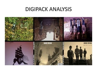
7. • I chose Benjamin Francis Leftwich
album cover because I like the
delicate illustrations and the two
children standing back to back on a
cloud. The colour schemes are
organic.
•
This is the album cover for 'Last
smoke before the snow storm’. Like
many other indie albums covers it
includes and aspect of hand
drawn/painted effect on the main
image. Another convention of indie
albums covers represented here is the
lack of images of the artist. Many
recent indie album
covers don't include images of the
artist, this relates to the rebellious
aspect of the indie genre, as most
other genres include artist images as
the main focus point. The CD artwork
matches the front cover in terms of
colour. They also include the same
style of font. The font used is a very
old fashioned one, it is elegant which
also relates to the hand drawn effect
of the images used in the cover and
others like it.