Advert editing
•Télécharger en tant que PPTX, PDF•
0 j'aime•192 vues

The document describes revisions made to a magazine advertisement design. It summarizes changes made to improve readability of text using different colors and adding an outline. It also discusses cropping a photo to make space for text, converting it to black and white with a blue tint, and using Photoshop tools like actions, healing brush, and adjustment layers.

Recommandé
Contenu connexe
Tendances
Tendances (20)
Similaire à Advert editing
Similaire à Advert editing (20)
Plus de Fabíolla Lorusso
Advert editing
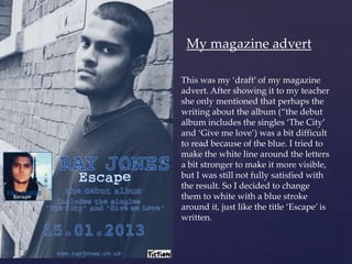
- 1. My magazine advert This was my ‘draft’ of my magazine advert. After showing it to my teacher she only mentioned that perhaps the writing about the album (‚the debut album includes the singles ‘The City’ { and ‘Give me love’) was a bit difficult to read because of the blue. I tried to make the white line around the letters a bit stronger to make it more visible, but I was still not fully satisfied with the result. So I decided to change them to white with a blue stroke around it, just like the title ‘Escape’ is written.
- 2. This is how my advert looks now. The text is much clearer in white. I will explain the steps I took to construct my advert on Photoshop. The text To add the text I simply used the typing tool (‘T’) and I used the same colour scheme (white and blue) and same font of my digipak. What’s new here is that the text has an outline around the letters. The reason why I chose to do that is because I thought it would help the text to stand out more in the black and white photograph (especially the blue, which I thought essential since it’s my main colour).
- 3. To create this line around the letters, I right clicked the layer of the text and clicked on ‘Blending Options’. This would open some options of layer style, and I ticked the option ‘stroke’. I can arrange the configurations the way I want, what colour I want the stroke, what size, opacity, etc. I used this same tool to outline in blue the image of my digipak cover.
- 4. The photograph I cropped the photograph because this image is very busy and it does not have space allowing me to write anything. Trying to be similar to Ed Sheeran’s advert in which the text is on his shirt, I cropped the mage in a way that I can have a closer shot of his face (to promote him better) and space to write on his shirt.
- 5. I decided to use a black and white photograph because it is very conventional of the genre and to be similar to Ed Sheeran’s advert as well. However, I didn’t want a common black & white, I wanted a more sophisticated one and with a slightly blue effect to keep this blue tone recurrent in the ancillary products. So I added two different effects to my image by using ‘actions’. The first action that I used was this one. It gives the image a nice black and white effect with some sophisticated tones. Then, on top of this action, I used another action called ‘Green tint’ that added a blue tone to the image.
- 6. And then I removed little imperfections of his face with the healing brush tool. I have also changed slightly the curves and the levels to create a nice contrast.