
Recommandé
Contenu connexe
Similaire à print ad edit.pptx
Similaire à print ad edit.pptx (20)
Plus de flynnjohnson
Plus de flynnjohnson (16)
Dernier
Dernier (20)
print ad edit.pptx
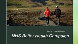
- 1. z Plan for a Healthy Lifestyle NHS Better Health Campaign
- 2. z Post Production. Print Advert. The idea for my print advert was getting active. I wanted to show that in a healthy lifestyle you need to be active and fit. However I wanted it to be realistic as I know people who have just started there journey of getting active wont be able to go for a run straight away, that’s why I choose to show me walking. Also I chose to shoot this outside to show you don’t need a gym to get active and as little as a walk outdoors can benefit your health. Due to this being my goal I took all my equipment and headed to my nearby forest. I set up my tripod and shot different angles. The goal behind each shot was to show me getting active in a peaceful calm setting as this would encourage people to get out and get active instead of scaring them off buy showing something extreme however I still wanted to show some sense of challenge and accomplishment once you have done it. I wanted my advert to be inspirational and to show that everyone can do it and I have hope for everyone to change because of this I tried to get the blue skies and sun into my advert.
- 4. z Post Production. Print Advert. This is the start of my print advert, this picture was shot at my chosen location using a tri-pod. Out of all my drafts I decided to pick this picture after the feedback I received as this was picked as the best one by my target audience. I also agree with the feedback as this is my favourite as it portrays everything I want to show. The sun on top of me shows hope, the hill getting steeper Infront of me shows the challenge aspect of it however the trees and the blue sky shows the peacefulness of overcoming this challenge so this picture was perfect. To take this picture I set the camera onto a timer this allowed me to get into position. I set myself slightly off centre to do this I used the rule of thirds. The reasoning behind this is I wanted the text to be next to me and not on top or below. As you can see I took inspiration from this advert however I felt like the text was a bit cramped so this is why I moved myself to the right side to allow my text to look free and clean and in proportion. Also I picked to position myself on the right side instead of the left because of 2 reasons. First reason is because naturally people read from left to right so when I add the text people will see my message first so they get a good idea about my advert. Second reason is I wanted to position it so the sun is shining on me. This represents light and hope and adds to my inspirational side of the advert.
- 5. z Post Production. Print Advert. This is my first step of editing my print advert. I first lowered the expose to “-0.34” this gave the picture a bit of a darker look by doing this it meant the picture looked cleaner and better quality however I only slightly lowered it as I didn’t want the picture to be too dark. Also due to the bright sun on the camera this dimmed it so the sun also looked better and more visual. Next I changed the offset to “-0.0050” this also slightly darkened the image as it adds a darker boarder which also makes the actual image look more vibrant and a better quality picture. I also lowered the gamma as in my imagine there is a lot of shadows from the sun and lowering the gamma means you can now see more detail in the shadows. For example if I increased the gamma the image would look washed out and too bright and a bad quality picture. Most of my editing was influenced from the sun and to make my image loom as clean and high quality as possible as I know my client is an extremely professional service. By editing all of these in the way I did I added more warmth to the image making everything look cleaner and vibrant.
- 6. z Post Production. Print Advert. After I changed all the exposure setting I then used the tint tool to make the image look even warmer I experimented with different colours and tints after using different colours I decided orange was the best as once again it added warmth to the pic and made the picture look more professional. The orange made the leaves and trees look more detailed and better quality. Also it matched the colour of the sun to make it look more realistic and blend into the picture. Also it gives it more of a golden look to it and the light shining on me also now looks golden which helps intensify the hope and inspiration message. I also experimented with red however the feedback I received said the orange tint was better also I believe the red makes it look fake and not very professional which would not suit my client.
- 7. z Post Production. Print Advert. Unfortunately I couldn’t screenshot the curves grid on Photoshop but this is the inspiration I used. By doing this set up it has a matte effect on the picture and because of the exposure settings I put on, the matte effect helps correct the image to make it look clean and more professional. I decided to use the matte effect as I believed the advert previously looked to shiny it also made the image look low quality before I did it ( I also got a second opinion from my audience and they agreed with me.) So I researched the best way to overcome this problem and that’s why I did the matte look.
- 8. z Post Production. Print Advert. For this part of my edit I adjusted the vibrance to +70 and saturation of the picture. By adjusting the vibrance it made all the details stand out in the picture. Also the vibrance makes the picture look brighter and id describe it as making the picture looking more happy and lively. By doing this it adds the aspect of “getting active” is fun and a happy process. I wanted to show this across my advert as it will increase the chance of someone starting to get active which helps my client so upping vibrance really helped me portray this. Also to add to this effect I slightly upped the saturation this made the colours stand out more and be more vivid on my advert so that’s why I slightly changed it as if I upped it anymore the advert started to look unrealistic and too edited which was not my goal at all.
- 9. z Post Production. Print Advert. This was my final stage of editing. First I picked my tag line/ inspirational quote. I wanted this to be the key message of the advert so I changed the font size to 142 so it was clearly visible. Then wanted to add emphases to that it will be a challenge to do this I changed “always” to red text this is to show challenge and a sense of danger but that you can overcome it . However the text was blending in to the picture so I added an outline to the text to make it stand out more. Finally I used the free transform tool to move the text into position and I used my ad research and inspiration to decide to put it to the left of me. Finally to finish off my advert was to add the branding of the nhs logo and the better health logo as well this just helps advertise the client and also shows the audience what the point of the advert is.
- 10. z Post Production. Print Advert. Challenges I Overcame. My original plan for this advert was to film it when I was snowy/frosty, I arranged a date for my shooting and planned it out using the forecast. However I could not shoot on this day as I was very ill because of this I had to re design my print ad. I wanted the snow to be there to show that this is going to be a challenge so because I could now not portray this I swapped the meaning behind my advert to be an inspirational advert and show hope because of this I planned a day where it would be sunny so I could try and get a shot of the sun shining on me to portray this meaning. Luckily I captured the perfect shot of the sun on me. Overall I'm really pleased how my ad turned out even though it wasn’t what I planned and I actually think it turned out better than if I stuck to the original.
- 12. z
- 13. z Post Production. Print Advert. Feedback Review. 1) How can I improve the advert? Due to the feedback on this advert I have changed it and now it has no full stop and I also corrected the text so its all in-line as that was one of the most frequency criticism of it. I agree with this advise as the adverts I've looked at and used for inspiration don’t have a full stop as well and my advert looks even more professional with the text being completely straight. Also this survey was sent to my target audience so there feedback is really important for the success for my client. 2) Is this advert professional? This question was extremely important to me because one of my main aims was to create a professional advert as I know the size of my client and unless the advert is professional it will not be able to be published so I put extra influence into making it as professional as possible. To confirm this I sent this question to a mixture of people including my audience which is 16-18 year olds as this is who my advert is meant for so if they think it is professional then that is great however I also asked people who are older (30+) as they have experience in a professional environment unlike my audience so I thought it was important to ask both. As you can see from the results both groups of people agree with each other that my advert is very professional which is very good and allows me to know that I've reached my goal and don’t have to change anything on my advert to make it more professional.
- 14. z Post Production. Print Advert. Feedback Review. 3) Is this advert inspirational? This advert is based around the goal of getting active, I believed that the best way to get results for my client was to inspire people to get active and to start there journey. This question was sent to my audience(16-18 year olds) because if they are inspired by it I then know it will be successful for my client and now that I can see the results from the survey I am very pleased with my advert as I know it will help the NHS so this means I have made a successful advert for my client which was my main goal. 4) Is this advert high quality? Once again I know how important my client is so I had to make sure the advert is the highest quality so they could be able to use it and put it on there website which gets millions of views. So they quality needed to be good enough for them to be proud to show the whole of the UK and fortunate everyone I questioned agreed that the advert is high quality this means my client will use my advert which was my goal so once again I had reached my goal.
- 15. z Post Production. Print Advert. Feedback Review. 5) If you were the NHS would you use it? I believe this is the most important question of them all as this is what it all comes down to. For this question I decided to ask a mixture of people including my audience and people with more experience in this industry. I choose these two because if my audience would use this advert it means they like it however as my audience is young they don’t know how this industry works and if this advert would get used or not so that’s why I asked people with more experience as they’ve seen ads which have been used. As you can see from the results both set of people would use it. This was such good news for me as it means my advert is perfect and has everything the NHS would need so my target that I set out to achieve has been met. This feedback was important as it means my advert works and doesn’t need any dramatic changes to it to make sure the NHS would use it and actually only requires tiny slight changes to make it absolutely perfect.