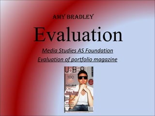
![Conventions of real media products Q1) in what ways does your media product use, develop or challenge forms and conventions of the real media? ,[object Object],Before i started my front cover i researched three front covers of different magazine each of these used different media conventions to attract the specific audience for the magazine. Front Cover I decided to use a large image with the image in a different position, through the research i seen that large images on front covers are frequent use on magazine front covers in the media in order for the magazine to stand out. In my image i decided to use classes so that you cannot see the eye contact therefore making the you want to know more. Classes are used of a sense that we don't know who is behind them. I also used large font text for the title of the magazine , large so it stands out and also people know what the magazine is called. I used numbers on my front cover as doing research i found that people are attracted by numbers on magazine as it makes the magazine interesting. i used a main cover line on my magazine so that people know what the main focus of the magazine is going to be. All front covers have main cover lines. I used a balance in my front cover i made sure that i packed the front cover with information but making sure that it looked attractive, more information, means that there i more in the magazine. With my image is didn't use the principle of thirds i didn't place my image in the centre of the page i slightly moved it to the right hand side, but i think that it makes the image more interesting.](data:image/gif;base64,R0lGODlhAQABAIAAAAAAAP///yH5BAEAAAAALAAAAAABAAEAAAIBRAA7)
Recommandé
Contenu connexe
Tendances
Tendances (18)
Similaire à Evaluation
Similaire à Evaluation (20)
Dernier
Dernier (20)
Evaluation
- 1. Evaluation Media Studies AS Foundation Evaluation of portfolio magazine Amy Bradley
- 3. Contents Page I structured the contents page with a equal balance , i placed the information of what is going to be in the magazine on the left hand side using the left third heavily as research shows that people look first top left to bottom right therefore i positioned my images on the right which reflects what the information is telling us. My images are varied in size and gender to give my specific audience variety. Variety is crucial in a magazine unless the magazine is targeted at an smaller audience which the magazine will be based around the same i.e music artists. In my contents page i use neat typeface to show the information that is given in magazine, the information given is simple but also information that i aimed at my target audience. In the information that i have constructed i have h used things such as competition wins, which i have researched and found that magazine often use this as it attracts people to the magazine. I also used something that i have seen in magazine which is i used numbers on the images to relate to the information so that my audience know what or who is on the certain pages. With my images on this page i but one behind the other to make the images jump out which also makes the images look interesting. My research on contents pages shows that you have to have a good balance of what information is going to be in the magazine so that the audience have a variety of things to enjoy reading. Also the layout of the page i feel is a lot harder, i have used different typefaces again which are very important on this page as it displays what is in the magazine and it is crucial to make the audience want to read more. Q1) Contents Page
- 4. Inner pages are very important as they have to represent what you have displayed on the contents and front cover of the magazine. It is crucial that it contains what the reader has hoped for in order for them to be satisfied with what you have promised. I have used blank space on my first page which i felt was a risk as if it isn't used right then it can make the organisation of the page unbalanced. Using blank space can effectively make the page look good without using anything. On my pages i have used different colour backgrounds, i have used my image a spread it across my second page taking up the whole page. This allows both pages to stand out and mainly grab you to want to read the information. I decided to write an interview with answers and questions. I did the answers and questions in different colours as it creates a sense of that there isn't a lot of writing. Therefore the reader will not be put off by the writing. Pull quotes are what i have seen in magazines whilst doing my research. And they are effective as the reader will look at these first and hopefully if they are powerful enough wan to read the article. I also decided to put other images that are different. Different angles and different costumes as the reader will be able to see a variety of images and also gives the page more variety to the page to make it look good. I used large mast head to stand out but then for the second title i used different fonts do that it eventually goes down to the size of the article so when reading it flows straight to the article. Q1) Double page spread