
Recommandé
Contenu connexe
Tendances
Tendances (19)
En vedette
En vedette (20)
Similaire à Question 2 how does your media product represent particular social groups (memory stick)
Similaire à Question 2 how does your media product represent particular social groups (memory stick) (20)
Plus de harrydarling777
Dernier
Dernier (20)
Question 2 how does your media product represent particular social groups (memory stick)
- 1. Question 2- How does your media product represent particular social groups?
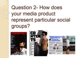
- 2. Shot Types In order to create engagement between the audience and the artists, the use of eye-line shots were vital. These shots emphasised whether or not direct mode of address was used; some cases it was used in order to form personal connections with the audience (as proposed in the uses and gratifications theory). However, for the majority of images, I did not use direct mode of address, this was because I aimed to grab the reader’s attention by creating a sort of mystery behind the artists, one which they would want to read the article and answer the questions they constantly propose in their head.
- 3. Shot Types I used many varied shots for the images in my magazine, this was to produce different connotations and different outcomes. For example, my front cover was an image in a medium-close up shot, this was to produce a form of intensity, made the readership focus on the facial expression and connotations beneath that. My contents page was an image in a medium shot, this was so I could fit the artist’s body in too, so I could include a sex appeal and create a more eye catching article. Similarly, my double page spread used a long shot, to include the background of a train station, making the artist relatable to anyone. I only used male models/artists for my magazine as the main demographic for hip-hop magazines is the male (normally young) audience.
- 4. My front cover followed conventions and presented a young male on the front cover. This was to attract male’s who felt it was relatable, and for women who preferred it in an admirable sense. This would mean it would therefore be attractive to the readership, as they’d feel at home with the layout of the magazine. Similar.
- 5. My double page spread quite evidently challenged conventions of normal hip-hop magazines in terms of layout, as the text is on the left and the picture is on the right. Normally, they are the opposite ways around. I did this to attract the readership’s full attention quicker, as the whole magazine attempts to be light on the density of the text, the picture would therefore be the first thing to be seen and would mean the younger audience would quickly relate to the artist of their age range. Opposite layout structure.
- 6. Mise En Scene Normally, artists who model for the front cover of a magazine are dressed smartly, often in expensive clothes. However, to appeal to the younger generations, I challenged these conventions and presented my artist as a relatable character, as he is wearing a school shirt, meaning kids believe they could perhaps reach where he is one day. XXL and other hip-hop based magazines showed dense variation throughout the course of the magazine, with the Mise en scene depending on the artist’s preference and the persona they want to be seen in. For example, both the artists on the front cover and double page spread are dressed in original clothing, hinting at a relatable sense (uses and grats theory). Whereas, the artist in my contents insisted on modelling with no shirt on, making him an admirable character and as a result more likely to be less relatable to the male readership.
- 7. Layout Evidently, from my target audience research I knew which demographic of the readership I was mainly basing my magazine around. To reflect our target audience’s stereotypical preferences, I used a simplistic layout, with everything neatly arranged with no overcrowding, producing a clear read for the audience. Obviously representing the younger audiences in my production here, as if it was text heavy it’d be assumed it was targeting older audiences. The balance of formal and informal style of writing needed to be perfect, as it needed to be informal to maintain the younger audience’s attention, yet needed to keep it’s formal and professional aspect. Conventions followed
- 8. Images Once again, the uses and grats theory is important for my production, as it is important for the audience to feel related and connected to the artists, by following conventions I did this as the artists are a similar age to the target audience. The contents page directly opposed Mulvey’s theory of women being used as sexual objects for the benefits of men, as in this case, a male is used as a sexual object for women’s pleasure. This would attract males who saw themselves in this way, perhaps a confidence booster maybe?
- 9. Simple but yet affective main aim for the double page spread is to attract reader’s based on how relatable it is and originality. For example, the image is shown a man waiting for a train, this is a regular occurrence for many people, and people can relate so therefore feel inclined to read on. Similarly, it’s clear the Mise en scene is very minimal, thus enforcing this natural aspect of the image.
- 10. Ideology The whole basis of my magazine tends to be centred around the idea of artists being relatable to the readership. Ordinary surroundings and low budget clothing enhances this idea, as well as the use of artists that are in a similar age range to the target audience. This enforces the idea that the artists are representing the teenagers reading, so they wan to read about their potential. The camera shots (eye-line shots) and informality helped support the idea that they are related and in some way similar to the audience.