SlideShare une entreprise Scribd logo
1  sur  23
THE EVALUATION Holly Redmond
In what ways does your media product use, develop or challenge forms and conventions of real media products?   Both use plain white masthead in capitals and quite bold, white is not complicated but stands out on the page and looks clean. Close up main image where eyes and lip on the person stand out a lot. Main image placed behind the masthead as the image is close up. Barcode in bottom right hand corner. All text on cover lines in capitals, making it seem like what is written is important and to also catch the readers eye. Majority of text on my front cover filled in white and VIBE magazine in black. Both plain yet sophisticated colours, not over the top.  SIMILARITIES IN FRONT COVER
DIFFERENCES IN FRONT COVER My magazine has a header and a footer whereas VIBE magazine doesn’t have anything. I included a header and a footer to put more information on the front cover of the magazine as I didn’t want to crowd the front with lots of sell lines so that it didn’t look clustered. My image takes up the whole cover so there is no need for a background whereas VIBE magazine has a plain blue background. I would have included a background if I had used a different image but the image I chose I thought would look good covering the whole page. VIBE magazine contains less text on the page and has one overly dominant sell line whereas my magazine has more sell lines and also the font size of all the text is pretty much the same.  My image has a more sepia effect and VIBE magazines main image of Rihanna has a black and white effect.  The person in my main image is looking straight into the camera making it obvious she knows the photo is being taken whereas in the image of Rihanna it is unsure if she knows the photo is being taken as she is looking away and not really posing.
SIMILARITIES IN CONTENTS PAGE I got the style of separating the letters in ‘contents’ from VIBE magazine as it looks more creative and gives an edge to the contents page. It also allowed more space on the page as I could place it in one corner on the page instead of taking up the top of the page. Both  magazines use the main image as a background, they both take up the whole page . I did this as the photo is of good quality so I didn’t need a background. Both magazine have a smaller picture in the corner, which has a white background. Both magazines contain headings for the text, separating the content of the magazine into different sections making it easier for the reader to follow. All of the text on my contents page is in capital letters and the majority of text on VIBE contents is also in capitals. I did this to make it look more clean on the page and look more sophisticated and stand out more. In both magazines, the smaller image in the picture is looking straight into the camera.
DIFFERENCES IN CONTENTS PAGE The main image in VIBE magazine is looking straight into the camera but my main image is looking away from the camera. I got the person to look out of the view of the camera because it is obvious she is already doing a certain pose so she knows the photo is being taken and I wanted to contents to look a little different to the pose shown in my front cover. The smaller photo in my magazine contains text showing where to go in the magazine to find out more and the image is also tilted and has a black border around it whereas the smaller image in VIBE contents is showing you a magazine cover, does not have a border and is not tilted.  The background on my main image is green as I got the person to stand in front of my green wallpaper whereas the VIBE contents has other people in the background and shows the setting of the image. I choose a plain background as her outfit has colour in it already and I wanted white text. Some of the text in VIBE contents has smaller text underneath it adding extra information in the page whereas mine doesn’t. My main image has colour and VIBE main image is in black and white. I wanted colour in my magazine as wanted it to be as bright as possible.
SIMILARITIES IN DOUBLE PAGE SPREAD Both images are on the left page and take up the whole page. I chose to do this as I thought the image was good so wanted to make it more dramatic and big.  I used VIBE magazine to get the idea of using initials of the person in big on the right page with two different colours, one being black and the other being red going with the theme of the page. Both images have page number, mine is in the bottom corners of each page and VIBE magazines is in the top right hand corner. Both images are focused on the camera and are mid close ups.  Both pages have two columns of text in them.
DIFFERENCES IN DOUBLE PAGE SPREAD My main image has a white background whereas VIBE double page spread has a black background. I chose a white background as the black background made the image look obviously cropped out more than the white background. The white background also goes with the white background to the text. My page has lines at the top as I wanted to keep the theme of lines as was on my contents, I also added a red line to go with the double page spread. VIBE magazine doesn’t have any pattern apart from the text and image. Although both pages have two columns, the layout of my text is where the first column is set to the right and the right column is set to the left. VIBE magazines text is justified. I wanted all of my text to look like its all going into the middle of the page which is why I set out my text in that way.
How does your media product represent particular social groups?
Female R&B singers are portrayed to be very strong, powerful women and this shows through their music as well as their image. R&B singers usually look very expensive with flashy clothes and their own style, for example Rihanna’s hair style changes frequently and her image is quirky and cool. I want my images for my magazine reflect the same idea a lot which is why I chose to take photographs of a girl with big, choppy short hair and a girl with her own individual style and also big hair as this goes with the conventions of R&B, pop and hip hop.     Although female R&B singers look powerful and in control, they also look attractive and sexy. Therefore my magazine attracts both a female and male audience as the images of the girls are strong making other females aspire to be like them but as they are attractive it might make males want the magazine as they are attracted to them. Male R&B singers are usually portrayed to have a lot of respect and are looked up to because they have a high reputation. They are also known for their quirky style which is commonly called ‘swag’, a word that is used in relation to R&B and hip hop music.
What kind of media institution might distribute your media product and why?   IPC Media produces over 85 media brands Two thirds of their readers are women Their brands when they come together reach over 20 million users each month. They have knowledge in the music genre as they distribute NME magazine. Publishing my magazine will be a good opportunity to expand their audiences and genres of music.
Who would the audience be for your media product? The audience for my media product will be aimed at both genders even though in my magazine the images are only of women, they should also attract men as the women are attractive in the images. People that enjoy R&B, hip hop and pop music, and people that enjoy going to gigs and concerts that are of this genre will also be my target audience for my magazine. My target audience will not just be aimed at Afro-Caribbean which is the stereotypical audience but will be targeted at people from different backgrounds including ethnic minorities to broaden the audience. I am also targeting both women that are confident and powerful and can relate to the women in the magazine and women that are not as confident and aspire to be like the women in the magazine. Typical Target Audience Tom, 17 year old Student from Solihull, favourite colour  blue.  Likes music, socializing, going to the gym, high interest in fashion. Dislikes rock music. Favourite music – MOBO (music of black origin), R&B. Goes to concerts, listens to music on iPod at the gym, majority of the time downloads music onto his iPod or CDs.
How did you attract/address your audience? I attracted my audience to my magazine by having lots of sell lines that might capture the readers attention, such as ‘The Only Interview’ and ‘The Glam Life of’ etc.  I used a dominant image with bold eyes and mouth to stand out and a choppy fringe coming around the persons face which looks a bit different to the usual hairstyle. The image is a powerful and strong one which relates to the audience I have aimed at. I set a reasonable price that all of my target audience will be able to afford. I addressed my audience by not using overly formal language but used simple and easy to understand language.
How did you attract/address your audience? The images I have used should attract the target audience because I have used people of different cultures and backgrounds to attract people from different backgrounds also.   The main image is dominating the page so it is also used as a background to make the contents more unique and interesting and the smaller image is tilted. Both of these changes I have made may further attract the audience. My contents page addresses the reader through  the regular and featured articles listed because the singers and bands listed would attract the audience as it is music they are familiar with and most likely enjoy. I have used all capital letters when writing my text and the writing is in filled in white to stand out better against the background. This will attract the audience as it will capture the eye.
How did you attract/address your audience? The big image which dominates the whole of the left page is interesting and the girl looks powerful in the image which will attract both males and females to the magazine as females with either aspire or relate to the image and men may find it attractive.  The big heading at the front will capture the audiences eye and the strap line which is all in capitals will make the reader want to read on as it gives an insight of what will be included in the article. The colour scheme I have used will attract my audience as over the two pages the red flows from parts of the text to the colours in the image.
What have you learnt about technologies from the process of constructing this product? Using PhotoShop I was able to edit the photographs I had taken on my camera to make them look more professional and manipulate the image. Using InDesign to create my magazine base and then my final magazine, inserting things into the pages and also editing things using InDesign. Using cameras to take photos for my magazine, using different shot types, editing the way the camera takes the picture using the settings on the camera.
Using Photoshop Original image for front cover I have edited my image for my front cover using Photoshop. I have made the image darker by playing around with levels and colour balance to make it look a bit different to the original image, darker and more professional. After editing my main image in Photoshop I then made my masthead ‘VOLUME’. The font used was Agency FB. I edited the masthead by changing the font to a style which I feel makes it look more like hip hop/R&B/pop genre and made it larger. I also changed the colour to white as it will go well with my main image and as the image has darkness to it the white would contrast well. I put my image and masthead together to make the base of my magazine cover and to make sure that it went well. I placed the masthead just above the eyes as it will make the eyes stand out more and look more striking. NEXT PAGE
Using PhotoShop (cont) I then added some cover lines and strap lines to the page mainly using the font ‘impact’ as it is bold and stands out yet it also looks sophisticated and clean. I started off with the text being all white as I knew I wanted my main colour on the page to be white. As I knew the image I am using for my contents page has a green background, I added the same colour to my swatches and used this colour to edit some of the text on the front cover. I added some boxes that were filled with the green and placed them behind some text which I have made black to make certain words stand out on the page that I think the audience would be attracted to. I also edited some of the colour of the text and used effects such as drop shadow, inner shadow and inner glow to make them pop out. I also added ‘NEW’ in green inside the ‘O’ in my masthead so that my masthead had an element of the green on it to tie in with the theme. When I was happy with everything I had edited on the page and where everything was, I added the barcode which I also slightly edited and a flasher; filled in green and edited using drop shadow, with a white £1.50 sign coming slightly out of the circle to give it an edge and make it stand out more.   I edited the barcode slightly so that instead of it being black lines on a white background it was white lines on a black background and rotated it on the page as I felt it looked more sophisticated.   After I had completed my front cover I made the layout of my magazine front cover, contents and double page spread using InDesign and then placed my front cover in there.
Using InDesign I took various photographs for my contents page and decided on two photos. I did not edit the second photo as it was already a strong picture, so I used it as the image that was going to dominate my contents page.   I used Photoshop to edit my first photo, I cropped out the background and then placed it in the contents page. After placing in the image, I rotated it slightly and made a black border around it to emphasise the photo and make it look more professional. I moved it to the right hand corner of the page and left out some of it. NEXT PAGE
Using InDesign (cont) I added text saying ‘contents’ with Agency FB font like my masthead on my front cover and used shape boxes filled in black to make a shape going in the top left hand corner to make the page look structured. I added headings using the same font I did on my front cover, in white with a black background, following the theme throughout the magazine. I also added a pull quote and a page number to go to onto the smaller picture. In the left hand corner of the page I added ‘volume contents’ which you will see in a standard magazine on the corner of all pages. I then added text under the headings and filled them in white, I used Agency FB font tying in with the theme of the magazine. For the page numbers I used Impact. All text is in capitals to make it stand out on the page.
Using PhotoShop and InDesign (cont) My original image for my double page spread.  I shone a light on her face while taking the photograph to make her eyes stand out.   I then further edited the photo in Photoshop  to make her eyes stand out more and to make  the image look harder and more edgy.   I placed the edited photo in InDesign and added page numbers at the bottom. I then added text in the top left hand corner saying  ‘ volume interview’ in the same style as on the contents page.   As I had used straight lines in the corner of my contents page, I carried on the theme of using lines, but as my main image had red in it I filled in one of the lines red so it matched. I also added a headline and to keep the theme of red I made one of the letters red. I added a strap line introducing the person I’m interviewing. It was written in capitals to make it stand out to the other text that I would be writing in lower case. NEXT PAGE
Using PhotoShop and InDesign (cont) I added my text and filled the questions in red and kept the answers in black to make it clear to the audience when they are reading. I also added a by-line to show who the article was written by. I added a pull quote and placed it in between  my text to draw attention to the interview.
Looking back at your preliminary task, what do you feel you have learnt in the progression from it to the full product?   PRELIMINARY TASK FINAL MAGAZINE I have learnt how to make my magazine look more professional in the way that I have taken better quality pictures and thought about the way I took them including the backgrounds, etc. as the background to the images in my preliminary task haven’t got much edit to them and have the original background making it look less official. I have learnt how to place things on the page to make it look neat and well presented rather than looking like there is no purpose for where it is put. I have learnt how to manipulate images using Photoshop and also using InDesign to effectively create my article. By using these programs my final magazine looks a lot more improved compared to the preliminary magazine. When making my preliminary magazine I didn’t look at other magazines to give me ideas for my magazine whereas for my final magazine I compared it to real music magazines of the same genre that  I was doing which helped me make my magazine.
Audience Feedback LIKED MOST ABOUT THE MAGAZINE  HOW TO IMPROVE THE MAGAZINE  Realistic Professional – very good images and manipulation  Use of images  Masthead on front cover to contrast with image a bit better Colours on cover don’t show up very well

Contenu connexe

Tendances

My evaluation rach
My evaluation rachMy evaluation rach
My evaluation rachrachaeltara
 
My evaluation rach
My evaluation rachMy evaluation rach
My evaluation rachrachaeltara
 
Media evaluation presentation
Media evaluation presentationMedia evaluation presentation
Media evaluation presentationmuminab
 
Media Evaluation Lewis Cooke
Media Evaluation Lewis CookeMedia Evaluation Lewis Cooke
Media Evaluation Lewis Cookeguest8e34681
 
As media studies slide show
As media studies slide show As media studies slide show
As media studies slide show mediamedia1
 
As media studies slide show
As media studies slide show As media studies slide show
As media studies slide show mediamedia1
 
Evaluation
EvaluationEvaluation
EvaluationGemma
 
As media evaluation – asmaa tanveer
As media evaluation – asmaa tanveerAs media evaluation – asmaa tanveer
As media evaluation – asmaa tanveerasmaa786
 
R'n'B Magazine Plan Research & Evaluation
R'n'B Magazine Plan Research & EvaluationR'n'B Magazine Plan Research & Evaluation
R'n'B Magazine Plan Research & EvaluationDiana
 
Forms and conventions finished
Forms and conventions finishedForms and conventions finished
Forms and conventions finishedfinzzyb
 
Media studies magazine evaluation
Media studies   magazine evaluationMedia studies   magazine evaluation
Media studies magazine evaluationjessiemc
 

Tendances (18)

My evaluation rach
My evaluation rachMy evaluation rach
My evaluation rach
 
My evaluation rach
My evaluation rachMy evaluation rach
My evaluation rach
 
My evaluation rach
My evaluation rachMy evaluation rach
My evaluation rach
 
My evaluation rach
My evaluation rachMy evaluation rach
My evaluation rach
 
Media evaluation presentation
Media evaluation presentationMedia evaluation presentation
Media evaluation presentation
 
Evaluation
EvaluationEvaluation
Evaluation
 
Media Evaluation Lewis Cooke
Media Evaluation Lewis CookeMedia Evaluation Lewis Cooke
Media Evaluation Lewis Cooke
 
As media studies slide show
As media studies slide show As media studies slide show
As media studies slide show
 
As media studies slide show
As media studies slide show As media studies slide show
As media studies slide show
 
Evaluation
EvaluationEvaluation
Evaluation
 
Evaluation
EvaluationEvaluation
Evaluation
 
Evaluation
EvaluationEvaluation
Evaluation
 
Evalaution 1
Evalaution 1Evalaution 1
Evalaution 1
 
As media evaluation – asmaa tanveer
As media evaluation – asmaa tanveerAs media evaluation – asmaa tanveer
As media evaluation – asmaa tanveer
 
R'n'B Magazine Plan Research & Evaluation
R'n'B Magazine Plan Research & EvaluationR'n'B Magazine Plan Research & Evaluation
R'n'B Magazine Plan Research & Evaluation
 
Forms and conventions finished
Forms and conventions finishedForms and conventions finished
Forms and conventions finished
 
Magazine evaluation
Magazine evaluationMagazine evaluation
Magazine evaluation
 
Media studies magazine evaluation
Media studies   magazine evaluationMedia studies   magazine evaluation
Media studies magazine evaluation
 

Similaire à R&B INSPIRATION: POWERFUL WOMEN

R&b magazine evaluation
R&b magazine evaluationR&b magazine evaluation
R&b magazine evaluationMiz_A
 
41 Evaluation
41  Evaluation41  Evaluation
41 EvaluationJordan
 
Actual evaluation
Actual evaluationActual evaluation
Actual evaluationmegan
 
AS Media Evaluation
AS Media EvaluationAS Media Evaluation
AS Media EvaluationEllieBrett
 
Evaluation for media 1
Evaluation for media 1Evaluation for media 1
Evaluation for media 1ShaniRoss
 
In what ways does your media product use, develop or challenge forms and conv...
In what ways does your media product use, develop or challenge forms and conv...In what ways does your media product use, develop or challenge forms and conv...
In what ways does your media product use, develop or challenge forms and conv...prialouise
 
Question 5 how did you attarct address your audience
Question 5 how did you attarct address your audienceQuestion 5 how did you attarct address your audience
Question 5 how did you attarct address your audiencesapphire29
 
41. Evaluation
41.  Evaluation 41.  Evaluation
41. Evaluation Jordan
 
Media evaluation presentation
Media evaluation presentationMedia evaluation presentation
Media evaluation presentationmuminab
 
Media evaluation presentation
Media evaluation presentationMedia evaluation presentation
Media evaluation presentationmuminab
 
New media evaluation
New media evaluationNew media evaluation
New media evaluationJas1231
 
New media evaluation
New media evaluationNew media evaluation
New media evaluationasmaa786
 
New media evaluation
New media evaluationNew media evaluation
New media evaluationasmaa786
 
New media evaluation
New media evaluationNew media evaluation
New media evaluationasmaa786
 
Sians evaluation
Sians evaluationSians evaluation
Sians evaluationsianamber
 

Similaire à R&B INSPIRATION: POWERFUL WOMEN (20)

R&b magazine evaluation
R&b magazine evaluationR&b magazine evaluation
R&b magazine evaluation
 
41 Evaluation
41  Evaluation41  Evaluation
41 Evaluation
 
Actual evaluation
Actual evaluationActual evaluation
Actual evaluation
 
Question 1
Question 1Question 1
Question 1
 
AS Media Evaluation
AS Media EvaluationAS Media Evaluation
AS Media Evaluation
 
Evaluation for media 1
Evaluation for media 1Evaluation for media 1
Evaluation for media 1
 
Poser
PoserPoser
Poser
 
Poser
PoserPoser
Poser
 
Poser
PoserPoser
Poser
 
In what ways does your media product use, develop or challenge forms and conv...
In what ways does your media product use, develop or challenge forms and conv...In what ways does your media product use, develop or challenge forms and conv...
In what ways does your media product use, develop or challenge forms and conv...
 
Question 5 how did you attarct address your audience
Question 5 how did you attarct address your audienceQuestion 5 how did you attarct address your audience
Question 5 how did you attarct address your audience
 
41. Evaluation
41.  Evaluation 41.  Evaluation
41. Evaluation
 
Media evaluation presentation
Media evaluation presentationMedia evaluation presentation
Media evaluation presentation
 
Media evaluation presentation
Media evaluation presentationMedia evaluation presentation
Media evaluation presentation
 
Evaluation1
Evaluation1Evaluation1
Evaluation1
 
New media evaluation
New media evaluationNew media evaluation
New media evaluation
 
New media evaluation
New media evaluationNew media evaluation
New media evaluation
 
New media evaluation
New media evaluationNew media evaluation
New media evaluation
 
New media evaluation
New media evaluationNew media evaluation
New media evaluation
 
Sians evaluation
Sians evaluationSians evaluation
Sians evaluation
 

Dernier

Transcript: New from BookNet Canada for 2024: BNC CataList - Tech Forum 2024
Transcript: New from BookNet Canada for 2024: BNC CataList - Tech Forum 2024Transcript: New from BookNet Canada for 2024: BNC CataList - Tech Forum 2024
Transcript: New from BookNet Canada for 2024: BNC CataList - Tech Forum 2024BookNet Canada
 
Unraveling Multimodality with Large Language Models.pdf
Unraveling Multimodality with Large Language Models.pdfUnraveling Multimodality with Large Language Models.pdf
Unraveling Multimodality with Large Language Models.pdfAlex Barbosa Coqueiro
 
"Debugging python applications inside k8s environment", Andrii Soldatenko
"Debugging python applications inside k8s environment", Andrii Soldatenko"Debugging python applications inside k8s environment", Andrii Soldatenko
"Debugging python applications inside k8s environment", Andrii SoldatenkoFwdays
 
Beyond Boundaries: Leveraging No-Code Solutions for Industry Innovation
Beyond Boundaries: Leveraging No-Code Solutions for Industry InnovationBeyond Boundaries: Leveraging No-Code Solutions for Industry Innovation
Beyond Boundaries: Leveraging No-Code Solutions for Industry InnovationSafe Software
 
My Hashitalk Indonesia April 2024 Presentation
My Hashitalk Indonesia April 2024 PresentationMy Hashitalk Indonesia April 2024 Presentation
My Hashitalk Indonesia April 2024 PresentationRidwan Fadjar
 
"LLMs for Python Engineers: Advanced Data Analysis and Semantic Kernel",Oleks...
"LLMs for Python Engineers: Advanced Data Analysis and Semantic Kernel",Oleks..."LLMs for Python Engineers: Advanced Data Analysis and Semantic Kernel",Oleks...
"LLMs for Python Engineers: Advanced Data Analysis and Semantic Kernel",Oleks...Fwdays
 
New from BookNet Canada for 2024: BNC CataList - Tech Forum 2024
New from BookNet Canada for 2024: BNC CataList - Tech Forum 2024New from BookNet Canada for 2024: BNC CataList - Tech Forum 2024
New from BookNet Canada for 2024: BNC CataList - Tech Forum 2024BookNet Canada
 
DevoxxFR 2024 Reproducible Builds with Apache Maven
DevoxxFR 2024 Reproducible Builds with Apache MavenDevoxxFR 2024 Reproducible Builds with Apache Maven
DevoxxFR 2024 Reproducible Builds with Apache MavenHervé Boutemy
 
What's New in Teams Calling, Meetings and Devices March 2024
What's New in Teams Calling, Meetings and Devices March 2024What's New in Teams Calling, Meetings and Devices March 2024
What's New in Teams Calling, Meetings and Devices March 2024Stephanie Beckett
 
Training state-of-the-art general text embedding
Training state-of-the-art general text embeddingTraining state-of-the-art general text embedding
Training state-of-the-art general text embeddingZilliz
 
Developer Data Modeling Mistakes: From Postgres to NoSQL
Developer Data Modeling Mistakes: From Postgres to NoSQLDeveloper Data Modeling Mistakes: From Postgres to NoSQL
Developer Data Modeling Mistakes: From Postgres to NoSQLScyllaDB
 
Kotlin Multiplatform & Compose Multiplatform - Starter kit for pragmatics
Kotlin Multiplatform & Compose Multiplatform - Starter kit for pragmaticsKotlin Multiplatform & Compose Multiplatform - Starter kit for pragmatics
Kotlin Multiplatform & Compose Multiplatform - Starter kit for pragmaticscarlostorres15106
 
Nell’iperspazio con Rocket: il Framework Web di Rust!
Nell’iperspazio con Rocket: il Framework Web di Rust!Nell’iperspazio con Rocket: il Framework Web di Rust!
Nell’iperspazio con Rocket: il Framework Web di Rust!Commit University
 
Connect Wave/ connectwave Pitch Deck Presentation
Connect Wave/ connectwave Pitch Deck PresentationConnect Wave/ connectwave Pitch Deck Presentation
Connect Wave/ connectwave Pitch Deck PresentationSlibray Presentation
 
Unleash Your Potential - Namagunga Girls Coding Club
Unleash Your Potential - Namagunga Girls Coding ClubUnleash Your Potential - Namagunga Girls Coding Club
Unleash Your Potential - Namagunga Girls Coding ClubKalema Edgar
 
SIP trunking in Janus @ Kamailio World 2024
SIP trunking in Janus @ Kamailio World 2024SIP trunking in Janus @ Kamailio World 2024
SIP trunking in Janus @ Kamailio World 2024Lorenzo Miniero
 
Streamlining Python Development: A Guide to a Modern Project Setup
Streamlining Python Development: A Guide to a Modern Project SetupStreamlining Python Development: A Guide to a Modern Project Setup
Streamlining Python Development: A Guide to a Modern Project SetupFlorian Wilhelm
 
"Subclassing and Composition – A Pythonic Tour of Trade-Offs", Hynek Schlawack
"Subclassing and Composition – A Pythonic Tour of Trade-Offs", Hynek Schlawack"Subclassing and Composition – A Pythonic Tour of Trade-Offs", Hynek Schlawack
"Subclassing and Composition – A Pythonic Tour of Trade-Offs", Hynek SchlawackFwdays
 

Dernier (20)

Transcript: New from BookNet Canada for 2024: BNC CataList - Tech Forum 2024
Transcript: New from BookNet Canada for 2024: BNC CataList - Tech Forum 2024Transcript: New from BookNet Canada for 2024: BNC CataList - Tech Forum 2024
Transcript: New from BookNet Canada for 2024: BNC CataList - Tech Forum 2024
 
Unraveling Multimodality with Large Language Models.pdf
Unraveling Multimodality with Large Language Models.pdfUnraveling Multimodality with Large Language Models.pdf
Unraveling Multimodality with Large Language Models.pdf
 
"Debugging python applications inside k8s environment", Andrii Soldatenko
"Debugging python applications inside k8s environment", Andrii Soldatenko"Debugging python applications inside k8s environment", Andrii Soldatenko
"Debugging python applications inside k8s environment", Andrii Soldatenko
 
E-Vehicle_Hacking_by_Parul Sharma_null_owasp.pptx
E-Vehicle_Hacking_by_Parul Sharma_null_owasp.pptxE-Vehicle_Hacking_by_Parul Sharma_null_owasp.pptx
E-Vehicle_Hacking_by_Parul Sharma_null_owasp.pptx
 
Beyond Boundaries: Leveraging No-Code Solutions for Industry Innovation
Beyond Boundaries: Leveraging No-Code Solutions for Industry InnovationBeyond Boundaries: Leveraging No-Code Solutions for Industry Innovation
Beyond Boundaries: Leveraging No-Code Solutions for Industry Innovation
 
My Hashitalk Indonesia April 2024 Presentation
My Hashitalk Indonesia April 2024 PresentationMy Hashitalk Indonesia April 2024 Presentation
My Hashitalk Indonesia April 2024 Presentation
 
"LLMs for Python Engineers: Advanced Data Analysis and Semantic Kernel",Oleks...
"LLMs for Python Engineers: Advanced Data Analysis and Semantic Kernel",Oleks..."LLMs for Python Engineers: Advanced Data Analysis and Semantic Kernel",Oleks...
"LLMs for Python Engineers: Advanced Data Analysis and Semantic Kernel",Oleks...
 
New from BookNet Canada for 2024: BNC CataList - Tech Forum 2024
New from BookNet Canada for 2024: BNC CataList - Tech Forum 2024New from BookNet Canada for 2024: BNC CataList - Tech Forum 2024
New from BookNet Canada for 2024: BNC CataList - Tech Forum 2024
 
DevoxxFR 2024 Reproducible Builds with Apache Maven
DevoxxFR 2024 Reproducible Builds with Apache MavenDevoxxFR 2024 Reproducible Builds with Apache Maven
DevoxxFR 2024 Reproducible Builds with Apache Maven
 
What's New in Teams Calling, Meetings and Devices March 2024
What's New in Teams Calling, Meetings and Devices March 2024What's New in Teams Calling, Meetings and Devices March 2024
What's New in Teams Calling, Meetings and Devices March 2024
 
Training state-of-the-art general text embedding
Training state-of-the-art general text embeddingTraining state-of-the-art general text embedding
Training state-of-the-art general text embedding
 
Developer Data Modeling Mistakes: From Postgres to NoSQL
Developer Data Modeling Mistakes: From Postgres to NoSQLDeveloper Data Modeling Mistakes: From Postgres to NoSQL
Developer Data Modeling Mistakes: From Postgres to NoSQL
 
Kotlin Multiplatform & Compose Multiplatform - Starter kit for pragmatics
Kotlin Multiplatform & Compose Multiplatform - Starter kit for pragmaticsKotlin Multiplatform & Compose Multiplatform - Starter kit for pragmatics
Kotlin Multiplatform & Compose Multiplatform - Starter kit for pragmatics
 
Nell’iperspazio con Rocket: il Framework Web di Rust!
Nell’iperspazio con Rocket: il Framework Web di Rust!Nell’iperspazio con Rocket: il Framework Web di Rust!
Nell’iperspazio con Rocket: il Framework Web di Rust!
 
Connect Wave/ connectwave Pitch Deck Presentation
Connect Wave/ connectwave Pitch Deck PresentationConnect Wave/ connectwave Pitch Deck Presentation
Connect Wave/ connectwave Pitch Deck Presentation
 
Unleash Your Potential - Namagunga Girls Coding Club
Unleash Your Potential - Namagunga Girls Coding ClubUnleash Your Potential - Namagunga Girls Coding Club
Unleash Your Potential - Namagunga Girls Coding Club
 
SIP trunking in Janus @ Kamailio World 2024
SIP trunking in Janus @ Kamailio World 2024SIP trunking in Janus @ Kamailio World 2024
SIP trunking in Janus @ Kamailio World 2024
 
Streamlining Python Development: A Guide to a Modern Project Setup
Streamlining Python Development: A Guide to a Modern Project SetupStreamlining Python Development: A Guide to a Modern Project Setup
Streamlining Python Development: A Guide to a Modern Project Setup
 
DMCC Future of Trade Web3 - Special Edition
DMCC Future of Trade Web3 - Special EditionDMCC Future of Trade Web3 - Special Edition
DMCC Future of Trade Web3 - Special Edition
 
"Subclassing and Composition – A Pythonic Tour of Trade-Offs", Hynek Schlawack
"Subclassing and Composition – A Pythonic Tour of Trade-Offs", Hynek Schlawack"Subclassing and Composition – A Pythonic Tour of Trade-Offs", Hynek Schlawack
"Subclassing and Composition – A Pythonic Tour of Trade-Offs", Hynek Schlawack
 

R&B INSPIRATION: POWERFUL WOMEN

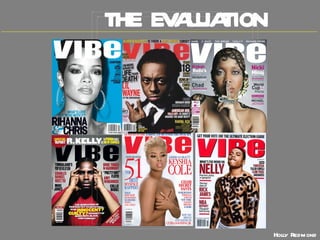
  • 2. In what ways does your media product use, develop or challenge forms and conventions of real media products? Both use plain white masthead in capitals and quite bold, white is not complicated but stands out on the page and looks clean. Close up main image where eyes and lip on the person stand out a lot. Main image placed behind the masthead as the image is close up. Barcode in bottom right hand corner. All text on cover lines in capitals, making it seem like what is written is important and to also catch the readers eye. Majority of text on my front cover filled in white and VIBE magazine in black. Both plain yet sophisticated colours, not over the top. SIMILARITIES IN FRONT COVER
  • 3. DIFFERENCES IN FRONT COVER My magazine has a header and a footer whereas VIBE magazine doesn’t have anything. I included a header and a footer to put more information on the front cover of the magazine as I didn’t want to crowd the front with lots of sell lines so that it didn’t look clustered. My image takes up the whole cover so there is no need for a background whereas VIBE magazine has a plain blue background. I would have included a background if I had used a different image but the image I chose I thought would look good covering the whole page. VIBE magazine contains less text on the page and has one overly dominant sell line whereas my magazine has more sell lines and also the font size of all the text is pretty much the same. My image has a more sepia effect and VIBE magazines main image of Rihanna has a black and white effect. The person in my main image is looking straight into the camera making it obvious she knows the photo is being taken whereas in the image of Rihanna it is unsure if she knows the photo is being taken as she is looking away and not really posing.
  • 4. SIMILARITIES IN CONTENTS PAGE I got the style of separating the letters in ‘contents’ from VIBE magazine as it looks more creative and gives an edge to the contents page. It also allowed more space on the page as I could place it in one corner on the page instead of taking up the top of the page. Both magazines use the main image as a background, they both take up the whole page . I did this as the photo is of good quality so I didn’t need a background. Both magazine have a smaller picture in the corner, which has a white background. Both magazines contain headings for the text, separating the content of the magazine into different sections making it easier for the reader to follow. All of the text on my contents page is in capital letters and the majority of text on VIBE contents is also in capitals. I did this to make it look more clean on the page and look more sophisticated and stand out more. In both magazines, the smaller image in the picture is looking straight into the camera.
  • 5. DIFFERENCES IN CONTENTS PAGE The main image in VIBE magazine is looking straight into the camera but my main image is looking away from the camera. I got the person to look out of the view of the camera because it is obvious she is already doing a certain pose so she knows the photo is being taken and I wanted to contents to look a little different to the pose shown in my front cover. The smaller photo in my magazine contains text showing where to go in the magazine to find out more and the image is also tilted and has a black border around it whereas the smaller image in VIBE contents is showing you a magazine cover, does not have a border and is not tilted. The background on my main image is green as I got the person to stand in front of my green wallpaper whereas the VIBE contents has other people in the background and shows the setting of the image. I choose a plain background as her outfit has colour in it already and I wanted white text. Some of the text in VIBE contents has smaller text underneath it adding extra information in the page whereas mine doesn’t. My main image has colour and VIBE main image is in black and white. I wanted colour in my magazine as wanted it to be as bright as possible.
  • 6. SIMILARITIES IN DOUBLE PAGE SPREAD Both images are on the left page and take up the whole page. I chose to do this as I thought the image was good so wanted to make it more dramatic and big. I used VIBE magazine to get the idea of using initials of the person in big on the right page with two different colours, one being black and the other being red going with the theme of the page. Both images have page number, mine is in the bottom corners of each page and VIBE magazines is in the top right hand corner. Both images are focused on the camera and are mid close ups. Both pages have two columns of text in them.
  • 7. DIFFERENCES IN DOUBLE PAGE SPREAD My main image has a white background whereas VIBE double page spread has a black background. I chose a white background as the black background made the image look obviously cropped out more than the white background. The white background also goes with the white background to the text. My page has lines at the top as I wanted to keep the theme of lines as was on my contents, I also added a red line to go with the double page spread. VIBE magazine doesn’t have any pattern apart from the text and image. Although both pages have two columns, the layout of my text is where the first column is set to the right and the right column is set to the left. VIBE magazines text is justified. I wanted all of my text to look like its all going into the middle of the page which is why I set out my text in that way.
  • 8. How does your media product represent particular social groups?
  • 9. Female R&B singers are portrayed to be very strong, powerful women and this shows through their music as well as their image. R&B singers usually look very expensive with flashy clothes and their own style, for example Rihanna’s hair style changes frequently and her image is quirky and cool. I want my images for my magazine reflect the same idea a lot which is why I chose to take photographs of a girl with big, choppy short hair and a girl with her own individual style and also big hair as this goes with the conventions of R&B, pop and hip hop.    Although female R&B singers look powerful and in control, they also look attractive and sexy. Therefore my magazine attracts both a female and male audience as the images of the girls are strong making other females aspire to be like them but as they are attractive it might make males want the magazine as they are attracted to them. Male R&B singers are usually portrayed to have a lot of respect and are looked up to because they have a high reputation. They are also known for their quirky style which is commonly called ‘swag’, a word that is used in relation to R&B and hip hop music.
  • 10. What kind of media institution might distribute your media product and why? IPC Media produces over 85 media brands Two thirds of their readers are women Their brands when they come together reach over 20 million users each month. They have knowledge in the music genre as they distribute NME magazine. Publishing my magazine will be a good opportunity to expand their audiences and genres of music.
  • 11. Who would the audience be for your media product? The audience for my media product will be aimed at both genders even though in my magazine the images are only of women, they should also attract men as the women are attractive in the images. People that enjoy R&B, hip hop and pop music, and people that enjoy going to gigs and concerts that are of this genre will also be my target audience for my magazine. My target audience will not just be aimed at Afro-Caribbean which is the stereotypical audience but will be targeted at people from different backgrounds including ethnic minorities to broaden the audience. I am also targeting both women that are confident and powerful and can relate to the women in the magazine and women that are not as confident and aspire to be like the women in the magazine. Typical Target Audience Tom, 17 year old Student from Solihull, favourite colour blue. Likes music, socializing, going to the gym, high interest in fashion. Dislikes rock music. Favourite music – MOBO (music of black origin), R&B. Goes to concerts, listens to music on iPod at the gym, majority of the time downloads music onto his iPod or CDs.
  • 12. How did you attract/address your audience? I attracted my audience to my magazine by having lots of sell lines that might capture the readers attention, such as ‘The Only Interview’ and ‘The Glam Life of’ etc. I used a dominant image with bold eyes and mouth to stand out and a choppy fringe coming around the persons face which looks a bit different to the usual hairstyle. The image is a powerful and strong one which relates to the audience I have aimed at. I set a reasonable price that all of my target audience will be able to afford. I addressed my audience by not using overly formal language but used simple and easy to understand language.
  • 13. How did you attract/address your audience? The images I have used should attract the target audience because I have used people of different cultures and backgrounds to attract people from different backgrounds also. The main image is dominating the page so it is also used as a background to make the contents more unique and interesting and the smaller image is tilted. Both of these changes I have made may further attract the audience. My contents page addresses the reader through the regular and featured articles listed because the singers and bands listed would attract the audience as it is music they are familiar with and most likely enjoy. I have used all capital letters when writing my text and the writing is in filled in white to stand out better against the background. This will attract the audience as it will capture the eye.
  • 14. How did you attract/address your audience? The big image which dominates the whole of the left page is interesting and the girl looks powerful in the image which will attract both males and females to the magazine as females with either aspire or relate to the image and men may find it attractive. The big heading at the front will capture the audiences eye and the strap line which is all in capitals will make the reader want to read on as it gives an insight of what will be included in the article. The colour scheme I have used will attract my audience as over the two pages the red flows from parts of the text to the colours in the image.
  • 15. What have you learnt about technologies from the process of constructing this product? Using PhotoShop I was able to edit the photographs I had taken on my camera to make them look more professional and manipulate the image. Using InDesign to create my magazine base and then my final magazine, inserting things into the pages and also editing things using InDesign. Using cameras to take photos for my magazine, using different shot types, editing the way the camera takes the picture using the settings on the camera.
  • 16. Using Photoshop Original image for front cover I have edited my image for my front cover using Photoshop. I have made the image darker by playing around with levels and colour balance to make it look a bit different to the original image, darker and more professional. After editing my main image in Photoshop I then made my masthead ‘VOLUME’. The font used was Agency FB. I edited the masthead by changing the font to a style which I feel makes it look more like hip hop/R&B/pop genre and made it larger. I also changed the colour to white as it will go well with my main image and as the image has darkness to it the white would contrast well. I put my image and masthead together to make the base of my magazine cover and to make sure that it went well. I placed the masthead just above the eyes as it will make the eyes stand out more and look more striking. NEXT PAGE
  • 17. Using PhotoShop (cont) I then added some cover lines and strap lines to the page mainly using the font ‘impact’ as it is bold and stands out yet it also looks sophisticated and clean. I started off with the text being all white as I knew I wanted my main colour on the page to be white. As I knew the image I am using for my contents page has a green background, I added the same colour to my swatches and used this colour to edit some of the text on the front cover. I added some boxes that were filled with the green and placed them behind some text which I have made black to make certain words stand out on the page that I think the audience would be attracted to. I also edited some of the colour of the text and used effects such as drop shadow, inner shadow and inner glow to make them pop out. I also added ‘NEW’ in green inside the ‘O’ in my masthead so that my masthead had an element of the green on it to tie in with the theme. When I was happy with everything I had edited on the page and where everything was, I added the barcode which I also slightly edited and a flasher; filled in green and edited using drop shadow, with a white £1.50 sign coming slightly out of the circle to give it an edge and make it stand out more. I edited the barcode slightly so that instead of it being black lines on a white background it was white lines on a black background and rotated it on the page as I felt it looked more sophisticated. After I had completed my front cover I made the layout of my magazine front cover, contents and double page spread using InDesign and then placed my front cover in there.
  • 18. Using InDesign I took various photographs for my contents page and decided on two photos. I did not edit the second photo as it was already a strong picture, so I used it as the image that was going to dominate my contents page. I used Photoshop to edit my first photo, I cropped out the background and then placed it in the contents page. After placing in the image, I rotated it slightly and made a black border around it to emphasise the photo and make it look more professional. I moved it to the right hand corner of the page and left out some of it. NEXT PAGE
  • 19. Using InDesign (cont) I added text saying ‘contents’ with Agency FB font like my masthead on my front cover and used shape boxes filled in black to make a shape going in the top left hand corner to make the page look structured. I added headings using the same font I did on my front cover, in white with a black background, following the theme throughout the magazine. I also added a pull quote and a page number to go to onto the smaller picture. In the left hand corner of the page I added ‘volume contents’ which you will see in a standard magazine on the corner of all pages. I then added text under the headings and filled them in white, I used Agency FB font tying in with the theme of the magazine. For the page numbers I used Impact. All text is in capitals to make it stand out on the page.
  • 20. Using PhotoShop and InDesign (cont) My original image for my double page spread. I shone a light on her face while taking the photograph to make her eyes stand out. I then further edited the photo in Photoshop to make her eyes stand out more and to make the image look harder and more edgy. I placed the edited photo in InDesign and added page numbers at the bottom. I then added text in the top left hand corner saying ‘ volume interview’ in the same style as on the contents page. As I had used straight lines in the corner of my contents page, I carried on the theme of using lines, but as my main image had red in it I filled in one of the lines red so it matched. I also added a headline and to keep the theme of red I made one of the letters red. I added a strap line introducing the person I’m interviewing. It was written in capitals to make it stand out to the other text that I would be writing in lower case. NEXT PAGE
  • 21. Using PhotoShop and InDesign (cont) I added my text and filled the questions in red and kept the answers in black to make it clear to the audience when they are reading. I also added a by-line to show who the article was written by. I added a pull quote and placed it in between my text to draw attention to the interview.
  • 22. Looking back at your preliminary task, what do you feel you have learnt in the progression from it to the full product? PRELIMINARY TASK FINAL MAGAZINE I have learnt how to make my magazine look more professional in the way that I have taken better quality pictures and thought about the way I took them including the backgrounds, etc. as the background to the images in my preliminary task haven’t got much edit to them and have the original background making it look less official. I have learnt how to place things on the page to make it look neat and well presented rather than looking like there is no purpose for where it is put. I have learnt how to manipulate images using Photoshop and also using InDesign to effectively create my article. By using these programs my final magazine looks a lot more improved compared to the preliminary magazine. When making my preliminary magazine I didn’t look at other magazines to give me ideas for my magazine whereas for my final magazine I compared it to real music magazines of the same genre that I was doing which helped me make my magazine.
  • 23. Audience Feedback LIKED MOST ABOUT THE MAGAZINE HOW TO IMPROVE THE MAGAZINE Realistic Professional – very good images and manipulation Use of images Masthead on front cover to contrast with image a bit better Colours on cover don’t show up very well