Rethinking The Presentation
•
11 j'aime•1,264 vues

How not to kill with your Powerpoint. View in conjunction with speaker notes in Notes tab. These are more or less as delivered at BarCamp Bradford on 14th November 2009. Watch this as a video here ---> http://ian-d-smith.me.uk/rtp-resources/

Recommandé
Recommandé
Contenu connexe
Tendances
Tendances (20)
Similaire à Rethinking The Presentation
Similaire à Rethinking The Presentation (20)
Dernier
Dernier (20)
Rethinking The Presentation
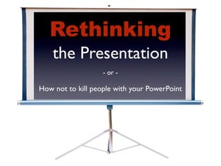
- 1. Rethinking the Presentation - or - How not to kill people with your PowerPoint
- 2. @ids
- 3. Rethinking the Presentation - or - How not to kill people with your PowerPoint
- 4. contemplating death by powerpoint?
- 5. why?
- 6. most presentations are boring
- 11. P LI FY A M OUR MES SAG E!
- 12. ✘ ✘ ✓
- 13. it matters
- 14. 120m * * - source Microsoft, July 2008
- 15. 120m 50
- 16. 120m x 12 50
- 17. 120m x 12 x 3 50
- 18. 86.4m
- 19. x 8 hours/day x 5 days/week x 48 weeks/yr x 45 yrs
- 20. a new approach
- 21. outcomes
- 22. “Buy the project” “eBusiness” “Agree the design” “vBusiness” “Start a WebSphere competency centre” “Adopt Linux” “Change your architecture models” “Go green”
- 23. ? do i care
- 24. feel inspired to do better at presentations
- 25. know how to get started
- 26. planning
- 34. Photo by timkelley - http://flic.kr/p/5BfhmJ
- 35. creating
- 36. 1 point per slide
- 37. high signal low
- 38. If you put a lot of words on your slides,then your audience will read them.They won't be able to help themselves. Oh,and while they're reading,they won't be listening to you.That's not good,because you might be saying something important. T thisake slide,for example. Aren't you worried,as you read this,that you're missing something I'm saying? I mean,this is quite funny,but what if I’m telling you something really important that you need to know about putting words on slides. It'll be gone forever. Y re probably experiencing some sort of ou' cognitive discomfort by now.Don't inflict this on your audiences.Keep the words in the speaker notes.
- 39. • The • That • Same • They • Applies • Usually • To • Don’t • Bulleted • Read • Lists • So • With • Well • The • Proviso
- 43. he has to go
- 44. he has to go (hah!)
- 49. rehearsal
- 52. delivery
- 53. attention
- 54. ten minute rule
- 60. in summary
- 61. in practice
- 63. 30 people in a room...
- 64. 30 people x 40 mins
- 65. 30 people x 40 mins = 20 hours
- 66. 200 people x 50 mins = 167 hours
- 67. how important are your outcomes?
- 70. slide A4 @ 600dpi
- 73. that’s it http://is.gd/2cMs ian_d_smith@uk.ibm.com or @ids
- 74. Presentation Camp London (17th Jan 2010)
- 75. Image Attributions The following images are used under a Creative Commons licence, and have been downloaded from http://flickr.com. Many thanks to everyone who makes their images available for use in this way. Please consider licensing your own images via Creative Commons. Slide 9, Teleprompter at Cisco by Robert Scoble - http://flic.kr/p/4tUKoz Slide 34, Barack Obama by timkelley - http://flic.kr/p/5BfhmJ Slide 53, Time by John-Morgan - http://flic.kr/p/4y3Rug Slide 55, How to conquer Europe with one smile by e³°°° - http://flic.kr/p/68zgbB Slide 56, Scary Nightmare Horror Scream Girl by Pink Sherbet Photography - http://flic.kr/p/6qJsiA Slide 57, Thunderbolt by mandolux - http://flic.kr/p/3p46fM Slide 58, fire alarm by TheTruthAbout... - http://flic.kr/p/54CNmN I personally made the images on slides 7, 8, 19, 28, 29, 31, and 33. The image on slide 67 is part of a real architecture model, kindly provided to me by Kevin Robson. I licensed all the other photographs from http://iStockPhoto.com, a wonderful source of high quality royalty free images.
Notes de l'éditeur
- Hi, my name is ...
- ...Ian. Welcome to this session on ...
- ... Rethinking the Presentation. I’ve made this presentation because I’m heartily sick of experiencing...
- ... Death by Powerpoint. My goal for the next few minutes is to not kill any of you. And hopefully in the process of not killing you, I can help you to join me in not killing other people. So, ...
- ... why should we rethink how we do presentations? Hands up if you’ve ever been bored in a presentation. Ok, hands up if you’ve actually fallen asleep in one. And that’s why. That’s the problem, right there. The problem is that ...
- ... most presentations are boring! That might sound a bit frivolous, but actually it’s really very important because ...
- ... nobody remembers anything that they hear when they are bored. How can you learn when you’re struggling to stay awake? So why are so many presentations boring? What’s the underlying reason for it? Well, the bad press is mostly aimed at ...
- ... the tool. Certainly the default templates with which Powerpoint presents us are potentially unhelpful, and even the icon for Powerpoint resembles a badly constructed slide, but I think that it would be wrong to place all the blame on Powerpoint. It is more instructive to examine how we’re using it. We tend to use our Powerpoint slides for three quite separate purposes. Firstly, we use them as a ...
- ... teleprompter, to remind us what to say. Secondly, we use them as a ...
- ... document. We want to give people a way to remember what our presentation was about, should they return to it later. Last, and regrettably least, we use them to ...
- ... support what we are saying. In other words, to increase the effectiveness of your talk, rather than acting as a form of notes either for you as the speaker or for the audience later. I think that these attempts to use the slides as teleprompters and take-away documents undermine this third requirement which should be...
- ... in fact, the real purpose of the slides. There are better ways to deliver those other two things. So in designing our slides, we should be focusing on making them add to the impact of our presentations, so that the audience is influenced and/or informed as we require. Doing better at this really does ...
- ...matter. If you’re looking for a reason why, then here’s one. Between November 2006 and July 2008 (that’s about 20 months), Microsoft sold...
- ... 120m licenses for Office 2007. Let us put aside for the moment all the previous versions of Powerpoint that are still out there, and ignore for the time being all the other presentation software such as Prezo, Impress, or Keynote. Let us pretend that Microsoft have sold no further copies of Office 2007 since July 2008, and in fact that there is no presentation software in the world except Powerpoint 2007. What if one in...
- ... fifty of those 120m users spent just an hour each ...
- ... month, giving a presentation to ...
- ... just three people. That’s a staggering ...
- ... 86.4 million hours of people’s time taken up with watching Powerpoint presentations. Just to put that figure into perspective, that is the amount of time contained within the entire working lifetimes of ...
- 1000 people. In a year! Wouldn’t it be great if we could improve this a little bit. What if we could make even a small proportion of this time more productive. That’s why I made this talk, to try and put forward a...
- ...new approach to making presentations. Actually, it isn't so much a new approach, as the application to presenting of an approach we already use for lots of other things. There are five steps, and step one is to figure out what ...
- ... outcomes you are looking for. What do you want people to know after you present to them? What do you want them to do? It’s worth thinking quite hard about these. For example, “The customer understands the design” might be a valid outcome for a client presentation describing the high level architecture of a proposed solution. However, perhaps “The CIO recommends to the board that the project is ordered” might be better. You should only have...
- ... a couple of desired outcomes. If you have too many, you risk your presentation becoming diffuse and unfocused. It’s a fact of life that nobody is going to remember 73 things after listening to your pitch. Since it’s only going to be one or two, make sure you know what you want them to be, and that your slides are focused accordingly. When you’re thinking about your outcomes, you should put some thought into answering an important question.
- “Do I care?” It’s a serious point. If you don’t really care about the outcomes from your presentation then you shouldn’t be wasting your time and everyone else’s in giving it. You should present about things that you are passionate about! And yes, I am passionate about this. I wrote down two outcomes for this presentation. At the end, please talk to me and let me know how I did. Firstly, I want you to ...
- ... feel inspired to do better at creating and giving presentations. Secondly, I want you to ...
- ... know how to get started in practice. So, decide what outcomes you want from your presentation, and make sure that they are something that you care about. Now, keeping them in mind, it’s time to start ...
- ... planning your presentation. This is very important in making sure that your presentation supports the outcomes that you defined in the previous step. A presentation has a lot in common with a...
- ... story. Good stories have interesting, attention-grabbing beginnings, thought provoking and engaging content in the middle, and a clear conclusion. It’s important to understand the flow of what you are going to be saying along with your slides, and to understand what the...
- ... structure will be. Much of the wisdom surrounding presentation structure suggests, citing Aristotle, that stories (and therefore presentations) should have three parts - a beginning, a middle, and an end. I have found that this works very well for me. For this presentation, I came up with...
- ... the structure that you see here. Why Rethink, A new approach (where we are now), and In Practice. Imposing structural constraints is generally a good thing, because it forces us to think harder about what we are doing, and what we are trying to say. By the way, I would strongly recommend that you get away from your computer to do the planning - and certainly away from the Powerpoint tool. Use...
- a pencil and paper. Or like I did for this presentation, use ...
- ... sticky notes. Here’s the corner of my office at home where I wrote most of this presentation, complete with bad wallpaper. Each sticky note represents a point that I wished to make in this talk. By the way, the sticky note phase turned out to be a good time to test my ideas for the presentation against my desired outcomes, to make sure that every point made a positive contribution. Another presentation planning tool that I like to use is ...
- ... mind mapping. Here is a mind map that I drew for this presentation. You can clearly see the three part structure, as well as the fact that the middle part is the biggest - which may or may not be a problem, depending on your presentation. The mind map is very useful for viewing the presentation as a whole, which can help you spot inconsistencies or structural problems early on. When you’re done with planning you should obviously ...
- ...start creating your slides. Well, actually, no. First, you should stop, and ask yourself whether you really need Powerpoint, or its brethren. Sounds like a silly question - in fact in many circles everyone uses Powerpoint it, it’s just the default. But if you’re not using it as a teleprompter, or as a takeaway document, then it has to support your talk, and not all talks need to be supported by Powerpoint. You’ve never seen ...
- ... this man speaking in front of Powerpoint slides, and he is one of the most powerful public speakers we’ve seen in recent times. Some of the most powerful talks at ted.com have no slides. If you can achieve your outcomes without slides, then consider it. You’ll get a lot of kudos for speaking without slides, and potentially a lot more attention from your audience. At any rate, think about it - don’t just sleepwalk into using slides. If you do decide you need slides, then after you’ve planned and structured your presentation, you can actually sit down with Powerpoint (or Keynote, or Preso. or Impress) and ...
- ... start creating your slides. I’ve come up with some tips that I’ve drawn together from experience, and my reading on the subject to help make slides that work. My number one point is, put ...
- ... one point on each slide. Don’t make your slides try to say more than one thing. Your slide should focus the audience’s mind on the point you are making NOW, not the one that you just made, or the one you’re about to make. Brain research shows that it’s not possible for humans to pay attention to two things at once, so only give the audience one thing to pay attention to. To pursue this theme further, when you design each slide, make sure that it has a high ...
- ... signal to noise ratio. That is, figure out what is really needed on the slide to make your one point and to drive it home. Get rid of everything else. Superfluous elements only distract. One thing that you definitely shouldn’t have on your slides is a lot of ...
- ... words. If you put a lot of words on your slides, then your audience will read them. They won't be able to help themselves. Oh, and while they're reading, they won't be listening to you. That's not good, because you might be saying something important. Take this slide, for example. Aren’t you worried, as you listen to me, that there might be something important on the slide that you’re missing. Perhaps you should be reading it? Some people will be reading it, and not listening, but if I mention something about antelopes or fairy dust, they’ll probably stop and listen to me for a bit instead. You're probably experiencing some sort of cognitive discomfort by now. Don't inflict this on your audiences. Keep the words in the speaker notes.
- The. Same. Applies. To. Bulleted. Lists. With. The. Proviso. That. They. Usually. Don't. Read. So. Well. Nancy Duarte, a presentation design guru, says that your slides should be like roadside billboards, in that the audience should be able to take them in and understand them in no more than about 3 seconds. ... Whatever you do end up putting on your slides, make it big. Don’t you just hate it when people say “this next slide is a bit of an
- eye chart”? ... The bit of the eye chart that they’re referring to when they say that is the bottom - the bit that you really have to strain to read. Don’t put words or diagrams on your slides that are too small for people to easily read. Aspire to use no font smaller than 64 point (which is about the size of the E at the top of that chart there). The absolute smallest font that you should have on your slides in any form is 30 point (around lines 5 in the chart). So instead of a lot of tiny words, use big ...
- ... pictures. Research shows that if information is presented orally, people remember about 10% of it when tested 72 hours later. The figure goes up to 65% if you add a picture. When you’re deciding on pictures to use, ...
- ... pick photos, not clip-art. If you can find a decent photograph that you are allowed to use, then it makes much more of an impact than the ...
- ... equivalent little clip-art guy in all his little situations. He just has to ...[click]... go. You may have noticed some ...
- ... equivalent little clip-art guy in all his little situations. He just has to ...[click]... go. You may have noticed some ...
- ... bold red words scattered around in these slides. Use contrasts in colour or font (or both, as here) to emphasise words that are important. I have found...
- ... Arial Black to be a wonderfully solid looking font to achieve this. Finally, when you are writing your slides, think of what you’re going to say when you are presenting them - especially how you are going to transition from one slide to ...
- ... the next. Powerpoint has a special place for you to store these thoughts, and that is...
- ... in the Speaker Notes box. So write them down - I actually write in full what I am going to say, although I rarely stick to it in practice. However, writing it down in that way has many benefits - it will help you deliver your presentation, it will help other people deliver your presentation, and last but not by any means least it will help you ...
- ... rehearse. This is something that you absolutely should do. Run through your presentation a few times - I always aim for at least six run throughs. It’s important to do it out loud. Rehearse to family, friends, or the ...
- ... furniture. Doing this will make your presentation delivery a lot better and it will ...
- ... boost your confidence. Don’t expect to remember it all word for word, but instead try to remember some link lines between the slides and between the various different topics in the presentation. That makes it much harder to get lost, or be otherwise caught out. Once you figure these out, put them in the speaker notes! This is not really a presentation about...
- ... delivery. That is a whole topic on its own. I can’t really hope to do it justice in this amount of time, so I’ll keep this section quite short. I just want to talk a little about...
- ... attention. There’s a lot of research in this area to draw upon, which shows how attention works and more pertinently how long it lasts and how, as a presenter, you can hold onto it and get it back if you lose it. The main thing to remember is the ...
- ... ten minute rule. The average person's mind will wander away from what you’re telling them about every ten minutes. However it’s possible to pull their attention back to you and your topic by making use of something called...
- ... emotionally competent stimuli. That’s a technical term for basically doing something to cause an emotional reaction - such as ...
- ... laughter or happiness. You probably want to avoid negative feelings such as ...
- ... horror ...
- ... shock, or ...
- ... alarm. You can also use slides containing media such as video (providing it’s good, and relevant) to reclaim people’s attention. You should aim to use ECS every ten minutes or so in your presentation, so as to avoid falling foul of the ten minute rule. The highest attention levels that you will get in your presentation are in the first minute, so be sure to use emotionally competent stimuli at that point to get people’s attention and establish the mood for the session. So, ...
- ... in summary. Define your outcomes, plan off the grid, create your slides, rehearse, and finally deliver your presentation. I am now going to cover some potential issues that may occur in ...
- ... practice. I think that the biggest practical consideration in making a really good presentation is ...
- ... finding the time to do it. By way of example, I can confirm that it took me a long time to put together this presentation. The question is not one of time, though, but of importance and priority. Rather than trying to come up with the answer to this, I’m going to suggest a way of thinking about it. One question you might ask is “How long are people going to spend listening to this?”. Take this presentation for an example. I first delivered it to an elective session at an internal IBM conference. The audience was about ...
- ... 30 people in a room. The session was ...
- ... 40 minutes long, which means that I spent about ...
- ... 20 hours of their time on listening to this. What proportion of that time would it be sensible for me to spend creating this presentation. What if it had been...
- ... a plenary session with upwards of 200 people? Is it reasonable to spend 20 hours creating a presentation that’s will consume 167 hours of an audience’s collective time? Think about that. It doesn’t make any kind of sense to waste people’s time on that sort of scale - so be prepared to put the required time in to do a good job if you have a substantial audience. There’s another factor to take into account too. If your ...
- ... outcomes are critically important, then how does that affect the time you spend preparing your slides? You might be presenting to three people for ten minutes, but if a huge deal or a key career milestone is resting on it, it might very well be appropriate to spend a large amount of time preparing. Ultimately, it’s not always appropriate to spend hours on these things - it’s up to you to decide intelligently what’s sensible and what’s possible. However much you decide to skimp on time, though, always know what your desired outcomes are, and spend a little time on planning and structure. Another practical consideration, then, is that there is sometimes a requirement to convey ...
- ... complexity. You might say, “It’s all very well having slides with big readable things on them, but I have to explain this complicated technical design!”. Well, the easy answer to that is to suggest that you’re using the wrong tool. Don’t write a presentation, write a...
- ... document. Seriously, a document is the right format for providing complex detail. If you really *have* to do a presentation to explain your particular complexity, make it high level and supply a document with it. There's a good reason for this. A presentation displayed at the standard 1024x768 resolution contains about 0.8 megapixels. A sheet of A4 paper, printed at 600dpi, contains more like ...
- ... 35 megapixels, allowing a far greater amount of definition and detail. That's why 12 point fonts are easy to read on paper, but very hard to read on a projected screen. If you really have to present something complex, chunk it up into a high level overview and then provide a document alongside. Finally, I’d like to tell you about some of the excellent resources that you can draw upon if you want to learn more about this topic. Rather than go through them all now, I have created
- ... a web page to go with this presentation. This short URL, which is designed to be easy to write down, will redirect you to this page, which contains links to various sites, resources and books that I think might benefit anyone who would like to pursue an interest in this topic a bit further. Having said that, I ...
- ... can't finish without giving some credit to Don McMillan, whose hilarious Youtube video on "How not to use Powerpoint" mocks some of our sillier presenting habits much more effectively than I ever could. There’s a link to this video at the address on the previous slide. So, we’ve covered a new approach to presenting, and discussed some practical considerations. For now, anyway, ...
- ... that's it from me. Please e-mail me at the address above if you want to discuss any of this - I would be very interested in your thoughts. One last thing, I’d like to put in a plug for ...
- Presentation Camp London - visit http://presentationcamplondon.org/ for more information, and to register your interest, get tickets, or find out what happened (depending when you get to this!). I’d also like to thank ..
- ... these photographers on Flickr for letting me use their images. I got the others from iStockPhoto.com, which rocks for affordable royalty free images. Thanks, and goodbye for now :)