Hire 💕 8617370543 Auraiya Call Girls Service Call Girls Agency
Media music videos
1. Music TV channels
• What does the font and colour of the logo suggest about the type of music on
the channel?
• What objects or shapes are used in the logo and what do these suggest about the
channel?
• What kind of audience does the channel logo seem to suggest?
1
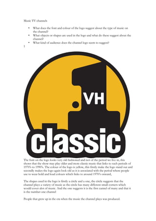
The font on the logo looks very old fashioned and not of the period we live in, this
shows that the show may play older and more classic music that links to such periods of
1970’s to 1990’s. The colour of the logo is yellow, this firstly make the logo stand out and
secondly makes the logo again look old as it is associated with the period where people
use to wear bold and loud colours which links to around 1970’s onward,
The shapes used in the logo is firstly a circle and a one, the circle suggests that the
channel plays a variety of music as the circle has many different small corners which
would cover alot of music. And the one suggests it is the first cannel of many and that it
is the number one channel
People that grew up in the era when the music the channel plays was produced.
2. 2
The font and colour of the logo is very plain and neat. This suggest to me that firstly the
tv station plays more sophisticated music for people that like older music. The red F
draws the viewer’s attention and draws them to the fact that this is a fm channel and is
also on the radio. The black background makes the white writing stand out, and makes
the font look very neat.
The shape of the logo is square which makes the logo look very neat and rounded and
makes the radio station look very neat. It also makes the logo look professional.
The people who would listen to this channel would be the more older people of this
world. They would not like modern music and would like music that has no singing. The
music would have a full orchestra to form the base of the music.
3
The font of the logo is again very plain but bold and makes the logo stand out and this
will draw the viewer’s attention. The TV logo in the m is very wavy and looks very
untidy compared to the rest of the logo. The colours are just black and white which
makes the logo look very plain but also makes it look very neat and crisp.
Again the circle shows that the music station would play a variety of music as a circle has
a load of corners and the 2 shows that this is MTV’s second channel. This suggests that
this music channel plays a different type of music from the first channel and the font
suggest a later type of music. 1980’s to 2005’s.
3. People who would listen to this music would be people who grew up when the music
was being produced and people who heard the music on such things as the TV and radio
4
The font of the writing is bold and stands out and draws the viewer’s attention for example the white
writing with the black outline. The kiss inside the lips acts as teeth but the shadowing of kiss makes the
writing stand out from the black background and breaks the logo
The shape of a pair of lips show that the radio station would play more romantic music and the colour red
shows that the lips would belong to a lady as they have lipstick on them. The colours and bold and stand
out and attract the audience’s attention. The white writhing and black out lining make the writing stand
out.
The people who would listen to this radio station would be people who grew up listening to the music that
the tv show play and take a interest in the music genre.
Music channel Company Other interests
4. Kerrang Bauer Media Group Other music magazines
VH1 Viacom Tv, Radio, Newspapers, Magazines and
Internet broadcasting
MTV Viacom Tv, Radio, Newspapers, Magazines and
Internet broadcasting
Scuzz CSC Media Group Main interest is in tv
Magic Bauer Radio also know as Bauer Media Other music magazines, radio, tv and
Group internet radio