Responsive Web Design
•Télécharger en tant que KEY, PDF•
0 j'aime•709 vues

Overview of Responsive Web Design Technique and tips

Recommandé
Recommandé
Contenu connexe
Similaire à Responsive Web Design
Similaire à Responsive Web Design (20)
Dernier
Dernier (20)
Responsive Web Design
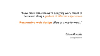
- 1. “Now more than ever, we’re designing work meant to be viewed along a gradient of different experiences. Responsive web design offers us a way forward...” Ethan Marcotte alistapart.com
- 3. 320 x 480 768 x 1024 >1280 x 800
- 4. 320 x 480 768 x 1024 >1280 x 800
- 5. 320 x 480 768 x 1024 >1280 x 800
- 6. Fluid Layout + Fluid Images responsive design
- 7. examples...
- 8. Media Type + Media Features = Media Query
- 9. CSS 2.1 Media Type + Media Features = Media Query screen print braille handheld projection tty tv embossed speech
- 10. CSS 2.1 CSS 3 Media Type + Media Features = Media Query screen width print height braille resolution handheld device-width projection device-height tty orientation tv aspect-ratio embossed device-aspect-ratio speech color color-index monochrome scan grid
- 11. media_query_list : S* [media_query [ ',' S* media_query ]* ]? ; media_query : [ONLY | NOT]? S* media_type S* [ AND S* expression ]* | expression [ AND S* expression ]* ; media_type : IDENT ; expression : '(' S* media_feature S* [ ':' S* expr ]? ')' S* ; media_feature : IDENT ;
- 12. Load CSS for Screen Devices <link rel="stylesheet" type="text/css" media="screen" href="sans-serif.css"> Nested CSS for Screen Devices @media screen { * { font-family: sans-serif } } Load CSS for Screen Devices with color <link rel="stylesheet" media="screen and (color)" href="color-images.css" /> Move sidebar to below content @media screen and (min-width:500px) and (color) { aside { float: none; } } Load Larger Image for Retina @media screen and (min-resolution: 250dpi) { header .logo { background-image:url(images/logo-hi.png); } }
- 13. 4+ 3.5+ 9.5+ 3.1+
- 14. 4+ 3.5+ 9.5+ 3.1+ 9+
- 15. 4+ 3.5+ 9.5+ 3.1+ 9+ 2.1+
- 16. respond.js css3-mediaqueries-js Polyfills github.com/scottjehl/Respond code.google.com/p/css3- mediaqueries-js/ feature support width, height only full speed fast slow
- 17. Tips Design mobile first, then add media queries for larger displays Use ems for width features to incorporate browser font size Add 100% max-width on images to scale down images to container Use with a grid system Include the viewport tag to fit screen on mobile <meta name="viewport" content="width=device-width, initial-scale=1">
- 18. Responsive Web Design EXAMPLES alistapart.com/articles/responsive-web-design anderssonwise.com Responsive Web Design (book) smashingmagazine.com abookapart.com/products/responsive-web-design foodsense.is clearairchallenge.com W3C CSS3 Media Queries Spec bostonglobe.com w3.org/TR/css3-mediaqueries github.nearinfinity.com Responsive Design Tools netmagazine.com/features/ 50-fantastic-tools-responsive-web-design jason harwig @jharwig
- 19. Separate Mobile Site? “Our mobile users only need subset of functionality” How do you know what mobile users will want to do with your app?
Notes de l'éditeur
- I&#x2019;d like to talk about responsive web design.\n- mention article\n- How can we optimize web experience for the device, instead of the reverse.\n\n
- device is adjusting the content (scaling down) lots of zooming\n
- device is adjusting the content (scaling down) lots of zooming\n
- device is adjusting the content (scaling down) lots of zooming\n
- device is adjusting the content (scaling down) lots of zooming\n
- device is adjusting the content (scaling down) lots of zooming\n
- device is adjusting the content (scaling down) lots of zooming\n
- device is adjusting the content (scaling down) lots of zooming\n
- not just fluid width\n
- \n
- conditional css type/features of user agent\nMedia types is link\n- how to use it? best docs are w3c\n
- conditional css type/features of user agent\nMedia types is link\n- how to use it? best docs are w3c\n
- conditional css type/features of user agent\nMedia types is link\n- how to use it? best docs are w3c\n
- conditional css type/features of user agent\nMedia types is link\n- how to use it? best docs are w3c\n
- Now that you know the syntax\n
- \n
- Making History, first time ever presenting a feature IE supports!\n
- Making History, first time ever presenting a feature IE supports!\n
- Making History, first time ever presenting a feature IE supports!\n
- Making History, first time ever presenting a feature IE supports!\n
- Making History, first time ever presenting a feature IE supports!\n
- Making History, first time ever presenting a feature IE supports!\n
- Making History, first time ever presenting a feature IE supports!\n
- Making History, first time ever presenting a feature IE supports!\n
- Making History, first time ever presenting a feature IE supports!\n
- \n
- \n
- \n
- \n