Sliding touch photo gallery for iPhone – HTML5, CSS3
•Télécharger en tant que DOC, PDF•
0 j'aime•457 vues

This tutorial speaks about a simple sliding touch photo gallery for iPhone. The app is meant to run on the mobile safari web browser. We start off by looking at a demo first and then talk about the code in details. Note that the same logic and implementation will work even on Android devices, you just need to correct the dimensions/positions and place the elements according to screen resolution. Demo Link: http://jbk404.site50.net/css3/slidinggallery/ (open in your iPhone/iPod or Android device’s web browser) For the full post download this file or visit the full blog post link: http://jbkflex.wordpress.com/2012/03/29/sliding-touch-photo-gallery-for-iphone-html5-css3/

Recommandé
Contenu connexe
Dernier
Dernier (20)
En vedette
En vedette (20)
Sliding touch photo gallery for iPhone – HTML5, CSS3
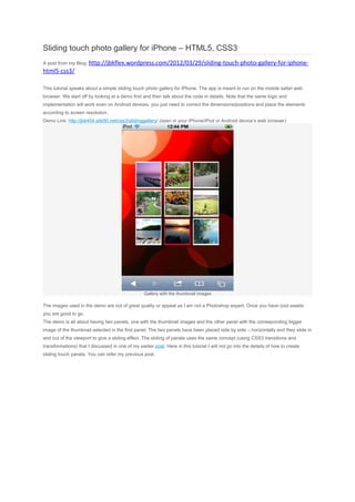
- 1. Sliding touch photo gallery for iPhone – HTML5, CSS3 A post from my Blog: http://jbkflex.wordpress.com/2012/03/29/sliding-touch-photo-gallery-for-iphone- html5-css3/ This tutorial speaks about a simple sliding touch photo gallery for iPhone. The app is meant to run on the mobile safari web browser. We start off by looking at a demo first and then talk about the code in details. Note that the same logic and implementation will work even on Android devices, you just need to correct the dimensions/positions and place the elements according to screen resolution. Demo Link: http://jbk404.site50.net/css3/slidinggallery/ (open in your iPhone/iPod or Android device’s web browser) Gallery with the thumbnail images The images used in the demo are not of great quality or appeal as I am not a Photoshop expert. Once you have cool assets you are good to go. The demo is all about having two panels, one with the thumbnail images and the other panel with the corresponding bigger image of the thumbnail selected in the first panel. The two panels have been placed side by side – horizontally and they slide in and out of the viewport to give a sliding effect. The sliding of panels uses the same concept (using CSS3 transitions and transformations) that I discussed in one of my earlier post. Here in this tutorial I will not go into the details of how to create sliding touch panels. You can refer my previous post.
- 2. The two panels are placed horizontally inside the wrapper using float:left As you have seen in the demo when you tap on a thumbnail image the entire panel slides out and a second panel with the corresponding larger image slides in. That is what we will achieve at the end of this post. Let’s begin by creating the grid that will hold the thumbnail images in panel1. Create the thumbnail image grid in Panel1 First, let us create our thumbnail gallery. We will use HTML and CSS to design and place the thumbnail images. The HTML code block needed is shown below, <section id="panel1"> <ul> <li class="normal"><img src="images/thumb1.jpg"/></li> <li class="normal"><img src="images/thumb2.jpg"/></li> <li class="normal"><img src="images/thumb3.jpg"/></li> <li class="normal"><img src="images/thumb4.jpg"/></li> <li class="normal"><img src="images/thumb5.jpg"/></li> <li class="normal"><img src="images/thumb6.jpg"/></li> <li class="normal"><img src="images/thumb7.jpg"/></li> <li class="normal"><img src="images/thumb8.jpg"/></li> <li class="normal"><img src="images/thumb9.jpg"/></li> </ul> </section> As you can see I have placed each thumbnail image inside an <li> element. And all the <li> elements are in turn placed inside an <ul> element. Now, to arrange them in a grid I do this in the CSS,
- 3. #panel1 ul { list-style:none; width:280px; position:absolute; left:40px; top:90px; } #panel1 ul li.normal { float:left; /* this is important to place the thumbnails in a grid */ margin-right:8px; margin-bottom:4px; background-color:#fff; padding-top:3px; padding-left:2px; padding-right:2px; } #panel1 ul li img { height:70px; } Also if you notice, each thumbnail image is initially given a classname of normal as none of them is selected. Once selected a thumbnail is assigned a classname of selected (this is done in the script block). This is done to differentiate between the last selected thumbnail image and the rest of them in the grid (I do it by giving a red border to the selected thumbnail, you can see it in the picture above). The CSS needed is below, #panel1 ul li.selected {
- 4. float:left; margin-right:8px; margin-bottom:4px; background-color:#ff0000; padding-top:3px; padding-left:2px; padding-right:2px; } Creating Panel2 Panel2 is relatively simpler to build. It has the back button at the top. When user taps on the back button, panel2 slides out to the right and panel1 slides in again from the left. The larger image is displayed by the Image element with id = bigImage. Below is the screenshot of Panel2, followed by the HTML code, Panel2 screenshot <section id="panel2" style="margin:0 !important; padding:0 !important;"> <img id="backBtn" src="images/back.png" /> <div id="bigImageHolder"><img id="bigImage" src="" /></div> </section> Adding touch events to thumbnail images When you tap on a thumbnail image I get the id of the thumbnail and using that id I determine the bigger image i.e its path. I have named the images as big1, big2…. etc so I just concatenate the id to the string value “big”. I have zipped the images used
- 5. in the demo. You can download it at the end of the tutorial. But before that we need to add touch events to the thumbnails. Let’s add it in our script block. gridGallery.thumbnailArr = gridGallery.panel1.getElementsByTagName("img"); for (var i = 0; i < gridGallery.thumbnailArr.length; i++) { gridGallery.thumbnailArr[i].addEventListener("touchend", gridGallery.taptHandler, false); gridGallery.thumbnailArr[i].setAttribute("id", i + 1); } As you can see above in the script block, I got the reference to all the thumbnail images and store them in thethumbnailArr array. Later I loop through the length of the array and assign a unique id to each thumbnail image and also register a touchend event listener. Now, that I have registered a touch event to the thumbnail images I need to handle when the event is generated i.e when user taps on a thumbnail image. For that I have created thetapHandler function. tapHandler: function(event) { if (event.target.id != "backBtn") { gridGallery.distanceX = -320; gridGallery.currentSelectedImage = event.target.parentNode; gridGallery.prevSelectedImage.className = "normal"; gridGallery.currentSelectedImage.className = "selected"; gridGallery.prevSelectedImage = gridGallery.currentSelectedImage; document.getElementById("bigImage").src = "images/big" + gridGallery.currentSelectedImage.getElementsByTagName("img")[0].getAttribute("id") + ".jpg"; } else { gridGallery.distanceX = 0; } gridGallery.panelContainer.style.webkitTransform = "translate3d(" + gridGallery.distanceX + "px, 0, 0)"; event.preventDefault(); } If you see inside the tapHandler function I have an if-else block. I will talk about the else part later. The if block starts by checking if the touch event is generated by the thumbnail images. I am doing this because I have used the sametapHandler event listener function for the back button as well. Note that the back button is also registered to listen to touch events. I will talk on this shortly. Now, if we look inside the if block, I set distanceX property a value of -320, this is for translating the panel container a distance of 320px to the left. I have hard coded the value as 320 since I am specifically
- 6. building this app for iPhone and iPod Touch and they have a width of 320px in the portrait mode. You can use the browser window width for a more generic result - window.innerWidth. Then I get the reference of the current selected thumbnail image and assign it a class name of selected, this will immediately set the border of the selected image to red. Also I set the class of the previous selected thumbnail to normal to remove its red border. Then finally I get the path of the corresponding larger image that will be shown in panel2. I get the id of the current selected thumbnail and then manipulate the name of the larger image. As I have already told, that I have named my images as big1, big2…. etc. So once I get the id I concatenate it to the path string to get the larger image. This is simple I guess. Adding touch event to the Back button When user taps on the back button panel2 slides out and panel1 slides in from the left again. For this to happen we need to add touch event to the back button as well. This is how to do it, gridGallery.backBtn = document.getElementById("backBtn"); gridGallery.backBtn.addEventListener("touchend", gridGallery.tapHandler, false); If you notice I have used the same event function (tapHandler) for handling the touch event generated by the back button. This is the reason why I used the if-else check inside tapHandler. When user taps on the back button the else part is executed. Inside it, I only set the distanceX to zero as now the panel container will be translated back to its original position. Nothing more is needed. else { gridGallery.distanceX = 0; } After the if-else block I have written a very important line, gridGallery.panelContainer.style.webkitTransform = "translate3d(" + gridGallery.distanceX + "px, 0, 0)"; This is where the actual sliding of the panels happen. I have used CSS3 Transformation – translate3d function to move the panel container in the x-direction. The distance to be moved is determined by distanceX property which I have talked about earlier. I will not go into the concepts of CSS3 transformation and transitions now, you can read my previous post about sliding touch panels. One thing you might be confused about my java script code is the syntax I have used to write. I have used the JSON pattern of writing my code wherein I have encapsulated everything inside an object. You can view the full source code in the desktop browser. Just open the demo link in any desktop browser and view source. The link to the demo once again: http://jbk404.site50.net/css3/slidinggallery/ (open in your iPhone/iPod or Android device’s web browser) Download the zipped images folder here.