Kiến thức bổ trợ CSS
•
1 j'aime•372 vues

Kiến thức bổ trợ CSS cho bài viết Hướng dẫn lập trình web với PHP

Recommandé
Contenu connexe
En vedette
Similaire à Kiến thức bổ trợ CSS
Similaire à Kiến thức bổ trợ CSS (20)
Plus de Nguyễn Tuấn Quỳnh
Plus de Nguyễn Tuấn Quỳnh (8)
Dernier
Dernier (20)
Kiến thức bổ trợ CSS
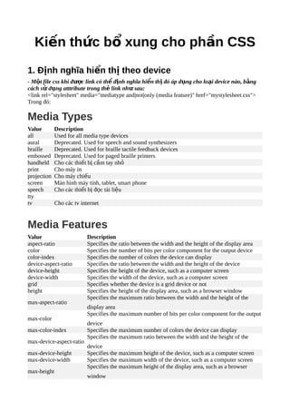
- 1. Ki n th c b xung cho ph n CSSế ứ ổ ầ 1. Đ nh nghĩa hi n th theo deviceị ể ị - M t file css khi đ c link có th đ nh nghĩa hi n th đó áp d ng cho lo i device nào, b ngộ ượ ể ị ể ị ụ ạ ằ cách s d ng atttribute trong th link nh sau:ử ụ ẻ ư <link rel="stylesheet" media="mediatype and|not|only (media feature)" href="mystylesheet.css"> Trong đó: Media Types Value Description all Used for all media type devices aural Deprecated. Used for speech and sound synthesizers braille Deprecated. Used for braille tactile feedback devices embossed Deprecated. Used for paged braille printers handheld Cho các thi t b c m tay nhế ị ầ ỏ print Cho máy in projection Cho máy chi uế screen Màn hình máy tính, tablet, smart phone speech Cho các thi t b đ c tài li uế ị ọ ệ tty tv Cho các tv internet Media Features Value Description aspect-ratio Specifies the ratio between the width and the height of the display area color Specifies the number of bits per color component for the output device color-index Specifies the number of colors the device can display device-aspect-ratio Specifies the ratio between the width and the height of the device device-height Specifies the height of the device, such as a computer screen device-width Specifies the width of the device, such as a computer screen grid Specifies whether the device is a grid device or not height Specifies the height of the display area, such as a browser window max-aspect-ratio Specifies the maximum ratio between the width and the height of the display area max-color Specifies the maximum number of bits per color component for the output device max-color-index Specifies the maximum number of colors the device can display max-device-aspect-ratio Specifies the maximum ratio between the width and the height of the device max-device-height Specifies the maximum height of the device, such as a computer screen max-device-width Specifies the maximum width of the device, such as a computer screen max-height Specifies the maximum height of the display area, such as a browser window
- 2. max-monochrome Specifies the maximum number of bits per "color" on a monochrome (greyscale) device max-resolution Specifies the maximum resolution of the device, using dpi or dpcm max-width Specifies the maximum width of the display area, such as a browser window min-aspect-ratio Specifies the minimum ratio between the width and the height of the display area min-color Specifies the minimum number of bits per color component for the output device min-color-index Specifies the minimum number of colors the device can display min-device-aspect-ratio Specifies the minimum ratio between the width and the height of the device min-device-width Specifies the minimum width of the device, such as a computer screen min-device-height Specifies the minimum height of the device, such as a computer screen min-height Specifies the minimum height of the display area, such as a browser window min-monochrome Specifies the minimum number of bits per "color" on a monochrome (greyscale) device min-resolution Specifies the minimum resolution of the device, using dpi or dpcm min-width Specifies the minimum width of the display area, such as a browser window monochrome Specifies the number of bits per "color" on a monochrome (greyscale) device orientation Specifies the whether the display is in landscape mode or portrait mode resolution Specifies the resolution of the device, using dpi or dpcm scan Specifies progressive or interlaced scanning of a television width Specifies the width of the display area, such as a browser window Ví d :ụ <!-- S d ng cho t t c -->ử ụ ấ ả <link rel="stylesheet" media="all" href="style.css"> <!-- Ch dùng cho máy in -->ỉ <link rel="stylesheet" media="print" href="style.css"> <!-- S d ng cho màn hình máy tính, tablet, smart phone, tv và máy in -->ử ụ <link rel="stylesheet" media="screen, print, tv" href="style.css"> <!-- S d ng cho màn hình máy tính, tablet, smart phone và b gi i h n kích th c màn t 701ử ụ ị ớ ạ ướ ừ đ n 900px -->ế <link rel='stylesheet' media='screen and (min-width: 701px) and (max-width: 900px)' href='css/medium.css' /> - Ngoài cách s d ng thông qua th link ra, chúng ta còn có th s d ng thông qua đ nhử ụ ẻ ể ử ụ ị nghĩa CSS. @media not|only mediatype and (media feature) { CSS-Code; }
- 3. Ví d :ụ @media only screen and (min-width: 701px) and (max-width: 900px) { /* Các đ nh nghĩa n m trong block này, s đ c áp d ng cho các màn hình có kích th c 7001-ị ằ ẽ ượ ụ ướ 900 */ .gridmenu { width:100%; } .gridmain { width:100%; } .gridright { width:100%; } } Chú ý: Nhi u đi u ki n s đ c cách nhau b i d u ph y. Ví d :ề ề ệ ẽ ượ ở ấ ẩ ụ @media all and (max-width: 699px) and (min-width: 520px), (min-width: 1151px) { body { background: #ccc; } } B ng cách s d ng media và các th thu t css ng i ta sinh ra khái ni m Responsive Webằ ử ụ ủ ậ ườ ệ Design. T c là web đ c thi t k và phù h p v i m i lo i thi t b hi n th .ứ ượ ế ế ợ ớ ọ ạ ế ị ể ị 2. Import CSS - M t file css có th import các file css khác vào nó đ s d ng các đ nh nghĩa style t các file đó.ộ ể ể ử ụ ị ừ Quy t c:ắ @import url; ho cặ @import url list-of-media-queries; Ví d :ụ @import url("fineprint.css") print; @import url("bluish.css") projection, tv; @import 'custom.css'; @import url("chrome://communicator/skin/"); @import "common.css" screen, projection; @import url('landscape.css') screen and (orientation:landscape); 3. Các hi u ng CSS và tools c n bi tệ ứ ầ ế # Effect Note Tools 1 Border radius Bo tròn góc http://border-radius.com/ ho cặ http://www.cssmatic.com/border-radius 2 Text drop shadown Hi u ng đ bóng choệ ứ ổ http://css3gen.com/text-shadow/
- 4. chữ 3 Box drop shadown Hi u ng đ bóng choệ ứ ổ box http://css3gen.com/box-shadow/ ho cặ http://www.cssmatic.com/box-shadow 4 Gradient Màu n n chuy nề ể http://www.colorzilla.com/gradient-editor/ ho cặ http://www.cssmatic.com/gradient-generator ho cặ http://css3gen.com/gradient-generator/ 5 Button Các m u button đ pẫ ẹ http://www.bestcssbuttongenerator.com/ ho cặ http://css-button-generator.com/ 6 Transform Generator http://css3gen.com/css-transform/ 7 Animation Hi u ng ho t hìnhệ ứ ạ cho web http://css3gen.com/css3-animation/ ho cặ http://cssanimate.com/ 8 Transition Hi u ng chuy nệ ứ ể http://css3gen.com/css-transition/#csstransition ho cặ http://css3generator.com/ 9 Column T o c t n i dungạ ộ ộ gi ng báoố http://css3gen.com/css3-multi-column- generator 10 Text effect D a trên text shadownự sinh ra các hi u ngệ ứ text đ pẹ http://css3gen.com/css3-text-effects/ 11 Flex box D ng nhanh layoutự theo flex box http://css3gen.com/css3-flexbox/ 12 Icon font http://fortawesome.github.io/Font-Awesome/ 4. HTML Entities - HTML Entity là mã hóa c a các ký t đ c bi t vi t trong HTML. Các ký t đ c bi t này đ củ ự ặ ệ ế ự ặ ệ ượ mã hóa đ tránh m t s l i hi n th và trùng l p v i các th đóng và th m c a HTML. Ví d :ể ộ ố ỗ ể ị ặ ớ ẻ ẻ ở ủ ụ < có mã là < > có mã là > Ký t tr ng là ự ắ Tham kh o thêm: http://www.w3schools.com/html/html_entities.aspả 5. URL Encoding - Url s d ng mã ASCIIử ụ - Mu n g i các ký t đ c bi t qua URL (ph ng th c GET) thì c n ph i mã hóa các ký t này,ố ử ự ặ ệ ươ ứ ầ ả ự đ mã hóa các ký t đ c bi t không n m trong b ng ký t ASCII ng i ta g i là URL encoding.ể ự ặ ệ ằ ả ự ườ ọ
- 5. Tham kh o thêm: http://www.w3schools.com/tags/ref_urlencode.aspả