
Recommandé
Contenu connexe
Tendances
Tendances (19)
Similaire à Sash evaluation pt2
Similaire à Sash evaluation pt2 (20)
Plus de katiesteph5
Plus de katiesteph5 (20)
Sash evaluation pt2
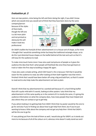
- 1. Evaluation pt. 2 Here are two posters, mine being the left and theirs being the right, if you didn’t know which one would mine you would sort of think that they have been done by the same company/person because of the styles of them both, though the left one is a bit more plain and not printed so obviously this will make it look less professional. On SASH’s leaflet the front/all of their advertisement is in a house sort of shape, so for mine I thought that I would do something similar but keep the traditional rectangle shape, so to do this I put distorted house shapes on the leaflet behind all the text and such so that it’s still easy for the audience to read. To make mine touch home more I have also used real pictures of people so it gives the audience the idea that that’s what people will feel/look like once they have got back on track or taken the first step to building a happy life again. I have also used a simple writing, which SAH haven’t, this is because I felt that it would be easier for the audience to read, but after looking at them both together now that mine’s finished I think that I would have been better off using a big and bold font, so that it’s easier to read and to also help make the advertisement not look so plain. Overall I think that my advertisement ha s worked well because it’s a hard hitting leaflet that still is quite mild with it’s words, looking at other posters I also think that my advertisement is of the same quality as in the content of it is mostly the same, it’s giving the audience information on what the company does, how many people they have helped and also where they can contact or go to get help. If you where looking in to getting help from SASH I think that my poster would be the one to go for and also if you’re finding out about how to get help from them, but if you’re just wanting to know a little about the company and not get any help then I think that SASH’s will be the one to go for. If I was picking just from the look of them as well, I would also go for SASH’s as it stands out more to me because of all of the colours on it, whereas mine doesn’t really stand out and I
- 2. wouldn’t even really notice it if it was amongst others, but on the other side of that, you might notice it because of how plain it is, so it could go one of two ways. I also think that people will find that the leaflet actually made my SASH is more for children because of it’s boldness and the colours, so I think that this poster should be made for young children/teenagers/young adults, and the one that I have made could maybe be for adults that have/older people that have found a homeless person and want to be able to help them.