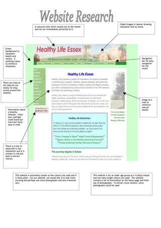
1. Faded images in banner showing
A colourful title which stands out to the viewer relaxation and no stress.
and we are immediately attracted to it.
Green
background to
represent
health and
nature. A Navigation
soothing colour bar for easy
to reinforce navigation
relaxation. for the
visitor
There are links at
the side set out
neatly for easy
access around the
website.
Image of a
tree to
reinforce
natural
Information about health.
a healthy
lifestyle. Clear
text, perhaps
could stand out
more but fairly
easy to read.
There is a link to
subscribe to the
newsletter and it is
written in red and
bold to attract
visitors.
This website is extremely simple as few colours are used and it This website is for an older age group as it is fairly simple
is fairly plain. For our website, we would like it to look more and not many bright colours are used. The website
exciting and perhaps use more photographs and less irrelevant contains a lot of information on the home page and little
text. use of photographs. To attract more viewers, more
photographs could be used.
2. The banner and navigation bar is present on every page for easy
access to various links. Although it is not the home page, this is the Although not by much, this page is slightly more
first page we see and it follows the same theme to the rest of the interesting than the home page as less text is
website, with the same colours throughout. included and a few more colours are presented.
As on the home
page, there is
another picture of a
tree so represent
health and living a
Images are health lifestyle. It
placed also follows the
underneath the theme of green and
links to show red.
what the link is
about. This is
an interesting
idea and useful
for the visitor.
The background is a pale
green again, following
the theme of the rest of
the website and
reinforcing relaxation and
health.
Links are shown across the bottom of the page clearly to access these
useful pages, for example, a ‘contact us’ page or ‘news’.
3. There are red tabs There are two slogans at the top of the
at the top for the website, written in different sizes and
useful links, such as colours. This could be because it is
a healthy diet, important to eat well to be well. There is a search bar at the top
which will be useful of the website (easy for visitors
for our health to see) for access around the
website. I also website.
think it is
interesting that the
tab that is open
presently (the home
page in this
example) has a Latest news from the
white tab with red Food Standards Agency
writing, opposite to is in the column at the
the other tabs not in side for visitors
use. interested and they
can also read more
news by clicking on
‘More news’
A blog and photograph of
Andrew Wadge is also in
The background is the right hand column for
a warm yellow, visitors to find out more
perhaps to about science and the
represent FSA.
radiance in a
healthy life. It
fades from the
top to the bottom
from light yellow
to a stronger,
warmer yellow to There are links for
add effect. telling friends about
the website or
accessing it through
different ways, such as
alerts.
The FSA logo
and link to
In a cream box, there are the FSA.
several links for easy
navigation around the
website for the visitor. The
main headings are written
in red to separate the
website into sections for
easier access around the Small links for about the website, a contact page etc
website. are at the bottom, although it is too small to catch the
visitors attention straight away. It is placed at the
bottom as this is where viewers scroll and see last.
The home page is attractive as not much information is used and it is laid out neatly for easy navigation for
the visitor. The use of colours is important as, subconsciously, the yellows and reds are warm colours
making us feel attracted to the website and want to improve our health.
4. Paragraph to
introduce the
FSA logo. Green to represent health/ page about
natural goodness. Health issues tab in health issues.
white to show which
tab is in use. To search throughout the website
Several links
to health
issues.
Easily
accessible
and clearly
presented. Q&A’s from
professionals.
Ask questions or
read questions
and answers from
other viewers on
food and medical
conditions.
The background is
the same colour
as the homepage
as the website
follows the same
theme throughout
the website.
Several sections on different areas related to health and Some space is left empty, perhaps so the visitor does
how to improve certain areas of your life to help live a not get uninterested, and only relevant information is
better one. included, as well as photographs to attract the visitor
of the website.
I find that when photographs are used next to links, the visitor can become
more attracted to the website as they help to illustrate the link. However, if
too many photographs are used, the website may look too busy and may not be
easy to access all pages.