
Recommandé
Contenu connexe
Magazine contents page analysing
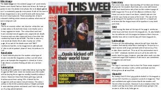
- 1. Main Image The main image on this contents page is of a extremely famous rock band Oasis at there world tour. By having a guitar in one the photo it emphasis the rock music genre as it’s a extremely popular instrument. Both of the men in these images have a very scruffy style with messy hair that isn’t neatly placed. There wearing lots of dark coloured clothing what connotes sadness what most of oasis songs are sad. Subscription By asking the audience to subscribe today it giving the magazine NME a lot more money because the reader will be buying this magazine weekly/monthly without choice. However they think there getting a special deal because there saving 33%. It benefits the magazine as they receive instant money. The colour yellow in the title has denotations of bright and bold it connotes happiness and stands out from the page as it’s a big advertisement. Font The font is mainly either red, black or white this are unisex colours. Rock/indie music is normally a very heavy aggressive music. The colour black and red have connotations of aggression, anger, blood, death. However red can also represent love, a love that the readership have towards NME. The font is also very oversized and bold, this makes it jump out of the page, the used of the shadow around ‘NME’ reinforces that this is the magazines masthead and it’s the most important piece of text; it stands out in red. Band Index A band index displays to the readers what type of music is inside the magazine so they can tell what genre and people the magazine is aimed at. It also helps them out when finding articles on a certain artist. Gig guide By having the UK’s No1 gig guide included in this magazine we can tell that this is a popular successful magazine. That are confident enough to know that there readers will listen to there opinion. However it also emphasis that the readers are big music fans and would enjoy going to live concerts of the rock/indie genre. Subheadings The use of the subheadings above the sell lines help the readers find exactly what there looking for. They are on a black banner with large and bold white font on top. This makes them stand out. The use of the exclamation mark on ‘LIVE!’ emphasis excitement as its all to do with the weeks best live gigs. However a exclamation mark can also represent anger and loudness. Rock music can sometimes be aggressive and loud. Date From having the date at the top of the page it reinforces what issue and how recent this magazine is. Its also helpful for the collectors of this magazine because then they can identify how old or new the copy of there magazine is. Cover story The cover story about Oasis kicking off on their world tour displays to the readers that Oasis are a very well known Indie/rock band hence why their on the contents page of NME magazine. The use of the ellipses reinforces that there is more to come from them, stated below in the article it says ‘keep an eye out for more’. The use of the graphology of the typeface Is very bold it’s a important article inside the magazine and the typeface is very bold and thick. Logo The logo is a acronym that is short for ‘New music express’ it’s a bright red colour with a white and black outline. What gives a shadow effect.
- 2. Main image The main image of one direction all grouped together smiling making direct eye contact with the camera. This reinforces a welcoming and friendly smile because the target audience are such a young age the main image has to look exciting and a extremely well know boy band. This band is very mainstream. The boys look very well groomed and clean looking with their hair and outfits perfectly styled. They are dressed in similar clothing and hair styles because there a mainstream pop band they can’t dress unique because there music isn’t. Website We love pop have advertised their website at the bottom of the contents page to allow their readers to view more information of the magazine online. It also includes online videos and quizzes that you can’t do in the magazine; loads of articles where the audience can respond and share there opinions. It includes signing up for the website to receive a weekly newsletter. Speech bubbles The speech bubble portrays that this magazine is aimed at a younger audience; it’s including small abbreviated text. Speech bubbles are often used in comic strips that are aimed at young children The use of the symbol of the heart is a relationship link to ‘We love this’. Smaller images The smaller images are all of mainstream artists/bands e.g. JLS, The wanted and The Saturdays. These are Pop bands that are very well know and younger girls look up to. ‘My cuddles are more full on’ Marvin from JLS talking about his personal life and a small interview. He posing very model like and sexy, he’s making direct eye contact with the camera trying to look cool. This magazine advertises 5 different front covers of one direction however with all of the same content inside, this is for collectors that will buy this just for the photos of 1D. Una from The Saturdays is giving fashion tips because she’s a big role model to some young teenage girls, a lot of girls who are into pop music will take advise from her because they will be such a young age. Pull quotes The pull quotes are cheesy and aimed at young teenage girls ‘Id pose naked for about a hundred quid’ connotes that this magazine is only for a female audience. A lot of young teenagers are obsessed with One direction, so this will wheel them into buying the magazine. However as this is aimed at a young audience they haven’t sexualised the boys in the main image. They’re fully clothed. Advertisement of posters The advertisement of free posters inside the magazine will make the reader more likely to purchase this, because they are getting a freebie. Especially if its there favourite artist. Article There are a lot more images then text this emphasis to us that this is aimed at a younger audience that prefer looking at images and not reading heaps of text. The small article is talking about pop music and only focusing on One direction a mainstream band. Colours This magazine has focused on the colours yellow and blue what are both primary colours. Yellow connotes happiness and warmth, however baby blue could indicate that this is aimed at a younger audience. The graphology of this magazine is mainly big, bold and black font that is in a circled feminine style.
- 3. Main image The main image is of a R&B singer Ciara, she is posing very sexy and trying to attracted the male audience into buying this magazine. She has been sexualised by V magazine as she is not wearing much clothing and has extremely high heels on, this is a common stereotype for the R&B genre music. She has been accessorised with the colour silver because is connotes wealth and expense. It is also a popular colour for the R&B music taste as they wear a lot of ‘bling’ accessories and over sized chains and jewellery. Ciara is a very popular artist so it could attract more readers. Vibe magazine is read by males and female from a teenage age upwards. This image used can appeal to both male and female in different ways. Women can look at the image and do one of two things; either idolise Ciara or feel negatively about the image. Men can look at the image and admire Ciara as she has been sexualised. However her clothing choice matches the whole theme of the magazine this can represent more of a formal feel to the magazine. Her legs are outlining a ‘V’ shape what represents and ties in with the whole magazine, as its name is ‘VIBE’. Ciara is making clear eye contact with the camera, this will draw the audience into the magazine as its making them feel like she is looking at them and it’s very mysterious. Colours The use of the colours; black, grey and white reinforce that this magazine is formal and for both genders, it also portrays that this magazine is aimed at the age of 16+ as most young children enjoy bright and happy colours jumping out from the page, and this doesn’t do that. The use of white behind Ciara makes her pop out of the page as she has very tanned skin. Font The title of the page ‘CONTENTS’ stands out as its on a darker background and extremely bold and capitalised. This draws more attention to the masthead then the other text. The bold font can also portray Ciara as a person and her music to reinforce that her music is bold and loud. Subheadings The subheadings are in a very flowing font. They have been made bolder then the rest of the text underneath them. This helps the main thing stand out for the readers so they can tell what there looking out. Website and dates From promoting the ‘V’ website on the contents page is advertises the magazine more as the have videos and other unseen articles on the website. There’s a load of video footage and images from concerts and gigs on their website, This it good for the magazine because its getting there web page views up and popularity. Dating the magazines is very important especially if you’re a collector, it helps people no what issue it is and display how old the magazine is. Background Image/logo The big ‘V’ behind Ciara represents the magazine ‘VIBE’ it has been outlined softly in white, however it’s still noticeable. It reinforces the name of the magazine and is basically the logo. Advertisement To the left of Ciara the magazine have listen the items of clothing she is wearing and where it is from. This is to promote the clothing brands a lot of people who idolise Ciara will want to purchase these items as she's been seen in them. The clothing brands will pay ‘V’ to advertise there clothing.