
Recommandé
Recommandé
Contenu connexe
Plus de leahdouglas98
Plus de leahdouglas98 (20)
Media presentation
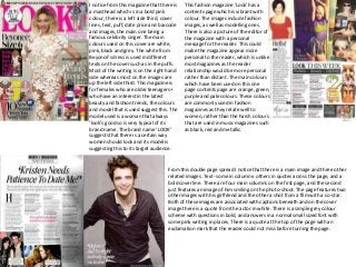
- 1. I notice from this magazine that there is a masthead which is in a bold pink colour, there is a left side third, cover lines, text, puff, date price and barcode and images, the main one being a famous celebrity singer. The main colours used on this cover are white, pink, black and grey. The white from Beyoncé's dress is used in different texts on the cover such as in the puffs. Most of the writing is on the right hand side whereas most on the images are up the left side third. This magazine is for females who are older teenagers+ who have an interest in the latest beauty and fashion trends, the colours and model that is used suggest this. The model used is a woman that always ‘look’s good so is very typical of its brand name. The brand name ‘LOOK’ suggests that there is a certain way women should look and its model is suggesting this to its target audience. This fashion magazine 'Look' has a contents page which is vibrant with colour. The images include fashion images, as well as modelling ones. There is also a picture of the editor of the magazine with a personal message for the reader. This could make the magazine appear more personal to the reader, which is unlike most magazines as the reader relationship would be more personal rather than distant. The main colours which have been used on this one page contents page are orange, green, purple and pale colours. These colours are commonly used in fashion magazines as they relate well to women, rather than the harsh colours that are used in music magazines such as black, red and metallic. From this double page spread I notice that there is a main image and three other related images. Text- some in columns- others in quotes across the page, and a bold cover line. There are four main columns on the first page, and the second just features an image of him smiling on the photo-shoot. The page features two other images with his girlfriend and the other a shot from a film with a co-star. Both of these images are associated with captions beneath and on the cover image there is a quote from the actor in white. There is a simple grey colour scheme with questions in bold, and answers in a normal small sized font with some pink writing in places. There is a quote at the top of the page with an exclamation mark that the reader could not miss before turning the page.
- 2. From this magazine front cover I notice that there is a masthead, one main image, cover lines, puffs, plugs, text, fonts and a left side third. The main colours on this cover are black, white and red. The writing is on the left side third, some at the bottom and more on the right hand side. The magazines target audience is people who are younger and into the latest music and information about it, I know this because Cheryl Cole was one of the most famous musicians when this issue was out so suggests to the audience that its for people witch a taste for the latest music whom I assume to be younger. The model ‘Q’ magazine have used is typical of its brand name as its for younger people and these people tend to look up to her as a role model. This contents page follows a similar colour scheme to the cover- red black and white- with a few other colours in the other images. The images include music which is appropriate to its magazine brand name as its genre is in music. The colours used are bold and make everything stand out so that everything is easier to read/see. These colours are widely used in music magazines as they are colours related to men and women which is what music is related to, so these colours suit its genre and target audience. This Q magazine double page spread features two images within this section. One image, Cheryl is pictured to be looking directly at the reader and on the other side (the main image) she seems to be looking over to the interview page; this technique is very effective. Dark clothes are being worn by Cheryl in each photo and this matches the colour of the majority of the text. For the bulk of the interview a sans-serif font is used. Contrasting this style is the huge red letter “C” seemingly overhanging the text and the quote which is in red block capitals. The use of red font mixed in with black font on a white background, is a very common trait within a “Q” magazine. The big letter “C” has a big impact on the page and acts as a colourful piece of decor which draws in the readers’ attention due to its brightness and size. The block capitals used to show a quote from Cheryl are also in a red font which matches the house style of “Q” magazine. Three columns are used on the right hand side page of this double page spread and bare spaces are a rarity due to the size of the font and the images used. A black block is used to separate the quote from Cheryl from the interview text – the black colour, again, matches the house colours of “Q” magazine of red, white and black.
- 3. From this cover I notice that there is a masthead, a left side third, cover lines, bottom strip, puff, text, images, plug and date price and barcode. The main colours used on this cover are pink, black, yellow and white. The writing is on the left side third and there is also some on the right side and cover lines in the centre. ‘GRAZIA’ magazines target audience Is woman of ages between 25-45. I know this because of the nature of the content and it is suggested by the model used in the main image. The model is a mother so is typical of its brand name as the magazine is about fashion, news, beauty tips and women's opinion. From this contents page I notice that it uses similar colours to the ones on its cover. The yellow squiggle that seems to be nail varnish is an appropriate image to use (and has a number beside it) as the magazine includes beauty tips so suggests to the reader that they are guaranteed beauty tips on a particular page. There are various other vibrant images including landscapes, accessories and fashion which are numbered so catch the readers attention. The colours used are bright which could reflect its season as an image involves a beach suggesting the colours used are aligned with the summer season. This double page spread has a sophisticated layout with dashes of vibrant colours such as orange, pink and blue. Its text varies in fonts and sizes with a catch phrase in large font to get the topic of the article across by also catching the readers attention using a large sized font. There is one main image involving a women with what seems to be a trainer collection and the other images are single shots of just trainers. The text is in chunks next to an appropriate image to go with-easier for the reader to read and know what its about. Some pictures are overlapping for effect and all text is in black so its stands out from its white background.
- 4. From this magazine cover I notice that there is a masthead which is partly covered- (suggesting that it is a well know brand that is confident in its target audience knowing the full brand name), left side third, barcode date price, puff, cover lines, text and images. The main colours used are black, gold, red and white. Most of the writing is on the right hand side but there is some on the left and at the very top. It's a magazine for mature music lovers, not teens and young adults, it shows respect for the history of music and features iconic artists. The model- Noel Fielding is part of a well known band and is typical of its brand name to use him as he is a well recognised face in the music world. This contents page uses four main colours which are black, grey, white and red. Some of these colours are involved on the front cover. None of the text is in black because the background is a grey colour which makes the font easier to see because its in white. The contents description is shaped and fitted using the outline of the models figure from the side. There is one main image of a musician which is an appropriate image to use as the magazine genre is music. Parts of the text are in red- again matching the covers colour scheme- and it sections the content, making it easier for the reader. This double page spread follows a sophisticated colour scheme of black white and grey- similar to its contents and its cover. There is a main image of a musician of the right hand page and the article is on the left. From this I can assume that the article is about this singer/musician so is appropriate to the text. All of the text is in black apart from the caption beneath the picture as the picture where the writing on is black- so mojo magazine have used a white text to stand out over the image. The cover line is the singer name and is in bold text so the reader knows what it is about before reading the article.
- 5. From this cover I notice that there is a bold masthead, cover lines, puffs, plugs, bottom strip, barcode date price, text and image. The main colours used are black, white and red. The writing is placed all over the cover there are no specific places, however most of the text is situated at the bottom half. The magazines target audience is mainly men aged between 17-30. The models used are male and part of a well known current band at the time. The models are dressed in similar outfits in the colour black which aligns itself with the masthead and cover lines and puffs. The models used are typical of the magazines brand name as its about music so using band members seems appropriate. This issue of NME focuses mainly on the band Kasabian within its contents page. It also contains many other features that are important in a contents page. The title of the magazine (NME) is located on the top of the page that reminds the readers of what magazine they are reading. The use of red and black in the colour choice helps the writing stand out despite being small. It also links to the colour of the NME logo linking to bands that NME are all about. This is a simple and effective use of a contents page that explores what's on each page. The central image is of two men (Kasabian) mid concert suggesting that it wasn't a photo-shoot and the photo wasn't taken at a organised time, so the reader can gather that NME where behind the scenes and will have the inside gossip of the bands events that you wont find anywhere else. This is a double page spread from NME. It features Sergio Pizzorno (Kasabian). His image takes up most of the two pages, asserting his status as musical legend and importance to the magazine. The white space behind Serge is more-or-less hidden with details on the wall he is stood in front of. He is looking directly into the camera with his hand against the wall, in a kind of posing fashion. Although he is posing, he looks casual- aligning itself with the general feel of this laid back and current magazine. Also- there is a sophisticated layout which suggests its target audience.
- 6. From this cover I notice that there is a masthead which is partly covered-suggesting confidence that its well known enough for people to recognise even when its covered, a left side third, text, main image, barcode date price, puff, plug and cover lines. The main colours used are pink black and white. Writing is on the left side third and there is some on the right- showing cover lines. The target audience for cosmopolitan magazine are females aged between 18-35. the model is wearing pink and black and her complexion is quite pale- this colour theme in the model is shown in other aspects of the cover such as in the text and the masthead. The magazine includes beauty tips, fashions and features so the model used is typical of its brand name as she resembles these things to its target audience. This contents uses three main colours- these are black pink and white- similar to its cover colour scheme. There is one main image covering the whole page- the lighter parts are covered with text about the contents. The background is mostly white and the text is in black so it stands out to the reader so that its easier to read. There is a bold pink title ‘contents’ showing the reader exactly what it is that they’re looking at- the pink colour aligns itself with the covers masthead. The background colour of this double page spread is a light pink colour which suggest that the target audience for this article could be aimed at a female. There is a main image of a actress/singer with an interest in fashion which is an appropriate image to use for this magazines brand name as she resembles these things. The columned text is fitted around the outline of the models body shape as she is lying down- taking up the majority of the space from the bottom half of the double page spread. The colours are quite basic and simple too, but the overall article at a glance stands out as the text begins with an oversized 'T'. However, without the T in the text content the article wouldn't not be as attention grabbing and make come across as quite plain, in some ways. But due to the arrangement and usage this has been stopped. The colour scheme as a whole is very consistent and fits in with the one image used as it's really feminine focused and the questions are coloured in a pink/purple tone which, also, contrasts to the colour of the answers which is simply black.
- 7. From this cover I notice there is a masthead- part of it is missing showing that it’s a well known brand name, a left side third, cover lines, puff, plug, barcode date price and a main image. The main colours used are pink grey and black. Most of the writing is situated in the left side third, however there is more on the right and at the bottom. The main target audience is women of the age of late 20's early 30's whom enjoy fashion and enjoy reading about it. The model Is situated in the centre of the cover- so we assume that inside she will feature in it. ‘Kate Moss’ is written in the same colour as the masthead, suggesting that this issue mainly features this woman. Using this model is typical of its own brand name as its about fashion and lifestyle which we see Moss as a role model for. it is the same in that the main focus is a high quality photo that shows of fashion greatly but this one has a vast amount of writing around the image, it also has the magazine brand “Vogue” written across the image drawing the attention to the brand of the magazine. It states that it is a contents page above the magazine brand and shows the issue number in a different colour to help it stand out. The page has used the same font throughout for the contents writing but have used different sizes and thickness of font to help different parts stand out, the main different is that this contents has a lot more colour, the colours match the image of the woman in the red dress showing colour coordination. There is also an advert on this contents page advertising their own subscription giving viewers a change to subscribe so the magazine then gets repeat customers. This double page spread contains one image covering all of the right hand side and the text is all on the left. All of the text is in black except for in the title there is some grey text which creates a more sophisticated theme but does not capture the readers eye greater than some of my other double page spread analysis’. The main image is appropriate to the title as its about makeup so is a profile shot of a woman wearing bright dashes of makeup/colour on her face. The text is in three single columns with a sub-heading above it which not only draws attention to the article- it almost frames the text.
- 8. From this cover I notice that there is a masthead, left side third, plug, puff, text, cover lines and a main image. The main colours used are blue, pink and black. The writing is at the sides of the cover-none on the bottom but some at the top. ‘VIBE’ magazine’s target audience is ages between 12-24 who follow hip hop when first launched. The model collar colour is used as the masthead colour-you can see this clearly as the main image is a portrait in the centre. The model is a hip hop rap artist so is typical of its brand name to use this model as he represents the magazines genre. This contents page uses a black white and grey colour scheme to create a clean-cut theme from the offset. The only spark of colour on the page is the red heart which is situated on the image of the model- which will inevitably capture the readers attention. ‘contents’ stands out to the reader because of its size and is in a bold black font. They have used a variety of fonts which makes the page look more formal and well presented. The page numbers are in a bold font which makes it easier for the reader to see more clearly-also ‘features’ and ‘fashion’ are in a fancy/formal font which gives the magazine a very classy and stylish edge as well as making it more interesting On this double page spread the artist name is in a bright colour of blue printed which puts emphasis on the artist as well as telling the reader straight away that the article is going to be about Solange Knowles. The use of the black and white images at the top of the double page adds variety and explores a better representation of the artist. The way vibe has used black lines through the page to help divide the page into two helps to make it easier for the reader to look at images more carefully, rather than having images and texts scattered on the pages. Vibe hasn’t used a drop capital and has preferred to start off with a small statement about the artist in bold the sharp, short, snappy statement is a way of interesting the reader and the statement has been written in bold gives this article a dramatic and mysterious effect. The images at the top of the article show the artist’s personality (fun) with the use of different poses and again to inform who the article is about. Most of the text is in black on a off-white background, with the occasional bold blue colour of text to add emphasis of the articles content.