
Recommandé
Contenu connexe
Tendances
Tendances (19)
En vedette
En vedette (20)
Similaire à Unit 21
Similaire à Unit 21 (20)
Plus de liamgearyringwoodmedia
Plus de liamgearyringwoodmedia (15)
Dernier
Dernier (20)
Unit 21
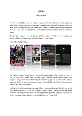
- 1. UNIT 21 EVALUATON: For unit 21 we had the choice to design a magazine, film a short film or trailer or create and advertising campaign. I chose to undertake a magazine. For these I first started to plan out what topic my magazine would be based upon. For this I chose to do something close to my heart as I know a fair amount about it and this topic revolves around my life on a daily basis; Music. Designing the magazine was a tough aspect of the project as it had to suit a wide age range and be suitable for grabbing the attention of ages 12 and above. Here is the final product: The product is called Reveal and is a music technology magazine for a variety of genres in the Electronic Dance Music area. The main pages: Contents & Front cover follow a more simplistic design which shows of a fresh pink and white design; whereas the articles follow a signature design for each one. I chose to use a theme of pink and white for the main pages because it is fresh and modern. Looking at my original proposal and design ideas, I have stuck them and the idea had for the final product turned out to look like I planned. Using software called Photoshop and Adobe Fireworks for image manipulation and the complete design of the magazine I was able to design a very attractive magazine which could be seen of a shop shelf.
- 2. In my pre-production time I designed a key logo and simple designs before I started to design the magazine on digital software. Strengths: The magazine is very attractive and desirable by the way it includes a simple design but allows a lot of information to be threaded on to a single page. ‘Reveal’ is a catchy name and is easy for fans to remember. Its target audicance is shown through the design of the front cover. The cover is also eye catching which could lead to people maybe not interested in music to pick it up and purchase the magazine. Improvements: In my opinion I would change the primary colours of the main pages. This is because the colours I have chosen ‘Pink & White’ promote a more feminist look towards the magazine. This could be changed to a natural colour. For example: Black and white or yellow.
- 3. Public analysis: Name Age Do youlike the design?(Colours, layoutetc.) Doesthe magazine meet itspurpose? Would you purchase this on a store shelf? Clive 46 Yes,The designis simple butIthink it isgood. Yes the magazine portraysa music genre onthe cover Possibly.Itwould dependonthe pricingof it. James 24 The coloursto presentamore female based magazine howeverthe design isfresh and attractive. Yes.It clearly showsitis a musicmagazine. Yes.I am in to electronicmusic so thiswould good entertainment. Worth the money. Cloudia 16 Yes, the design is really effective and stands out. I don’t really like the fontas it does not reallysuit the style of everything else Yes. It clearly shows it is a music magazine. No, as I’m not a fan of music mages. Liberty 16 Yes the design is eye catching and SNAZZY Yes it does No as I am not a fan but if I was then yes.