
Recommandé
Contenu connexe
Tendances
Tendances (20)
En vedette
En vedette (16)
Similaire à Advert analysis 3
Similaire à Advert analysis 3 (20)
Plus de libbydulhanty
Dernier
Dernier (20)
Advert analysis 3
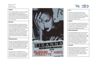
- 1. Salford City College Eccles Centre AS Media Studies Foundation Portfolio Masthead The masthead ‘RIHANNA’ is in white font set against a black background and is tilted to one side, breaking design formality and suggesting a sense of rebellion and lack on convention in the advert. The wide spaced sans serif font is simple and thus allows focus to remain on other aspects of the advert such as the main image. Main image The close up of Rihanna is in black and white and therefore makes the image appear to be authentic and also more dark and mysterious. Rihanna give direct mode of address which makes the reader feel that she is looking directly at them, and thus engaging the reader’s attention. The fact that she is covering half of her face with her hand along with her gloomy facial expression suggests that she is perhaps angry and this creates a narrate enigma and the reader may wonder what has happened to her. Photography Lighting The advert uses low key lighting to add to the sense of mystery and darkness surrounding the image and represent the fact that despite being a pop artist, in this album Rihanna is defying genre conventions. However, the high key lighting on her face suggests that this is still a positive representation of her, Coverlines The cover lines are in a different font to the masthead and are in red, serif font. The cover lines detail the songs on the album and the fact that they are more complex in font and colour suggest that they are the most important aspect of the album. Colour The colour scheme is black, white and red, a conventional colour scheme of the rock genre, however less expected of the pop genre. This again shows that in this album Rihanna is showing rebellion towards the stereotype of female pop and is attempting to defy convention. Typefaces The contrast between the simple sans serif font and the red, serif font is minimal but allows both fonts to stand alone. The contrast between the two draws attention to the informative text and thus ensures that the reader is engaged with the advert. Design Principles Used? The Guttenberg Design Principle is used as the main focus of the advert is the image, which is feature predominantly in the primary optical area. The strong fallow area also includes the image and also a graffiti style ‘R’ which we may assume is the logo of the advert and therefore significant. The informative details are featured in the weak fallow area and the terminal area as they are secondary to the image which is key in engaging the readers attention. House Style The house style of the advert is representative of the pop/rock genre, and thus represents Rihanna’s rebellion against the pop genre and a break out into a more dark and enigmatic genre. The imagery alongside the colour scheme suggest that there is mystery behind the advert and thus intrigues the reader to find out more.
- 2. Salford City College Eccles Centre AS Media Studies Foundation Portfolio
- 3. Salford City College Eccles Centre AS Media Studies Foundation Portfolio