1. Project R SAT analysis
Leo
January 12, 2017
load(file="table_2010_clean")
load(file="table_2012_clean")
load(file="binary_table_2010_clean")
load(file="binary_table_2012_clean")
load(file="cluster_data_2010")
load(file="cluster_data_2012")
load(file="grades_2010_clean")
load(file="grades_2012_clean")
load(file="df")
Graphical Analysis
In this first part, we will study graphically our dataset. We are trying to see if there is a general behavior.
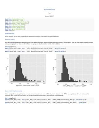
Histogram Analysis
With these two graphs, we see a general pattern. First, we have the largest amount of school who scores around 1200 to the SAT. After, we have another group of extreme
values, scoring way better than the others. These two groups are clearly identified in both 2010 and 2012.
library(ggplot2)
ggplot(table_2010_clean, aes(x = table_2010_clean.overall_numeric_2010)) + geom_histogram()
ggplot(table_2012_clean, aes(x = table_2012_clean.overall_numeric_2012)) + geom_histogram()
Scatterplot Writing Mathematical
In this first graph, we are exploring the connection between mathematic score and the final score obtained at the SAT. In our graph, we see the same pattern as the
histogram. Most schools perform close to the average, but a few schools seem to perform better than the average.
library(ggplot2)
ggplot(table_2010_clean, aes(x=table_2010_clean.overall_numeric_2010, y=table_2010_clean.Writing_Mean)) + geom_point() 2012
ggplot(table_2012_clean, aes(x=table_2012_clean.overall_numeric_2012, y=table_2012_clean.Writing_Mean_2012)) + geom_point()
2. Matrix
The matrix shows us the relationship between each variable. There is a strong relation between each Type of test. It shows that schools perform not just in their
specialization to SAT. When they succeed well, most of the time it is in every discipline. This intuition goes against the general assumption that schools with specializations
are just good in their field. The result shows that It is rather linked to being a “common” high school or an “elite” high school.
# Scatterplot Matrix 2010
pairs(~table_2010_clean.overall_numeric_2010+table_2010_clean.Writing_Mean+table_2010_clean.Mathematics_Mean+table_2010_clean.Critica
l_Reading_Mean,data=table_2010_clean, main="Simple Scatterplot Matrix 2010")
# Scatterplot Matrix 2012
pairs(~table_2012_clean.overall_numeric_2012+table_2012_clean.Writing_Mean_2012+table_2012_clean.Mathematics_Mean_2012+table_2012_cle
an.Critical_Reading_Mean_2012,data=table_2012_clean, main="Simple Scatterplot Matrix 2012")
3D Scatterplot
In the two-dimensional graph, we were not able to say that the school succeeding in writing and mathematics will be the same one succeeding in mathematics and reading.
Now, we are able to see the distribution of schools in the three dimensions of the SAT evaluation. Therefore, we can confirm there is a group of elites having higher grades
in every test. This is the group we were guessing from the beginning.
library(scatterplot3d)
attach(table_2010_clean)
scatterplot3d(table_2010_clean.Writing_Mean,table_2010_clean.Mathematics_Mean,table_2010_clean.Critical_Reading_Mean, main="3D Scatte
rplot 2010")
library(scatterplot3d)
attach(table_2012_clean)
scatterplot3d(table_2012_clean.Writing_Mean_2012,table_2012_clean.Mathematics_Mean_2012,table_2012_clean.Critical_Reading_Mean_2012,
main="3D Scatterplot 2012")
3. 3D Scatterplot with Coloring and Vertical Drop Lines
We are now able to easily count how many of them are top schools.
attach(table_2010_clean)
scatterplot3d(table_2010_clean.Writing_Mean,table_2010_clean.Mathematics_Mean,table_2010_clean.Critical_Reading_Mean, pch=16, highlig
ht.3d=TRUE, type="h", main="3D Scatterplot and Vertical Drop Lines 2010")
attach(table_2012_clean)
scatterplot3d(table_2012_clean.Writing_Mean_2012,table_2012_clean.Mathematics_Mean_2012,table_2012_clean.Critical_Reading_Mean_2012,
pch=16, highlight.3d=TRUE, type="h", main="3D Scatterplot and Vertical Drop Lines 2012")
Modeling Part
Classification tree
This tree shows us that in 2010, success to the writing tests, was a good indicator to define if the school will perform better than the average on the SAT.
#tree_2010
library(rpart)
tree_classification_2010 <- rpart( binary_column_2010 ~ .-School_Name_2010, data = binary_table_2010_clean, method = "class", cp=0.00
01)
# tree graphic
plot(tree_classification_2010)
# add the description of each leaf to the graph
text(tree_classification_2010, use.n = TRUE, all= TRUE, cex=.8)
In 2012, mathematics was the main indicator of success followed by reading and writing. So, this year, most of the schools scoring well in mathematics will have more
chances to get above the average of SAT results. It was followed by the reading and writing criteria that drop at the end, as a key factor of success.
#tree_2012
tree_classification_2012 <- rpart( binary_column_2012 ~ .-School_Name_2012, data = binary_table_2012_clean, method = "class", cp=0.00
01)
4. # tree graphic
plot(tree_classification_2012)
# add the description of each leaf to the graph
text(tree_classification_2012, use.n = TRUE, all= TRUE, cex=.8)
Logistic Regression
This model shows us that apparently performing well in mathematics give more likelihood to the school, being highly ranked in SAT’s results. This tendency becomes even
greater in 2012, when we look at the difference between the estimated standards.
#logistic regression 2010
logistic_regression_2010 <- glm( formula = binary_column_2010 ~ .-School_Name_2010, data = binary_table_2010_clean, family = "binomia
l")
summary(logistic_regression_2010)
#logistic regression 2012
logistic_regression_2012 <- glm( formula = binary_column_2012 ~ .-School_Name_2012, data = binary_table_2012_clean, family = "binomia
l")
summary(logistic_regression_2012)
## Call:
## glm(formula = binary_column_2012 ~ . - School_Name_2012, family = "binomial",
## data = binary_table_2012_clean)
##
## Deviance Residuals:
## Min 1Q Median 3Q Max
## -0.9587 0.0000 0.0000 0.0000 1.8930
##
## Coefficients:
## Estimate Std. Error z value Pr(>|z|)
## (Intercept) -42.49 4721.27 -0.009 0.993
## binary_math_2012 40.88 4721.27 0.009 0.993
## binary_reading_2012 20.93 3354.46 0.006 0.995
## binary_writing_2012 21.02 3322.35 0.006 0.995
Probit
The Probit model gives another conclusion than logistic regression for 2010. The best indicator will be the writing performance. On the other hand, in 2012 the probit and
logistic models agree that mathematical results give you a better idea over the school’s SAT results.
#probit_2010
probit_2010 <- glm(binary_column_2010 ~ .-School_Name_2010, family=binomial(link="probit"), data=binary_table_2010_clean)
summary(probit_2010)
#probit_2012
probit_2012 <- glm(binary_column_2012 ~ .-School_Name_2012, family=binomial(link="probit"), data=binary_table_2012_clean)
summary(probit_2012)
##
## Call:
## glm(formula = binary_column_2012 ~ . - School_Name_2012, family = binomial(link = "probit"),
## data = binary_table_2012_clean)
##
## Deviance Residuals:
## Min 1Q Median 3Q Max
## -0.9587 0.0000 0.0000 0.0000 1.8930
##
## Coefficients:
## Estimate Std. Error z value Pr(>|z|)
5. ## (Intercept) -13.778 846.793 -0.016 0.987
## binary_math_2012 12.811 846.793 0.015 0.988
## binary_reading_2012 6.724 604.443 0.011 0.991
## binary_writing_2012 6.718 593.048 0.011 0.991
Mapping
In the mapping, we find two evidences. First, in the top five, two are clearly specialize in science (Staten and Bronx). Furthermore, they seem to avoid Brooklyn district and
two in the Bronx are on the border of Manhattan district.
find top school
library(plyr)
head(arrange(table_2010_clean,desc(table_2010_clean.overall_numeric_2010)), n = 5)
head(arrange(table_2012_clean,desc(table_2012_clean.overall_numeric_2012)), n = 5)
Create a Mark 2012
library(shiny)
library(leaflet)
m_2 <- leaflet() %>%
addTiles() %>% # Add default OpenStreetMap map tiles
addMarkers(lng=-73.8237707, lat=40.7349273, popup="Townsend Harris High School at Queens College")
addMarkers(lng=-74.0155873, lat=40.7155446, popup="Stuyvesant High School")
addMarkers(lng=-74.1203016, lat=40.5676214, popup="STATEN ISLAND TECHNICAL HIGH SCHOOL")
addMarkers(lng=-73.8974118, lat=40.8748759, popup="HS of American Studies at Lehman College")
addMarkers(lng=-73.8974118, lat=40.8783054, popup="BRONX HIGH SCHOOL OF SCIENCE")
m_2 <- leaflet()
m_2 <- addTiles(m_2)
m_2 <- addMarkers(m_2, lng=-73.8237707, lat=40.7349273, popup="Townsend Harris High School at Queens College")
m_2 <- addMarkers(m_2, lng=-74.0155873, lat=40.7155446, popup="Stuyvesant High School")
m_2 <- addMarkers(m_2, lng=-74.1203016, lat=40.5676214, popup="STATEN ISLAND TECHNICAL HIGH SCHOOL")
m_2 <- addMarkers(m_2, lng=-73.8974118, lat=40.8748759, popup="HS of American Studies at Lehman College")
m_2 <- addMarkers(m_2, lng=-73.8974118, lat=40.8783054, popup="BRONX HIGH SCHOOL OF SCIENCE")
m_2
2012 2010
Conclusion
After having gone through this dataset, we are now able to drive some assumptions based on data insights. First, we found a small amount of well-performing high schools.
We can qualify them as an elite group of schools in New York. This shows that inequalities have always divided high schools and students. SAT is the main factor impacting
the college selection. The results from this group of elite high school students may reoccur later in college.
Therefore, parents tend to think that some schools have strengths and weaknesses. Some institutions will be better in Science and Mathematics like “Bronx High School of
Science”. But apparently, that classification is misleading. It seems more like, when a school performs in a field it is just an indicator of a general performance and not a
specialization.
But, our models show us that even if you should take one indicator to anticipate the performance of a school to improve SAT results, you need to choose one aspect of
education in the context of a public policy to improve SAT’s results. Mathematical proficiency will apparently help to guarantee good SAT’s scoring. This is quite surprising,
because this examination seems disconnected from the two other ones of writing and reading.
Lastly, we have tried to position schools in the elite group, at least for the top five. Looking at the map and the longitude and latitude, they seem to be a geographical
discrimination, which can be held as a sign of social schemas being reproduced.
To conclude the “famous” inequalities of the United States colleges, start even sooner than what is generally thought. Public policy in high school education could be a better
way to fight inequalities than going to free Universities as Mr. Bernie Sander sustains.