SlideShare une entreprise Scribd logo
1  sur  13
Magazine Analysis.  By Lottie Heckman
Masthead - Uses Sans serif font which is  Straight forward and informal. the pink font is used because the magazine aims at The female gender and the colour pink is associated with that stereotype of the girly  teenager. Also this is shown as the word ‘Bliss’ is a name you would expect as it reminds the reader of something glamorous or girly.  Barcode-  A common convention used on the front cover in order for the consumer to purchase the media product. Main Image-  The image connotes the celebrity ‘Taylor Swift’ wearing fashionable clothes and She is using direct address by looking into the camera  this is a form of interaction as the audience may feel connected with the image of the front cover.  She is the main focus to the front cover which attracts the audience to read the magazine.  This also supports the ‘Male Gaze’ because teenagers look “at” her hoping to be like her and look at her as a role model.  Date and price-  This is a common  convention you would expect in all  magazines.   When the price is displayed in smaller font it is usually a convention that the company doesn’t want it to stand out as it is not as appealing to the audience.  The price of £2.50 also reflects on the socioeconomic status of the working class.  Sub image-  This is  used to advertise what is featured inside the magazine which is used to attract the audience in order for them to read the magazine.  Pug - This stands out on the front cover in order to draw in the audiences attention to look at the ‘Latest fashion’.  Buzz word-  Using words such as ‘ Exclusive’ draws in the audience as it makes The consumer feel more involved as if they are the first ones to know the gossip.  This is also reveals the genre being a gossip magazine. Layout-  Very Colourful layout  using lots of bright pinks and blues in order to follow the representation of  females.  Also from the layout we can work out it is a cheaper (weekly) magazine as the page is very busy full with captions, pictures and text.  Sub Heading-  Uses a good use of alliteration which is catchy in order to gage the audiences attention.  Also a black background also brings more focus to the text because of the contrast of colours.
Headline-  The contents title connotes a sans serif blue colour font, but they also put the month of the issue which is used to inform the consumer when the issue is.  Although the contents page is not from the same magazine as the Bliss front cover as we can see from the dates, we can recognise that is the same magazine organisation from the colour blue which fits with the genre of a female teenage girly magazine.  Subheading-  Bliss have put a section for the ‘features’ telling the consumers which are the most popular stories, and the ones that should be focused on. This creates another attraction for the audience by the way the font is in bold sans serif font .  Layout & Colour Scheme-  The layout of the contents page is neat and organised; they used the main focus of the magazine with the smaller front cover and the main headlines. The Colours used of pinks and blue also fit the genre of the fashion and gossip magazine.  It adheres to a normal stereotypical girly magazine.  Front cover analysis-  This is a main focus to the contents page as it placed at the top of the page in order to draw the audiences attention.  This is used because it directs the target audience to the main headlines which are placed on the front cover which is done through synergy.  Sub-image-  This connotes shot of a women with the cinematography of a close up in order to reveal to the audience the expression on her face.  We can see she is posing with her finger over her lip which denotes that she knows a secret or something she shouldn’t know in order to gage the audiences attention so that they read the page about it. This therefore represents the genre of a girls gossip magazine and the stereotype that girls like to gossip.  Sub-image-  This connotes the celebrity ‘Tulisa’ from the group N Dubz posing using direct address.  This effect is used in order to draw in the audience.  Also it fits with the theory of the ‘Male Gaze’ as females look at her and her appearance hoping to be like her and look at her as a role model.  Page numbers-  Bliss named different sections with different topics within the magazine. This makes the navigation of the magazine a lot easier. They have used bold font for the sub-titles; this is because it is informing the reader the different topics to fit their interests.
Feature Headline-   The title shows the typography of sans serif bold font which is used to look informal and a chatty style and the use of a quote fits well with this as it makes the audience feel more involved with the article.  Main Image-   The image connotes the celebrity Victoria Hesketh posing with her hand touching her blonde hair in a girly way which is used to attract the audience into reading what the article is about.  This is the main focus to the double page spread as it is covers half of the double page spread. It also creates a ‘Male gaze’ as females look at her hoping to look or inspire to be like her from the way she looks. Also from the mise-en-scene of the artist she is not wearing revealing clothing like most celebrity artists which represents her as being a respected artist and the target audience of young teenagers will look up to her.  Sub-images-  These are secondary features which is used as a purpose as it links to the main story.  We can see that it links to the main story as it is the same lady portrayed in the main image.  Layout-  This follows the common convention of a double page spread as it in columns.  Also subheadings are used to divide the paragraphs which use the typography of bold font which is used to break up the text which is more appealing to read.  Also pictures fill up the majority of the page because it is more attractive to look at in the reader perspective.  Quote-  The use of this  common convention is a good way to engage the audience to read the article as it is used as a teaser.  Also this fits with the genre of gossip magazine and the target audience of teenagers as they are interested in finding out the party life of celebrities.  Masthead-  includes the name of the magazine organisation which shows that synergy has been used throughout the magazine. However we can see from the Bliss front cover and contents page I analysed that its not from the same magazine from the colour of the font.  Colour scheme -  Its a complimentary colour scheme as the colours purple and yellow are opposite on the colour wheel which also fits with the target audience of the magazine of teenagers as they stand out because of the contrast in colours which draws the audience in.
Masthead-  Uses bold, black Serif font.  The title has been partly covered by the artist ‘Katy Perry, this tells us that the magazine company is very well known to its audience and can be easily recognised. The title of my chosen magazine is `blender` magazine. The meaning of `blender` is a person or a thing that blends in no matter where he/she is. The conventional use of the word “blender” as the title suggests that the magazine is aimed at the typical cool people.   Main Image-  The image connotes a medium  shot of Katy Perry wearing a skimpy outfit which is used to reveal the mise-en-scene of what she is wearing.  Her facial expression is cool and shows a little sign of vulnerability.  The target audience for blender magazine are mostly young men because they have been dressed in a way that to appeal to men. She is using direct address by looking into the camera  this is a form of interaction as the audience may feel connected with the image of the front cover. Header -  Uses a strap line to advertise the USP (unique selling point) of the magazine.  The font of ‘Free Downloads’ is in bold lettering, this is used to stand out so that it catches the audiences eye and then buy the magazine.  Secondary Feature- ‘ Metallica’ this attracts the target audience who are  interested in metal and rock.  Feature Headline-  this links to the main  Image as the female artist is called  ‘ Katy Perry’ which attracts the target Audience of people who are interested In pop, majority being Pop.  The text  Is larger than the other text in order for It to stand out.  Sub-Heading-  ‘BI-CURIOUS BABE ’  This is an alliteration which is informal text is used in order to catch the audiences attention and gives the audience the idea that the particular story is about the figure on the front page. Colour Scheme-  Only three main colours are used in the magazine (white. black and white), this is a convection used by most music magazine to create uniformity. Barcode-  A common convention used on the front cover in order for the consumer to purchase the media product. Price-  This is a common  convention you would expect in all  magazines.   The price is displayed in smaller font which indicates that the company doesn’t want to show it off the price because it is not as appealing to the audience.  The price of £4.00 also reflects on the socioeconomic of a higher status.
Main Image-  This connotes ‘Katy Perry’ wearing a dress holding a large mushroom.  This portrays the characteristics of her as she is an abstract person and is a very unique artist.  Also the image synergises with the front cover as ‘Katy Perry’ is represented in both of the pages.  Heading-  With the contents title they used the back serif font which is similar to the masthead on the front cover which shows that synergy has been used. Underneath the title is information about the magazine which provides the consumer with the date of the issue. Quote-  This is a common convention on a contents page. A quote is a nice way to make the audience feel more involved with them. It adds a bit of a personal touch.  Also we can tell from the quote that it fits with the music genre as she uses the word ‘music’ which means she is clearly talking about her career.  Sub Heading-  The subtitle connotes bold sans serif font in the colour pink in order to stand out against the white background. The word ‘features ‘ is used to tell the consumer the different main sections of the magazine and the ones that should be focused on. This creates another lure for the audience.  Website-  This convention promotes the magazine more however they have placed it at the bottom of the page therefore does not stand out very much as most of the focus is on the main image.  Page numbers-  Blender have given the different artists a section of the magazine.  This opens their target audience to a much wider audience as it is not focused on only one artist but a variety of different music genres such a pop, rap and rock . This also creates a lure with the magazine as people would want to read the magazine to see their favourite artist. The artists names are written in black which is used in bold letters in order to stand out and in contrast with the white background.
Main image-  This is the main focus to the double page spread as it is covers half of the double page spread.  We see a a black and white image which is used to fit the genre of  ‘House music’. ‘Katy Perry’ is wearing the same outfit as in the front cover which shows that synergy has been used to produce this.  The celebrity is also represented as sexy because the figure in this magazine is dressed in a way that appeals to men.  Also the image features ‘Katy Perry’ as she is a stereotypical ‘perfect’ celebrity because the magazine has aimed at the stereotypical ‘normal, young, beautiful people’.  Also the way she is positioned links to the story as she has her fists up as if she is about to have a fight with someone.  Also this images uses Laura Mulvey’s theory of the ‘Male gaze’ which men see her as a sex idol and women judge her appearance and idolize her.  Main Heading-  The font used is black serif and it tilted to make it stand out.  Also ‘Girl on Girl’ is a pun as the writer has implies that the story is going to be based on ‘Katy Perry’s’ childhood but also links to her song ‘I kissed a girl’ however, it depicts that she is having a fight with someone which conveys conflict in the music industry.  Colour Scheme -  The only colours used are black and white which are a good combination because they contrast with each other which makes the page look more interesting to look at.  Also we can see from the colours used that the magazine would attract the target audience of adults as it looks more sophisticating that a traditional magazine.  Text -  The text is split into two columns which is conventional of a double page spread.  However, the text takes up nearly half of the page and is not broken up which is unconventional.  This usually would appear overwhelming and put off the reader.  Also we can see that it would attract the target audience of young adults as the editors believes that there is no need to break up the text as they believe the audience is sophisticating enough to read it anyway.
Masthead - Uses white serif font in contrast with the background which is used to make the magazine stand out.  Puff- ‘ THE WORLD’S  BIGGEST DANCE MUSIC..’ Trying to emphasise its own  importance in the market Which is another reason why You should buy it. This also creates a USP for the magazine.  Barcode-  This is not a very  appealing convention however is a necessary part of a front  cover.  Main image -  This is the  main focus of the front cover as the cinematography of a  long shot is used to reveal   the skimpy costume the  model is wearing to portray that is it a summer issue.  Also her posture reveals that she is in a ‘party holiday destination’ by the way she has her arm up as if she is listening to music.  Freebie-  This is a great way to draw in the audience because they feel they are gaining out  something out of purchasing the magazine and also makes the  company different and unique compared to other competitors. This is therefore the Unique Selling point (USP) of the magazine.  Colour scheme-  The colours of turquoise, yellow are complementary colour scheme because they are opposites on the colour wheel.  The colours which are all bright are used to attract the audience. This is used for young audiences but also is used to fit in with the ‘summer’ theme.  Feature Headline-  This Is the largest serif text used is designed to grab the target  audience’s interest and also  is a great way to sell the magazine because it combines with an offer ‘cut price’ which makes the audience think they can get something cheap.  Also the country ‘Ibiza’ is chosen because although it is a holiday destination is links with the party music as it where young people go to party. Which therefore reveals the target audience of the consumer which is young adults (‘party animals’). It also appeals to the target audience that consists of the psychographics of interests in clubbing, dancing, listening to music and drinking alcohol as it states ‘Dance for free’ and ‘Drink Cheap’ which stereotypically states that all people who enjoy clubbing like to get drunk and go wild.  Sub Image-  This gives the audience a sneak peak of what is inside the magazine so that the consumes continues to read the magazine in order to find out more information. The cinematography of a close up shot is used to reveal the detail on the persons face.
Logo-  Mixmag  has put their brand  name on their magazine on the top left hand side because It is the first place in which the consumer looks at.  They have used the same serif font so that the  consumer is able to identify the magazine.  Masthead - The word  contents in a typical convention we would expect to see as it reassures the reader  what page it is.  The  font is serif and colour is white in contrast with the black in order to stand out which fits nicely with the genre.  Basic Colour Scheme-  The basic colour of a black background As it makes it easier on the eyes and also fits with the genre of dance music as it reminds the consumer of being in a club.  Also we can see it is not the same contents page as the front from the lack of colours used as they are not consistent.  Main Image-  Mixmag have used a striking image of lots of people dancing in  club which fits with the genre of dance music as it is what you would expect to see at a party or a club however, they have ignored any gutter space and have written over the image showing that that writing is more important than the photo.  Freebie-  This draws in the target audience as they feel they are gaining more out of the magazine which will want them to stay loyal to the magazine.  Date-  The date is placed at the top to show the audience what issue it is and is in yellow sans serif font so that the audience recognises this.  Sub heading-  Mixmag put a section for the ‘features’ telling the consumers which are the most popular stories, and the ones that should be focused on.  This creates another lure for the audience. List of contents-  This is a convention essential for the contents page however Mixmag have hidden it away front the main feature of the image which is more attractive to look at.
Main Image -  The main image is the main feature on the double page spread.  It connotes two females in a club environment having fun which is portrayed by the way the girl has her two fingers up and the mise-en-scene of the glasses and hat she is wearing.  This represents the genre of the magazine of being a dance music magazine. This is also shown by the lighting in the image and the colours of yellow and orange in the corner of the image which conveys that it during the summer in a hot destination such a ‘Ibiza’ which is also known as a clubbing destination.  Which shows that synergy has been used throughout the magazine as this is also portrayed in the front cover and contents page.  Secondary features-  The images connote young adults partying in a club which links to the main article and the main image. It also appeals to the target audience that consists of the psychographics of interests in clubbing, dancing and listening to music which is represented by the position of the female in the club dancing with her hands in the air.  Also the mise-en-scene of the man holding alcohol also fits with the genre as young adults are stereotypical seen as ‘drunken party animals’.  Colour scheme-  The colours used on the double page spread are black and pink and white which is typical for the genre of the dance magazine using a ‘house style’ which reminds the consumer of being in a club. Also the use of these colours contrast well which makes it stand out more. Also the colours are very sophisticating looking compared to cheap magazines who use random bright colours such a yellow, pink, orange etc, which also shows that the price of the magazine is slightly more expensive which reflects the target audience having a higher socio economic status.  Layout-  The layout of the double page spread is conventional as the text is placed in columns' and broken up by using sub heading and sub images which makes the article more appealing to read for the consumer and more attractive to look at.  Caption-   This is a convention which provides a brief summary of what the main image is based on in order to inform the consumer of what is happening making them feel more involved with the magazine.
Masthead - This reveals to the reader the company of the magazine which gives the company recognition.  the white font used is sans serif and is put in front of a pink background in order for it to stand out.  It also reveals the genre of the magazine as we can see it is a female gossip magazine from the colours being used.  Colour Scheme & Layout -  The use of bright colours such as yellow, pink and blue and the layout being very crowded and busy reveals that it is a cheaper weekly magazine.  Also the front cover layout is placed in three columns which is a common convention on a magazine. This is conventional of a a front cover of this genre of a gossip magazine because it makes the magazine stand out and draws in the audience to want to read the magazine.  Pug-  This convention is used in order to grab the audiences attention so that notice that its unique compared to other magazines in the same market of the genre of gossip which gives the product more of a demand.  Price-  The price of 95p is made to stand out as it the colour of the font is yellow. The price also reflects the socio economic status of unemployed people or lower class.  Feature Headline-  This is the largest font used and the font is sans serif black bold font which is designed to grab the target audiences interest.  Also it follows the genre of gossip by the language used.  Date, issue number & website- This is a common convention that you would expect on the front cover to inform the reader when the magazine was released and also promotes the magazine more by placing the website on the front cover.  Barcode-  This is not a very  appealing convention however is a necessary part of a front  Cover in order for the consumer to purchase the magazine.  Main Images-  Although this magazine does not follow the usual convention of one main image however both images link to the feature headline and also fits with the genre of a gossip of the magazine as we can see from the expression on the celebrities faces which tells the audience some sort of drama is occurring.
Puff -  This header is used to catch the audiences attention as it is the first thing the audience looks at.  The sans serif yellow font is used in order to stand out trying to emphasise its own importance in the market which is another reason why the audience should purchase the magazine. Also this is the Unique Selling Point (USP)  of the magazine.  Editors letter - This is feature in the contents page to welcome new readers, outlining what’s distinctive about this issue.  An image of the editor and her signature is used in order to make the audience feel more involved with them. It adds a personal touch.  Pug-  This is used in order to focus the audiences’ attention on the main image.  Serif font is used to make it look more interesting and they also used the masthead in a different context to sound quirky and unique.  This shows that synergy has been used.  Main Image-  This connotes an image of the celebrity model ‘Pamela Anderson’ in the Big brother house which links to the front cover where big brother is mentioned which shows that synergy has been used.  Also this reveals the genre of the magazine being gossip as it states in the caption that it is “rumoured” that she is entering the house. This is stereotypical to the target audience of females as they love to know the juicy gossip. Pamela is represented  as a sex object towards males by the mise-en-scene as she is wearing a short dress with one strap falling off her shoulder.  She is using direct address by looking into the camera  this is a form of interaction as the audience may feel connected with the image of the front cover. This shows the ‘Male Gaze’ as both males and females look ‘at’ her and admire or judge her by her appearance instead of their actually point of view and their perspective.  Page numbers-  New!  named different sections with different topics within the magazine. This makes the navigation of the magazine a lot easier. It also uses a purple background behind the different subtitles in order to stand out .  Secondary Feature-  Uses social networking sites, Twitter, to promote the magazine because the target audience is represented as young people who love using new technology.  Website-  This convention is common on a contents page and is placed at the bottom of the page because it is the least important to the reader.
Feature headline-  The main headline uses the typography of sans serif to appear informal and friendly.  They have used quote marks to make it appear personal a if it was the actual words from the celebrity exclusive to the magazine. Also we can see from the heading that the target audience is for females from the language used such as ‘sexier’ as women are known to be more conscious about their weight and appearance. Also black font contrasts with the white background in order to stand out.  Main image-  The image reveals the celebrity Gemma from the programme ‘The Only way is Essex’ which is targeted at the same audience who reads the magazine which are those who within demographics are a lower social class and spending power.  It also follows the genre of a gossip magazine as women are  interested in finding out gossip about people.  Also in contrast with the sub image the mise-en-scene shows her wearing heels which they have intended to do to make her appear slimmer than she actually is.  Quote -  This is used to make the consumer feel more involved and is used as a teaser to attract the reader in to read the article and to find out more the juicy gossip.  In contrast with the Katy Perry ‘Blender’ has high expectations of their readers whereas  New!  Try to attract their audience as much as possible. Standfirst:  Its an introduction of the article and entices the reader into reading it. The typography used it white sans serif font and is highlighted with a pink background which is used in order to contrast the colours to make it stand out.  Also the colour pink is used as it follows the stereotype of females as pink is associated with girls.  Drop Cap-  This is used to stand out on the double page spread and is a common convention.  Layout - The text is displayed in columns which is conventional of a double page spread. The text is also broken up which shows the contrast of the questions and answers which is portrayed through the different colour font where the questions are in pink.

Contenu connexe

Tendances (18)

Vibe magazine analysis
Vibe magazine analysisVibe magazine analysis
Vibe magazine analysis
 
Magazine analysis media
Magazine analysis media Magazine analysis media
Magazine analysis media
 
Evaluation 1: In what way does my media product use, develop or challenge the...
Evaluation 1: In what way does my media product use, develop or challenge the...Evaluation 1: In what way does my media product use, develop or challenge the...
Evaluation 1: In what way does my media product use, develop or challenge the...
 
As media coursework best
As media coursework bestAs media coursework best
As media coursework best
 
Pop music magazine
Pop music magazinePop music magazine
Pop music magazine
 
Joss bradley research and planning
Joss bradley  research and planningJoss bradley  research and planning
Joss bradley research and planning
 
Conventions (1)
Conventions (1)Conventions (1)
Conventions (1)
 
Textual Analysis
Textual Analysis Textual Analysis
Textual Analysis
 
Magazine analysis
Magazine analysisMagazine analysis
Magazine analysis
 
Magazine front cover decon
Magazine front cover deconMagazine front cover decon
Magazine front cover decon
 
Evaluation 1: In what way does my media product use, develop or challenge for...
Evaluation 1: In what way does my media product use, develop or challenge for...Evaluation 1: In what way does my media product use, develop or challenge for...
Evaluation 1: In what way does my media product use, develop or challenge for...
 
Evaluation
EvaluationEvaluation
Evaluation
 
Analysis of three double page spreads from music magazines
Analysis of three double page spreads from music magazinesAnalysis of three double page spreads from music magazines
Analysis of three double page spreads from music magazines
 
1
11
1
 
Kerrang Contents Page
Kerrang Contents PageKerrang Contents Page
Kerrang Contents Page
 
Research
ResearchResearch
Research
 
Analysing music magazine 2
Analysing music magazine 2Analysing music magazine 2
Analysing music magazine 2
 
Media evaluation
Media evaluationMedia evaluation
Media evaluation
 

En vedette

Gallorini Marta_2011-2012_Esercizio 4
Gallorini Marta_2011-2012_Esercizio 4Gallorini Marta_2011-2012_Esercizio 4
Gallorini Marta_2011-2012_Esercizio 4
Martuzza
 
Tu duy trieu phu - T.Harv Eker
Tu duy trieu phu - T.Harv EkerTu duy trieu phu - T.Harv Eker
Tu duy trieu phu - T.Harv Eker
hoangphuoc88
 
Minitutorial de: WRITER (crear un document word)
Minitutorial de: WRITER (crear un document word)Minitutorial de: WRITER (crear un document word)
Minitutorial de: WRITER (crear un document word)
SERGIOCERVERACANO
 
Presentation Mobile Monday Munich, March 2012
Presentation Mobile Monday Munich, March 2012Presentation Mobile Monday Munich, March 2012
Presentation Mobile Monday Munich, March 2012
wolframkriesing
 
Magazine Preparation
Magazine PreparationMagazine Preparation
Magazine Preparation
957422
 
портфоліо вчителів мк англійської мови
портфоліо вчителів мк англійської мовипортфоліо вчителів мк англійської мови
портфоліо вчителів мк англійської мови
Alyona Krivonosova
 
Ιστορίες της θάλασσας
Ιστορίες της θάλασσαςΙστορίες της θάλασσας
Ιστορίες της θάλασσας
kalirodatou
 
Facebook ad metrics
Facebook ad metricsFacebook ad metrics
Facebook ad metrics
Anna Jo
 

En vedette (19)

Gallorini Marta_2011-2012_Esercizio 4
Gallorini Marta_2011-2012_Esercizio 4Gallorini Marta_2011-2012_Esercizio 4
Gallorini Marta_2011-2012_Esercizio 4
 
Sfu ceuss focus-mid-term symposium_13-03-2012_general
Sfu ceuss focus-mid-term symposium_13-03-2012_generalSfu ceuss focus-mid-term symposium_13-03-2012_general
Sfu ceuss focus-mid-term symposium_13-03-2012_general
 
Persak
PersakPersak
Persak
 
Tu duy trieu phu - T.Harv Eker
Tu duy trieu phu - T.Harv EkerTu duy trieu phu - T.Harv Eker
Tu duy trieu phu - T.Harv Eker
 
Minitutorial de: WRITER (crear un document word)
Minitutorial de: WRITER (crear un document word)Minitutorial de: WRITER (crear un document word)
Minitutorial de: WRITER (crear un document word)
 
Solo or together
Solo or togetherSolo or together
Solo or together
 
ขาดโปรตีน
ขาดโปรตีนขาดโปรตีน
ขาดโปรตีน
 
Grezia
GreziaGrezia
Grezia
 
Vivastay
VivastayVivastay
Vivastay
 
Presentation Mobile Monday Munich, March 2012
Presentation Mobile Monday Munich, March 2012Presentation Mobile Monday Munich, March 2012
Presentation Mobile Monday Munich, March 2012
 
trabajo de ciencias
trabajo de ciencias trabajo de ciencias
trabajo de ciencias
 
Magazine Preparation
Magazine PreparationMagazine Preparation
Magazine Preparation
 
портфоліо вчителів мк англійської мови
портфоліо вчителів мк англійської мовипортфоліо вчителів мк англійської мови
портфоліо вчителів мк англійської мови
 
Israel
IsraelIsrael
Israel
 
Ιστορίες της θάλασσας
Ιστορίες της θάλασσαςΙστορίες της θάλασσας
Ιστορίες της θάλασσας
 
Facebook ad metrics
Facebook ad metricsFacebook ad metrics
Facebook ad metrics
 
Social media voor evenementen
Social media voor evenementenSocial media voor evenementen
Social media voor evenementen
 
K10
K10K10
K10
 
Miniprzewodnik
MiniprzewodnikMiniprzewodnik
Miniprzewodnik
 

Similaire à Magazine Analysis (20)

Analysis of cover page
Analysis of cover pageAnalysis of cover page
Analysis of cover page
 
Front cover decon.
Front cover decon.Front cover decon.
Front cover decon.
 
My evaluation!
My evaluation!My evaluation!
My evaluation!
 
Magazine examples
Magazine examplesMagazine examples
Magazine examples
 
Appealing to the audience
Appealing to the audienceAppealing to the audience
Appealing to the audience
 
Media magazine
Media magazineMedia magazine
Media magazine
 
Magazine analysis
Magazine analysisMagazine analysis
Magazine analysis
 
Magazine analysis
Magazine analysisMagazine analysis
Magazine analysis
 
Evaluation 5
Evaluation 5Evaluation 5
Evaluation 5
 
Evaulation For Coursework
Evaulation For CourseworkEvaulation For Coursework
Evaulation For Coursework
 
Evaulation To My Coursework
Evaulation To My CourseworkEvaulation To My Coursework
Evaulation To My Coursework
 
Media magazine
Media magazineMedia magazine
Media magazine
 
Media magazine
Media magazineMedia magazine
Media magazine
 
Media magazine
Media magazineMedia magazine
Media magazine
 
Pop magazine anaysis
Pop magazine anaysisPop magazine anaysis
Pop magazine anaysis
 
Question 1 - Media Evaluation
Question 1 - Media EvaluationQuestion 1 - Media Evaluation
Question 1 - Media Evaluation
 
Evaluation 1
Evaluation 1Evaluation 1
Evaluation 1
 
Media Evaluation
Media EvaluationMedia Evaluation
Media Evaluation
 
Media evaluationnnn
Media evaluationnnnMedia evaluationnnn
Media evaluationnnn
 
1
11
1
 

Plus de lottie1995

Plus de lottie1995 (14)

Evaluation Q7
Evaluation Q7Evaluation Q7
Evaluation Q7
 
Sketches
SketchesSketches
Sketches
 
Sketches
SketchesSketches
Sketches
 
Location
LocationLocation
Location
 
Distributor
DistributorDistributor
Distributor
 
Mood board
Mood boardMood board
Mood board
 
Marketing
MarketingMarketing
Marketing
 
Price
PricePrice
Price
 
USP
USPUSP
USP
 
Target Audience
Target AudienceTarget Audience
Target Audience
 
Similar magazines
Similar magazinesSimilar magazines
Similar magazines
 
Target audience
Target audienceTarget audience
Target audience
 
Masthead
MastheadMasthead
Masthead
 
Introduction
IntroductionIntroduction
Introduction
 

Dernier

Pakistani Call girls in Deira 0567006274 Deira Call girls
Pakistani Call girls in Deira 0567006274 Deira Call girlsPakistani Call girls in Deira 0567006274 Deira Call girls
Pakistani Call girls in Deira 0567006274 Deira Call girls
Monica Sydney
 
Models in Deira 0567006274 Deira Call girl Service
Models in Deira 0567006274 Deira Call girl ServiceModels in Deira 0567006274 Deira Call girl Service
Models in Deira 0567006274 Deira Call girl Service
Monica Sydney
 
Dubai Call girls Service 0524076003 Call girls in Dubai
Dubai Call girls Service 0524076003 Call girls in DubaiDubai Call girls Service 0524076003 Call girls in Dubai
Dubai Call girls Service 0524076003 Call girls in Dubai
Monica Sydney
 
Ghansoli Escorts Services 09167354423 Ghansoli Call Girls,Call Girls In Ghan...
Ghansoli Escorts Services 09167354423  Ghansoli Call Girls,Call Girls In Ghan...Ghansoli Escorts Services 09167354423  Ghansoli Call Girls,Call Girls In Ghan...
Ghansoli Escorts Services 09167354423 Ghansoli Call Girls,Call Girls In Ghan...
Priya Reddy
 

Dernier (20)

Unnao 💋 Call Girl 8617370543 Call Girls in unnao Escort service book now
Unnao 💋 Call Girl 8617370543 Call Girls in unnao Escort service book nowUnnao 💋 Call Girl 8617370543 Call Girls in unnao Escort service book now
Unnao 💋 Call Girl 8617370543 Call Girls in unnao Escort service book now
 
Call Girls in Perumbavoor / 9332606886 Genuine Call girls with real Photos an...
Call Girls in Perumbavoor / 9332606886 Genuine Call girls with real Photos an...Call Girls in Perumbavoor / 9332606886 Genuine Call girls with real Photos an...
Call Girls in Perumbavoor / 9332606886 Genuine Call girls with real Photos an...
 
Call Girls Bijnor Just Call 8617370543 Top Class Call Girl Service Available
Call Girls Bijnor  Just Call 8617370543 Top Class Call Girl Service AvailableCall Girls Bijnor  Just Call 8617370543 Top Class Call Girl Service Available
Call Girls Bijnor Just Call 8617370543 Top Class Call Girl Service Available
 
Call Girls Bhubaneswar 9777949614 call me Independent Escort Service Bhubaneswar
Call Girls Bhubaneswar 9777949614 call me Independent Escort Service BhubaneswarCall Girls Bhubaneswar 9777949614 call me Independent Escort Service Bhubaneswar
Call Girls Bhubaneswar 9777949614 call me Independent Escort Service Bhubaneswar
 
Deira call girls 0507330913 Call girls in Deira
Deira call girls 0507330913  Call girls in DeiraDeira call girls 0507330913  Call girls in Deira
Deira call girls 0507330913 Call girls in Deira
 
Pakistani Call girls in Deira 0567006274 Deira Call girls
Pakistani Call girls in Deira 0567006274 Deira Call girlsPakistani Call girls in Deira 0567006274 Deira Call girls
Pakistani Call girls in Deira 0567006274 Deira Call girls
 
Badshah Nagar ] Call Girls Service Lucknow | Starting ₹,5K To @25k with A/C 9...
Badshah Nagar ] Call Girls Service Lucknow | Starting ₹,5K To @25k with A/C 9...Badshah Nagar ] Call Girls Service Lucknow | Starting ₹,5K To @25k with A/C 9...
Badshah Nagar ] Call Girls Service Lucknow | Starting ₹,5K To @25k with A/C 9...
 
Genuine 8617370543 Hot and Beautiful 💕 Gomati Escorts call Girls
Genuine 8617370543 Hot and Beautiful 💕 Gomati Escorts call GirlsGenuine 8617370543 Hot and Beautiful 💕 Gomati Escorts call Girls
Genuine 8617370543 Hot and Beautiful 💕 Gomati Escorts call Girls
 
Call Girls Kozhikode - 9332606886 Our call girls are sure to provide you with...
Call Girls Kozhikode - 9332606886 Our call girls are sure to provide you with...Call Girls Kozhikode - 9332606886 Our call girls are sure to provide you with...
Call Girls Kozhikode - 9332606886 Our call girls are sure to provide you with...
 
Bhubaneswar🌹Call Girls Kalpana Mesuem ❤Komal 9777949614 💟 Full Trusted CALL ...
Bhubaneswar🌹Call Girls Kalpana Mesuem  ❤Komal 9777949614 💟 Full Trusted CALL ...Bhubaneswar🌹Call Girls Kalpana Mesuem  ❤Komal 9777949614 💟 Full Trusted CALL ...
Bhubaneswar🌹Call Girls Kalpana Mesuem ❤Komal 9777949614 💟 Full Trusted CALL ...
 
Models in Deira 0567006274 Deira Call girl Service
Models in Deira 0567006274 Deira Call girl ServiceModels in Deira 0567006274 Deira Call girl Service
Models in Deira 0567006274 Deira Call girl Service
 
Hire 💕 8617370543 Khalilabad Call Girls Service Call Girls Agency
Hire 💕 8617370543 Khalilabad Call Girls Service Call Girls AgencyHire 💕 8617370543 Khalilabad Call Girls Service Call Girls Agency
Hire 💕 8617370543 Khalilabad Call Girls Service Call Girls Agency
 
Bhubaneswar🌹Call Girls Chandrashekharpur ❤Komal 9777949614 💟 Full Trusted CAL...
Bhubaneswar🌹Call Girls Chandrashekharpur ❤Komal 9777949614 💟 Full Trusted CAL...Bhubaneswar🌹Call Girls Chandrashekharpur ❤Komal 9777949614 💟 Full Trusted CAL...
Bhubaneswar🌹Call Girls Chandrashekharpur ❤Komal 9777949614 💟 Full Trusted CAL...
 
Call Girls Moradabad Just Call 8617370543 Top Class Call Girl Service Available
Call Girls Moradabad Just Call 8617370543 Top Class Call Girl Service AvailableCall Girls Moradabad Just Call 8617370543 Top Class Call Girl Service Available
Call Girls Moradabad Just Call 8617370543 Top Class Call Girl Service Available
 
Call Girls in Ernakulam - 9332606886 Our call girls are sure to provide you w...
Call Girls in Ernakulam - 9332606886 Our call girls are sure to provide you w...Call Girls in Ernakulam - 9332606886 Our call girls are sure to provide you w...
Call Girls in Ernakulam - 9332606886 Our call girls are sure to provide you w...
 
Hire 💕 8617370543 Auraiya Call Girls Service Call Girls Agency
Hire 💕 8617370543 Auraiya Call Girls Service Call Girls AgencyHire 💕 8617370543 Auraiya Call Girls Service Call Girls Agency
Hire 💕 8617370543 Auraiya Call Girls Service Call Girls Agency
 
Bhubaneswar🌹Call Girls Rasulgada ❤Komal 9777949614 💟 Full Trusted CALL GIRLS ...
Bhubaneswar🌹Call Girls Rasulgada ❤Komal 9777949614 💟 Full Trusted CALL GIRLS ...Bhubaneswar🌹Call Girls Rasulgada ❤Komal 9777949614 💟 Full Trusted CALL GIRLS ...
Bhubaneswar🌹Call Girls Rasulgada ❤Komal 9777949614 💟 Full Trusted CALL GIRLS ...
 
Dubai Call girls Service 0524076003 Call girls in Dubai
Dubai Call girls Service 0524076003 Call girls in DubaiDubai Call girls Service 0524076003 Call girls in Dubai
Dubai Call girls Service 0524076003 Call girls in Dubai
 
Turbhe Female Escorts 09167354423 Turbhe Escorts,Call Girls In Turbhe
Turbhe Female Escorts 09167354423  Turbhe Escorts,Call Girls In TurbheTurbhe Female Escorts 09167354423  Turbhe Escorts,Call Girls In Turbhe
Turbhe Female Escorts 09167354423 Turbhe Escorts,Call Girls In Turbhe
 
Ghansoli Escorts Services 09167354423 Ghansoli Call Girls,Call Girls In Ghan...
Ghansoli Escorts Services 09167354423  Ghansoli Call Girls,Call Girls In Ghan...Ghansoli Escorts Services 09167354423  Ghansoli Call Girls,Call Girls In Ghan...
Ghansoli Escorts Services 09167354423 Ghansoli Call Girls,Call Girls In Ghan...
 

Magazine Analysis

  • 1. Magazine Analysis. By Lottie Heckman
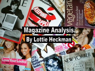
  • 2. Masthead - Uses Sans serif font which is Straight forward and informal. the pink font is used because the magazine aims at The female gender and the colour pink is associated with that stereotype of the girly teenager. Also this is shown as the word ‘Bliss’ is a name you would expect as it reminds the reader of something glamorous or girly. Barcode- A common convention used on the front cover in order for the consumer to purchase the media product. Main Image- The image connotes the celebrity ‘Taylor Swift’ wearing fashionable clothes and She is using direct address by looking into the camera this is a form of interaction as the audience may feel connected with the image of the front cover. She is the main focus to the front cover which attracts the audience to read the magazine. This also supports the ‘Male Gaze’ because teenagers look “at” her hoping to be like her and look at her as a role model. Date and price- This is a common convention you would expect in all magazines. When the price is displayed in smaller font it is usually a convention that the company doesn’t want it to stand out as it is not as appealing to the audience. The price of £2.50 also reflects on the socioeconomic status of the working class. Sub image- This is used to advertise what is featured inside the magazine which is used to attract the audience in order for them to read the magazine. Pug - This stands out on the front cover in order to draw in the audiences attention to look at the ‘Latest fashion’. Buzz word- Using words such as ‘ Exclusive’ draws in the audience as it makes The consumer feel more involved as if they are the first ones to know the gossip. This is also reveals the genre being a gossip magazine. Layout- Very Colourful layout using lots of bright pinks and blues in order to follow the representation of females. Also from the layout we can work out it is a cheaper (weekly) magazine as the page is very busy full with captions, pictures and text. Sub Heading- Uses a good use of alliteration which is catchy in order to gage the audiences attention. Also a black background also brings more focus to the text because of the contrast of colours.
  • 3. Headline- The contents title connotes a sans serif blue colour font, but they also put the month of the issue which is used to inform the consumer when the issue is. Although the contents page is not from the same magazine as the Bliss front cover as we can see from the dates, we can recognise that is the same magazine organisation from the colour blue which fits with the genre of a female teenage girly magazine. Subheading- Bliss have put a section for the ‘features’ telling the consumers which are the most popular stories, and the ones that should be focused on. This creates another attraction for the audience by the way the font is in bold sans serif font . Layout & Colour Scheme- The layout of the contents page is neat and organised; they used the main focus of the magazine with the smaller front cover and the main headlines. The Colours used of pinks and blue also fit the genre of the fashion and gossip magazine. It adheres to a normal stereotypical girly magazine. Front cover analysis- This is a main focus to the contents page as it placed at the top of the page in order to draw the audiences attention. This is used because it directs the target audience to the main headlines which are placed on the front cover which is done through synergy. Sub-image- This connotes shot of a women with the cinematography of a close up in order to reveal to the audience the expression on her face. We can see she is posing with her finger over her lip which denotes that she knows a secret or something she shouldn’t know in order to gage the audiences attention so that they read the page about it. This therefore represents the genre of a girls gossip magazine and the stereotype that girls like to gossip. Sub-image- This connotes the celebrity ‘Tulisa’ from the group N Dubz posing using direct address. This effect is used in order to draw in the audience. Also it fits with the theory of the ‘Male Gaze’ as females look at her and her appearance hoping to be like her and look at her as a role model. Page numbers- Bliss named different sections with different topics within the magazine. This makes the navigation of the magazine a lot easier. They have used bold font for the sub-titles; this is because it is informing the reader the different topics to fit their interests.
  • 4. Feature Headline- The title shows the typography of sans serif bold font which is used to look informal and a chatty style and the use of a quote fits well with this as it makes the audience feel more involved with the article. Main Image- The image connotes the celebrity Victoria Hesketh posing with her hand touching her blonde hair in a girly way which is used to attract the audience into reading what the article is about. This is the main focus to the double page spread as it is covers half of the double page spread. It also creates a ‘Male gaze’ as females look at her hoping to look or inspire to be like her from the way she looks. Also from the mise-en-scene of the artist she is not wearing revealing clothing like most celebrity artists which represents her as being a respected artist and the target audience of young teenagers will look up to her. Sub-images- These are secondary features which is used as a purpose as it links to the main story. We can see that it links to the main story as it is the same lady portrayed in the main image. Layout- This follows the common convention of a double page spread as it in columns. Also subheadings are used to divide the paragraphs which use the typography of bold font which is used to break up the text which is more appealing to read. Also pictures fill up the majority of the page because it is more attractive to look at in the reader perspective. Quote- The use of this common convention is a good way to engage the audience to read the article as it is used as a teaser. Also this fits with the genre of gossip magazine and the target audience of teenagers as they are interested in finding out the party life of celebrities. Masthead- includes the name of the magazine organisation which shows that synergy has been used throughout the magazine. However we can see from the Bliss front cover and contents page I analysed that its not from the same magazine from the colour of the font. Colour scheme - Its a complimentary colour scheme as the colours purple and yellow are opposite on the colour wheel which also fits with the target audience of the magazine of teenagers as they stand out because of the contrast in colours which draws the audience in.
  • 5. Masthead- Uses bold, black Serif font. The title has been partly covered by the artist ‘Katy Perry, this tells us that the magazine company is very well known to its audience and can be easily recognised. The title of my chosen magazine is `blender` magazine. The meaning of `blender` is a person or a thing that blends in no matter where he/she is. The conventional use of the word “blender” as the title suggests that the magazine is aimed at the typical cool people. Main Image- The image connotes a medium shot of Katy Perry wearing a skimpy outfit which is used to reveal the mise-en-scene of what she is wearing. Her facial expression is cool and shows a little sign of vulnerability. The target audience for blender magazine are mostly young men because they have been dressed in a way that to appeal to men. She is using direct address by looking into the camera this is a form of interaction as the audience may feel connected with the image of the front cover. Header - Uses a strap line to advertise the USP (unique selling point) of the magazine. The font of ‘Free Downloads’ is in bold lettering, this is used to stand out so that it catches the audiences eye and then buy the magazine. Secondary Feature- ‘ Metallica’ this attracts the target audience who are interested in metal and rock. Feature Headline- this links to the main Image as the female artist is called ‘ Katy Perry’ which attracts the target Audience of people who are interested In pop, majority being Pop. The text Is larger than the other text in order for It to stand out. Sub-Heading- ‘BI-CURIOUS BABE ’ This is an alliteration which is informal text is used in order to catch the audiences attention and gives the audience the idea that the particular story is about the figure on the front page. Colour Scheme- Only three main colours are used in the magazine (white. black and white), this is a convection used by most music magazine to create uniformity. Barcode- A common convention used on the front cover in order for the consumer to purchase the media product. Price- This is a common convention you would expect in all magazines. The price is displayed in smaller font which indicates that the company doesn’t want to show it off the price because it is not as appealing to the audience. The price of £4.00 also reflects on the socioeconomic of a higher status.
  • 6. Main Image- This connotes ‘Katy Perry’ wearing a dress holding a large mushroom. This portrays the characteristics of her as she is an abstract person and is a very unique artist. Also the image synergises with the front cover as ‘Katy Perry’ is represented in both of the pages. Heading- With the contents title they used the back serif font which is similar to the masthead on the front cover which shows that synergy has been used. Underneath the title is information about the magazine which provides the consumer with the date of the issue. Quote- This is a common convention on a contents page. A quote is a nice way to make the audience feel more involved with them. It adds a bit of a personal touch. Also we can tell from the quote that it fits with the music genre as she uses the word ‘music’ which means she is clearly talking about her career. Sub Heading- The subtitle connotes bold sans serif font in the colour pink in order to stand out against the white background. The word ‘features ‘ is used to tell the consumer the different main sections of the magazine and the ones that should be focused on. This creates another lure for the audience. Website- This convention promotes the magazine more however they have placed it at the bottom of the page therefore does not stand out very much as most of the focus is on the main image. Page numbers- Blender have given the different artists a section of the magazine. This opens their target audience to a much wider audience as it is not focused on only one artist but a variety of different music genres such a pop, rap and rock . This also creates a lure with the magazine as people would want to read the magazine to see their favourite artist. The artists names are written in black which is used in bold letters in order to stand out and in contrast with the white background.
  • 7. Main image- This is the main focus to the double page spread as it is covers half of the double page spread. We see a a black and white image which is used to fit the genre of ‘House music’. ‘Katy Perry’ is wearing the same outfit as in the front cover which shows that synergy has been used to produce this. The celebrity is also represented as sexy because the figure in this magazine is dressed in a way that appeals to men. Also the image features ‘Katy Perry’ as she is a stereotypical ‘perfect’ celebrity because the magazine has aimed at the stereotypical ‘normal, young, beautiful people’. Also the way she is positioned links to the story as she has her fists up as if she is about to have a fight with someone. Also this images uses Laura Mulvey’s theory of the ‘Male gaze’ which men see her as a sex idol and women judge her appearance and idolize her. Main Heading- The font used is black serif and it tilted to make it stand out. Also ‘Girl on Girl’ is a pun as the writer has implies that the story is going to be based on ‘Katy Perry’s’ childhood but also links to her song ‘I kissed a girl’ however, it depicts that she is having a fight with someone which conveys conflict in the music industry. Colour Scheme - The only colours used are black and white which are a good combination because they contrast with each other which makes the page look more interesting to look at. Also we can see from the colours used that the magazine would attract the target audience of adults as it looks more sophisticating that a traditional magazine. Text - The text is split into two columns which is conventional of a double page spread. However, the text takes up nearly half of the page and is not broken up which is unconventional. This usually would appear overwhelming and put off the reader. Also we can see that it would attract the target audience of young adults as the editors believes that there is no need to break up the text as they believe the audience is sophisticating enough to read it anyway.
  • 8. Masthead - Uses white serif font in contrast with the background which is used to make the magazine stand out. Puff- ‘ THE WORLD’S BIGGEST DANCE MUSIC..’ Trying to emphasise its own importance in the market Which is another reason why You should buy it. This also creates a USP for the magazine. Barcode- This is not a very appealing convention however is a necessary part of a front cover. Main image - This is the main focus of the front cover as the cinematography of a long shot is used to reveal the skimpy costume the model is wearing to portray that is it a summer issue. Also her posture reveals that she is in a ‘party holiday destination’ by the way she has her arm up as if she is listening to music. Freebie- This is a great way to draw in the audience because they feel they are gaining out something out of purchasing the magazine and also makes the company different and unique compared to other competitors. This is therefore the Unique Selling point (USP) of the magazine. Colour scheme- The colours of turquoise, yellow are complementary colour scheme because they are opposites on the colour wheel. The colours which are all bright are used to attract the audience. This is used for young audiences but also is used to fit in with the ‘summer’ theme. Feature Headline- This Is the largest serif text used is designed to grab the target audience’s interest and also is a great way to sell the magazine because it combines with an offer ‘cut price’ which makes the audience think they can get something cheap. Also the country ‘Ibiza’ is chosen because although it is a holiday destination is links with the party music as it where young people go to party. Which therefore reveals the target audience of the consumer which is young adults (‘party animals’). It also appeals to the target audience that consists of the psychographics of interests in clubbing, dancing, listening to music and drinking alcohol as it states ‘Dance for free’ and ‘Drink Cheap’ which stereotypically states that all people who enjoy clubbing like to get drunk and go wild. Sub Image- This gives the audience a sneak peak of what is inside the magazine so that the consumes continues to read the magazine in order to find out more information. The cinematography of a close up shot is used to reveal the detail on the persons face.
  • 9. Logo- Mixmag has put their brand name on their magazine on the top left hand side because It is the first place in which the consumer looks at. They have used the same serif font so that the consumer is able to identify the magazine. Masthead - The word contents in a typical convention we would expect to see as it reassures the reader what page it is. The font is serif and colour is white in contrast with the black in order to stand out which fits nicely with the genre. Basic Colour Scheme- The basic colour of a black background As it makes it easier on the eyes and also fits with the genre of dance music as it reminds the consumer of being in a club. Also we can see it is not the same contents page as the front from the lack of colours used as they are not consistent. Main Image- Mixmag have used a striking image of lots of people dancing in club which fits with the genre of dance music as it is what you would expect to see at a party or a club however, they have ignored any gutter space and have written over the image showing that that writing is more important than the photo. Freebie- This draws in the target audience as they feel they are gaining more out of the magazine which will want them to stay loyal to the magazine. Date- The date is placed at the top to show the audience what issue it is and is in yellow sans serif font so that the audience recognises this. Sub heading- Mixmag put a section for the ‘features’ telling the consumers which are the most popular stories, and the ones that should be focused on. This creates another lure for the audience. List of contents- This is a convention essential for the contents page however Mixmag have hidden it away front the main feature of the image which is more attractive to look at.
  • 10. Main Image - The main image is the main feature on the double page spread. It connotes two females in a club environment having fun which is portrayed by the way the girl has her two fingers up and the mise-en-scene of the glasses and hat she is wearing. This represents the genre of the magazine of being a dance music magazine. This is also shown by the lighting in the image and the colours of yellow and orange in the corner of the image which conveys that it during the summer in a hot destination such a ‘Ibiza’ which is also known as a clubbing destination. Which shows that synergy has been used throughout the magazine as this is also portrayed in the front cover and contents page. Secondary features- The images connote young adults partying in a club which links to the main article and the main image. It also appeals to the target audience that consists of the psychographics of interests in clubbing, dancing and listening to music which is represented by the position of the female in the club dancing with her hands in the air. Also the mise-en-scene of the man holding alcohol also fits with the genre as young adults are stereotypical seen as ‘drunken party animals’. Colour scheme- The colours used on the double page spread are black and pink and white which is typical for the genre of the dance magazine using a ‘house style’ which reminds the consumer of being in a club. Also the use of these colours contrast well which makes it stand out more. Also the colours are very sophisticating looking compared to cheap magazines who use random bright colours such a yellow, pink, orange etc, which also shows that the price of the magazine is slightly more expensive which reflects the target audience having a higher socio economic status. Layout- The layout of the double page spread is conventional as the text is placed in columns' and broken up by using sub heading and sub images which makes the article more appealing to read for the consumer and more attractive to look at. Caption- This is a convention which provides a brief summary of what the main image is based on in order to inform the consumer of what is happening making them feel more involved with the magazine.
  • 11. Masthead - This reveals to the reader the company of the magazine which gives the company recognition. the white font used is sans serif and is put in front of a pink background in order for it to stand out. It also reveals the genre of the magazine as we can see it is a female gossip magazine from the colours being used. Colour Scheme & Layout - The use of bright colours such as yellow, pink and blue and the layout being very crowded and busy reveals that it is a cheaper weekly magazine. Also the front cover layout is placed in three columns which is a common convention on a magazine. This is conventional of a a front cover of this genre of a gossip magazine because it makes the magazine stand out and draws in the audience to want to read the magazine. Pug- This convention is used in order to grab the audiences attention so that notice that its unique compared to other magazines in the same market of the genre of gossip which gives the product more of a demand. Price- The price of 95p is made to stand out as it the colour of the font is yellow. The price also reflects the socio economic status of unemployed people or lower class. Feature Headline- This is the largest font used and the font is sans serif black bold font which is designed to grab the target audiences interest. Also it follows the genre of gossip by the language used. Date, issue number & website- This is a common convention that you would expect on the front cover to inform the reader when the magazine was released and also promotes the magazine more by placing the website on the front cover. Barcode- This is not a very appealing convention however is a necessary part of a front Cover in order for the consumer to purchase the magazine. Main Images- Although this magazine does not follow the usual convention of one main image however both images link to the feature headline and also fits with the genre of a gossip of the magazine as we can see from the expression on the celebrities faces which tells the audience some sort of drama is occurring.
  • 12. Puff - This header is used to catch the audiences attention as it is the first thing the audience looks at. The sans serif yellow font is used in order to stand out trying to emphasise its own importance in the market which is another reason why the audience should purchase the magazine. Also this is the Unique Selling Point (USP) of the magazine. Editors letter - This is feature in the contents page to welcome new readers, outlining what’s distinctive about this issue. An image of the editor and her signature is used in order to make the audience feel more involved with them. It adds a personal touch. Pug- This is used in order to focus the audiences’ attention on the main image. Serif font is used to make it look more interesting and they also used the masthead in a different context to sound quirky and unique. This shows that synergy has been used. Main Image- This connotes an image of the celebrity model ‘Pamela Anderson’ in the Big brother house which links to the front cover where big brother is mentioned which shows that synergy has been used. Also this reveals the genre of the magazine being gossip as it states in the caption that it is “rumoured” that she is entering the house. This is stereotypical to the target audience of females as they love to know the juicy gossip. Pamela is represented as a sex object towards males by the mise-en-scene as she is wearing a short dress with one strap falling off her shoulder. She is using direct address by looking into the camera this is a form of interaction as the audience may feel connected with the image of the front cover. This shows the ‘Male Gaze’ as both males and females look ‘at’ her and admire or judge her by her appearance instead of their actually point of view and their perspective. Page numbers- New! named different sections with different topics within the magazine. This makes the navigation of the magazine a lot easier. It also uses a purple background behind the different subtitles in order to stand out . Secondary Feature- Uses social networking sites, Twitter, to promote the magazine because the target audience is represented as young people who love using new technology. Website- This convention is common on a contents page and is placed at the bottom of the page because it is the least important to the reader.
  • 13. Feature headline- The main headline uses the typography of sans serif to appear informal and friendly. They have used quote marks to make it appear personal a if it was the actual words from the celebrity exclusive to the magazine. Also we can see from the heading that the target audience is for females from the language used such as ‘sexier’ as women are known to be more conscious about their weight and appearance. Also black font contrasts with the white background in order to stand out. Main image- The image reveals the celebrity Gemma from the programme ‘The Only way is Essex’ which is targeted at the same audience who reads the magazine which are those who within demographics are a lower social class and spending power. It also follows the genre of a gossip magazine as women are interested in finding out gossip about people. Also in contrast with the sub image the mise-en-scene shows her wearing heels which they have intended to do to make her appear slimmer than she actually is. Quote - This is used to make the consumer feel more involved and is used as a teaser to attract the reader in to read the article and to find out more the juicy gossip. In contrast with the Katy Perry ‘Blender’ has high expectations of their readers whereas New! Try to attract their audience as much as possible. Standfirst: Its an introduction of the article and entices the reader into reading it. The typography used it white sans serif font and is highlighted with a pink background which is used in order to contrast the colours to make it stand out. Also the colour pink is used as it follows the stereotype of females as pink is associated with girls. Drop Cap- This is used to stand out on the double page spread and is a common convention. Layout - The text is displayed in columns which is conventional of a double page spread. The text is also broken up which shows the contrast of the questions and answers which is portrayed through the different colour font where the questions are in pink.