1. From Teaching Geography, Second Edition, by Phil Gersmehl. Copyright 2008 by The Guilford Press.
Permission to photocopy is granted to purchasers of this book for personal use only (see copyright
page for details).
248
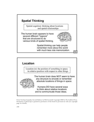
2. Teacher ’s Guide for Transparency 6A
Before the invention of brain-scanning machines, neuroscientists had to work with a rather
crude and inefficient “research design.” Basically, they had to find people who had been
injured in wars or accidents and try to figure out what those people could not do. In recent
years, however, brain-scanning technologies allow scientists to “see” what parts of the brain are
active when people are doing certain kinds of activities. This research has come to a conclusion
that is very interesting for geographers: the human brain has a number of separate “regions”
that are structured to do specific kinds of spatial thinking — thinking about places, conditions
at places, and connections between places.
Activity: Ask students if they have ever:
walked through a crowd without paying much attention and still didn’t run into anyone
reached for a doorknob or light switch without specifically looking at it
walked along a street and turned into the right store without looking at the sign
moved a chair through a door and down the hall without hitting the wall
put a glass back on a table without specifically looking at the table
caught a baseball or football while running
If so, they were using some of the spatial-thinking “tools” that are built into the human brain.
Some of these mental tools (and others like them) can also help people read and interpret
maps, if they learn how to use them. This chapter is about designing lessons that make use of
various modes of spatial thinking that have been identified by neuroscientists and developmen-
tal psychologists.
Teacher ’s Guide for Transparency 6B
The best way to learn how to describe a location accurately is to practice making accurate
descriptions of location.
Activity: Select a prominent feature in the local community and write several sentences that
describe its location in different ways.
Activity: One student chooses a prominent feature in the local community and describes its
location to another student, without naming the feature. That student “decodes” the message,
decides what feature is being described, and “encodes” its location into a different vocabulary.
For example, if the first student describes a store in terms of its street address, the next one
might say it is between two other well-known stores. A third student might then say that it is
across the street from a named park, or a certain number of miles north of a major landmark,
and so forth. See Transparency 4B for more ideas.
Activity: Select the political or economic capital of a major country or another city that might
be in the news. Make a map to show its location. Carefully select some reference features to
include on your map (see Chapter 2), so that they put the location of the city into a spatial con-
text that would be meaningful to the intended audience. Include an inset map to help readers
put the main map into its global and/or continental context. Make sure to indicate the scales of
the main map and the inset(s) clearly.
249
3. From Teaching Geography, Second Edition, by Phil Gersmehl. Copyright 2008 by The Guilford Press.
Permission to photocopy is granted to purchasers of this book for personal use only (see copyright
page for details).
250
4. Teacher ’s Guide for Transparency 6C
As noted several times in the text, conditions at places and connections between places are the
basic facts of geography. In effect, they are the “raw material” for geographic analysis. The
human brain, however, cannot remember all the conditions and connections of every place on
earth. For that reason, we suggest that a teacher should usually try to design lessons that use at
least one other spatial thinking skill, in order to help students organize their geographic facts
while they are learning them.
Two exceptions to this suggestion are activities that focus on the interplay of conditions and
connections and activities that explore multiple perspectives — i.e., how a specific condition or
connection might have different meanings for different people.
Activity: Select a place that is likely to be in the news. Try to identify important forces that con-
verge at that specific location in order to give that place the conditions that it has. For example,
the pattern of vegetation on a mountain can be influenced by wind that comes from some-
where else and may bring moisture, depending on whether it passed over an ocean or a high
mountain on the way. Similarly, the ethnic makeup of a population in a particular place is often
influenced by the events that persuaded people to move from somewhere else. When you have
identified some plausible connections that have an influence on conditions in your place,
design an attractive and easy-to-read poster or computer presentation that uses a mix of graph-
ics and text to present your information.
Activity: Select a place and write a paragraph to describe its conditions as you experience them
— focus on the conditions that strike you as most important, and don’t be afraid to evaluate
them, using whatever criteria you think are important. Then, write a paragraph to describe the
conditions at that place as if you were looking at them from a different perspective. For exam-
ple, if you are a male high-school student, try to describe the place as if you were something
quite different — an elderly woman with a cane, for example, or a blind person, or a female for-
eign traveler with a limited knowledge of English.
Teacher ’s Guide for Transparency 6D
Connections between places can be broadly classified into two groups:
Natural connections are features or forces in the environment that cause something to move
from one place to another — e.g., gravity causes water to flow downhill and form a river,
which in turn becomes a natural connection that can carry pollution from one place to
another. Other examples include winds, landslides, ocean currents, migrating animals,
and so forth.
Artificial connections include the modes of transportation or communication that people
build to connect places. They also include family relationships, political allegiances, cor-
porate ties, and other features that link people in one place with people in another
place. Those personal links help explain other artificial connections — people are willing
to pay to build freeways, subways, or phone lines if they live in one place but work,
shop, or visit relatives in another.
Activity: Select a place that might be in the news. Put a dot in the center of a page to represent
the place, and draw lines that extend outward from the dot in appropriate directions to other
places that are connected to your place in important ways. Then design an attractive and easy-
to-read poster or computer presentation that uses a mix of graphics and text to describe the
connections. You might start by simply writing the nature of the connection next to the line,
and then decide if (and how) you might be able to present the information more effectively.
251
5. From Teaching Geography, Second Edition, by Phil Gersmehl. Copyright 2008 by The Guilford Press.
Permission to photocopy is granted to purchasers of this book for personal use only (see copyright
page for details).
252
6. Teacher ’s Guide for Transparencies 6E and 6F
One of the goals of geographic analysis is to help put new information into perspective. The
Appendix provides some basic information that can be useful for this purpose. For example, if
all Americans knew that the United States uses about 7.5 billion barrels of oil every year, then
public-opinion surveys would not report that a large number of people think that the Arctic
National Wildlife Refuge holds the key to energy security for decades to come. People would be
aware that the ANWR reserves, estimated at between 6 and 16 billion barrels, could not satisfy
more than one or two years of demand.
The process of putting information in perspective can begin with simple comparisons of
basic information such as area, population, production, and income.
Activity: Select a country that might be in the news. Identify a state or group of states that
have approximately the same total area as that country. Devise an appealing graphical design
that shows your country next to or superimposed on top of those states. Then look up the pop-
ulations of the country and the states(s) in an almanac or www.cia.gov/factbook and see how
they compare. Finally, select several other variables that may be informative, such as average
per capita income, life expectancy, miles of highway, or percentage of the population under
age 15. Design an effective layout that combines text, tables, and graphics in order to illustrate
that comparison. Somewhere in your layout, you should have a “sound-bite” summary sentence
(e.g., “Bangladesh is roughly the same size as Iowa, but it has more than 50 times as many peo-
ple”).
When comparing places according to criteria such as money income, food production, or
energy consumption, an analyst usually has to adjust for the fact that places have different pop-
ulations. The story does not stop there, however. Depending on the kind of comparison you
are making, it may also be necessary to adjust for other variables, such as land area, life expec-
tancy, income, education, etc. Geographers use a number of mathematical and graphical ways
of making comparisons — pie or bar graphs, percentages, densities, per-capita ratios, compar-
ing indices, etc. (see the CD unit on Comparing Places).
The particular kinds of information that you should include depend on the kind of compar-
ison you are trying to make. The integrity of that decision is what separates a fair comparison
from one that is misleading, regardless of whether the misinformation is accidental or deliber-
ate.
I’ll leave it to the reader to decide whether the following statement is good information or
misinformation — it turned up as the number-2 hit in a Google search on 7/21/07:
“Studies of the ANWR coastal plain indicate it may contain between 6 and 16 billion barrels
of recoverable oil (between 11.6 and 31.5 billion barrels in-place). With enhanced recovery
technology, ANWR oil could provide an additional 30 to 50 years of reliable supply.”
www.anwr.org
253
7. From Teaching Geography, Second Edition, by Phil Gersmehl. Copyright 2008 by The Guilford Press.
Permission to photocopy is granted to purchasers of this book for personal use only (see copyright
page for details).
254
8. Teacher ’s Guide for Transparencies 6G and 6H
Project: Find a feature that is likely to have an effect on nearby places. At the scale of a state or
city map, your features may be a point (e.g., a powerplant or mall), a line (a freeway or bike
path), or an area (a suburb or wilderness). Show the location of your feature on a satellite
image, aerial photograph, or reference map. Then use a line or semi-transparent color to iden-
tify the “aura” of inf luence around your feature — the area where your feature is likely to have a
noticeable beneficial or adverse effect. Design an effective layout that combines text and graph-
ics in order to explain that inf luence.
Issue 1: The nature of influence. A place can have different kinds of influence on different
neighbors. A new airport, for example, can be profitable for construction companies,
beneficial for some local businesses, a nuisance for a shopping mall, and a disaster for
an opera-under-the-stars in a park. As a result, some pairs of features (for example,
courthouses and law offices) often occur near each other, while other pairs of features
seldom occur close to each other (bars and schools, for example, or sewage treatment
plants and high-income residential areas).
Issue 2: Directional bias. The influence of a particular land use or project often extends far-
ther in some directions than in others. Wind, for example, carries air pollution farther
in some directions than others. A good analyst, therefore, should not simply assume
that the “aura” of a feature is a circle around it (or a symmetrical band along the feature,
in the case of lines such as highways or powerlines).
Predicting the impact of a smokestack, toxic waste spill, earthquake, or other natural or man-
made hazard is one of the major uses of Geographic Information Systems. A GIS is a computer
system for storing, combining, and displaying geographic information about places. The list of
commands in a GIS usually includes one that creates a “buffer zone” around any specified
point, line, or area. The program can then locate and display information about the environ-
ments, populations, or buildings that are in the “at-risk” zone. This is fairly easy to do for static
features that have equal influence in all directions — the problem becomes conceptually more
difficult (and politically much more controversial) when the location of the problem can
change and/or its influence can extend farther in some directions than in others. Of course,
that is precisely what happens with things like tornadoes, toxic waste spills from tank trucks or
railroad cars, noise from an airport, and fallout from terrorist bombs.
255
9. From Teaching Geography, Second Edition, by Phil Gersmehl. Copyright 2008 by The Guilford Press.
Permission to photocopy is granted to purchasers of this book for personal use only (see copyright
page for details).
256
10. Teacher ’s Guide for Transparencies 6I and 6J
As noted in the text, the process of regionalization is basically a form of classification. People
try to simplify the world by noting places that are similar to each other and located close to
each other. Putting those places into groups can make them easier to remember.
Activity: Find some phenomenon that has been portrayed by using dot maps (e.g., crimes or
boarded-up houses in a city, acres of a particular crop in a state, members of a particular ethnic
group in a country, etc.) Try to draw a smooth line that encloses the major concentration of
this feature. The desired result is a colored area that shows the “region” characterized by the
presence of this specific feature.
Then try to identify the factors that limit the extent of your region in different directions.
Make maps of those factors, if desired, and arrange your maps and text in an attractive layout
that shows the extent of the region and the factors that limit it. You might want to combine
maps for several features of the same kind (e.g. different crops, languages, ethnic groups, reli-
gions, or architectural styles), and adjust your boundaries until you have a single multi-area
map that could be entitled something like “crop regions,” “ethnic regions,” “architectural
regions,” etc.
The criteria that you choose to define your region are important, because the shape of a
region may change if you choose a different feature (or group of features) as the key character-
istic of the region. Awareness of this is especially important when a regional map has been
made to support some kind of private investment or government policy.
For example, officials in many cities have drawn lines around areas that have a lot of pov-
erty, unemployment, deteriorating housing, particular kinds of crime, homelessness, etc. They
give the resulting region a euphemistic name, such as “urban enterprise zone,” and they reduce
taxes and/or provide other subsidies for businesses that choose to locate within the area. The
purpose is to improve the neighborhood by bringing more investment, jobs, and income into
the area.
What’s the problem with this? From a spatial analyst’s point of view, the major problem is
usually at the boundary around the region — the line that someone had to draw on a map. Out
in the real world, a location just inside the boundary might gain thousands of dollars in subsi-
dies and tax breaks, while people just outside of the boundary are not eligible for these bene-
fits, even though their property might be almost identical in age, condition, crime vulnerability,
etc. In fact, if a different analyst made a map by using a different list of features, or by weight-
ing the features in a different way, the neighboring property might have been included in the
enterprise zone.
To minimize the number of these “border disputes,” analysts often adjust their maps so that
regional boundaries run through major barriers, such as railroad yards, multi-lane freeways,
parks, cemeteries, etc. This does not actually solve the border questions — the properties right
across a freeway might still have almost identical characteristics — but at least it makes them less
noticeably arbitrary.
257
11. From Teaching Geography, Second Edition, by Phil Gersmehl. Copyright 2008 by The Guilford Press.
Permission to photocopy is granted to purchasers of this book for personal use only (see copyright
page for details).
258
12. Teacher ’s Guide for Transparencies 6K and 6L
Environmental limits tend to be gradual, not abrupt. The world is not divided into distinct
“usable” and “non-usable” categories. It is more like a mosaic of sites that range from quite
comfortable through barely habitable to unacceptable. As a result, land uses also tend to occur
as fuzzy areas with blurry transitions rather than distinct regions with sharp boundary lines
between them.
Activity: Choose a street that goes from one place in your community to another one that is
very different in some way (higher or lower, richer or poorer, residential or industrial, Spanish-
speaking or English-speaking). Walk along that street. Stop at intervals, and record the approxi-
mate percentage of the scene that fits one of your categories (e.g., the percentage of signs that
are in Spanish). Make a graph with distance on the X-axis, percentage on the Y-axis, and dots
showing your observation at each stopping place along the street.
Activity: Select an area that might be in the news. Find a map that shows some important envi-
ronmental or economic information, such as rainfall, growing season, family income, average
land value, age of housing, percent of population speaking Russian, etc. Make a reference map
of your area. Then draw a line between two points of interest on the map, and make a graph
that shows your information along that line. To make this graph, you will have to determine
what the map says is the value at a number of points that are spaced along your line, and then
transfer that information to your graph.
Examine either graph — do the data values tend to go steadily upward or downward as you
go from one place to the other, or do they stay at roughly the same level and then change
abruptly at some point along the line, or do they go up and down in an irregular manner? If the
change is fairly abrupt, does it occur in the same general area as a change in some other vari-
able? Arrange your map, graph, and text in a layout that explains the transition you observed.
This way of conceptualizing the nature of transitions between areas has implications for pri-
vate investment and public policy. To borrow a concept from ecology, an economic or political
activity probably has a particular set of conditions that are optimum. That is the place where
the activity generates the most profit and/or the least disagreement. As you move in any direc-
tion away from that optimum location, at least some conditions are likely to become less favor-
able, and the activity becomes less profitable. Deciding where to locate activities on this kind of
landscape will almost always be a judgment call — and it is safe to conclude that there will be
plenty of employment opportunities for people who can do this kind of geographic analysis!
259
13. From Teaching Geography, Second Edition, by Phil Gersmehl. Copyright 2008 by The Guilford Press.
Permission to photocopy is granted to purchasers of this book for personal use only (see copyright
page for details).
260
14. Teacher ’s Guide for Transparencies 6M and 6N
According to some neuroscientists, the human brain organizes spatial information in a hierar-
chical manner, with a few major features forming a kind of framework. As we learn more about
an area, we can add other features to our mental map without altering the basic framework.
One major goal of a spatial-hierarchy activity is to help students select useful features to use
as landmarks, so that their mental maps are both accurate and efficient.
Activity: Identify some features that can help you remember where the Equator crosses each
continent. For example, the Equator enters South America at the mouth of a major river
(which one?) and exits at roughly the border between two countries (which ones)? Across the
Atlantic, the Equator goes across Africa by going just south of the big “bulge” of West Africa
and then crossing the northern edge of Lake Victoria. What major river does it cross twice?
Another kind of hierarchy activity tries to get students to identify the components of one of
the many spatial hierarchies that exist in the real world.
Activity: Write my complete address: number, block, street, neighborhood, community,
county, state, country. Each level of that hierarchy can be described with a sentence that has
some proper names and some generic words like town, county, state, and so forth. Here is the
basic form of that sentence: “My ______ is one of many inside a ______ called ______.”
Activity: Find a creek or river near the school. Then try to find out what areas drain into your
creek and what rivers it flows into. For example, if it is a small creek,
lightly shade all of the slopes that go down to your creek instead of another one,
trace the path of your creek on a map and identify the larger creek into which it flows,
shade all the land that drains into the larger creek with a different color,
trace that creek to see what larger river it joins,
and so on until you reach a lake or ocean.
If it is a large river, look upstream to see what smaller rivers flow into it.
All of this is just to provide context for the big question — what happens if someone puts
pollution into that river or creek at a particular place? What other places are likely to be
affected because they are located downstream in the same drainage system? Is the pollution
likely to be diluted by other creeks flowing into the polluted one?
Activity: Interview a store manager and try to make a map of the store’s market area, defined as
the area where most of its customers live. If different members of a class do different stores, it
might be possible to divide the entire community into market areas for different stores of the
same kind — grocery stores, for example, or drug stores, gas stations, and so forth. These differ-
ent stores are all at the same level of a commercial hierarchy. The next level might be a distribu-
tor or warehouse that provides products for a number of stores. That warehouse serves a large
territory that includes the small territories of all the individual stores it serves. Another distribu-
tor might serve a different group of stores in the area to the west, and so on. As if this weren’t
complex enough, each different kind of store (groceries, auto parts, clothing, etc.) may have its
own hierarchy of distributors. Then there are the giant discount stores, with their own hierar-
chy of distribution centers and warehouses. Small wonder that nearly one-fifth of all the jobs in
the United States are part of these interlocking hierarchies of warehouses and stores!
These are the jobs that may be affected if there is a major a change in transportation or sup-
pliers. Citizens need to be aware of the complexity of these spatial hierarchies.
261
15. From Teaching Geography, Second Edition, by Phil Gersmehl. Copyright 2008 by The Guilford Press.
Permission to photocopy is granted to purchasers of this book for personal use only (see copyright
page for details).
262
16. Teacher ’s Guide for Transparencies 6O and 6P
The stately turning of the earth on its axis has two important consequences — it makes day and
night, and it gives each place at the same latitude the same amount of solar energy. As a result,
the world pattern of climate has a great deal of latitudinal regularity:
If a place is near sea level and close to the Equator, it probably has warm weather and
plenty of rain in every month.
If a place is in the western part of a continent about 25 degrees of latitude, north or
south of the Equator, it is probably a desert.
If a place is in the eastern part of a continent about 20 degrees of latitude, north or
south, it is likely to have mild winters, hot summers, and hurricanes in the fall.
Closer to the North Pole, Norwegian people use the word fjord to describe a narrow, steep-
sided valley that was carved by a glacier flowing into the ocean. Similar features occur in similar
situations on the west coasts of Alaska, Chile, and New Zealand. Africa doesn’t extend far
enough from the Equator, so it’s not surprising that the continent has no fjords — it has no
location that is analogous to the fjord area of Norway.
Activity: Select a place on another continent. Then try to find a similar place in the United
States (or in some other comparison area, such as Canada or Brazil, if no analogous place exists
within the United States). Write a paragraph to explain how the two locations are analogs. Los
Angeles and Casablanca, for example, are analogs because both are close to an ocean at about
the same latitude. As a result of their similar situations, both places have long, hot, dry sum-
mers and short, mild, rainy winters — and a predictable annual cycle of summer smog, autumn
fires, and winter mudslides, especially on slopes where fires have removed the protective cover
of vegetation.
To see how topography complicates this latitudinal pattern, look at a world map. It is obvi-
ous that most of the major mountain ranges of Europe and Asia run east-west, whereas the larg-
est mountains of North and South America run north-south. As a result, moisture-carrying
masses of air can move inland quite far across Europe, making agriculture possible far into Rus-
sia. In North America, by contrast, winds from the Pacific Ocean drop their moisture on the
mountains of Washington, Oregon, and California. East of that mountain barrier, Nevada,
Utah, and other “rainshadow” states have deserts. In those states, only high mountains (topog-
raphy again!) get enough rain to support forests. Indeed, the economic history of many western
states can often be summarized quite accurately as a struggle to control the water that falls on
mountains and the minerals that were put in place when the mountains were formed. Not sur-
prisingly, similar struggles are common in analogous regions of Australia, Argentina, and
China.
Do climatically similar places always have similar economies? Of course not. The traits of a
place are the result of many influences. Climate can be a strong influence, but culture, politics,
and history are also important. Let’s get past the pointless debate about which influences are
“generally” the most powerful — the answer always depends on where you are and what forces
are operating in that specific place. It’s like arguing whether genes are more important than
environment — the answer is “yes” in some cases, “no” in others, and “maybe” in still others!
Are analogs always climatic? No, there are other kinds of spatial analogs. For example, Sili-
con Valley, California, and Bangalore, India, could be called economic analogs, because both
economies depend on computer technology and software development (and have a history of
military contracts that support high-tech research). One can also find suburban analogs, cul-
tural or ethnic analogs, religious analogs, etc.
263
17. From Teaching Geography, Second Edition, by Phil Gersmehl. Copyright 2008 by The Guilford Press.
Permission to photocopy is granted to purchasers of this book for personal use only (see copyright
page for details).
264
18. Teacher ’s Guide for Transparencies 6Q and 6R
A geographic pattern is a non-random arrangement of features in a place. The key to interpret-
ing patterns is to understand the different ways in which an arrangement can differ from ran-
dom. For example, the features may be pushed to one side of an area (like the Arab settlements
on Transparency 9C). Or they may be grouped into a cluster in one small part of an area (like
the corn fields in Transparency 7B), or aligned in long strings (like the earthquakes in Trans-
parency 9E), or spread evenly throughout an area (like the roads in West Phoenix on Transpar-
ency 4D).
Activity: Play a modified version of Simon says, in which students arrange themselves into pat-
terns on the playground. For example, Simon says to form a line pattern that goes from the
tree to the swing. Form a ring pattern around the water fountain. And so forth.
This kind of activity can be especially useful when combined with the basic classroom-
behavior teaching in primary grades — careful choice of words while directing students to line
up for the walk to the cafeteria can help build a foundation for geographic pattern analysis in
later grades.
Activity: Describe spatial patterns that you see in photographs, or while on a field trip. At first,
concentrate on features that appear in the home community. Later, you can extend to photos
or maps of other places around the world.
It is important to remember that the point of the activity is not simply to describe patterns.
On the contrary, a spatial pattern is important because it is usually the result of some force act-
ing in that place, and an understanding of the causes and effects of that force can help us
understand the place better. For example, the pattern of vegetation on a Western mountain is a
result of the movement of wind up and down slopes — the resulting non-random pattern of
rainfall has implications not only for natural vegetation but also for human use of the land.
Likewise, the pattern of earthquakes can help us identify fault zones that in turn can lead to
better predictions of what areas might be vulnerable next. The pattern of successful oil wells
can help us figure out where to drill next. In an urban area, the pattern of successful new stores
can help us understand the economic forces that make some locations more profitable than
others.
In short, noticing and describing a geographic pattern may suggest a line of inquiry that is
worth pursuing.
265
19. From Teaching Geography, Second Edition, by Phil Gersmehl. Copyright 2008 by The Guilford Press.
Permission to photocopy is granted to purchasers of this book for personal use only (see copyright
page for details).
266
20. Teacher ’s Guide for Transparencies 6S and 6T
Activity: Find a thematic map that shows an intriguing pattern of information — e.g., a definite
bias toward one side of an area, a cluster in a small part of the area, strings aligned in a particu-
lar direction, etc. Examine thematic maps of other information in the same area. Look for
another variable with a map pattern that is similar to the pattern on your first map (and there-
fore might be related in some way, either as cause, effect, or linked through a third variable).
Choose two or more maps that have similar map patterns and arrange them in a layout with
some text that explains the relationship you have observed.
The decisions made by a cartographer can have a direct impact on the appearance of a
map, and thus indirectly can affect the apparent similarity of two maps. These decisions include
obvious ones, such as the choice of colors or symbol shapes. They also include subtle but often
even more far-reaching decisions, such as
the representation ratio of a dot map
(how many real-world entities does each dot represent?)
the divisions between categories on a choropleth map
the scaling of symbols (what is the ratio of large and small circles?)
the line spacing on an isoline map
This list is basically a restatement of the basic principle of informed map reading — if you want
to get an accurate message from a map, you have to be aware of what kinds of decisions the car-
tographer had to make and the likely consequences of each decision. For example, suppose a
state had two cities, one with exactly twice as many people as the other. In making a scaled-sym-
bol map of city population, a cartographer can choose to make the larger circle twice the diam-
eter of the smaller one, or twice the area, or twice the apparent volume, or any other size ratio
that might seem appropriate. The visual effect, however, is different for each of those choices.
A casual map reader might not examine the map key carefully, and therefore might get a mis-
leading impression from the map.
If we focus too much on the visual consequences of cartographic decisions, we might over-
look some data issues that can have even more impact on the message. These include questions
about the source of the data, the size of the areas used in reporting the data, etc.
A census map, for example, can have a very different appearance if the map-maker used
data reported by census tract or by block group.
A map of crime can look very different if the map-maker shows the actual addresses of each
burglary or just the police precinct in which the burglaries occurred.
A map of disease can look very different if it shows the home addresses of sick people or
the clinics where they were diagnosed and treated.
A map of wildlife will give a different impression if the source of the information is a sum-
mary of feeding observations or a record of nest locations.
A map of elderly population will have a different appearance if the census is taken in mid-
winter (when many are living in hotels, condos, RVs, or mobile homes in southern
states) or in some other season, when people are more likely to be in their “permanent”
homes.
Bottom line? sometimes you have to know quite a bit about a subject to read a map about it! A
map is like a poem or work of art — additional knowledge can usually help us interpret the
work better.
267
21. From Teaching Geography, Second Edition, by Phil Gersmehl. Copyright 2008 by The Guilford Press.
Permission to photocopy is granted to purchasers of this book for personal use only (see copyright
page for details).
268
22. Teacher ’s Guide for Transparency 6U
Places change. The nature and magnitude of change is one of the defining characteristics of a
place. The main task for a geography teacher is to keep the focus on the geographic aspects or
consequences of change, not just the historic fact of change through time!
Activity: Find two photographs of the same area, taken at different times. This is not as hard as
it may sound at first glance. For one thing, many cities have books with titles like “Pittsburgh
Then and Now.” Even more communities have historical societies with staff people who are
more than willing to help you find old photos of specific places. A good old photo provides an
excellent topic for a field trip or independent-study activity: go to the same place and try to take
a picture of the same scene from the same vantage point. Then fill in the Venn diagram on the
Transparency —
What features existed on both photos?
What features were there in the past but are now gone?
What new features have moved in or been built since the old photo was taken?
If doing this with a specific pair of photos seems too easy for your students, you can add com-
plexity in several ways. Have students try to calculate the percentage of past features that are no
longer there, or of present features that existed in the past, and so on. Ask about the sequence
of change — are there some changes that occur and then have an influence on nearby areas,
which eventually causes them to change too?
Teacher ’s Guide for Transparency 6V
The movements of things, people, or ideas from one place to another are some of the most
important geographic facts about the world.
Activity: Arrange students in two lines facing each other (or some other pattern that works
better on your playground or classroom). Ask each group to observe the group across from
them. Then tell one group to close their eyes (or put paper bags over their heads). Point to one
or more individuals on the non-blindfolded group and use hand signals to direct them to move,
silently, to new locations. Then have the blindfolded ones open their eyes and try to figure out
who moved.
Activity: Examine two photographs and try to identify what moved.
Activity: Have students identify the countries where one or more of their ancestors lived prior
to moving to where they now live. Discuss the push or pull factors that might have influenced
their decisions about when or where to move. CAUTION: if your class has a significant major-
ity with a particular kind of family history and one or two individuals with a very different
ancestry, this kind of activity must be done with great care. Some teachers consult with students
or parents before starting an activity of this kind.
Activity: Distribute a table of sources and buyers of some important commodity, such as petro-
leum (data can come from an almanac or the CIA Factbook, www.cia.gov). Have students draw
arrows from sellers to buyers, making the width of each arrow roughly proportional to the
amount of the commodity that moves along that path.
269
23. From Teaching Geography, Second Edition, by Phil Gersmehl. Copyright 2008 by The Guilford Press.
Permission to photocopy is granted to purchasers of this book for personal use only (see copyright
page for details).
270
24. Teacher ’s Guide for Transparency 6W
Activity: Find a sequence of maps that show the spread of something through space — an
ancient empire, a suburb, a disease, a forest fire, etc. Examine the pattern as it changes through
time, and try to figure out whether it is spreading by contagion (neighbors “catching it” from
neighbors), relocation (individuals carrying it to new places as they move), or hierarchical com-
mand (orders moving down through a chain of command). Examine the edges of the pattern to
see whether it has reached a barrier or has just been “frozen” by the mapmaker at an instant in
time and is still spreading. Then try to predict how far it might spread in the next time period.
Maybe even try to make a map that shows the at-risk area or population.
The “null hypothesis” (the outcome we would expect if there are no complicating factors) is
that something like a forest fire, an empire, or a disease will continue to advance in the same
direction and at the same speed as it has in the recent past. Under these circumstances, analysts
can use a variety of equations to predict its future position.
Most things that spread on the surface of the earth, however, have speeds that depend in
part on the conditions in the areas through which they move. A forest fire, for example, can
move faster if it is going uphill, or through an area of low, dry shrubs rather than tall, ground-
shading trees (that’s why it is so much harder to fight fires in California than in Maine). Pre-
dicting the spread of a disease is even more complicated, because people can move and carry
the disease with them, rather than simply infecting their immediate neighbors. Moreover, peo-
ple in the path of a spreading disease may have a different population density or frequency of
contact with their neighbors, or different degrees of resistance to the disease, or they might
take steps (such as vaccination) to protect themselves from the disease. That, of course, is the
basic reason why we try to predict the future movements!
A geographic analysis of diffusion, therefore, usually includes a look at:
the characteristics of the disease (its contagiousness and “normal” rate of spread)
the traits of the population through which it has been moving, and
the nature of the areas into which it is likely to move.
Can we use the same equations to deal with slow-moving things, like the spread of a suburb or
gypsy moth, as well as fast-moving things like forest fires or smoke from a factory?
This question has a surprising answer: yes. The analytical equations are really quite simple:
the devil is in the details, the numbers used to represent things like contagiousness, population
density, resistance, etc. The goal is to make a “good-enough” model, so that we can make deci-
sions about whether we want to do something to change the pattern of spread in the future.
For example, do we want to allow a suburb to continue to expand in the same way as it has in
the recent past? Do we want to try to fight every forest fire, or should we let some of them burn
out naturally? Here’s a messier version of that question: should we use our growing knowledge
of the behavior of forest fires to help us make decisions about how and where people should be
allowed to build houses (or at least get public subsidies to rebuild after a destructive fire)?
And what about predicting the spread of anthrax or radiation after a terrorist attack?
Teacher ’s Guide for Transparency 6X
Activity: Think about the effects of a major invention, such as air conditioning, the automobile,
barbed wire, deepwell pumps, the cotton gin, electric-arc steel furnaces, or the Internet. Put a
large plus sign on places that became more valuable as a result of that invention, and a large
minus sign on places that lost value. Put smaller plus and minus signs on places that gained or
lost less. This kind of map is admittedly sketchy, because it is very difficult to make an accurate
assessment of gains or losses. But the idea behind the map is extremely important: each major
invention can increase the value of some places and cause others to lose value. If people are
hurt in some places as a result of a new invention, it is not fair to call it “their fault”!
271
25. From Teaching Geography, Second Edition, by Phil Gersmehl. Copyright 2008 by The Guilford Press.
Permission to photocopy is granted to purchasers of this book for personal use only (see copyright
page for details).
272
26. Teacher ’s Guide for Transparencies 6Y and 6Z
According to many writers, the goal of education is to help students achieve a basic level of
expertise in thinking. One of the big questions in educational circles is “What constitutes
expertise?” This question can be difficult to answer, but I do not want to get bogged down in
details. Let me offer, therefore, the following short definition of expertise in map use:
When viewing a map, an expert map reader is able to apply more different modes of spatial
thinking, and to apply them more efficiently, than a novice. Moreover, a person who uses
multiple brain areas is more likely to remember information from a map.
Activity: This map shows the locations of “Census places” in the coterminous 48 states of the
United States. Ask students to try to use many different modes of spatial thinking to interpret
this map. Here are some observations one might make after applying each mode of spatial
thinking:
Location:
Conditions: Ohio has a lot of places. Place density in Montana is low.
Connections: It is difficult to find direct evidence of connections on a thematic map of
conditions. An expert map reader, however, can deduce some indirect evidence of
connections by using other forms of spatial thinking, such as pattern analysis. For
example, one could hypothesize that the towns of western North Dakota are con-
nected by railroads that run mainly east-west.
Comparison: Georgia has more places than Wyoming. Ohio has larger places than Idaho.
Aura: Large cities seem to have attracted clusters of places near them. This is particularly
obvious with relatively isolated cities such as Atlanta or Minneapolis.
Region: Megalopolis is a region of closely-spaced cities and suburbs that stretch from
Boston through New York to Washington, DC. The Great Basin is a sparsely populated
region between the Sierra Nevada of California and the Great Salt Lake area of Utah.
Transition: The density of places seems to taper off gradually as you go west from Illinois. It
decreases much more rapidly as you go north. The limiting influence of cold weather,
therefore, appears to be stronger and more abrupt than the limiting effects of dryness.
Hierarchy: Texas has at least six urban areas within it, and each urban area has a number of
suburbs within its metropolitan area. New Mexico has only one major urban area.
Analog: Lake Michigan, Lake Erie, and Lake Ontario each has a major cluster of populated
places near its southwestern tip. So does Lake Superior, but the cluster near this cold
lake is much smaller.
Pattern: At a national scale, the overall pattern of places is definitely biased to the east;
more than three-quarters of the places are in the eastern one-half of the country. At a
state scale, Utah and Colorado have north-south strings of medium-sized places; the
Dakotas and Kansas have east-west strings of small places. There are clusters of cities
near important harbors, such as San Francisco Bay, Puget Sound, Chicago, Tampa Bay,
and the mouth of the Hudson River in New York. The places of Arizona are mostly in
the southern half of the state. The places of Nebraska are biased toward the east. Places
in Oregon and Washington are clustered near but not on the west coast.
Association: Many large places are associated with coastal locations. Small towns on the
Great Plains are associated with railroads, which run mainly east-west. The overall pat-
tern of places is strongly associated with the pattern of precipitation — places become
much less common when the rainfall is below about 18 inches. Clusters of places in the
western half of the country are associated with the lower slopes of high mountain
ranges, which are able to capture some moisture from winds forced to rise over them.
Extension activity: For each observation, ask students to identify another state about which the
same comment could be made. Or, make some untrue observations and ask students to iden-
tify the mistakes and correct them.
273