“Oh GOSH! Reflecting on Hackteria's Collaborative Practices in a Global Do-It...
Guide for teaching geography concepts
1. From Teaching Geography, Second Edition, by Phil Gersmehl. Copyright 2008 by The Guilford Press.
Permission to photocopy is granted to purchasers of this book for personal use only (see copyright
page for details).
284
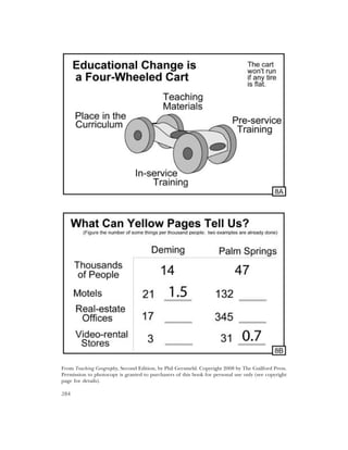
2. Teacher ’s Guide for Transparency 8A
This Transparency is meant primarily to be used in administrative meetings, teachers’ confer-
ences, and on other occasions where there might be a reason to put the process of materials
development and teacher training into perspective.
Teacher ’s Guide for Transparency 8B
To thrive economically, every place needs at least one bigjob – an occupation that brings
money into a community. BIGJOB is an acronym that stands for Basic Income-Generating JOB.
Other textbooks may call this a basic industry, economic base, or core activity.
Most bigjobs produce something for sale to people outside the community. “Produce” and
“sale,” however, can also have different meanings in different places. People in some places, for
example, might produce corn, pulpwood, or iron ore. In other places, people might make ath-
letic shoes, CDs, or missile parts. Still others might sell vacations, radio talk shows, or heart
transplants. And so forth, through a bewildering variety of products, both goods and services.
The question is: how do we teach students to identify the bigjobs in a community? One
alternative is having students memorize lists of places and their products, a tedious activity that
seldom leads to durable learning.
We could start by trying to find a book that classifies communities. For example, Places
Rated Retirement Guide (by Boyer and Savigeau) identifies Palm Springs, California, as one of
the top places in the country to retire. Deming, New Mexico, is on the same list of retirement
destinations, but it is near the bottom.
Both Deming and Palm Springs have some distinctive landscape features that contribute to
their role as places where people can retire and spend their pensions, Social Security payments,
and stock dividends. With all of that money coming in, many residents of both towns earn their
living by providing services to retirees and vacationers. Those workers are doing the bigjobs of
that community. Their places of work are part of the landscape that people have “built” in
order to do those jobs. The Transparency has data about some occupations that serve various
kinds of retirees. Comparison clearly shows that the two communities are different even
though they both depend on retirees for their primary income.
Activity: A telephone book (printed or online) is a good resource for information about a com-
munity. Many occupations and structures in a community are related to its bigjobs – the goods
and services that the people produce to sell or exchange with people in other places in order to
get things they cannot produce. Have students pick a community and try to identify its bigjobs
by looking at the yellow pages of the phone book.
For example, if you suspect that a South Carolina community gets some income from for-
estry (a good guess for any rural area in the Southeast), you might count the yellow-page list-
ings under headings such as “forestry consultants,” “logging equipment and supplies,” or “tim-
ber sales.” It also pays to look in the pages devoted to government listings to see which agencies
have offices there. Look especially at occupation-related departments such as Mine Safety, Nat-
ural Resources, or Energy.
To put the results in perspective, calculate the number of various things per thousand peo-
ple in the community being studied. Then, compare those ratios with national or world aver-
ages (Transparency 8D). The product of this Activity might be a short report (e.g., to a group of
investors) or a poster showing the bigjobs in a community.
285
3. From Teaching Geography, Second Edition, by Phil Gersmehl. Copyright 2008 by The Guilford Press.
Permission to photocopy is granted to purchasers of this book for personal use only (see copyright
page for details).
286
4. Teacher ’s Guide for Transparency 8C
Since we can observe or measure places in so many different ways, it is not surprising that there
are many different kinds of thematic maps. Each major “map vocabulary” (choropleth, isoline,
dot, cartogram, etc.) is designed to show particular kinds of information. For example, a valid
way to show amounts of something such as population or steel production is with a scaled-sym-
bol map (sometimes called a proportional symbol map or a graduated circle map). In this kind
of map, symbols of different sizes show greater and lesser amounts in different places.
Activity: Find a large outline map of the United States (or project this Transparency or another
country or continent on a large piece of paper and trace the outline). Lay the outline on a table
and stack pennies or poker chips on each city to indicate its population. Use one penny or chip
for each million people. The resulting stacks are a dramatic illustration of population geogra-
phy. The activity also teaches some basic place location. You can provide city names and have
students look them up in an atlas, or provide a table of names and numbers but have the stu-
dents create the base map. Proportional symbol maps can be used for any topic that involves
counts or other absolute numbers; other kinds of maps are better for percentages or other
ratios (Transparency 1B).
Teacher ’s Guide for Transparency 8D
One way for advanced students to compare places is to calculate a Comparing Index (other
books call this an Index of Local Importance or a Localization Quotient – we prefer CI, not just
because it is a more accurate description and a simpler term, but also because its abbreviation,
CI, gives teachers a wonderful nickname to use for the index, the “C-ing I” which sounds like
“seeing eye”). (See the CD unit on the Comparison Index.)
This index is a simple way to show how a local area compares to others. A census report, for
example, can tell how many people in an area do such things as work in clothing factories,
speak Korean, or are between 15 and 19 years old. These “raw” numbers, however, cannot say
whether that local figure is typical or unusual. To make raw numbers easier to compare, we fig-
ure some ratios (it’s a great math-across-the-curriculum Activity!).
For example, in 2008, Bangladesh had about 150 million people and 56,000 square miles of
land. Most of the land was usable for farming, although some was subject to flooding. Iowa had
about the same amount of land (also mostly usable for crops), but fewer than 3 million people.
To make those numbers easier to compare, calculate the amount of land per thousand people:
Iowa had about 20 square miles per thousand people (in 2008), whereas Bangladesh less than
half of one square mile.
To make the comparison even more obvious, divide the ratio in each area by the world
average. That gives the number called the Comparing Index. In our example, Iowa had a land-
availability CI of about 2 (20 square miles per thousand people, divided by the world average of
10). This means Iowa had twice the world average land per thousand people. Meanwhile, the
figure for Bangladesh was 0.4 divided by 10, for a CI of about 0.04 – it had one 25th of the aver-
age land per thousand people.
Activity: Give students a table of data (e.g., population density, per capita income, life expec-
tancy) for 10-15 states and the national average (or provide country figures and world averages,
for an international focus). Have them compute CIs by dividing state values by the national
average. Warning: To be valid, CIs must use ratios, not raw data.
Activity: Make a choropleth map of CIs, to allow comparison with other maps (compare Trans-
parencies 8D and 3O; it makes you wonder, no?).
287
5. From Teaching Geography, Second Edition, by Phil Gersmehl. Copyright 2008 by The Guilford Press.
Permission to photocopy is granted to purchasers of this book for personal use only (see copyright
page for details).
288
6. Teacher ’s Guide for Transparency 8E
Here is a quick recipe for drawing a side profile of a topographic map (for more detail, see the
ARGUS or ARGWorld CDs, or NCGE Pathways Publication Number 1, The Language of
Maps):
1. Find (or make) some graph paper with grid intervals that match the scale on your map.
2. Position the edge of the graph paper along your chosen profile line. At every place where
a contour line crosses or touches the horizontal axis of the graph, go “up” from the bot-
tom of your graph and place a dot at the proper elevation.
3. Note the positions of hill tops and valley bottoms along the profile line. Place dots to show
the horizontal positions and elevations for these key features. (Someone who is fairly good
at profile drawing can sometimes skip the other steps and concentrate on these informa-
tion-rich locations).
4. Draw a smooth line connecting the dots. Other contour lines on the map can help shape
the details of the profile – it should slope steeply where contours are close together and
gently where they are far apart. This result is a line that shows the shape of the land as
seen from one side.
5. Optional: Label key features of your profile with names. Add other information (e.g., for-
est cover, density of houses, underlying geology, etc.) with appropriate symbols if you wish
to show the relationship between surface topography and other landscape features.
You could use this same grid with other maps, but it is usually better to design one to fit the
specific scale and contour interval of the map you are using (the contour interval is the vertical
distance shown by two adjacent contour lines).
Activity: Draw a side profile of a region of interest – a ski slope in Colorado, for example, or a
local hill that might be used as a golf course or a minibike trail. You will need a topographic
map; they can be downloaded for any place in the country from www.topozone.com or you could
write to the Map Distribution Center, U.S. Geological Survey, Federal Center, Denver, CO
80225, for a (free!) index map of your state.
Teacher ’s Guide for Transparency 8F
This is a side profile of the ridge at Harpers Ferry (also shown in Transparency 1C). Some of
the slopes are as steep as the stairs in an office building, and the ridge is a thousand feet high.
Before the invention of internal combustion engines (for trucks and tractors) or dynamite (for
clearing land and building roads), getting to the top of a hill this size and shape was a real chal-
lenge. You could walk up, or perhaps ride a horse, but moving something like a 1,200-pound
cannon to the top was very difficult.
The town of Harpers Ferry is located at the only easy gap through this ridge for more than
a hundred miles. The gap was created by the Potomac River. Washington, DC, the national cap-
ital, is only a short distance downstream. Is it any surprise that several of the bloodiest battles in
United States history were fought near this town? (See the CD unit on Harpers Ferry.)
Activity: Find topographic maps of the area around Harpers Ferry, Chattanooga, Vicksburg, or
other major Civil War battles. Have students draw side profiles of the terrain. Then discuss
ways in which the terrain influenced the course of the battles (and why that would not be so
important today). Looking at the interaction between terrain and history helps move the focus
away from mere body counts.
Or, if you prefer a nonmilitary focus, do profiles of ski slopes or hiking trails.
289
7. From Teaching Geography, Second Edition, by Phil Gersmehl. Copyright 2008 by The Guilford Press.
Permission to photocopy is granted to purchasers of this book for personal use only (see copyright
page for details).
290
8. Teacher ’s Guide for Transparency 8G
Names can be misleading. For example, a soil survey is not just about soil.
Every person, family, and society has to make decisions about where to store things. Ask
students to list things their parents store in “weird” places – you know, like a flashlight in the
underwear drawer, or a can of tuna under one leg of a table. In most cases, the “weird” place
turns out to make sense in the context of available space, family needs, and local conditions
(like a wobbly table!).
The U.S. government chooses to store environmental information of all kinds in its soil sur-
veys. Want to know what areas are suitable for campgrounds? The biggest storm a place is likely
to have in 20 years? Where good habitats for deer are? What places would be hazardous for
buildings with basements? What date is safely past the last frost in spring? A soil survey can tell
you. About 2,500 counties have made a soil survey, and (write this down) they are usually pro-
vided free to teachers. Look for the Natural Resource Conservation Service under Department
of Agriculture in the phone book listings for the federal government.
The soil surveys have colorful maps of general conditions in an entire county as well as doz-
ens of detailed maps of smaller areas. The detailed maps look complicated, but they are based
on aerial photographs that show every road, tree, house, and pond. Post the map for a local
area – students can ignore the soil codes as they enjoy trying to identify the features they are
familiar with.
Activity: Give students a copy of a soil survey map and a list of soils that are unsuitable for a
specific purpose, such as building houses or growing corn. The survey will give you that infor-
mation, in tables that are tied to the map via short letter-number codes (it will make sense once
you open the survey — just ignore the technical stuff about horizons and plasticity indices and
so forth; after all, one goal of education is to learn how to focus on the information you need).
Have students color in the unsuitable areas. Then (here’s the kicker), go on a field trip to
see if people are using the land in appropriate ways. Or take pictures for the class to study.
The Transparency shows a piece of land that was used for high-priced houses in Minnesota;
some of the houses were hard to sell, because water got into their basements and caused wall
damage. If the builders had consulted the soil map, they would have seen that construction on
some of these soils was unwise. (What teacher of environmental science could resist: “Isn’t it
fun to see rich people do stupid things?”)
Teacher ’s Guide for Transparency 8H
Activity: Describe a local issue – an environmental question, for example, or a proposal to
build a mall. For several weeks, have students cut articles, editorials, and letters from the news-
paper and try to classify the clippings according to several criteria: pro or con, illustrated or
just text, fact-based or opinion, and so on. Variation: Use number scales rather than either/or
categories – for example, give each article a number, say from 1 for front-page headline to 5 for
really buried, and so on.
Activity: Cut maps out of the newspaper, post them, and have students rate them according to
several criteria: clear or confusing, easy or hard to read, correct or questionable in use of con-
ventional cartographic “grammar,” fair or unfair in presenting issues. If an important story is
not sufficiently accompanied by maps, write a letter to the editor asking why the paper did not
put an issue of such obvious importance into its geographic context.
291
9. From Teaching Geography, Second Edition, by Phil Gersmehl. Copyright 2008 by The Guilford Press.
Permission to photocopy is granted to purchasers of this book for personal use only (see copyright
page for details).
292
10. Teacher ’s Guide for Transparency 8I
Using a road map is a fundamental geographic skill. Satellites, global positioning devices, and
electronic maps are starting to become tools for use in personal navigation. Even so, we occa-
sionally need to be able to translate a map view of the world into “egocentric” directional words
such as left, right, and straight.
For 20 years, my research has involved interviewing government officials in small towns.
For a typical interview, I stopped near the edge of town, called the official, reminded him or
her that we had an interview scheduled, and then asked for directions to the office. In my sam-
ple of 300-plus counties, the range of approaches to giving directions was astonishing. For
example, they might start by asking me (I am not making this up!):
Are you familiar with [town-name]?
No, I’ve never been here before.
Do you know where the supermarket is?
No, I’ve never been here before.
Well, go out on the highway and head toward the high school.
I have not been here before. Which way is that?
Toward town from where you are.
OK, I can manage that.
Go about three, maybe four stoplights or signs,
OK, what then?
Then turn left where the old Amoco station burned down in ‘97.
What’s there now?
You know, next to where the guy lived who married Dr. Jones’s daughter
How far is that from here?
About four or five stoplights. Then go left; we’re behind some stores. You can’t miss it.
Wanna bet?
Activity: Hand out copies of a map showing a destination of interest. Ask students to plan a
route from a specified location to the destination. Then have them describe that route as if they
were giving directions to a traveler. In general, a good set of directions should have:
The number and/or name of the road the traveler should take.
The compass direction and a clearly visible landmark to go toward.
The distance in miles (which can be estimated visually or read on an odometer) rather
than stoplights or blocks, although that type of thing could be supplemental.
A “warning sign,” preferably a cross street, that comes just before a turn.
A prominent landmark at key intersections (e.g., Post Office).
The name or number of the street to turn on (“get in the left lane; you turn left on Green
Street just after you pass the Post Office”).
The direction of the turn, in both egocentric and geocentric terms (“turn left, so you’ll be
going east”).
A prominent street or landmark that says “you’ve gone too far” (e.g., “if you see Oak
Street, you’ve gone past the turn”).
And so forth until the arrival at the destination.
Teacher ’s Guide for Transparency 8J
This one is fairly self-explanatory; I saw some figures in a newspaper and was curious about
where the countries were. (Selling high-tech weapons to dictators bothers me. Maps like this
will help me judge candidates in the next election. That’s geography for life!)
293