
Recommandé
Contenu connexe
Tendances
Tendances (19)
Similaire à Kanye west media studies
Similaire à Kanye west media studies (20)
Plus de lucasyatesandersen
Plus de lucasyatesandersen (20)
Kanye west media studies
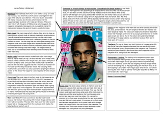
- 1. Lucas Yates - Andersen Comment on how the design of the magazine cover attracts the target audience: The whole design of the magazine if very appealing to its target audience because of the use of colours from blue, pink and black and the actual main image itself because the artist Kanye West is very Masthead:The masthead of this front cover ‘VIBE’ is large and bold popular with teenagers and young adults at the moment who are mostly male so to use some like and the colour is a vibrant blue which stands out straight from the this as the front cover attracts a large amount of people both male and female. Also, the other page which will grab your attention. The colour blue in associated artists used on the front cover from, Britney Spears and The Dream are also current in hip hop/rap with mainly males but also females which implies that this genre of music so this is also very appealing to the magazines target audience because they are magazines target audience is for males and females. The word known artists who are current and this target audience are interested in current music. ‘vibe’ links in with the genre of R&B and rap which suggests this magazine is targeted at teenagers and young adults mainly the male gender because this genre of music is usually for males. Colour:On this magazine cover there are only three colours used for the text, blue, pink and black. The pink targets at females and the blue and black targets at males. The colours are bright and vibrant not dark which Main image:The main image which is Kanye West which is close up shows that the target audience is for a younger generation not for middle framing shows a direct mode of address towards the target audience. aged people and above. Due to the colours being vibrant and bright There is minimal facial expressions coming from the main image, everything on the page catches your attention because there are no Kanye West looks serious which puts a statement forward on how he bleak parts of the cover. is about his music. The first thing that you notice when looking at the magazine cover is the main image which implies that the main focus Typefaces:The use of vibrant and bright colours on the page show it is of this magazine will be about this artist, everything else on the page less formal than other magazine because they use less bright colours is noticed after looking at the main image. The image covers up which show what type of target audience the magazine has. The use of some part of the masthead which definitely shows that Kanye West slanted text also shows it is less formal than other magazine and the is the main story. magazine is for young adults and teenagers. Model credit:The model credit is located next to the main image . Photography Lighting: The lighting on the magazine cover is light which is ‘Kanye West I am rap’, we know that this is the model credit which emphasises the brightness of the vibrant colours. The lighting because it links in with the main image and it also says a brief part of around the main images face is light which makes Kanye West very the story on Kanye west. One part of the model credit is a different clear to the audience. Due to the use of lighting the main image stands colour to the rest which suggests that this is made to be important for out from everything else on the page making him the whole focus. A lot the reader and that they should take notice. The colouring of the of the lighting is around the main images eyes which draws you to them model credit is pink which is a colour used when targeting the female showing the direct mode of address making the target feel as if they are gender so this shows this magazine is also targeting females not just connected to the main image. males. Design Principals Used? Cover lines:The cover lines on the front cover of this magazine are ‘HIS 50 GREATEST SONGS (AND 10 TO DELETE)’ because it is big and bold and has other information below the ‘kicker’ about the cover line. Additionally, the cover lines are linked in with the main image which creates the impression again that Kanye West is going House style:The whole colour scheme on the front cover is of to be a large focus in this magazine. The cover lines are associated three main colours which are blue, pink and black which are all with the music genre of rap which implies that the target audience is in some way linked with males and females. They way that the for mainly males because they enjoy this genre of music not females, colours have been used shows what parts of the front cover the most likely teenagers and young adults. designers want the target audience the most because some parts of text stand out more than others. On a whole the Main cover lines:The main cover line is also the model credit structure of the front cover is quite formal, the text is on straight because it is the main focus along with the main image and they both lines and the font is hard edged. On one area of the front cover, link in with one another. The size of the main cover line is the second text has been slanted which is the model credit which implies largest text on the page apart from the masthead which implies the again that Kanye West is the main focus in the magazine. The target audience needs to see it. formality of the front cover shows its target audience is older teenagers and young adults not young teenagers.