
Recommandé
Contenu connexe
Tendances
En vedette
Similaire à Front Cover Essay
Similaire à Front Cover Essay (20)
Plus de lydiaplatts
Plus de lydiaplatts (17)
Dernier
Dernier (20)
Front Cover Essay
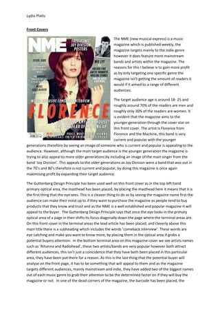
- 1. Lydia Platts Front Covers The NME (new musical express) is a music magazine which is published weekly, the magazine targets mainly to the indie genre however it does feature more mainstream bands and artists within the magazine. The reasons for this I believe is to gain more profit as by only targeting one specific genre the magazine isn’t getting the amount of readers it would if it aimed to a range of different audiences. The target audience age is around 18- 25 and roughly around 70% of the readers are men and roughly only 30% of the readers are women. It is evident that the magazine aims to the younger generation through the cover star on this front cover. The artist is Florence from Florence and the Machine, this band is very current and popular with the younger generations therefore by seeing an image of someone who is current and popular is appealing to the audience. However, although the main target audience is the younger generation the magazine is trying to also appeal to more older generations by including an image of the main singer from the band ‘Joy Division’. This appeals to the older generations as Joy Division were a band that was out in the 70’s and 80’s therefore is not current and popular, by doing this magazine is once again maximising profit by expanding their target audience. The Guttenberg Design Principle has been used well on this front cover as in the top left hand primary optical area, the masthead has been placed, by placing the masthead here it means that it is the first thing that the eye sees. This is a cleaver thing to do as by seeing the magazine name first the audience can make their mind up to if they want to purchase the magazine as people tend to buy products that they know and trust and as the NME is a well established and popular magazine it will appeal to the buyer. The Guttenberg Design Principle says that once the eye looks in the primary optical area of a page in then shifts its focus diagonally down the page where the terminal areas are. On this front cover in the terminal areas the lead article has been placed, and cleverly above this main title there is a subheading which includes the words ‘comeback interview’. These words are eye catching and make you want to know more, by placing them in the optical area it grabs a potential buyers attention. In the bottom terminal area on this magazine cover we see artists names such as ‘Rihanna and Radiohead’, these two artists/bands are very popular however both attract different audiences, this isn’t just a coincidence that they have both been placed in this particular area, they have been put there for a reason. As this is the last thing that the potential buyer will analyse on the front page, it has to be something that will appeal to them and as the magazine targets different audiences, mainly mainstream and indie, they have added two of the biggest names out of each music genre to grab their attention to be the determined factor on if they will buy the magazine or not. In one of the dead corners of the magazine, the barcode has been placed, the
- 2. Lydia Platts dead corners are where people do not tend to pay attention to, and as the barcode is not something that is seen as important it is a good place for it to be put. The main image on the front page sets the house style for the magazine as the colours in the image are all pastel colours ranging from reds, creams and greens .The colours of the image have influenced the colours of the text that has been used on the cover as they have to be calm and subtle and this is exactly what has been done as white, black and red have been used, these colours done strike you as subtle colours but in relation to the image they have worked well together. The use of red text is very cleaver as Florence is known for her bright red hair and it works well as it gives the cover more colour and is appealing to the eye. Black is used to make appealing words in article titles to stand out, by making them stand out it catches your eye and then you want to read the article. The lead article has been placed across the page in large red writing, compared to the other colours on the page this title stands out and jumps off the page. The artists name ‘Florence’ is the main word used in the lead article, by using just the name as the title appeals to the magazines specific audience as Florence is very current and popular to the genre of this magazine. So therefore the target audience will be attracted to this as it relates to them and it is something that is current and popular. Other words that have been used within the article title are ‘world exclusive’ by using these words makes the magazine unique and different from every other magazine because no one else has this story, it is ‘exclusive’ to this particular magazine. Knowing that this article is ‘world exclusive’ draws people in to buy the magazine because this is the only magazine that has this article and they won’t find it anywhere else. The masthead on the magazine is the largest text on the front cover, and it has been placed in the top left hand corner of the magazine which is the primary optical area and where our eyes are automatically drawn too. By having the masthead the largest text on the page establishes what the magazine is called, it also appeals to potential customers because, NME is a well known and successful magazine and when seeing this masthead straight away you recognise and trust it so you would then therefore buy the magazine. Overall I believe that this magazine front cover is very successful and well designed, I believe this because every part of the magazine has been though about. You can see how well planned the magazine is through the house style as the colours used relate to the colours on the main image, this is something that I intend to take into consideration when planning my own magazine. Also the use of black text within article titles is something that I will also consider using when planning my own magazine as it makes the articles jump off the page and grab your attention and makes you want to buy the magazine. I think using an image as the magazine back ground is also something I will do when creating my magazine because it establishes the magazine straight away as the image is so big and of an artist/band that is related to the genre of music and magazine. I want my magazine to establish its genre straight away and appeal to its target audience successfully just like this magazine has done.
- 3. Lydia Platts After looking at the NME magazine I now want to look at another magazine of a different target audience and genre and analyse the magazine, the magazine I have chosen is Mixmag. Mixmag is also a music magazine like the NME however its target audience and genre is dance music which is in some ways a niche audience as it is not mainstream music and doesn’t have the following that mainstream music has, however the magazine is said to be ‘the world's biggest selling dance music magazine". The magazine, also like the NME, is published on a monthly basis, I believe the reasons for both magazines being published monthly is that if they were to be published weekly that the magazine would lose profit as in this day and age people do not buy magazines as much as they used to. Therefore by making the magazine monthly they are getting more profit rather than losing any. The target audience age for the magazine, similar to NME, is around 18-25 as the genre of music that it caters for is a very young and now. Although dance music has been going for years it has only just become more well known and popular meaning that the audience who listens to the music are within the younger generation rather than the older generations. Unlike the NME magazine, Mixmag has not used and image of a band or artist as the magazine background, instead it has used an abstract image of a yellow spider against a black background. Although this is unusual for a music magazine it is actually appropriate to this particular genre as the appearances of dance artists/acts are not well known, their name and music is more well known, so if there was an image of a dance artist on the cover, people may not know who this person is and then would therefore not buy the magazine. The Guttenberg Design Principle has been used to some extent on this magazine cover, we see in the primary optical area, which is the top left hand corner, half of the masthead and half of the banner cover line above the masthead. As this is the first place the eye looks it is, in my opinion, the best place to put the masthead as it established the magazine straight away. By placing the banner cover line which in the primary optical area is very cleaver and successful, this is because, the banner says ‘the world’s biggest dance music and clubbing magazine’. By placing the banner above the masthead it makes the magazine more appealing. This is because the magazine name is not a household name and isn’t as popular as the NME and someone buying the magazine may be unsure to buy the magazine because they have never heard of it before, but then they see the magazine is the ‘world’s biggest’ this gives them the trust and confidence in the magazine and influences them to buy it. After your eyes sees the primary optical area it then moves down to the terminal areas, in this area we see the main article title which reads ‘ who is the greatest dance act of all time? Winner
- 4. Lydia Platts revealed inside’ this text grabs the reader’s attention because you want to know who is the best act and therefore you want to open the magazine and find out who is the greatest of all time. The eye then carries on diagonally across the page to the bottom right hand corner, here is where the rest of the articles have been placed. This follows the Guttenberg Design Principle very well as this area is where the eye is attracted therefore by placing the articles here they will be read. This is different to the NME magazine as the articles on that magazine are placed along both sides of the page rather than in one particular area. The house styles of this magazine are black, white and dark yellow; these colours have been set by the back ground image as it is a black background with a yellow bug. The text on the front cover then corresponds to the background image as it follows the same colours of yellow and white. Mixmag has used a successful house style as everything corresponds and looks professional, also the house styles of the magazine make it stand out and grab your attention as this is not the normal look of a magazine as magazines such as the NME are normally colourful and have cover stars on. By not setting out the magazine like a traditional magazine it draws you in and makes you want to look at the magazine. Both of the magazines that I have looked at are both successful front covers although very different as one is set out in a very tradition way, NME, and the other not so traditional, Mixmag. After looking at both of the magazines I have come to the conclusion that I will follow the traditional layout of magazines, which includes a cover star, rather than do what Mixmag did with the abstract background image and minimalistic layout. Both of the magazines have followed the Guttenberg Design Principle successfully and when designing my magazine I will take this into consideration and try to follow it as successfully as these two magazines have done. Also I will chose particular colours to form a house style to use throughout my magazine as this gives the magazine consistency and a sense of professionalism. Looking at both of these magazines has helped me a lot and will help contribute to the design and planning of my own magazine.