SlideShare une entreprise Scribd logo
1  sur  1
Télécharger pour lire hors ligne
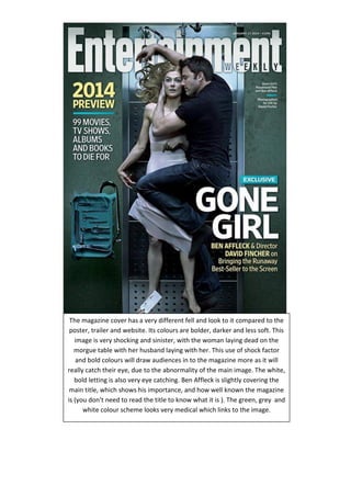
The magazine cover has a very different fell and look to it compared to the poster, trailer and website. Its colours are bolder, darker and less soft. This image is very shocking and sinister, with the woman laying dead on the morgue table with her husband laying with her. This use of shock factor and bold colours will draw audiences in to the magazine more as it will really catch their eye, due to the abnormality of the main image. The white, bold letting is also very eye catching. Ben Affleck is slightly covering the main title, which shows his importance, and how well known the magazine is (you don’t need to read the title to know what it is ). The green, grey and white colour scheme looks very medical which links to the image.

Contenu connexe

Plus de Maia Legg

Evaluation question 4 (made using PIKTOCHART and presented with powerpoint)
Evaluation question 4 (made using PIKTOCHART and presented with powerpoint)Evaluation question 4 (made using PIKTOCHART and presented with powerpoint)
Evaluation question 4 (made using PIKTOCHART and presented with powerpoint)Maia Legg
 
Evaluation question 4
Evaluation question 4Evaluation question 4
Evaluation question 4Maia Legg
 
Evaluation question 2- How effective is the combination of your main product ...
Evaluation question 2- How effective is the combination of your main product ...Evaluation question 2- How effective is the combination of your main product ...
Evaluation question 2- How effective is the combination of your main product ...Maia Legg
 
Group feedback rough cut ivy
Group feedback rough cut ivyGroup feedback rough cut ivy
Group feedback rough cut ivyMaia Legg
 
Pitch%20 for%20ivy
Pitch%20 for%20ivyPitch%20 for%20ivy
Pitch%20 for%20ivyMaia Legg
 
Blair witch project
Blair witch projectBlair witch project
Blair witch projectMaia Legg
 
Shutter island teaser trailer analysis
Shutter island teaser trailer analysisShutter island teaser trailer analysis
Shutter island teaser trailer analysisMaia Legg
 
Warm bodies teaser trailer analysis
Warm bodies teaser trailer analysisWarm bodies teaser trailer analysis
Warm bodies teaser trailer analysisMaia Legg
 

Plus de Maia Legg (8)

Evaluation question 4 (made using PIKTOCHART and presented with powerpoint)
Evaluation question 4 (made using PIKTOCHART and presented with powerpoint)Evaluation question 4 (made using PIKTOCHART and presented with powerpoint)
Evaluation question 4 (made using PIKTOCHART and presented with powerpoint)
 
Evaluation question 4
Evaluation question 4Evaluation question 4
Evaluation question 4
 
Evaluation question 2- How effective is the combination of your main product ...
Evaluation question 2- How effective is the combination of your main product ...Evaluation question 2- How effective is the combination of your main product ...
Evaluation question 2- How effective is the combination of your main product ...
 
Group feedback rough cut ivy
Group feedback rough cut ivyGroup feedback rough cut ivy
Group feedback rough cut ivy
 
Pitch%20 for%20ivy
Pitch%20 for%20ivyPitch%20 for%20ivy
Pitch%20 for%20ivy
 
Blair witch project
Blair witch projectBlair witch project
Blair witch project
 
Shutter island teaser trailer analysis
Shutter island teaser trailer analysisShutter island teaser trailer analysis
Shutter island teaser trailer analysis
 
Warm bodies teaser trailer analysis
Warm bodies teaser trailer analysisWarm bodies teaser trailer analysis
Warm bodies teaser trailer analysis
 

Magazine cover for gone girl

  • 1. The magazine cover has a very different fell and look to it compared to the poster, trailer and website. Its colours are bolder, darker and less soft. This image is very shocking and sinister, with the woman laying dead on the morgue table with her husband laying with her. This use of shock factor and bold colours will draw audiences in to the magazine more as it will really catch their eye, due to the abnormality of the main image. The white, bold letting is also very eye catching. Ben Affleck is slightly covering the main title, which shows his importance, and how well known the magazine is (you don’t need to read the title to know what it is ). The green, grey and white colour scheme looks very medical which links to the image.