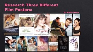
2. This is the Endless Love film poster. The layout of the film
poster is very clear and attractive. The big main image
allows the audience to understand that the film is clearly
going to be about the relationship between the male and
female characters in the image. The tagline 'say goodbye to
innocence' in big font is effective because it allows the
audience to understand that it is going to be a teenage love
story. Already the audience will be able to know if they will
enjoy this film or not. The film title 'Endless Love' is at the
bottom of the page which I think should e at the top,
typically because it is hugely significant for the audience to
see the name of the film before anything so that it sticks in
their heads. This film poster will appeal to the target
audience because it does have the main convention of a
romance film within it - love. It is clear that the two
characters are in love by the way that the male character is
staring at the female character. I also believe that this film
poster is appealing for the audience due to the colours used.
All the coolers used are very happy and bright colours which
will impact on what the audience believe are the themes to
the film.
3. This is the film poster for The Last Song. This film poster
has more information on it than the Endless Love poster. It
has a lot of conventions on it that will appeal to the target
audience and make them want to watch the film. There are
two images on the film poster. A main image which is
showing the audience that the male and female characters
are clearly together or in love. This will appeal to the
audience because it is the main convention of a romance
film. The smaller image is showing a close relationship
between the male and female characters which almost
confirms that the film is going to be about the relationship
between the two characters. This film poster has inspired me
because of the amount of conventions the creator of the film
poster has included on it. It shows how much knowledge the
creator has about film posters in general and it is showing
the skills off. I need to ensure to include all of the
conventions of film posters generally to show off my
knowledge and skills.
4. I decided to look at this film poser because it is different to
the other two that I have looked at. It includes more then
just a male and a female character and shows various
relationships. Love Actually is also a romantic comedy
which is different to the other two films as well therefore
the film poster will differ to the other, more dramatic
romance film posters. The layout of this film poster tells the
audience a lot about the film itself. It is clear that the ten
characters on the film poster have links to each other and it
is also clear that the film has a Christmas theme within it
due to it having a red ribbon on the front and a snow effect
on the film poster too. I think that the fact that the film
poster has ten picture on it shows that the film is going to
have many themes within it and many relationships that the
audience will follow throughout the film itself. It is also
clear that the audience will see many conventions from the
romance genre throughout the film due to the many
relationships. The film poster does not have one main
image because it is not just about two people like the other
films are therefore there re ten images of the ten main
characters. The conventions on the film poster all link to
the romance theme successfully through the use of the
color red which is one of the main conventions of the
romance genre which targets the audience successfully.