Designing Websites For Kids: Trends & Best Practices
•
0 j'aime•12 vues

Read the full blog here: https://bit.ly/30DWrFQ Connect with us through: Contact us : https://bit.ly/2Ew2GDx Facebook : https://www.facebook.com/PixelCrayons Twitter : https://twitter.com/pixelcrayons LinkedIn : https://www.linkedin.com/company/pixelcrayons Instagram : https://www.instagram.com/pixelcrayons/ Pinterest : https://in.pinterest.com/pixelcrayons/

Recommandé
Contenu connexe
Similaire à Designing Websites For Kids: Trends & Best Practices
Similaire à Designing Websites For Kids: Trends & Best Practices (20)
Plus de Pixel Crayons
Plus de Pixel Crayons (20)
Dernier
Dernier (20)
Designing Websites For Kids: Trends & Best Practices
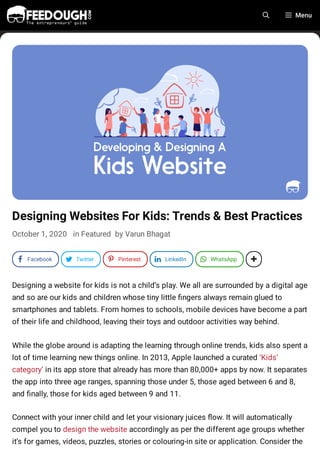
- 1. Designing Websites For Kids: Trends & Best Practices October 1, 2020 in Featured by Varun Bhagat Designing a website for kids is not a child’s play. We all are surrounded by a digital age and so are our kids and children whose tiny little ngers always remain glued to smartphones and tablets. From homes to schools, mobile devices have become a part of their life and childhood, leaving their toys and outdoor activities way behind. While the globe around is adapting the learning through online trends, kids also spent a lot of time learning new things online. In 2013, Apple launched a curated ‘Kids’ category’ in its app store that already has more than 80,000+ apps by now. It separates the app into three age ranges, spanning those under 5, those aged between 6 and 8, and nally, those for kids aged between 9 and 11. Connect with your inner child and let your visionary juices ow. It will automatically compel you to design the website accordingly as per the different age groups whether it’s for games, videos, puzzles, stories or colouring-in site or application. Consider the Menu a Facebook d Twitter h Pinterest k LinkedIn J WhatsApp 1
- 2. following trends, practical design guidelines, and practices to create better stuff for kids and children. Design For Different Age Groups It becomes a challenging thing to keep beautiful, colourful, stimulating and engaging content on the web. The design varies for kids and children of different age groups. You need to narrow your target audience while designing the website. It is better to target and categorise the website according to the speci c age group of children. For example – an 8-year-old child won’t engage with something that is too babyish. At the same time, if they nd something that is too odd or di cult to understand, they will switch to some other website. A pair of poorly designed content and the dark pattern will provoke children to switch on to the next website. It is essential to unleash the inner child in you so that you can create websites that instil learning into their brain and at the same time, empower their personality. Ages 3-5 Young ones, especially the one who steps into this category does not have any reading skills initially, so it is advised to use fewer texts and more pictures in brighter colours. Go for brighter colours, big fonts and bold texts that will entice the tiny eyeballs of these pint-sized people. Also Read: Why Brands Fail? Reasons for Brand Failure Table of Contents
- 3. Put some animated videos within the content as this will catch the attention of kids aged 3-5 years. You can even use sound effects to make your website more attractive to children like what PBS did with their website. Ages 6-8 Children lying in this category can now understand the basics of words and their formation. But still, use graphics and images with brighter colours. Starfall is a website familiar among children aged 6-8. The website contains a lot of images of people, animals, and other recognisable objects. 0:00 / 0:16
- 4. Age 9-12 Well, the children who fall into this category think and fall that they are grown-up now. But it is not so. They are highly pro cient and compatible with the sources on the internet and look for educational stuff there. Although the typography remains simple, you need to put word structure more traditional, colour saturated, and palette more complex. Books of the much-loved children’s famous author Beverly Cleary contain realistic illustrations and platelets, including saturated and muted colour schemes. Use Child-Friendly Colours
- 5. Always use bold, bright, vivid and vibrant colours that will entice the eye of little kids. Primary and secondary colours – red, blue, yellow, green, purple and orange – are all happy colours and popular options and colour schemes can include all of them plus more. Go for a palette of happy and go to click colours. Also, make limited use of jewel and pastel tones or use them in combination with saturated colours. Make Your Navigation, Icons And Call-To-Action Obvious
- 6. Children usually prefer websites that are user-friendly and easy to navigate while at the same time, it should serve their queries. Large buttons and exciting fonts size will stand out and make the entire website oversimpli ed. Put Simple Typography Keep the typography simple and use the following guidelines. ADVERTISEMENT Make the text easier to read by using Sans Serif font. The palette must contain only one typeface, or it can be two for older children. Also, use those colours which creates a contrasting effect against the background.
- 7. Gain Trust From Parents Parents are always concerned about their children, whether they are visiting the right website or not. Is that website unsafe, or will it distract them for their childhood? A web designer must include a section on the website that will assure a particular website is safe, secure and age-appropriate. You need to put yourself in place of kids’ parents and design grown-up sections for parents. The Wiggles and The ABC Kids are some of the examples that have a separate section with information and resources for parents. Also Read: Top 20 Gun Brands In The World
- 8. Advertise Wisely Kids nd it di cult to differentiate between advertising and promotion. However, some advertising is clearer from the children’s point of view while it is appropriate than others. If the ads are your own creatives, make sure they stand out as advertisements. If the advertisements are from a third party, make sure they’re child friendly and not misleading. For example, if you are advertising a Mike, the Knight app on the Bob the builder website, the characters and range of colours on the later website will not make it different from the actual website content. However, the colours being bright will attract the children and eventually, the goal of the advertiser will be achieved. Encourage Education
- 9. Source: apkpure Remember we used to love these kinds of puzzles in our childhood which helped our learning? The young minds of children always love to learn new things on online platforms. This can be a great opportunity to grab and make the learning fun and engaging for these kids. Try to impart learning by incorporating puzzles and exciting activities on the website or app. Further, motivate the children and encourage their achievements by keeping the rewards, badges and levels in it. You can check the website of Funbrain as a reference check. The way they organise mathematics, reading, puzzles, crosses and noughts in learning is all fun and one of the best ways to engage and entertain children for hours. What’s Your Take? Designing a website for kids and children is a whole new thing, unlike the one we create for the grown-ups. Also, by designing a website for kids, you can break the age- old norms of designing a web for adults because it comes with its own set of design guidelines. With this article, I have compiled all the web designs, trends and best practices that will help you think from the child’s psychological point of view and interest. Refrain your ideas from implementing advanced gestures as this would only confuse and annoy the kids and their parents as well. Go On, Tell Us What You Think!
- 10. Varun Bhagat PixelCrayons Did we miss something? Come on! Tell us what you think about our article on designing websites for kids in the comments section. ABOUT VARUN Featured Name * Email * Yes, add me to your mailing list Post Comment Varun Bhagat is a Sr. Tech Consultant & Blogger working for PixelCrayons which is a leading web designing company in India. He possesses in-depth knowledge of all the latest technologies and likes to share it with like-minded people.
- 11. About Feedough Feedough is the one-stop resource for everything related to startups. Our philosophy is to research, curate, and provide the best startup feeds and resources to help you succeed in your venture. We are currently ranked as the 15th best startup website in the world and are paving our way to the top. What are you waiting for? Start your search now on this startup guide. Search For An Article Search … Navigate Disclaimer We spend a lot of time researching and writing our articles and strive to provide accurate, up- to-date content. However, our research is meant to aid your own, and we are not acting as licensed professionals. We recommend that you use your own judgement and consult with your own consultant, lawyer, accountant, or other licensed professional for relevant business decisions. The site may also contain links to a liate websites, and we receive an a liate commission for any purchases made by you on the a liate website using such links. Click here to see our full disclaimer. Product or company names, logos, and trademarks referred to on this site belong to their respective owners. Submit Your Startup Startup Reviews Generation Z: The Comprehensive Guide What Is A Business Model? 30 Types Of Business Models A Beginner’s Guide To Product Management Pitch Deck Guide
- 12. Feedough © 2016-20. All Rights Reserved. About us Contact us Disclaimer Cookie Policy Privacy Policy Terms of Service Acknowledgments & Credits Sitemap