
Recommandé
Contenu connexe
Tendances
Tendances (18)
En vedette
En vedette (20)
Similaire à Masthead
Similaire à Masthead (20)
Masthead
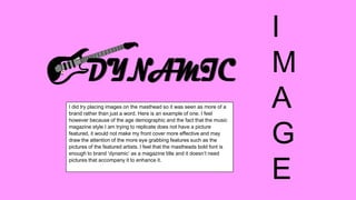
- 1. I did try placing images on the masthead so it was seen as more of a brand rather than just a word. Here is an example of one. I feel however because of the age demographic and the fact that the music magazine style I am trying to replicate does not have a picture featured, it would not make my front cover more effective and may draw the attention of the more eye grabbing features such as the pictures of the featured artists. I feel that the mastheads bold font is enough to brand ‘dynamic’ as a magazine title and it doesn’t need pictures that accompany it to enhance it. I M A G E
- 2. When looking at the font for my masthead, I tried to see if I could take any of the fonts that I had used from my style sheet, after which I tried to see other variations of fonts. I decided on the top one in the end which wasn’t in my style sheet (Magneto) because it is very different from the text that is used throughout which helps for the reader to see the masthead as the first thing as it breaks up the text in the page. I did consider the second one (Broadway) however chose against it in the end as it didn’t stand out as much as the first. F O N T
- 3. When deciding on the colour of my masthead, I decided to choose between the colours that I had chosen on my style sheet as this would fit in most with the colour scheme throughout my pieces of work. I thought the black looked the most effective particularly as it will contrast with the background of my front cover. Black is very good to use generally as it stands out the most as a block colour. C O L O U R