
Recommandé
Contenu connexe
Tendances
Tendances (20)
Similaire à Distance time graphs - Race for the Line
Similaire à Distance time graphs - Race for the Line (20)
Plus de missstevenson01
Plus de missstevenson01 (20)
Dernier
Dernier (20)
Distance time graphs - Race for the Line
- 2. DISTANCE TIME GRAPHS Time and distance graph questions often appear on examinations. As the name suggests, the axes are time (usually on the X axis) and distance (usually on the Y axis). The distance of an object from its starting position is plotted against the time it takes to get there. This is graph of a family car journey from home for a day at the beach. • How long did it take to get there? • How long did they stay? • How far away was it? • How long did it take to get back? 10 20 30 40 50 60 70 80 90 100 0 0 1 2 3 4 5 6 7 8 9 10 Time (hours) Distance(km) GRAPH OF A DRIVE TO THE BEACH
- 3. Look at the journey on the right. It shows a cyclist’s journey from home to a post office and back. • How far away is the post office? • How long did the journey take from home to the post office? • How long did the cyclist wait at the post office? • What do you think might be 300 metres away from the home? Why? • If the cyclist left at 10:35AM what time would they get back home? 100 200 300 400 500 600 700 800 900 1000 0 0 1 2 3 4 5 6 7 8 9 10 Time (minutes) Distance(m) DISTANCE TIME GRAPHS A CYCLE TRIP TO THE POST OFFICE
- 4. We can use time and distance graphs to work out average speeds between points on lines. Between points A and B the bike travels 300 metres in 120 seconds (2 minutes) We can now calculate the average speed between the two points. 300 ÷ 120 = 2.5 m/s • What was the average speed between C and D? Was it faster? 100 200 300 400 500 600 700 800 900 1000 0 0 1 2 3 4 5 6 7 8 9 10 Time (minutes) Distance(m) Speed = Distance Travelled (m) Time Taken (s) A B DISTANCE TIME GRAPHS A CYCLE TRIP TO THE POST OFFICE C D
- 5. You can also compare the speeds of different objects by looking at their gradients (the angle of the line) Here are some model rocket car predictions. Car A travels 100m in 2 seconds: 100÷2=50m/s Car B travels 100m in 5 seconds: 100÷5=20m/s Car C travels 100m in 10 seconds: 100÷10=10m/s Steeper lines represent faster movement. 10 20 30 40 50 60 70 80 90 100 0 0 1 2 3 4 5 6 7 8 9 10 Time (second) Distance(m) DISTANCE TIME GRAPHS A B C
- 6. In reality vehicles do not always move at the same speed and when they speed up we call this acceleration and when they slow down we call this deceleration. Green is a period of acceleration – the speed increases over time. Red is deceleration – the speed decreases over time. The black line represents the line of average speed between A and B 10 20 30 40 50 60 70 80 90 100 0 0 1 2 3 4 5 6 7 8 9 10 Time (second) Distance(m) DISTANCE TIME GRAPHS A B
- 7. When looking at distance time graphs some journeys may not end up back at the destination. Sometimes the lines may be curved and the shape of the curve can tell us how something is changing. The blue line shows a fast, steady speed but no return. The red line show a journey with a stop and a return The green line shows acceleration, then deceleration and finally a stop some distance away 10 20 30 40 50 60 70 80 90 100 0 0 1 2 3 4 5 6 7 8 9 10 Time (seconds) Distance(m) GRAPH SHOWING DIFFERENT TYPES OF MOVEMENT Steady, fast speed Stationary Steady return to start Steady speed Getting faster Getting slower Stationary DISTANCE TIME GRAPHS
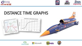
- 8. DISTANCE TIME GRAPHS 0 20 40 60 80 100 120 140 Time (seconds) Distance(miles) 0 2 4 6 8 10 12 BLOODHOUND SSC – PREDICTED DISTANCE TIME GRAPH This is a distance time graph for Bloodhound SSC. Using your knowledge, work in groups or teams to find mathematical questions you can ask using this graph. e.g. How far does it travel?
- 9. RACE FOR THE LINE