Annie Liebovitz's Iconic Career Photographing for Rolling Stone Magazine
•Télécharger en tant que PPT, PDF•
0 j'aime•3,027 vues

This is a slideshare showing and explaining annie leibovitz's work
![Rolling Stones Magazine ,[object Object],[object Object],[object Object],[object Object],[object Object],[object Object]](data:image/gif;base64,R0lGODlhAQABAIAAAAAAAP///yH5BAEAAAAALAAAAAABAAEAAAIBRAA7)
Recommandé
Contenu connexe
Tendances
Tendances (20)
En vedette
En vedette (20)
Similaire à Annie Liebovitz's Iconic Career Photographing for Rolling Stone Magazine
Similaire à Annie Liebovitz's Iconic Career Photographing for Rolling Stone Magazine (20)
Plus de Morrighan Humpleby
Plus de Morrighan Humpleby (12)
Dernier
Dernier (20)
Annie Liebovitz's Iconic Career Photographing for Rolling Stone Magazine
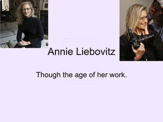
- 1. Annie Liebovitz Though the age of her work.
- 8. I like the colours in this picture, the colours are light, and dark. The women in the picture are either in black or in colours such as light pick and cream. I like the difference in people, the height of the women and the way in which they are standing and the black lines down through the pictures, this breaks the pictures up makes it less of a full on picture. But the way that the women in the picture carry through and past the lines it doesn’t cut the photography up completely.
- 10. Again like the photograph taken for the first cover, it has been separated with black lines, but this one is less strong, the photograph has been separated into three, this obviously cuts the photograph into different images but is not as strong separation as it has edges, showing that they are different. In this photograph the models, are modelling in very manly ways, arms crossed, hands in pockets. Most of them are in shirt ties and suits, lots of them their clothing is blowing about, for example Leonardo DiCaprio’s shirt is blowing apart.
- 12. this photograph has a very classy feel to it, I think that would be reflecting the people in the photograph, they are all we known, we respected actresses, they are all in evening, ball dresses. The colours are not to bold but simple, some are in black but the way they are positioned makes them softer and not so strong.
- 14. I like this photograph, I like how all of the all of there faces and body colour is very washed out, and for most of the models are in opposite colours, ie. Black creating a very good contrasted. But then on the other hand Cate Blanchett is not got any conrast at all, her skin is pale, her dress is pale and she has blonde hair, but I like this though, it is in contrast to the res to for the photograph. All the others have contrast and most of them are sat but she is all washed out and pale and standing, personally I see her first because of this point.