Mobi IMPACT - Why You Need a Responsive Website Design

Why businesses need to have a responsive or mobile-friendly website design. New Horizons Consulting - Communication-IMPACT 15447 Boischatel Pierrefonds, Quebec H9H 1Y7 514-996-3347 1-866-777-6569 http://www.communication-impact.ca https://www.facebook.com/MontrealOnlineMarketing https://plus.google.com/+Communication-ImpactCA/about https://twitter.com/DrPresentation https://www.linkedin.com/in/localonlinemarketingexpert https://plus.google.com/u/0/+MJPlebon/posts https://www.youtube.com/user/mjplebon Your customers are looking for you online. Are you there? Get more exposure on the internet so your customers see you when they are looking for your products and services. Give us a call. 514-996-3357 Marketing your business on the internet is challenging because the internet is changing quickly. What tactics worked well a few months ago no longer work as well today. This is why you need to develop a sound online marketing strategy that compliments and works with your overall marketing strategy. Quick-fix tactics and first page guarantees on Google do not work. There are no "one-shot" tactics that will catapult your company to the top of the search engine pages. That doesn't work anymore. A sound online marketing strategy is long-term, consistent and will change over time. It takes time to gain prime exposure on the internet and you need to be consistent with your content for the long term. Give us a call for a free 30 minute phone consultation regarding your business. We can offer you some sound suggestions for your online marketing initiatives. Call us at 514-996-3357

Recommandé
Recommandé
Contenu connexe
En vedette
Dernier
Dernier (20)
Mobi IMPACT - Why You Need a Responsive Website Design
- 2. AGENDA • What is a multi-screen website? • The growing importance of multi-screen sites • What Google recommends • What Google requires • Turning visitors into customers • Providing a custom experience • Dynamic Content • Weighing your options • Getting started
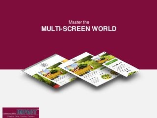
- 3. What is a MULTI-SCREEN SITE? A multi-screen site refers to one website that is optimized for desktop, tablet and mobile. A common, but more technical, term for these kind of websites is “responsive.”
- 4. A desktop-only website used to cut it, but not anymore… DESKTOP TABLET SMARTPHONE Device share of website traffic: Devices are diversifying & WEBSITES MUST ADAPT *E-commerce Monetate 2013 Quarterly report
- 5. DIFFERENT DEVICES DOESN’T MEAN DIFFERENT CUSTOMERS 90% use multiple screens sequentially to accomplish a task over time The average person uses a combination of 3 different screens every day Smartphones are the most common starting place for online activities PCs/laptops are most often a starting point for more complex activities Tablets are most often a starting point for shopping and trip planning HubSpot 2012
- 6. A MULTI-SCREEN SITE IS SEO GOLD Google has declared that they prefer responsive web design over separate mobile and desktop websites. THE REASON One single URL makes it easier for Google to search a site for relevant content. THEREFORE Responsive websites generally rank much higher in search results. HubSpot 2012
- 7. IT’S ALSO MANDATORY FOR MOBILE Google has recently changed the way they rank websites in mobile searches. Unless your website passes their Mobile-Friendly Test, it won’t even show up. Up to 60% of all internet searches are now made on mobile devices. Small Business Trends 2014
- 8. WE GO BEYOND RESPONSIVE With Business-Driving Features Our multi-screen websites are unique. We build in high-powered features to meet the specific needs of your business and customers. Here are just a few examples. CLICK-TO-CALL Enables your customers to contact you with just the push of a button MAPS Ensures your customers will always be able to find their way to your door YELP REVIEWS Inspires confidence in your business and assures customers you’re the right choice CUSTOM COUPONS Places your most enticing deal front and center on your website
- 9. v To Provide a Custom Experience DEVICE BY DEVICE Different devices means different customer needs. When visitors land on your site via mobile or a tablet, they don’t necessarily need all of the same information that’s on your desktop site. Image Slider for tablet users A Click-to-Call button for mobile users Full navigation only for desktop users
- 10. And Leverage DYNAMIC CONTENT Everyone wants a personalized experience and we can deliver just that. Using technology that has traditionally been reserved for enterprise-level companies like Amazon, we’ll set up a custom experience for your customers based on their physical location, time of day, number of previous visits to the site and more. FIRST-TIME VISITORS Will view a welcome video AFTER HOURS Ask your users to leave a message
- 11. THE ECOMMERCE OPTION In addition to creating a website that encourages customers to visit your brick-and-mortar store, we can give them the convenience to shop anywhere from any device. Depending on your needs, your store can include: COUPON CODES Generate coupon codes for a particular product, or overall order, for customers to use at checkout. 30+ PAYMENT OPTIONS Customers can pay using secure, trusted payment providers like PayPal, Stripe, Authorize.net and more. E-GOODS Offer digital content for purchase and download (e.g. video and audio files, images, documents, etc.). AND SO MUCH MORE.
- 12. WHICH WAY DO YOU WANT TO GO? Stick with what you’re doing Create a responsive website?
- 13. GO MULTI-SCREEN: 73% of visitors prefer a site that’s optimized for mobile Faster load times Takes full advantage of the 4.4 hours of leisure time customers spend in front of different screens each day THE RESULTS You only get one chance to make a first impression. A responsive website ensures you’ll be putting your best foot forward, no matter what device your customers are using to view your site. STAY THE COURSE 61% of visitors will abandon a site that isn’t mobile-friendly 40% of consumers will abandon a web page that takes more than 3 seconds to load KISSmetrics Google 2013
- 14. ONE LAST REASON TO BE RESPONSIVE It’s future-proof! Our multi-screen websites are built using a framework that adapts to all device types. This means that no matter what someone is using to view your site, it will display perfectly. So in the future, as new devices, like TVs, watches and Google Glass, grow in web capabilities, your responsive site will still provide visitors with a fantastic user experience.
- 15. READY TO GET STARTED? Communication-IMPACT.ca CONTACT M.J. Plebon 514-996-3357 mj@communication-IMPACT.ca