![Dale Sawyer’s Discovering Plate Boundaries Exercise (http://terra.rice.edu/plateboundary) ,[object Object],[object Object],[object Object],[object Object],An aside:](data:image/gif;base64,R0lGODlhAQABAIAAAAAAAP///yH5BAEAAAAALAAAAAABAAEAAAIBRAA7)
Recommandé
Contenu connexe
Tendances
Tendances (20)
En vedette
Similaire à Plate tectonic activity with maps
Similaire à Plate tectonic activity with maps (20)
Plus de Lori Welsh
Plus de Lori Welsh (20)
Dernier
Dernier (20)
Plate tectonic activity with maps
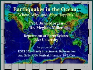
- 1. Earthquakes in the Ocean: Where, Why, and What Happens? As prepared for ESCI 323 - Earth Structure & Deformation And Sally Ride Festival , Houston (10/25/06) Prof. Julia Morgan Dr. Meghan Miller Department of Earth Science Rice University
- 3. Seismology Map – Earthquake Locations and Depths
- 4. Volcanology Map – Recent Volcanic Activity
- 5. Geochronology Map – Seafloor Age
- 6. Geography Map – Topography and Bathymetry
- 8. Where do all the earthquakes occur?? (Press et al., Understanding Earth, 4th Ed.)
- 9. Kurile Earthquake Nov. 15, 2006 Juli
- 11. Kurile Earthquake Nov. 15, 2006
- 12. Kurile Tsunami - Nov. 15, 2006
- 16. Alaska Tsunami (Press et al., Understanding Earth, 4th Ed.)
- 18. Sumatra Earthquake Fault zone rupture ~ 1000 km in length Epicenter Sumatra Indian Plate (Source: USGS)
- 23. Can This Happen in N. America? Yes!!
- 25. January 1700 Cascadia Tsunami (Source: K. Satake, http://www.pgc.nrcan.gc.ca/press/index_e.php)
- 29. Co-seismic Slip Zone (Bangs et al., 2004) Up-dip limit
- 30. Recent Ocean Drilling & Surveys
- 31. Toe of Muroto Transect Decollement 1 km Proto-decollement Deformation front Proto- thrusts Frontal thrusts NANKAI TROUGH NANKAI PRISM PROTO-THRUST ZONE Depth (m) Trench Fill turbidites Shikoku Basin Strata hemipelagic sediments Ocean Crust
Notes de l'éditeur
- Add JOI and ODP logos, and Rice logo. And thanks for JOI,USSSP, etc.
- The fourth, and perhaps the richest of the data maps, shows the topography and bathymetry of the Earth. This is the elevation of the land surface and the depth of the oceans. The map uses color to indicate varying elevation and depth and simulates sun shading to add a sense of 3-dimensionality to the map. The scale bar on the right shows how colors on the map correspond to elevation in meters.
- An exercise based on observing, describing, and classifying data must be built on some rich and well displayed data. I use 4 data maps that contain an amazing amount of information about large scale plate tectonic processes on the Earth. These data have been acquired over many years by many scientists. When examined together, most of the basic tenets of plate tectonics are laid bare and seem irrefutable. Scientists developing the key ideas of plate tectonics over the past 40 years had only fragments of these data to work with as they tried to describe, classify, and interpret what they saw. In Discovering Plate Boundaries, you will be asking your students to walk the same path, but with the advantage of more complete, although not perfect, data. The first map shows earthquake locations and depths. The location of each earthquake is indicated by a small dot and its depth is indicated by the color of the dot. Red dots indicate earthquakes having depths between zero and 33 km. We refer to these as shallow earthquakes. The yellow or orange dots indicate earthquakes having depths between 33 and 70 km. We call these intermediate depth earthquakes. The green dots indicate earthquakes having depths between 70 and 300 km We call these deep earthquakes. The blue dots indicate earthquakes having depths between 300 and 700 km. We call these ultra-deep earthquakes.
- The second map shows the locations of recent volcanic or thermal features on the Earth. In this dataset, recent refers to the past 10,000 years. The dots represent volcanoes, geysers, hot springs, and similar features. In these slides, the maps are not shown in a way that you can see all the detail. The second part of the Teachers Guide, called A Tour of the Maps, shows the maps in much more detail. It is also possible to download the maps in several high resolution formats from the DPB website so that you can see the details.
- The third map shows the age of the oceanic crust under most of the world’s oceans. This map really highlights divergent plate boundaries, also known as mid-ocean ridges or spreading centers. The scale bar on the right shows how the colors correspond to age of the seafloor in millions of years. Red signifies the youngest crust. Blue signifies the oldest known oceanic crust. An important feature of the maps used in this exercise is that they are all displayed at the same scale and projection, and use the same coastline data. Uniformity of the map base makes it easy for students to compare data from map to map. This is an important aspect of the exercise. It is possible to obtain excellent maps (better than mine!) of each of these data from other sources, but they are unlikely to be displayed in the same way. I have found inconsistent display to be a source of frustration for students.
- The fourth, and perhaps the richest of the data maps, shows the topography and bathymetry of the Earth. This is the elevation of the land surface and the depth of the oceans. The map uses color to indicate varying elevation and depth and simulates sun shading to add a sense of 3-dimensionality to the map. The scale bar on the right shows how colors on the map correspond to elevation in meters.
- When the students arrive for the first period of the class, I hand out the Student Instruction sheet, and a plate boundary map. I use 11 by 17 in black and white maps that I make on a copying machine. They are displayed at the same projection and base as the data maps, although to a smaller scale. I also hand each student a slip of paper with a Scientific specialty (Seismology, Geochronology, Volcanology, or Geography) and a Plate Name (Pacific Plate, North American Plate, African Plate, and etc.). My goal is to have each student have a different combination of specialty and plate, and for all four scientific specialties to be covered for each plate used in the exercise. Therefore, if you have 24 students, I would use 6 plates and have all four specialties for each. Numbers that are not multiples of four can be handled by having 1-3 plates with only 3 specialties. If I have to do this, I drop a different specialty from each, but never Seismology. I bet you can guess that I am a Seismologist! I mix the specialties and plates up randomly among students because I think this exercise works best if they are not self arranged into their usual social groupings.
- The fourth, and perhaps the richest of the data maps, shows the topography and bathymetry of the Earth. This is the elevation of the land surface and the depth of the oceans. The map uses color to indicate varying elevation and depth and simulates sun shading to add a sense of 3-dimensionality to the map. The scale bar on the right shows how colors on the map correspond to elevation in meters.