Admirable # 00971529501107 # Call Girls at dubai by Dubai Call Girl
Cd analysis
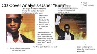
1. CD Cover Analysis-Usher “Burn”
There’s fire
on both
front and the
back cover of
the CD, this
is significant
as it
The Arist is on the front and back
• Track
• Track remixes
Logos and paragraph
about the how the song
was made
• Warm colours to emphasise
the pain and hurt
The image of usher is in the left
frame this is allow the fire in
the background to be seen.
His body language
connotes a strong persona,
he has his fist clenched
tightly in the air.
The writing on the CD is
very old fashion and
classy. Its strategically
place in front of the fire
to correlate with the
word “Burn”. Manly
touch.
2. CD Analysis Ariana Grande “Dangerous
women” The back of the looks like
a old fashion, old
newspaper its simple.
Because of the name
being in script
handwriting, it gives
the album a personal
feel as if the artist
signed it themselves.
The artist is looking right at
the camera in a slightly
intimating way, which
corresponds with the
name of the album.
3. CD Analysis Mariah Carey “We Belong
together”
ARIST
COLOUR SCHEME;
Suttle,innocence
• Plain writing
• Italic mimic hand writing almost making the album feel
personal for the fans
The images portrays a sense of seductive innocence.
The artist is making eye contact with audience.
The album is fairly
simple and straight
forward.
A lot of
information
about the
Mariah carey is
centred in the left
section of the
4. CD Analysis R Kelly “Happy People”.
Warm colours symbolising that the
album is friendly, relax and chilled.
Two CDs
Different poses, he looks like he's
feeling the music.
The title of the CD is in the left
frame, the way the title is
position is looks like its coming
through the artist.
5. Evaluation
From analysing “Burn”, “We belong together” and “happy people” I
have listed a few ideas of what I include CD;
Things I would like to
do
• Artist (front and
back)
• Colours that
represent or
links with theme
of the song
• Remixes
• Font
(fancy/handwriti
ng)
•
use of images (shot type / framing /
angle, body language, lighting,
airbrushing / effects, representation of
the artist / band), text used and its
placement, combination of image and
text, promotional methods used
The things to consider
The albums that I have looked at are very simple and they just focus on the artist. The front seems to be the
most important thing of the album which is something I would like to consider.
With each album the colour choice represent the feel and mood of the album.
6. Advert
I’ve taken inspiration from these three music adverts, mainly because of the colours and the
camera angels. I like how the close up show the emotions of the artist and how the colours
set the mood for the album it self. This is something I’d like to replicate in my own music
advert.