
Recommandé
Contenu connexe
Tendances
Tendances (18)
En vedette
Similaire à Double page spread analysis
Similaire à Double page spread analysis (20)
Plus de paduaanne
Dernier
Dernier (20)
Double page spread analysis
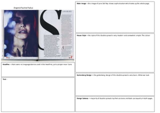
- 1. AngielaPauline Padua Main Image – this image of Lana Del Rey shows sophistication which takes up the whole page. House Style – the style of this doublespread is very modern and somewhat simple.The colour Text - Guttenberg Design – the guttenberg design of this doublespread is very basic.When we look Headline – there were no languagedevices used in the headline, justa proper noun ‘Lana Design balance – majority of double spreads lay their pictures and texts out equally in both pages.
- 2. AngielaPauline Padua HOUSE STYLE - Main Image – this is a medium shot of Lily Allen from NME magazine. She is standingin a very strikingposition and the directmode of address shows an intenseexpression for the audience with a bit of her smileshown. She looks very casual on her top which also followsthe colour scheme of this doublepage spread. Her messy hair and dark make up also follows thecolour scheme of NME and also to make the layoutof the double spread consistently,also her position shows tough nature and femininity insideher.The image takes up the whole right page of the doublespread and slightly takes up the center left of the page. Just likeLana Del Rey from Q magazine, it is also theonly image on this double spread makingher the center of attention in this articleand for the audience to know that this is abouther which may persuadeher fans to buy this magazine. Her casualty in this spread will makethe audience relate to an ordinary person rather than a celebrity which makes itdifferent story with Lana Del Rey’s double spread. House Style – the house styleof this double spread is similarto Q magazinebecause they use the colour scheme of red, black and white. This colour scheme fits into the conventional styleof an indie/rock genre. The background was plain and white and so it’s different from Lana Del Rey’s background which is dark. This is made to drawthe attention to Lily Allen’s image. We can see that there are 3 different fonts used to make the article. From the headline,to the subheadingand the article. The headlinetakes up almosthalf of the spaceon the left page of the doublespread which makes modernity, creativity and emphasis on the thought of the headline itself.The overall impression for this doublespread is artistic and appealing,effective us e of designs areused to highlightthe important bits in this double spread to make the audiencebe entertained whilereadingthe article. Guttenberg Design – as we look through the primary optical area in this double spread,our attention will bedrawn on the headlineitself,as we can a starting quote. As we go through the readinggravity,it’s either we will bedrawn to the subheadingor justthe casual top worn by Lily Allen, as we go to the terminal area, justlikein Q magazine, we can see the page number, the iconic logo of NME and the issuingmonth of the magazine. Goingstraightto the strongfallowarea,we can see Lily Allen’s hair styleand make up, which makes the audiencestare ather for some time. And lastly,as go through the weak fallowarea,we can see a bit of the text about the articlealso thepage number, logo of NME and the issuingmonth. Headline –