2. Masthead Caption Secondary Leads Flash Graphic Feature Selling Line Banner/Plug Feature Article Photo Kickers Cover Lines inc. pull-quote Headline Anchorage Plug Menu Strip Bar Code Date Line with web address
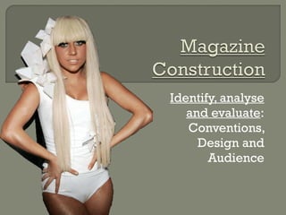
3. 1 .The main featured image takes up the whole page and covers the kerrang! Logo a little bit this works and help it sell because it make the image seem more important than the magazine its self. 2 .All of the colours are based around white red and black and theses colours are the best combo of contrasting colours that you can get making the who cover stand out. 3 .Also because of there being a colours scheme of those 3 colours the little bits of yellow stand out even more and this show the free things or added bonuses in that issue 4 .The font are basic font but sometimes in italics the main headline is in white surrounded by a white text boxed in red which allows the plain texted font to stand out and give lots of impact, because the fonts are quite plain they are made to stand out by the colour of the text and the background that they are on. The main mast head is giving a feeling of the type of features my might be displayed within the magazine, the thing that makes it seem like that are the jagged font making it look rough and the lines though it make the jagged text look cracked and it makes it seem like the magazine will display from genres between rock and metal
7. The main featured image the person is looking directly at you, and his expression is that he is having fun so this suggest that in the magazine there will be some stories that are going to be humorous and, some that are going to be fun to read. The top middle third is used to interfere with the masthead and it follows on a little to the left and right thirds. The kickers are on the right instead of the left like kerrang! usually have I think this is because the headline looks better with the image facing the way it is and there is a gap on the right middle third left for kickers.
8.
9.
10.
11.
12.
13.
Notes de l'éditeur
Colour schemes (use of three main colours), use of the left third to highlight masthead or headline, font use remains the same style or constrained to only 3 different fonts.
1 – Masthead, banner, kicker, cover line, menu strip, secondary lead, plug, graphic feature, enigma, feature article photo, headline, anchorage, flash, bar code, date line & weblink. 2 – Rule of thirds, grid system, use of 3 main colours, use of three main fonts, no dead space, juxtaposition, inter-textuality, size / blend of different elements, cohesion (text/images working together). 3 – language use (tone and expression), mode of address, enigmas, use of personal pronouns and various forms of mediation.