This document analyzes the contents pages of three music magazines: Q, Billboard, and Q again. It finds that they all follow typical conventions for magazine contents pages, including: having a large central image related to the main feature; smaller additional images and their corresponding page numbers; section headings and subheadings to categorize articles; listings of articles alongside their page numbers; placement of the magazine title; and consistency in house style colors, fonts and layout throughout the issue. The document examines how these conventions help make the contents pages visually appealing, informative, and easy for readers to navigate.
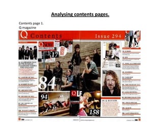
2. This is the contents page of the music
magazine Q. Q usually do double
page contents pages, like this
one…this is good as you can fit more
on to the page without it looking to
crammed.
The magazine has most of the
typical conventions:
-The heading ‘ Contents’ and also
the title of the magazine next to
it.
It has the main images big in the
middle of the page. This makes
the contents page look much
better, this isn't too much writing
which would make it look less
interesting. The main images are
usually linked too the main
features in the magazine. The
page numbers are on the
pictures, this is another
convention which will tell the
audience where they can find the
article about the person in the
magazine. Doing this also helps
reduce the amount of writing
making the magazine more
aesthetically pleasing to the
audience.
There are subheadings such as ‘exclusive’ listing the different articles and
features the audience can find inside the magazine. Also with page numbers so
that they know where they are. The writing is laid out in columns making the
page look tidy and organised.
Page numbers at the bottom of each page.
Q Magazine
There is an editors note on the first
page of the contents page. It is before
all of the subheadings. This is another
typical convention usually found on
contents pages. The editor of the
magazine will usually quickly talk
about thing the audience can find in
that issue of the magazine or any
quick and important news they want
to share with the audience.
There are other smaller images around the page other than the main images.
These usually also link to people that will be featured in this issue of the
magazine but are not the main feature. They also will have page numbers on
the image.
The contents page usually follows the same house style than the rest of the
magazine. In this case this is what they have done. The colour scheme for Q is
red white and black…they use these colours on the contents page,front cover
and any other pages. They also use the same fonts throughout so that the
magazine looks organised and matches.
4. This contents page is from the music magazine
Billboard. It also follows the typical conventions
of a magazine.
There is a central image in the middle of the
page. Usually the central image is linked to the
main feature in that issue of the magazine.
There are smaller images on the page as
well as the main image, these also link to
artists or anyone that is going to be in that
issue of the magazine. The images also
have page numbers in the corner of them.
This is a typical contents page convention
and is used to tell people what page the
article about that person will be.
Having images to tell people what is going
to be in the magazine makes it look much
better and more interesting than if it was
just text.
There is the main title ‘contents’ at the top of the
page in bold letters. Most magazines will have the
title big and bold so it stands out on the page, like
this magazine for example.
After the main title there are subheadings, which
put the articles in the magazine in to categories. In
this magazine there are ‘UPFRONT’ , ‘FEATURE’ and
‘MUSIC’ for example.
Underneath the subheadings on the page, the articles that are in
the magazine are listed, along with page numbers, this is used so
that it is easy for the audience to find articles that they want.
The title of the magazine is usually mentioned somewhere
on the contents page.
Billboard
The house style for any magazine is
when the pages use the same colours
and texts throughout the magazine. In
billboard the colours in the house style
are usually red ,yellow, blue, black and
white. In this case the contents page
follows the same house style as the
front cover and the rest of the
magazine. This makes the magazine
look much neater and everything
matches.
Subscription and contact information is normally mentioned
somewhere on the page. This gives the readers any information
they need to get in contact with the magazine or anything else.
In this magazine they have put the information at the bottom of
the page along with information the audience might need for
upcoming events. This contents page provides all of the
information the audience might need.
6. This contents page is from the music
magazine Q. It also uses most of the
contents page conventions to insure
their contents page looks good and also
has all of the information the reader
might need.
There is a central image on the
contents page. This image is usually
quite large and eye catching. It also is
usually linked with the main feature
artist in this issue.
At the top of the page is the title ‘Q Contents’ this is another typical
contents page convention. Sometimes the title will only be ‘Contents’
and the title of the magazine will be mentioned somewhere else on the
page but Q have put them together.
Around the edge of the pages the articles are listed
underneath subheadings which split them into different
categories, for example ‘ features’. This makes the articles
easy for the audience to find.
Q magazine
This is a double page contents page,
this means there is plenty of room
for all of the information that there
needs to be and also there is lots of
room for images to make the page
look better and less boring.
In this case they have placed lots of
smaller images, also in the middle of
the page near the main image. These
smaller images also link with people
that are going to be featured in this
issue of the magazine.
Next to the articles name listed underneath
the subheadings will the number of the page
it will be on. This also makes it easier for the
audience to find without having to look
through the entire magazine if they just want
to see one specific article.
There will usually be page numbers
on the edge of the images, this shows
the audience where they will be able
to find the article about that artist in
the magazine, or if there isnt a whole
article on them, where they can find
any news on the aritst.
The house style for Q is usually red
white and black. They follow this
colour scheme throughout their
magazine using it on the front cover,
contents page and sometimes the
double page depending on the
artist etc.
The house style usually means that
the same fonts will be used
throughout the magazine. This
makes the magazine look much
neater and aesthetically pleasing.