Are you Making these eCommerce Mistakes?
•
0 j'aime•83 vues

Start with your email: http://eepurl.com/gNoJBL What mistakes to avoid when building your eCommerce site and what to quickly fix. This article was originally published on https://www.ergoseo.com/ecommerce-mistakes.html

Recommandé
Recommandé
Contenu connexe
Tendances
Tendances (20)
Similaire à Are you Making these eCommerce Mistakes?
Similaire à Are you Making these eCommerce Mistakes? (20)
Plus de Ted Politidis
Plus de Ted Politidis (9)
Dernier
Dernier (20)
Are you Making these eCommerce Mistakes?
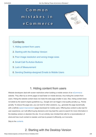
- 1. 5/25/2020 Are You Making These eCommerce Mistakes? https://www.ergoseo.com/ecommerce-mistakes.html 2/8 Contents 1. Hiding content from users 2. Starting with the Desktop Version 3. Poor image resolution and wrong image sizes 4. Small Call-To-Action Buttons 5. Lack of Measurement 6. Sending Desktop-designed Emails to Mobile Users 1. Hiding content from users Website developers deal with screen restrictions when building a mobile version of an eCommerce website. They often try to shrink pages to load faster on mobile devices, thus hiding the content from users. Hiding the website content does not make the web page smaller in size. Also, hiding content does not abide by the search engine guidelines e.g., Google and can trigger a low-quality penalty e.g., Panda penalty. To reduce the page size, you can look for other solutions, e.g., generate the page dynamically with a definite speed improvement (page download) for mobile users. Offering less content is also bad for user experience, as it will affect buying decisions and may lead the users to search for more information in the desktop version or abandon the site. It is an entirely new mindset that calls for a reconsideration of what and how much content is needed, and how to present it efficiently, so it converts. Skip to the contents 2. Starting with the Desktop Version
- 2. 5/25/2020 Are You Making These eCommerce Mistakes? https://www.ergoseo.com/ecommerce-mistakes.html 3/8 A common mistake for mobile developers is that they start designing for the desktop version first, then scaling down for mobile devices. During this process, a lot of useful stuff gets removed, sanitized, and restrictions, flaws, unsolved technical challenges from the desktop version passes to mobile. The best practice is to start designing with the mobile version in mind, like dealing with the design of a brand new site and making the correct choices without carrying past burdens. Beginning the layout for smaller screens simplifies things and offers UX solutions that can be scaled up for the desktop version. Smaller screens can create a better experience for all device types: desktop, mobile, and tablet. Skip to the contents 3. Poor image resolution and wrong image sizes When building a mobile responsive site, all images should be offered to match user screen resolutions. Resize accordingly to render correctly on all screens, reduce page size, and save bandwidth. Still, a large number of eCommerce sites fail to understand the adaptive mindset. There are some techniques to accomplish this task, such as using CSS (fluid images) or the HTML5 element for modern browsers, which do not need additional scripts or third-party services to do the job. Skip to the contents 4. Small Call-To-Action Buttons Some developers are eager to satisfy the need to fit everything on small screens and make their build responsive that they end up designing too small call-to-action buttons. Why make the users tap and zoom in to click a button? Why not build a good user experience? How does that impact conversions? Skip to the contents 5. Lack of Measurement When the mobile-friendly index came into play, the majority of e-commerce sites had only desktop versions. Designing for mobile was not a priority but only a rush to be compatible with not losing traffic. Most eCommerce stores did not analyze their mobile users' behavior; It was a mobile patch. Analyzing visitor behavior is fundamental to drive design decisions, rethink conversions, CTA buttons, product images, pricing elements, and descriptions. It can show what mobile devices are used, compatibility issues that cause drop-offs, browsing behavior, zooming on product images, clicking buttons, etc. Visitor analysis should be integrated into business processes when the need is to design or optimize conversions.
- 3. 5/25/2020 Are You Making These eCommerce Mistakes? https://www.ergoseo.com/ecommerce-mistakes.html 4/8 Skip to the contents 6. Sending Desktop-designed Emails to Mobile Users You have prepared a mobile-friendly eCommerce site, and you have mobile traffic, but when you send emails to customers, you have missed the part that these should be responsive to fit their small screens. Should you expect your conversions to increase? Email lists keep customers engaged with your brand (customer retention), lead to more sales, and build awareness. All email content should be tested first on mobile and be efficient. Modern email management software facilitates this process. Skip to the contents If you have enjoyed the content please consider making a donation. Thank you! Article Author Ted Politidis: Expert in providing Google Top 10 Rankings.
- 4. 5/25/2020 Are You Making These eCommerce Mistakes? https://www.ergoseo.com/ecommerce-mistakes.html 5/8 Sign up for the SEO Program and see your page on Google page one. How to Redesign a Site with SEO When you redesign a site, you have to factor in critical SEO parameters to keep the flow of traffic running.
- 5. 5/25/2020 Are You Making These eCommerce Mistakes? https://www.ergoseo.com/ecommerce-mistakes.html 6/8 Mobile Responsive Websites and SEO Why change your current website setup? Are there any gains that justify the costs of making a website mobile-friendly? Startup Marketing Plan - Traffic Channels Breakdown How to segment your audience, set the growth KPIs, use all traffic channels, track performance, calculate costs, build the brand and generate leads.