Responsive Design + LESS for Digital VU Meeting
•Télécharger en tant que KEY, PDF•
1 j'aime•749 vues


Recommandé
Contenu connexe
Tendances
Tendances (13)
En vedette
Similaire à Responsive Design + LESS for Digital VU Meeting
Similaire à Responsive Design + LESS for Digital VU Meeting (20)
Responsive Design + LESS for Digital VU Meeting
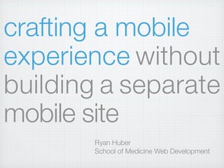
- 1. crafting a mobile experience without building a separate mobile site Ryan Huber School of Medicine Web Development
- 2. crafting a tablet experience without building a separate tablet site Ryan Huber School of Medicine Web Development
- 3. crafting a netbook experience without building a separate netbook site Ryan Huber School of Medicine Web Development
- 4. crafting a smarttv experience without building a separate smarttv site Ryan Huber School of Medicine Web Development
- 8. because you love your users...
- 9. ...regardless of the device they use
- 11. doesn’t exist
- 12. Redirected from the page you actually wanted to our awesome mobile homepage or is... eh... 1. Five links 2. from our 3. full site we limited 4. assume 5. you want. no more content for you.
- 14. a design that adapts to the environment in which it is viewed
- 16. rather than a separate site for each device
- 18. cool right?
- 19. developing (if html and css aren’t your thing, cover your ears)
- 21. write css for mobile
- 22. (here comes the magic part)
- 23. media queries
- 27. polyfill
- 28. images
- 32. grids
- 33. videos
- 34. wide tables
- 35. slideshows
- 37. if all of that seems like a lot to remember
- 38. Boilerplates
- 39. themes for your cms of choice
- 40. designing
- 42. The control which designers know in the print medium, and often desire in the web medium, is simply a function of the limitation of the printed page. We should embrace the fact that the web doesn’t have the same constraints, and design for this flexibility. - John Allsopp
- 43. a couple of ideas...
- 45. code is compiled into CSS
- 46. hold it. you’re asking me to learn a new language?
- 47. all CSS is valid code
Notes de l'éditeur
- \n
- \n
- \n
- \n
- \n
- \n
- .net Magazine chose Responsive Design as #2 on its list of Top Web Design Trends for 2012\n
- image credit: http://www.flickr.com/photos/brandoncwarren/4164759025/\n
- Everyone is seeing an explosion of growth in their non-desktop traffic.\n\nOr maybe\n
- \n
- \n
- \n
- \n
- \n
- Whether that device is a computer, tablet, or phone (or anything in between.)\n\nMostly, we’re talking about width, but also about capabilities.\n\nimage courtesy: http://theindustry.cc/assets/2012/01/responsive_web_design.png\n
- Benefits -- not maintaining multiple sites, not making bad assumptions about what content users want.\n
- http://seesparkbox.com/\nhttp://spigotdesign.com/\nand a few others\n
- \n
- \n
- 1. Meaningful HTML\n2. Valid HTML\n3. Separate content and style\n4. Quality content\n5. Lean as possible\n
- Think percentage widths, one column, large tap areas.\n\nMobile first -- a good plan. Luke Wroblewski can tell you all about it.\n
- \n
- hide / show elements, change font sizes, etc.\n\nHow do you choose breakpoints? Find natural breakpoints.\n
- \n
- \n
- \n
- \n
- caveat: image scaling can look bad, especially in older versions of IE. There are some CSS tricks for improving this, beyond the scope of this presentation\n
- what not to do -- disable scaling altogether\n
- Lots of javascript snippets to prevent this bug from occurring. Use those.\n
- \n
- by nature a typical fixed width grid system will not work. responsive grid systems exist. (like semantic.gs or twitter bootstrap)\n
- \n
- \n
- they exist, just search for them. Flexslider is one I like\n
- aim to make your initial view work well on regardless of bandwidth, screen size, processor speed. Replace small images with larger images if the browser is wide enough. Be conscious of resources being loaded.\n
- \n
- 320 and up is nice. Twitter bootstrap is super awesome.\n
- Wordpress, Drupal both have RWD themes.\n
- \n
- designers a bit uncomfortable? how do I design for an unknown width?\n
- from “A Dao of Web Design”\n
- Design live with html.\nIf you design in photoshop, you’ll need to show mockups at various sizes. May consider combining all sizes into one big photoshop document, so it’s easy to duplicate items between sizes.\n\n
- lesscss.org\n\n“a dynamic stylesheet language”\n\nan alternative to writing straight css\n
- LESS is compiled into CSS.\n\nlessphp\nless.app\nplugin for wordpress\nplugin for drupal\njavascript\n
- \n
- Don’t panic, less just extends CSS. \n
- Less CSS demo\n
- \n