
Recommandé
Contenu connexe
Tendances
Tendances (17)
En vedette
En vedette (19)
Similaire à Construction of double page spread
Similaire à Construction of double page spread (20)
Plus de rebeccalambert
Plus de rebeccalambert (13)
Construction of double page spread
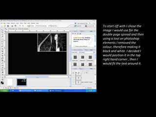
- 1. To start off with I chose the image I would use for the double page spread and then using a tool on photoshop elements I removed the colour, therefore making it black and white. I decided I would position it in the top right hand corner , then I would fit the text around it.
- 2. I thought of a headline for the article, which had to be something that would grab the attention of the reader and also some extra information which gave an insight into what the article was actually about, without reading any further.
- 3. I had already written out the copy for my double page spread, so the next part of the construction was to write it up on photoshop, making sure I made no spelling mistakes. I kept to the house style of the magazine by using pink and white text.
- 4. This was the final version of the first draft of my double page spread. The last aspect I added was a grab quote, something from the interview that would also grab the readers attention and give an insight in to what the interview is about. I also added page numbers in to the bottom left and right corners
- 5. After receiving some feedback about my magazine double page spread, I made a few alterations to different aspects within the page. Firstly, I flipped the photo and moved it to the opposite side, fitting the text in around it. This made the page more clear and it drew you to the headline because that was the direction her eyes were facing. I resized the image to make it bigger because after examining my work closely, I realised that it was too small and wouldn’t stand out as something important of you were flicking through the magazine. I also changed the spacing of the copy, I removed some of the copy and added it to other sections, making sure it still followed that the conventions of a music magazine.
- 6. After receiving feedback about the first version of my double page spread, the first aspect I changed was the size of the image as it was too small. I also flipped the image so that she was facing the opposite way and then moved it from the right to the left.
- 7. I then added the headline I had originally used, however this time it was with a by-line, which shows who wrote the article and who took the picture.
- 8. I then added the original copy I had used, however I changed the spacing so that it made the page look better as a whole.
- 9. This is the final version of the double page spread of my music magazine. The last thing I added again was the page numbers. Overall, I think this draft is a lot better than the first, it follows the conventions of a music magazine more tightly and works better as a whole.