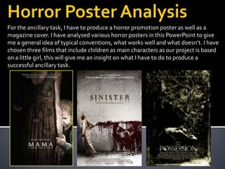
1. For the ancillary task, I have to produce a horror promotion poster as well as a
magazine cover. I have analysed various horror posters in this PowerPoint to give
me a general idea of typical conventions, what works well and what doesn’t. I have
chosen three films that include children as main characters as our project is based
on a little girl, this will give me an insight on what I have to do to produce a
successful ancillary task.
2. Most promotion posters that have
celebrity stars include the name at the
top of the poster, being the main focus to
encourage more people to see it,
however this particular one does not
hinting the film doesn’t contain any big
stars. Instead, the headline ‘based on a
true story’ is used to potentially scare the
audience, knowing that it’s true would
immediately make the film creepier.
The focus is image is of the main
character. The film has followed typical
conventions of a horror film using a girl as
the victim, which is seen often as women
are seen to be weaker and more
vulnerable. The fact the girl is a child also
emphasises the innocence and naivety of
the character.
3. The colour scheme of the poster is very dull using only greys and blacks, however works
effectively as it looks stereotypically ‘scary’. Usually, a horror poster uses bright colours such
as red to signify blood, death and danger. However on this occasion the title is a neutral
colour. The font works effectively as it has almost a ‘worn out’ and ‘scratched’ look, making
the poster looked damaged. This reflects the state of the young girls mind as she is unaware
of her dangerous state.
The bottom corners of the poster also looked worn, and almost as if they’ve been
‘scratched’ for effect.
4. The butterflies are the main focus of the
image, juxtaposing the idea of fear as
butterflies are meant to be pretty, harmless
insects. The colour also does this as
butterflies are known to be bright, eccentric
colours however the colour has been taken
from the poster to juxtapose this. The
young girls mouth is opened suggesting
that she is distressed, her facial expression
looks possessed to reinforce the title ‘The
Possession.’ The image looks as though the
girl would be screaming (as seen in the
trailer) which would give the audience a
sense of involvement as they would
imagine the scream when they saw the
poster.
5. The tagline is placed right beneath the title to immediately attract the
audiences attention as it is the second thing the audience will read on the
poster. It fits in with the colour palette as it is the same colour as the title, and all
the text on the page. The tagline stands out from the black background which
has been done purposely to grab the audience’s attention as well as look extra
‘creepy’.
6. The release date is shown in a The films website is also advertised
medium sized font, however however in much smaller font, again
not too large as it does not not to distract from the main focuses,
want to distract the audience but still giving the audience a sense of
from the main focuses such as ownership as they can visit the
the image and title. website for any more information.
7. Again, there is no huge named celebrities
in the film however instead the tagline is
used promoting other famous horror
films, which will convince the audience that
this film will follow the good reputation of
the two that have been advertised. The
title is centre frame which is effective as it
immediately attracts the audiences
attention to the name of the film. The font
has a smudged effect, almost as if the font
is dripping down the wall, which is
stereotypical as most horror posters use
edgy fonts. The little girl is dressed in white
pyjamas, which highlights her innocence
and vulnerability as well as the fact she’s a
child. The colour scheme is quite dull
however the image of the man is
red, signifying blood and danger, the dull
colour scheme makes this stand out more.
8. The black coloured font immediately stands out from the dull white/grey
background image. The title is very simple but extremely effective as the font
looks as though its dripping down the wall, like blood would do, as well as the
name of the film highlighting the horror to come. The tagline appears
underneath the heading, which reinforces the title ‘Sinister’ as ‘nothing can save
you’ which immediately establishes the genre. The fact that whatever it is has
not been named, and is referred to as ‘him’ creates wonder and mystery for the
audience making them want to watch the film to find out who he is. The use of
fonts are effective as even though they are simple, they fit very well with the
focus images
9. This is the main focus image on the poster.
The image of ‘him’ is painted in blood which
suggests danger, blood, death, passion and
evil. The fact the blood had dripped down
the wall fits well with the font used for the
title. The image of ‘him’ is frightening which
would provoke those of the target audience
to want to see it more, even though there
hasn’t been much information given about
him or who he is. The image stands out
extremely well against the white
background, making it the main focus for
the whole poster. The film tape hints
something more to the audience, making
them wonder why it’s there or what it’s got
to do with the film, making them even more
eager to see the film.
10. Looking at the image, the girls
appearance immediately suggests
naivety and innocence. Her
stereotypical ‘cuteness’ would make
the audience wonder why she’s painted
the image. Her white pyjamas highlight
her purity, emphasising the fact she’s
only a young child. The fact she’s only a
little girl is very conventional of a
horror film as women and young
children are often used because they
appear weaker than the male, making
them an easier target for the villain.
11. This is obviously a teaser poster as there is no specific release date, this teaser element
is used to involve the audience in the distribution process as now they have been
attracted to the poster, intrigued to see the film they will then seek the exact release
date online or at the cinema. The official website for the film is advertised at the very
bottom of the poster, the font is kept very small so that it doesn’t distract the audience
from the main focuses of the poster however people that are interested in seeing the
film can seek more information by visiting the site, as well as being able to watch
teaser trailers and such. This allows the audience to be involved in the digital
distribution of the film.
12. The poster advertises a big named celebrity
immediately catching the audiences eye, this
will make the audience and fans of the actress
eager to see it. The poster’s colour scheme is
very dull, using blacks browns and whites
which isn’t as typical for a horror poster as
usually they include colours such as red to
signify blood, evil and danger. The tagline at
the top, like with the Sinister poster, is
advertising another successful film made by
the director of this one, encouraging the
audience to go and see it as they will believe
this will have as good as reputation as the
film advertised. Again this poster features a
young child which is a typical horror movie
victim as they are seen as weak and an easy
victim, as well as women. The title is very
plain and simple, but works well against the
dark background.
13. The use of simple fonts works well with the poster as it is as if the font is ‘glowing’ kind
of like the mothers spirit. However, the use of the font doesn’t establish the genre very
clearly. The name of the main actress appears above the title as that is the first thing
the company wants the audience to see, giving the movie ‘star factor’ and a general
better reputation. The tagline ‘A mother’s love is forever.’ fits with the title ‘Mama’
hinting to what the film is about however it is mysterious as the audience aren’t sure
what’s happened to the mother and child.
14. The main image is different to that of other
horror posters, and is not typical of the
genre. Like The Possession, the butterflies
have had the colour drained from them
juxtaposing with the genre as butterflies are
supposed to be harmless and ‘pretty’. The
main focus is of the little girl as the light is
shining on her face, her appearance appears
vulnerable as her expression is sad. The body
next to her contrasts with the little girl as it is
dirty, dull and grubby looking, suggesting
that the women standing next to her is her
dead mother.
The fact the poster has no release date
advertised suggests it is just a teaser poster.