
Recommandé
Contenu connexe
Tendances
Tendances (20)
Similaire à Digipack 2 analysis
Similaire à Digipack 2 analysis (20)
Plus de ryangriffiths1999
Plus de ryangriffiths1999 (20)
Dernier
Dernier (20)
Digipack 2 analysis
- 2. FKA Twigs LP1 • LP1 is the debut studio album by English singer and songwriter FKA Twigs It was released on 6 August 2014 by Young Turks. Production on the album is handled by FKA Twigs herself, alongside Emile Haynie,Arca,Cyan Devonté Hynes,Clams Casino,Paul Epworth, Sampha and Tic. • Upon release, LP1 received widespread critical acclaim, and placed high on several year-end critics' lists. The album spawned three singles including; ‘Two Weeks’, ‘Pendulum’ and ‘Video Girl’ • The album was nominated for the 2014 Mercury Prize and the award for ‘Best Recording Package’ at the 2015 Grammy’s
- 3. About the artist/album • FKA Twigs (then known simply as Twigs) self-released her debut extended play, EP1 on Bandcamp on 4th December. Music videos were filmed for each of the four tracks and released on her YouTube Channel. On the 6th August 2013, The Guardian profiled FKA Twigs as their ‘New artist of the day’ feature, describing her as the UK’s best example to date of ethereal, twisted R&B. • FKA Twigs second Extended play known as EP2 , was released through the Young Turks label on the 17th September 2013 , the EP was produced by Twigs and Arca • n December 2013, she was nominated for the BBC Sound of 2014 and was chosen by Spotify for their spotlight on 2014 list. FKA Twigs was features on Billboard’s 14 artists to watch in 2014.
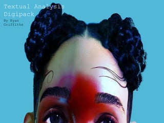
- 4. Album Cover This album cover does not conform to the genre conventions of a digipack due to it not featuring the artists name. This is unusual for a debut album as the audience might not be aware of the artists name as they have not established themselves by having a wider discography released prior to their debut album. However this may be seen as effective as it creates mystery surrounding the identity of the artist, leaving the audience feeling inclined to want to find out more about who this artist is and their style of music. Despite this image being incredibly detailed it also has a futuristic/surreal look due to the doll-like appearance of the artist. This further implies ideas about this artist being new and unique as the visuals that they use in their work are futuristic which might suggest that their music is something that the audience is unlikely to have seen before. The focal point of this album cover is the portrait of the artist with a large red mark covering the features of her face. This uses the colours of; red,purple,blue and green and resembles a bruise. This may then be linked to Barthes’ semantic code as it may be reflective of the hard work the artist has put into this album (blood, sweat and tears) or the bruise may be representing the pain of past experiences that have shaped the songs on the album. It is also significant this mark is shown on her face as she is directly addressing the audience with this past trauma and being vulnerable by having this mark cover her eyes which are conventially considered to be the windows to the soul.
- 5. Reverse cover The reverse cover for this album is minimalist in style as it only features the track listing of the album against a plain background and no additional images. However it does conform to the conventions of a digipack due to its use of logos of the record label and a barcode that will allow the digipack to be purchased.
- 6. Additional imagery Other visuals that have been used for this album used the same plain blue background which carries the connotations of sadness, which may then be linked back to the style and genre of music that her songs represent. However this blue might also represent ideas about peace and serenity as the colour blue is also associated with the sea. It is also significant that these images have been distorted almost to a point where the artist is unrecognisable. This might then relate to the artists almost futuristic style of music which has been described as “breathy R&B” and “Ethereal twisted soul” by music reviewers and critics.
- 7. Font This digipack uses a very distinct font that is reflective of the artists experimental style of pop music due to its erratic style and use of serif. This artist uses a bespoke style font that is similar to being typed on a typewriter. This might suggest that the artists music is a combination of old and new in its style. Therefore their use of fonts and logos are highlighting that this artist is very and unique and cannot be replicated.
- 8. Colour scheme The main colour scheme that is used within this digipack are mainly primary colours (red and blue)that are analogous on the colour wheel and are not conventionally used together. However for this album's artwork they are effective due to the high level of contrast between them. These colours also have contrasting connotations e.g. blue has connotations of sadness whilst red has connotations of anger meanwhile blue has connotations of peace and red has connotations of lust and passion which might imply that these contrasting themes are present within the artists music.
- 9. Summary This digipack uses of bright colours in order to draw the buyer in and make them interested in listening to the album. A free lyric booklet with photographs from the photoshoot for the album was also featured as added incentive to buy the digipack opposed to downloading the album online or streaming it. The colours used throughout the album match the tone of the music by conforming to conventions of pop music whilst still using elements of experimental and electronic music. The target audience for this digipack would likely be 15-25 and from the socio-economic group of E. This is made evident through the style of music as well as the futuristic style of the digipack.