
Recommandé
Contenu connexe
Tendances
Tendances (20)
En vedette
En vedette (14)
Similaire à Digipak Analysis of Nature Themes and Innocence
Similaire à Digipak Analysis of Nature Themes and Innocence (20)
Dernier
Dernier (20)
Digipak Analysis of Nature Themes and Innocence
- 2. •The overall look of my digipak has a neutral simplistic feel with the use of dark colourings which promote a chilled vibe and feel to my digipak. My promotional packages have a narrative which follows the story of friendship and loss and that is why I used the album title ‘Whisper’ having connotations of secrets and potentially lies, which happens between friends. The typography which is similar to that of handwriting is conventionally seen on indie folk album covers which I feel adds to the idea of simplicity as its written in a whitish/yellow also giving the impression of innocence as well as a naturalistic look. I carefully chose to use this particular font for the albums writing as I think although it is clear and simplistic to read it also has a innocent feel to it as the handwriting looks quite childish. •To create the fonts, I used a website called dafont.com and downloaded one of their premade fonts allowing myself to choose exactly what I wanted on the digipak, I then proceeded to change the size and colouring of the fonts on Photoshop. After this I altered the scale of the font and positioned it with the selection tool central in the digipak front cover ensuring that it did not cover the main image on the front cover. •I felt that by putting the artists name and album name as the same font it would create familiarity for the audience and would create a memorable font for the artists name. Also if I did decide to have different font styles for the artists name and album name it probably wouldn’t of fitted as I would have also had to alter the back of the digipak.
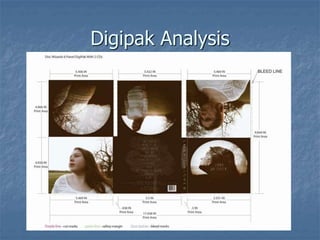
- 3. The front cover uses several different images that I took during mine and the talents photo shoot, blended together by changing the opacity levels of the images. I also repositioned the images so that the trees wouldn’t cover the whole of my artists face but also just enough to make it clear that it was a tree branch. The medium close up of her faces helps the target audience identify her from a distance. The overall image have several purpose and connotations. For example, my artist is not making direct eye contact with the camera, which is unconventional of a front cover however it connotes a sense of loss or distant thinking to the audience possibly reflecting how the album will make the audience feel. The target audience will also be able to detect this album as a indie folk album as they also typically feature nature and connote innocence. The image is quite unconventional as the overlays make the image look more abstract and the white glowing ring around the overall image was chosen to make it look like a moon matching the artists name ‘Luna’ which has the meaning of the moon. The shot image is quite impacting and although isn't brightly coloured is eye catching because it is so unusual. The outfit that isn't particularly featured on the front cover of the digipak shows the artists innocence matching the connotations of the overall image. I chose a white dress for the artist to wear as it connotes naivety to show the vulnerable side of the artist as well as her music.
- 4. Back Of Digipak For the back of the digipak, I used the brown colouring on the front of the digipak for the basis of the back of the digipak. This allowed it to blend in with the nature/ simplistic theme already displayed on the front of the digipak. To further display the use of nature I used a tree brush for the back of the digipak so that the back didn’t look as bland. For this I ensured I used a lighter caramel coloured brush sp that it was clearly visible in comparison to the brown background and the text. The overall look of the digipak has a haunting, nature feel to it with the overlayed layers and the nature surrounding it giving a darker feel with the ‘mood’ lighting. Also the typography on the digipak has a sort of careless connotations to it symbolising innocence and heartbreak. The music video has a part narrative/abstract feel to it allowing to show the longing on the artists face and the actresses face in the music video. The songs on the album are clear and easy to read like the fonts used on the rest of the digipak creating a house style (also shows continuity between this product and the website. The typography contrasts with the brown background to allow them to be readable but also allowing it to fit in with the nature earthy theme. The contrasts colours could also connote the innocence of the artist which is contrasted with the feelings of being lost featured in the music video. Stereotypically, like most digipaks, my artists songs are all presented in a conventional format so that it is clearer for the target audience to read and to ensure that it is still quite conventional. Finally, I added a record label and the artists website details to help identify and brand my product. I also added the barcode to make it more conventional and to allow my target audience to buy the physical copy of the Digipak.
- 5. Inside images: • For one of my inside images I used the image features on the website I have made to show continuity and familiarity for the audience. By using this image, I felt it gave connotations of determination as the artist looks as though they are overcoming something. The dark colourings continue onto this shot also giving the image a old looking effect. This is also a convention of the indie folk genre with the artist not making direct eye contact with the audience connotation a sense of mystery. • The next image I chose was of my artist in a close up shot stood within the same field as the other shots looking to the sky. The artist in this shot as a smirk on their face which has connotations of happiness and suggests that my artist is hoping for something. By editing the image in a dark colouring it gives the overall album a nostalgic look to it. • As these images face each other in the digipak, it suggests that the artist is looking at her past/future for example, the one of the images is darker then the other connoting the ‘darkness’ in the artists past but being determined to overcome it and the other images looks more brighter and ‘glowing’ suggesting that she has overcome the past but is still hoping for better things by being optimistic.
- 6. CD images: PICTURE 1: To create continuity like the other CD image I placed a brown ring around the image to follow the brown and white house style I have created. I also used the sleeve of the artists white dress to feature in the shot so that it wasn’t another image of the artist. I duplicated this image and overlayed it on itself so that I could achieve this doubled effect look. PICTURE 2: For this image, I edited one of the images to look like the front cover /9the brown ring around the image) to create continuity and had the artist look at the camera. This is quite unconventional of a typical indie folk album but I felt that some eye contact with the audience was essential. The forest scene in the background give overall nature connotations to the cd image and creates continuity throughout the whole three products. I have also placed the artist in the white lace dress to connote naivety and longing for greater things.