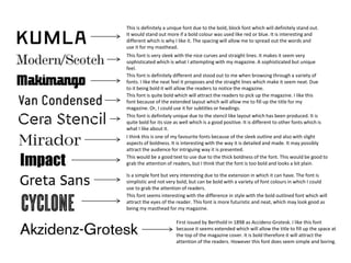
1. First issued by Berthold in 1898 as Accidenz-Grotesk. I like this font
because it seems extended which will allow the title to fill up the space at
the top of the magazine cover. It is bold therefore it will attract the
attention of the readers. However this font does seem simple and boring.
This font seems interesting with the difference in style with the bold outlined font which will
attract the eyes of the reader. This font is more futuristic and neat, which may look good as
being my masthead for my magazine.
Is a simple font but very interesting due to the extension in which it can have. The font is
simplistic and not very bold, but can be bold with a variety of font colours in which I could
use to grab the attention of readers.
This would be a good text to use due to the thick boldness of the font. This would be good to
grab the attention of readers, but I think that the font is too bold and looks a bit plain.
I think this is one of my favourite fonts because of the sleek outline and also with slight
aspects of boldness. It is interesting with the way it is detailed and made. It may possibly
attract the audience for intriguing way it is presented.
This font is definitely unique due to the stencil like layout which has been produced. It is
quite bold for its size as well which is a good positive. It is different to other fonts which is
what I like about it.
This font is quite bold which will attract the readers to pick up the magazine. I like this
font because of the extended layout which will allow me to fill up the title for my
magazine. Or, I could use it for subtitles or headings.
This font is definitely different and stood out to me when browsing through a variety of
fonts. I like the neat feel it proposes and the straight lines which make it seem neat. Due
to it being bold it will allow the readers to notice the magazine.
This font is very sleek with the nice curves and straight lines. It makes it seem very
sophisticated which is what I attempting with my magazine. A sophisticated but unique
feel.
This is definitely a unique font due to the bold, block font which will definitely stand out.
It would stand out more if a bold colour was used like red or blue. It is interesting and
different which is why I like it. The spacing will allow me to spread out the words and
use it for my masthead.