

Recommandé
Contenu connexe
Tendances
Tendances (19)
En vedette
Similaire à Eval q 2 updated
Similaire à Eval q 2 updated (20)
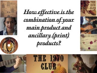
Eval q 2 updated
- 2. -I have constructed a coherent style throughout all 3 media products through their codes and mise-en scene. This style will be easily recognised and be identified with my artist to promote her image.
- 3. Linking my music product and ancillary task, I chose to use close up angles of flowers to also represent the romance theme of the video but also the flower is dying to represent the change of the main protagonists emotions and the theme of death which occurs in the ending. The ripping apart of the flower shows the frustration of the main protagonist and the heartbreak she feels. I chose to feature this idea of the flower on my main cd cover and poster as it is a subtle link to the music video but does not inform the viewer too much of the main story line of the video. Main features in my product and ancillary task
- 4. Main features in my product and ancillary task A constant theme running through my music video and ancillary task’s are the colour tones used. I chose to use slight pastel and saturated colours to reflect the dark, mysterious style of the video and reflect the artists style and mood.
- 5. When choosing the outfits for my artist and linking this to my music product, I continually stuck to the pastel colour pallet that reflects the artists style. The clothing in particular featured feathers and birds which also linked to the back ground where the filming took place and the image of the background on the music product. These shapes of birds and cages could connote freedom but I chose to use this theme to show the caging in of the victim in my music video. Main features in my product and ancillary task
- 6. Main features in my product and ancillary task The main objects which feature throughout the combinations of my product are mainly the acoustic guitar and the flowers. Through the presentation of the guitar, this could connote the folk/alternative style which the band is labled. The centre piece of the guitar is featured on the cover of the CD and is labelled with the band name with a vintage styled font to carry the folk style.
- 7. In both my poster and cd digi pack, I have used different colours, fonts, logo’s and layouts to reflect my band’s genre style and to promote their music. The different styles of fonts in both my products are vintage style, as well as the colour tones of the images. These different styles connote folk genre and appeal to that audience group. The logos used such as rough trade which is subtley placed on the back of the digi pack inform the audience of who the band is a part of and the style of bands which rough trade take on. The layouts of my products are simple layouts apart from the backing of my cd cover. The titles of the songs are dotted around the back like a map which could connote the artistic flair and originality of the band. Main features in my product and ancillary task
- 8. Representation/image As shown in a personal image of the band featured in my ancillary task and the image of my main singer shown throughout my music video, her image throughout is a contrast from most music videos. No sexual appeal is shown through clothing/acting as the video is not purposed for that but for shock and slight humour. The image of my singer may fulfil the personal identifications of the audience in areas such as emotional release and possibly gaining insight into themselves at a obsessed state of mind. They may be able to find relations to my main protagonist in the area’s of wanting to find love and not being able to come to the realisation that the person they like does not feel the same way.