


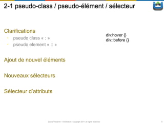
![2-3 pseudo-class / pseudo-élément / sélecteur
Sélecteur d’attribut
E[att] Un élément avec l’attribut att spécifié
E[att=val] Un élément dont l’attribut att est égale à une certaine valeur
E[att~=val] Un élément dont l’attribut att est une liste de valeurs séparées par
un espace et dont une des valeurs est égale à val
ex : p[class~=‘selected’] => <div class=‘button selected’> … </div>
E[att|=val] Un élément dont l’attribut att est égale à val ou commence par val
suivit de ‘-’
ex : p[lang|=‘en’] => <p lang=‘en-US’> … </p>
E[att^=val] Un élément dont l’attribut att commence par val
E[att$=val] Un élément dont l’attribut att se termine par val
E[att*=val] Un élément dont l’attribut att contient val
David Thevenin / ViniSketch / Copyright 2011 all rights reserved 11](https://image.slidesharecdn.com/webinarintelcss3-111218150128-phpapp01/85/CSS3-Intel-Webinar-11-320.jpg)
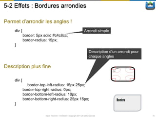
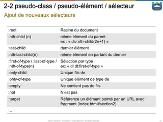
![5-3 Effets : Bordure d’images
Proposition de la spécification
border-image-source url sur l’image à utiliser
border-image-slice Offsets pour décomposé
l’images en 9 zones
border-image-width Taille des 4 bordures
border-image-outset Décalage de l’image
border-image-repeat Règle d’application (stretch,
repeat, …)
Ce qui marche :
WebKit, firefox, …
border-image: [source] [slice] [repeat];
border-width: [width];
David Thevenin / ViniSketch / Copyright 2011 all rights reserved 20](https://image.slidesharecdn.com/webinarintelcss3-111218150128-phpapp01/85/CSS3-Intel-Webinar-20-320.jpg)
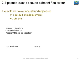
![5-4-1 Effets : Fond multiples
Format d’une propriété
propriété: valeur [, valeur]*;
Les principales propriétés
background-image url sur l’(les) image(s)
background-position position x, y en pourcentage/pixels/…
background-repeat répétition en x et/ou y ou non de chaque
image
…
David Thevenin / ViniSketch / Copyright 2011 all rights reserved 22](https://image.slidesharecdn.com/webinarintelcss3-111218150128-phpapp01/85/CSS3-Intel-Webinar-22-320.jpg)
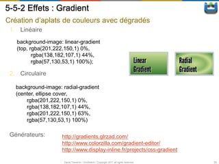
![5-5-1 Effets : Gradient
Création d’aplats de couleurs avec dégradés
1. Linéaire
<linear-gradient> = linear-gradient(
[ [ <angle> | to <side-or-corner> ] ,]?
<color-stop>[, <color-stop>]+
2. Circulaire
<radial-gradient> = radial-gradient(
[ [ <shape> || <size> ] [ at <position> ]? , |
at <position>,
]?<color-stop> [ , <color-stop> ]+
)
Webkit (safari < 5.1, Chrome < 10) :
-webkit-gradient(linear, …
-webkit-gradient(radial, …
FireFox/Opera/Webkit
[-moz|-o|-webkit]-linear-gradient(…
[-moz|-o|-webkit]-radial-gradient(…
David Thevenin / ViniSketch / Copyright 2011 all rights reserved 24](https://image.slidesharecdn.com/webinarintelcss3-111218150128-phpapp01/85/CSS3-Intel-Webinar-24-320.jpg)
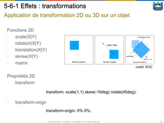
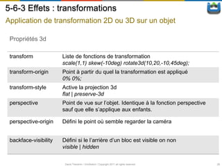
![5-6-2 Effets : transformations
Application de transformation 2D ou 3D sur un objet
Fonctions 3D
• scale(3d|X|Y|Z)
• rotate(3d|X|Y|Z)
• translation(3d|X|Y|Z)
• skrew(X|Y)
• matrix(3d)
• perspective
.parent {
transform: rotate3d(10,-10,-10,-145deg);
}
.parent >*:nth-child(n) {
transform: rotateY([n*8] deg) translateZ(100px) ;
}.
David Thevenin / ViniSketch / Copyright 2011 all rights reserved 27](https://image.slidesharecdn.com/webinarintelcss3-111218150128-phpapp01/85/CSS3-Intel-Webinar-27-320.jpg)

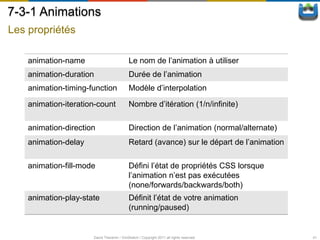
![7-3-2 Animations
Définir une animation (Keyframes)
@keyframes animation_name {
0% | from {
[property: value;]*
}
n% {
[property: value;]*
}
...
100% | to {
[property: value;]*
}
}
David Thevenin / ViniSketch / Copyright 2011 all rights reserved 42](https://image.slidesharecdn.com/webinarintelcss3-111218150128-phpapp01/85/CSS3-Intel-Webinar-42-320.jpg)

![8-3 Media Queries
Syntaxe
media_query_list
: S* [media_query [ ',' S* media_query ]* ]?
;
media_query
: [ONLY | NOT]? S* media_type S* [ AND S* expression ]*
| expression [ AND S* expression ]*
;
media_type
: IDENT
;
expression
: '(' S* media_feature S* [ ':' S* expr ]? ')' S*
;
media_feature
: IDENT
;
David Thevenin / ViniSketch / Copyright 2011 all rights reserved 48](https://image.slidesharecdn.com/webinarintelcss3-111218150128-phpapp01/85/CSS3-Intel-Webinar-48-320.jpg)


Le document traite des évolutions majeures de CSS3, abordant ses spécifications, modules et améliorations telles que les sélecteurs, les polices, les effets visuels, et les transformations. Il explique également comment utiliser des préfixes pour la compatibilité entre navigateurs et détaille des fonctionnalités comme les ombres, les dégradés et les animations. Enfin, il mentionne des modèles de mise en page tels que le modèle de boîte et les colonnes, ainsi que les transitions et animations en CSS.


