Famous and Important UIUX Laws for your next Digital product

UI/UX laws, also known as principles or guidelines, are foundational concepts in the field of User Interface (UI) and User Experience (UX) design. These laws are based on research, observation, and best practices, and they help designers create interfaces that are intuitive, user-friendly, and effective. Here are some common UI/UX laws: Learn all UX laws in my 🏆 The Ultimate UI UX Handbook - https://princepaluiux.com/the-ultimate-ui-ux-handbook Hick's Law: This law states that the time it takes to make a decision increases with the number and complexity of choices. In UI/UX design, it suggests that simplifying options and reducing cognitive load can improve user experience. Fitts's Law: This law describes the relationship between the size of a target and the time it takes to interact with it. It states that larger targets that are closer require less time and effort to interact with. In UI/UX design, it emphasizes the importance of making interactive elements like buttons and links easily clickable. Gestalt Principles: These principles describe how humans perceive and organize visual information. They include principles like proximity, similarity, closure, and continuation, which designers use to create layouts and interfaces that are visually cohesive and easy to understand. Miller's Law: Miller's Law suggests that the average person can only keep about seven (plus or minus two) items in their working memory at once. Designers use this principle to limit the number of elements on a screen and organize information in a way that is easy to process. Jakob's Law: This law states that users are more comfortable with interfaces that are familiar to them. Designers often follow established design patterns and conventions to create interfaces that users can quickly understand and navigate. Familiarity Principle: Users prefer interfaces that are familiar and similar to other interfaces they have used before. This principle encourages designers to follow common design patterns and conventions to create intuitive experiences. Visibility Principle: This principle suggests that important features and functions should be easily visible to users. Designers use techniques like prominent placement, contrasting colors, and clear labels to ensure that key elements are readily apparent. Progressive Disclosure: This principle involves revealing information and functionality gradually to users as they interact with an interface. It helps prevent overwhelming users with too much information at once and allows them to focus on the most important tasks. These laws are not strict rules but rather guidelines that inform design decisions and help designers create interfaces that are effective and user-friendly.

Recommandé
Recommandé
Contenu connexe
Similaire à Famous and Important UIUX Laws for your next Digital product
Similaire à Famous and Important UIUX Laws for your next Digital product (20)
Plus de Think 360 Studio
Plus de Think 360 Studio (7)
Dernier
Dernier (16)
Famous and Important UIUX Laws for your next Digital product
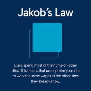
- 2. Benefits By leveraging the mental models that users have developed from familiar products, we can enhance user experiences, enabling them to concentrate on tasks rather than learning new interfaces. When introducing changes, it is essential to minimize disruption by allowing users to access the previous version for a limited time. This approach helps in transferring user expectations from one product to another that appears similar, thus maintaining a seamless user experience.
- 3. Examples
- 4. 1. Form Controls Form toggles, radio inputs, and buttons were designed to mimic their physical counterparts.
- 5. 2: YouTube Redesign When YouTube updated to a new Material Design UI in 2017 , they let desktop users preview the change, provide feedback, and optionally revert to the old design, effectively reducing mental model discord by allowing users to switch on their terms.
- 6. 3: Similar Navigation Structure In interface design, strategically using common design patterns and conventions for page structure, workflows, navigation, and placement of key elements like search can enhance usability.
- 7. 4: E-commerce websites Both the e-commerce websites using same size selection option and following the buttons and information on the right side and image left.
- 8. 5: Music Player Controls All 3 major music apps have a similar user interface and that’ s not a crime, my fellow designers.
- 10. Benefits Reduce options to expedite decision-making during time-sensitive situations. Divide intricate tasks into manageable steps to alleviate mental burden. Highlight suggested choices to prevent user overload. Implement gradual familiarization processes to ease cognitive burden on newcomers. Ensure complexity is retained without veering into overly abstract territory.
- 11. Examples
- 12. 1. Google Homepage Google streamlines the keyword entry process by removing extraneous content, minimizing distractions, and reducing decision- making requirements.
- 13. 2. Apple TV Remote Apple TV remotes minimize cognitive load by offloading complexity to the TV interface, facilitating efficient organization and progressive disclosure of information within menus
- 14. 3. Slack’ s Progressive Onboarding Slack gently guides users through its features using a bot, starting with messaging to prevent overwhelm, gradually unveiling more functions as users become familiar . This gradual approach ensures users learn without feeling overwhelmed by the full app at once
- 15. 4. Menu Items Hick's Law applies to interface design but not to complex decision- making involving extensive reading or research, as it can't reliably predict decision time in those situations.
- 16. 5. Cars Choosing between two options is simpler than selecting from a larger set, adhering to basic logic; as the number of options increases, so does the cognitive load on the user , exemplifying Hick's law.
- 18. Benefits Larger targets: Make interactive elements bigger to enhance usability. Closer targets: Position frequently used elements nearer to the user for quicker access Balance size and distance: Find the right balance between target size and distance for optimal interaction. Context matters: Consider device type, input method, and user preferences when designing touch targets.
- 19. Examples
- 20. 1. Finding a purchase button In the snapshot, users aim to finalize their purchase; however , in the inferior layout, the top-right Buy option complicates one-handed use. Conversely, the superior layout places the Purchase button at the bottom, easing one-handed tapping with comprehensive information.
- 21. 2.Larger form options During app setup, users select fitness goals. In a less ideal setup, cramped options make tapping difficult and require extra thinking, with the Next button hard to reach. Conversely, a well-designed layout features spaced-out options and an accessible Next button for smoother interaction.
- 22. 3.Simplified tab bars We're checking out an app's homepage in this example. This page is really important because it guides what the user does next. If it's good, they might stay and buy things, but if it's bad, they might delete the app quickly.
- 23. 4. Bigger targets are better Fitts's law emphasizes the importance of making targets larger . It shows that people click, tap, or hover faster on bigger targets, and error rates decrease as target sizes increase.
- 24. 4.Creating large enough target area When designing buttons and clickable on-screen elements, paying attention to Fitts's Law is crucial. It's a fundamental principle for creating good user experiences and highlights how overlooking it can result in serious consequences.
- 25. AvailableOn
- 26. Follow me for more tips on UX and Product Design. Hello, I’m Prince Pal Singh www.princepaluiux.com