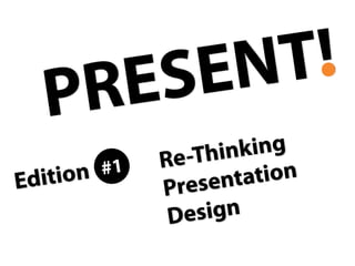
Present! - Edition #1 Rethinking Presentation Design
•
683 j'aime•58,995 vues

How do I start when creating a PowerPoint or Keynote presentation? What are the things to focus on? How should I approach the design? These slides try to answer these questions.
Signaler
Partager
Signaler
Partager
Télécharger pour lire hors ligne

Recommandé
Help, My Presentation Sucks! 3 emergency ideas to help your presentation
You're nearing the deadline and still unhappy with the presentation? Here are 3 ideas which you can implement fast to improve your presentation.
2012 and We're STILL Using PowerPoint Wrong
The document criticizes the overuse and misuse of PowerPoint presentations. It notes that PowerPoint was created in 1990 but presenters are still improperly using it 22 years later by overstuffing slides with too much text and information instead of using it to tell stories. The document recommends using images, telling interesting stories, preparing early, getting better training, and stopping the practice of overstuffing slides to create more effective presentations.
How to stand out online
The document provides 5 steps to help brands stand out: 1) Have a mission that makes a statement about humanity. 2) Tell a remarkable story that elicits emotions. 3) Create an effective business card that stands out visually and includes a call to action. 4) Develop unique trademarks and language styles. 5) Always look for ways to improve and "plus" your work. The overarching message is to create in the most unique way possible.
My Thesis Defense Presentation
The document discusses the importance of conversations in developing relationships. It notes that while some advocate "selling the sizzle not the steak", engaging in meaningful conversations where common ground is found is better. The results of interviews with people on their dating experiences and favorite companies suggest that conversations matter because that's how relationships are formed. People are more inclined to connect with companies or products that fit their personality or lifestyle.
General Ppt
The document contains several short presentations on various topics including excuses that are not recommended, tips to improve character, gifts that do not cost money, examples of people who achieved things late in life, sayings about different topics like country, quitting, money, respect, and facts about the human body. It concludes with "secrets of success" sayings associated with different objects.
Innovation with extreme consumers
This document discusses how engaging with extreme consumers can help drive innovation. It provides examples of how extreme demands from individual consumers transformed companies like Harley-Davidson and Top Shop. The document advocates finding extreme or unconventional users, called "muses," to help think laterally and create unexpected solutions that could change a business. Engaging with extreme consumers may be more valuable than typical average users when it comes to innovating new products and business models.
The Art of Storytelling
We are all born storytellers. But not many of us know how to create and tell stories in the right way. Especially, in presentations and public speaking. Learn about the art of storytelling in our short slide deck covering valuable tips and tricks about it.
Check out our training: http://yanyhbash.ru/training-courses/let-me-speak-from-my-heart-storitelling-v-prezentatsiyakh/
60 Minute Brand Strategist: Extended and updated hard cover NOW available.
This book includes the very latest thinking on branding and brand strategy. It has been published in different many languages and use by top global brands to train their brand managers. New updated hard cover version is not available from Amazon May 2013
Pls view in full screen mode. Published in more than 5 languages.
1 simple way to better presentations: don't outline, PUMA!
The biggest problem in creating our presentation is making a great storyline. Here's how to do it: create a PUMA.
There's more in my book.
http://www.amazon.com/Show-Tell-Everybody-Extraordinary-Presentations/dp/1591846854/ref=zg_bs_660628_14
My Life's Journey
This document summarizes the life journey of Andy Harjanto. It describes how he was born and raised in Indonesia, then moved to the US at age 19 to pursue higher education, obtaining various degrees. He started his own startup company but it failed. He then did consulting work for several years before joining Microsoft where he worked for 14 years on various projects. More recently, he co-founded Guppers.com and enjoys traveling and spending time with his family. Throughout his journey, he has learned the importance of taking risks, pursuing passions, and making a positive impact.
How to Give a TED Worthy Presentation
http://www.skillshare.com/How-to-Create-a-TED-Worthy-Presentation/698156887/1007905343
ABOUT THE PRESENTATION:
We are living in a world where Steve Jobs was a modern-day hero, Al Gore won an Oscar for his Inconvenient Truth presentation and the TED conference is the place everyone wants to be each year. Thanks to this leadership style, the bar for presentations that convey world changing ideas is set incredibly high. This class is designed to help you clear that high bar with confidence, grace and skill.
Creating meaningful presentations can be tricky, time consuming and nerve wracking, but by focusing on the key elements in this class, you too can give a TED worthy presentation.
This class is designed to cover the following topics:
Audience: understanding your audience
Stickiness: creating unique messaging that sticks
Authenticity: remaining authentic so your audience trusts you
Tools: using the right tools - both offline and online
Deck: 3 steps to building your presentation - preparation, design, delivery
Follow up: sending the right materials as a follow up (and it's not just your noteless deck!)
By the end of the class, you will have everything you need to create a strong presentation that is simple, easy to understand, exciting and visually stimulating.
ABOUT THE PRESENTER:
Brooke spoke at TEDxBKK, was a speaker coach for TEDxPhnom Penh, TEDxMission, and is the Director of Communications for an NGO that was the result of a TED prize - hence the name InSTEDD. Before InSTEDD, Brooke worked on Public Relations at Kiva, Social Innovation Design at Lovely Day, Business Development at All Day Buffet, & Project Coordination at Change Fusion Bangkok. Brooke is a frequent public speaker and has spoken at events in Thailand, Nepal, Europe and the US, including Stanford, Berkeley and Northwestern.
7 Lessons from the World's Most Captivating Presenters
Lessons From the World's Most Captivating Presenters provides tips for effective presentations. It recommends starting with your story before creating slides, telling your story to convey why the audience needs what you offer and how it will benefit them. It also suggests using pictures instead of just words since pictures are better remembered, appealing to emotions to make a lasting impression, speaking in plain English, and ditching bullet points in favor of full sentences to engage the audience. Finally, it stresses the importance of extensive rehearsal to deliver an excellent presentation.
Sold Our Souls To The Devil
Sold our souls to the devil and wrote a book. "DON'T SUCK! How to make presentations rock".
This eBook for iPad will help you create great stories and visually awesome slides. Say NO to crappy slides.
Что-то там про Сторителлинг
Презентация с мастер-класса Алексея Каптерева "Сторителлинг" 12 ноября 2013 года в НИУ ВШЭ.
Мастер-класс организован Бизнес-инкубатором НИУ-ВШЭ.
Future-Proof Your Career: 10 quotes that will guarantee your employment - fo...
10 inspirational quotes that to help you build a future-proof career.
A career where you're always inspired, successful, and doing your best work. A career where you're developing valuable skills, taking risks, and always at the top of your game.
These quotes will inspire you, make you think, and help you plan for an uncertain future.
Talk & Play #1 - Making Games without Coding - Tinytouchtales
Tinytouchtales is a game studio run by Wiebke Rauers and Arnold Floeck that creates games and interactive stories for touchscreens without coding. They use the Stencyl game engine to design games once that can then be played on multiple platforms. Tinytouchtales shares information about their games and development process on their website and social media channels and encourages others to make games.
3 minute presentation
The document provides suggestions for creating a single slide summary of a thesis presentation. It recommends including the key elements of the research, results, and relevant images on the one slide. Alternatively, a quote that encapsulates the thesis could be used. The document humorously advises against making the font too small to fit everything or relying on clipart without offering proper tribute to the Gods of Clipart.
How to Create an INSANELY GREAT Presentation or Pitch
This document provides tips for creating highly effective presentations. It emphasizes the importance of clear communication and storytelling to engage audiences. The key recommendations are to have a single core message, keep content simple, start with an engaging story rather than an agenda, use visuals over words whenever possible, appeal to emotions, and practice presentation skills. The overall goal is to make presentations "insanely great" so that audiences feel compelled to pay attention.
Influencing change through presentations
The ability to craft (and deliver) a good presentation should be in the quiver of every designer, right along side their Moleskine and Micron pens.
I use presentations to unravel a vague idea or requirement to be sure I completely understand all of the facets and details. If I can’t clearly explain a topic or idea then I need to go back to the project stakeholder and regroup. In some cases this will uncover holes that need to be address even before I start sketching out a wire frame.
Celebrities
These slides help students to use the vocabulary they have learned connected with appearance. First, they have to guess who is shown in the picture and then describe him/her. This presentation can also work as a warmer before introducing the topic of Entertainment or Celebrities.
Sample slides by Garr Reynolds
This deck contains slides I have used in live talks that (more or less) are simple and contain quite a bit of empty space. The first set are some before/after examples, followed by a random sample. This deck is not meant to tell a story -- this is just a way to show some random examples. The meaning of the slides may not be at all clear without the narration that goes with the slides.
Go To Meeting Presentation Secrets Of Steve Jobs
The document summarizes 10 presentation techniques used by Steve Jobs that made him one of the world's most extraordinary storytellers. These include planning presentations in analog first before digitizing, focusing on benefits rather than products, sticking to the rule of three main points, selling dreams rather than just products, using visual slides over text, making numbers meaningful, revealing a "holy smokes" moment, and practicing presentations extensively. The document was written by Carmine Gallo to teach business professionals how to give inspiring presentations.
Slides (in PDF) from Safari Webcast
These were the slides used in the Safari Webcast held 12_15_08 from Tokyo. These are *not* meant to be stand alone slides, but many people were asking for the PDF, so here you go. This is the actual PDF I used. Here, however, some of the type colors may be off (though it worked well when uploaded; colors were correct). It is 240 slides because I used a PDF and therefore more slides are used to simulate animation. The PDF was 30 MB uploaded here. There were lagging issues during the webex webcast though I was not aware of them. The archive is better though there are still timing issues. Not really much new here in this deck for longtime followers.
The presentation secrets of steve jobs
the Secret of Presentation by Steve Jobs that tremendously inspired a lot of people in the world.. This presentation will show you the passion, strategy, and technically tips how to transform your presentation into the best one..
PowerPoint - Mastering The Art
The document discusses common mistakes in PowerPoint presentations and provides tips to improve presentations. 99% of PowerPoint presentations are ineffective due to incoherence, poor design, and misuse of fonts, colors, and clipart. To avoid these issues, presentations should start with defining the end goal and understanding the audience. The content should be the focus, kept simple, and structured with an outline. Visuals like graphics, charts, and audio/video can be used if they enhance the content but extra elements should be limited. Maintaining eye contact and passion during delivery is also important.
20 Tweetable Quotes to Inspire Marketing & Design Creative Genius
This document provides 20 quotes from historical figures to inspire creative genius. The quotes encourage thinking outside the box, taking risks, being curious, breaking rules, and gaining an unfair advantage through creativity. They emphasize trusting instincts, changing the world through committed groups, and navigating without a map in creative pursuits. The document aims to banish creative roadblocks by sharing inspirational thoughts on creativity.
What would steve do
The document provides 10 tips for creating captivating presentations based on lessons from famous presenters like Steve Jobs, Scott Harrison, and Gary Vaynerchuk. The tips include crafting an emotional story with a beginning, middle, and end; creating slides that answer why the audience should care, how it will improve their lives, and what they must do; using simple language without jargon; using metaphors; ditching bullet points; showing rather than just telling through images; rehearsing extensively; and that excellence requires hard work with no shortcuts.
What Would Steve Do? 10 Lessons from the World's Most Captivating Presenters
The document provides 10 tips for creating captivating presentations based on lessons from famous presenters like Steve Jobs, Scott Harrison, and Gary Vaynerchuk. The tips include crafting an emotional story with a beginning, middle, and end; creating slides that answer why the audience should care, how it will improve their lives, and what they must do; using simple language without jargon; using metaphors; ditching bullet points; showing rather than just telling through images; rehearsing extensively; and that excellence requires hard work with no shortcuts.
The Future of Presentations: Top Trends for Communicators
From the rise of visual communication to mobile optimization, top trends in presentations for communicators. Created by Catherine Carr, Haiku Deck's Chief Inspiration Officer.
12 Secrets for Jazzing up Your Presentation
A Learning Chi workshop on the Jazz of Powerpoint, secrets to captivate you audience for the Executive Women in Texas Government Annual Conference. LaDonna Coy, (cc)
Contenu connexe
Tendances
1 simple way to better presentations: don't outline, PUMA!
The biggest problem in creating our presentation is making a great storyline. Here's how to do it: create a PUMA.
There's more in my book.
http://www.amazon.com/Show-Tell-Everybody-Extraordinary-Presentations/dp/1591846854/ref=zg_bs_660628_14
My Life's Journey
This document summarizes the life journey of Andy Harjanto. It describes how he was born and raised in Indonesia, then moved to the US at age 19 to pursue higher education, obtaining various degrees. He started his own startup company but it failed. He then did consulting work for several years before joining Microsoft where he worked for 14 years on various projects. More recently, he co-founded Guppers.com and enjoys traveling and spending time with his family. Throughout his journey, he has learned the importance of taking risks, pursuing passions, and making a positive impact.
How to Give a TED Worthy Presentation
http://www.skillshare.com/How-to-Create-a-TED-Worthy-Presentation/698156887/1007905343
ABOUT THE PRESENTATION:
We are living in a world where Steve Jobs was a modern-day hero, Al Gore won an Oscar for his Inconvenient Truth presentation and the TED conference is the place everyone wants to be each year. Thanks to this leadership style, the bar for presentations that convey world changing ideas is set incredibly high. This class is designed to help you clear that high bar with confidence, grace and skill.
Creating meaningful presentations can be tricky, time consuming and nerve wracking, but by focusing on the key elements in this class, you too can give a TED worthy presentation.
This class is designed to cover the following topics:
Audience: understanding your audience
Stickiness: creating unique messaging that sticks
Authenticity: remaining authentic so your audience trusts you
Tools: using the right tools - both offline and online
Deck: 3 steps to building your presentation - preparation, design, delivery
Follow up: sending the right materials as a follow up (and it's not just your noteless deck!)
By the end of the class, you will have everything you need to create a strong presentation that is simple, easy to understand, exciting and visually stimulating.
ABOUT THE PRESENTER:
Brooke spoke at TEDxBKK, was a speaker coach for TEDxPhnom Penh, TEDxMission, and is the Director of Communications for an NGO that was the result of a TED prize - hence the name InSTEDD. Before InSTEDD, Brooke worked on Public Relations at Kiva, Social Innovation Design at Lovely Day, Business Development at All Day Buffet, & Project Coordination at Change Fusion Bangkok. Brooke is a frequent public speaker and has spoken at events in Thailand, Nepal, Europe and the US, including Stanford, Berkeley and Northwestern.
7 Lessons from the World's Most Captivating Presenters
Lessons From the World's Most Captivating Presenters provides tips for effective presentations. It recommends starting with your story before creating slides, telling your story to convey why the audience needs what you offer and how it will benefit them. It also suggests using pictures instead of just words since pictures are better remembered, appealing to emotions to make a lasting impression, speaking in plain English, and ditching bullet points in favor of full sentences to engage the audience. Finally, it stresses the importance of extensive rehearsal to deliver an excellent presentation.
Sold Our Souls To The Devil
Sold our souls to the devil and wrote a book. "DON'T SUCK! How to make presentations rock".
This eBook for iPad will help you create great stories and visually awesome slides. Say NO to crappy slides.
Что-то там про Сторителлинг
Презентация с мастер-класса Алексея Каптерева "Сторителлинг" 12 ноября 2013 года в НИУ ВШЭ.
Мастер-класс организован Бизнес-инкубатором НИУ-ВШЭ.
Future-Proof Your Career: 10 quotes that will guarantee your employment - fo...
10 inspirational quotes that to help you build a future-proof career.
A career where you're always inspired, successful, and doing your best work. A career where you're developing valuable skills, taking risks, and always at the top of your game.
These quotes will inspire you, make you think, and help you plan for an uncertain future.
Talk & Play #1 - Making Games without Coding - Tinytouchtales
Tinytouchtales is a game studio run by Wiebke Rauers and Arnold Floeck that creates games and interactive stories for touchscreens without coding. They use the Stencyl game engine to design games once that can then be played on multiple platforms. Tinytouchtales shares information about their games and development process on their website and social media channels and encourages others to make games.
3 minute presentation
The document provides suggestions for creating a single slide summary of a thesis presentation. It recommends including the key elements of the research, results, and relevant images on the one slide. Alternatively, a quote that encapsulates the thesis could be used. The document humorously advises against making the font too small to fit everything or relying on clipart without offering proper tribute to the Gods of Clipart.
How to Create an INSANELY GREAT Presentation or Pitch
This document provides tips for creating highly effective presentations. It emphasizes the importance of clear communication and storytelling to engage audiences. The key recommendations are to have a single core message, keep content simple, start with an engaging story rather than an agenda, use visuals over words whenever possible, appeal to emotions, and practice presentation skills. The overall goal is to make presentations "insanely great" so that audiences feel compelled to pay attention.
Influencing change through presentations
The ability to craft (and deliver) a good presentation should be in the quiver of every designer, right along side their Moleskine and Micron pens.
I use presentations to unravel a vague idea or requirement to be sure I completely understand all of the facets and details. If I can’t clearly explain a topic or idea then I need to go back to the project stakeholder and regroup. In some cases this will uncover holes that need to be address even before I start sketching out a wire frame.
Celebrities
These slides help students to use the vocabulary they have learned connected with appearance. First, they have to guess who is shown in the picture and then describe him/her. This presentation can also work as a warmer before introducing the topic of Entertainment or Celebrities.
Sample slides by Garr Reynolds
This deck contains slides I have used in live talks that (more or less) are simple and contain quite a bit of empty space. The first set are some before/after examples, followed by a random sample. This deck is not meant to tell a story -- this is just a way to show some random examples. The meaning of the slides may not be at all clear without the narration that goes with the slides.
Go To Meeting Presentation Secrets Of Steve Jobs
The document summarizes 10 presentation techniques used by Steve Jobs that made him one of the world's most extraordinary storytellers. These include planning presentations in analog first before digitizing, focusing on benefits rather than products, sticking to the rule of three main points, selling dreams rather than just products, using visual slides over text, making numbers meaningful, revealing a "holy smokes" moment, and practicing presentations extensively. The document was written by Carmine Gallo to teach business professionals how to give inspiring presentations.
Slides (in PDF) from Safari Webcast
These were the slides used in the Safari Webcast held 12_15_08 from Tokyo. These are *not* meant to be stand alone slides, but many people were asking for the PDF, so here you go. This is the actual PDF I used. Here, however, some of the type colors may be off (though it worked well when uploaded; colors were correct). It is 240 slides because I used a PDF and therefore more slides are used to simulate animation. The PDF was 30 MB uploaded here. There were lagging issues during the webex webcast though I was not aware of them. The archive is better though there are still timing issues. Not really much new here in this deck for longtime followers.
The presentation secrets of steve jobs
the Secret of Presentation by Steve Jobs that tremendously inspired a lot of people in the world.. This presentation will show you the passion, strategy, and technically tips how to transform your presentation into the best one..
PowerPoint - Mastering The Art
The document discusses common mistakes in PowerPoint presentations and provides tips to improve presentations. 99% of PowerPoint presentations are ineffective due to incoherence, poor design, and misuse of fonts, colors, and clipart. To avoid these issues, presentations should start with defining the end goal and understanding the audience. The content should be the focus, kept simple, and structured with an outline. Visuals like graphics, charts, and audio/video can be used if they enhance the content but extra elements should be limited. Maintaining eye contact and passion during delivery is also important.
20 Tweetable Quotes to Inspire Marketing & Design Creative Genius
This document provides 20 quotes from historical figures to inspire creative genius. The quotes encourage thinking outside the box, taking risks, being curious, breaking rules, and gaining an unfair advantage through creativity. They emphasize trusting instincts, changing the world through committed groups, and navigating without a map in creative pursuits. The document aims to banish creative roadblocks by sharing inspirational thoughts on creativity.
What would steve do
The document provides 10 tips for creating captivating presentations based on lessons from famous presenters like Steve Jobs, Scott Harrison, and Gary Vaynerchuk. The tips include crafting an emotional story with a beginning, middle, and end; creating slides that answer why the audience should care, how it will improve their lives, and what they must do; using simple language without jargon; using metaphors; ditching bullet points; showing rather than just telling through images; rehearsing extensively; and that excellence requires hard work with no shortcuts.
What Would Steve Do? 10 Lessons from the World's Most Captivating Presenters
The document provides 10 tips for creating captivating presentations based on lessons from famous presenters like Steve Jobs, Scott Harrison, and Gary Vaynerchuk. The tips include crafting an emotional story with a beginning, middle, and end; creating slides that answer why the audience should care, how it will improve their lives, and what they must do; using simple language without jargon; using metaphors; ditching bullet points; showing rather than just telling through images; rehearsing extensively; and that excellence requires hard work with no shortcuts.
Tendances (20)
1 simple way to better presentations: don't outline, PUMA!
1 simple way to better presentations: don't outline, PUMA!
7 Lessons from the World's Most Captivating Presenters
7 Lessons from the World's Most Captivating Presenters
Future-Proof Your Career: 10 quotes that will guarantee your employment - fo...
Future-Proof Your Career: 10 quotes that will guarantee your employment - fo...
Talk & Play #1 - Making Games without Coding - Tinytouchtales
Talk & Play #1 - Making Games without Coding - Tinytouchtales
How to Create an INSANELY GREAT Presentation or Pitch
How to Create an INSANELY GREAT Presentation or Pitch
20 Tweetable Quotes to Inspire Marketing & Design Creative Genius
20 Tweetable Quotes to Inspire Marketing & Design Creative Genius
What Would Steve Do? 10 Lessons from the World's Most Captivating Presenters
What Would Steve Do? 10 Lessons from the World's Most Captivating Presenters
En vedette
The Future of Presentations: Top Trends for Communicators
From the rise of visual communication to mobile optimization, top trends in presentations for communicators. Created by Catherine Carr, Haiku Deck's Chief Inspiration Officer.
12 Secrets for Jazzing up Your Presentation
A Learning Chi workshop on the Jazz of Powerpoint, secrets to captivate you audience for the Executive Women in Texas Government Annual Conference. LaDonna Coy, (cc)
Top 7 Online Tools to Create Visual Content that Engages
This document lists 7 online tools that can be used to create visual content for engagement: Canva for visual social posts, presentations, and eBook covers; Piktochart for infographics; PicMonkey for photo editing and collages; Infogr.am for infographics and charts; Pixlr for photo editing; Timeline Slicer for Facebook images; and Unsplash for free high-resolution photos. The tools allow users to edit photos, create collages and infographics, and find stock images to engage audiences visually.
How To Create PowerPoints That Are Out Of This World
Take it from someone who cringes at the site of ugly powerpoints. If you apply these 4 takeaways, your Powerpoint will dramatically help you amplify your message.
The 10 Commandments of Presentation Design
For the complete explanation of these slides and more insight on great presentations, please visit http://www.squareplanet.com/10-commandments-design
Using Your Camera Phone to Create Awesome Presentations
Stock photography is commonly used but can look similar across presentations. This presentation was created using only an iPhone and PowerPoint to take unique city background photos. Effective techniques include taking photos on sunny days for drama, blurring detailed photos so content is clear, using the rule of thirds composition, and removing backgrounds from photos for interaction with drawn shapes.
How to Make your Slides More Memorable?
Slides are meant to aid the audience's memory, not the speaker's, and should contain less text to be more memorable. Presenters should not treat slides as a substitute for lecture notes or use poor or complicated graphics that are difficult for audiences to understand as they detract from effectively making their point.
Slide Bandits
The document discusses the benefits of meditation for reducing stress and anxiety. Regular meditation practice can help calm the mind and body by lowering blood pressure, reducing muscle tension, and decreasing levels of stress hormones. Making meditation a part of a daily routine, even if just 10-15 minutes per day, can offer significant health advantages over time.
10 Tips for Making Beautiful Slideshow Presentations by www.visuali.se
1. Know your goal | make each slide count
2. Plan it out | in some detail
3. Avoid templates | they have the uglies
4. Choose a color scheme | 4 colors, 1 accent
5. Choose a font scheme | match tone
6. Choose a layout scheme | comprehension
7. Use images (wisely) | they’re more memorable
8. 15 words per slide | this slide had 16 words
9. Play with typography | impact, interest, hierarchy
10. Don’t overdo it | white space
Hope you enjoy!
SEE MORE OF MY WORK: http://www.visuali.se
The Science of Memorable Presentations
Learn more about "The Science of Memorable Presentations" by checking out the Ethos3 blog post on this topic: http://ethr.ee/1ULMrxy
Ethos3 is a presentation design agency with premier PowerPoint and presentation designers. We can create the perfect presentation for you: www.ethos3.com
If you need help creating professional presentations, email us at: info@ethos3.com
7 Tips to Beautiful PowerPoint by @itseugenec
Short talk about presentations given at Startup Dynamo, a workshop held by Startup@Singapore NUS using the Learn Startup Methodology.
My segment was on Presentation Design to make an impact on VCs. Many thanks to @ryanlou for the invite. And not to forget Emiland De Cubber for his amazing slide deck inspirations and invaluable advice. Disclaimer: this is a reimagination off some of Emiland's presentations. I do not make any money of this.
Download for just a tweet: http://goo.gl/fbM4j
Want something similar done for your next pitch? Contact me at my site: http://itseugene.me/contact/
10 Better Ways to Add Text to #Images
When you are creating a visuals and want them to look as snazzy as possible, there is a lot you can do to make your images shine with the brightness and glory of a thousand suns. You can add beautiful background textures, have perfectly complimentary fonts, or play with the orientation of your text in different ways. Even so, if you are not careful your text can look boring. Another way to make your presentation slides look spiffy (and certainly not boring) is to change up the way you display your text. Here are ten clever and easy to implement design tips for mixing up your text display and maximizing your design potential.
MOVE - don't sit still (by Jimmy Janlén)
Presentation created by Jimmy Janlén, Certified TBR Trainer and Agile Coach at Crisp (Sweden).
Movement trumps sitting is the first and most important of the six learning trumps from Sharon Bowmans book "Using Brain Science to make learning stick".
This presentation summarizes why and gives 7 examples of how you can add movement into your class and workshops.
A or B
Today's teachers need to evolve with their students and society. It is no longer enough to master the basics--students need and want 21st century skills.
Sketchnoting FOR Learning
The term sketchnoting describes a style of visual note-taking recently gaining popularity among conference attendees. Contrary to popular belief, you do not have to be an artist to sketchnote and to take advantage of a different type of learning and making content connections beyond conference keynotes . Sketchnoting is helping make your thinking visible and shareable as you are reading a professional book, watching a movie clip, reading an educational blog post or article or listening to a lecture of conference keynote.
This workshop is for educators who want to hone their abilities to listen more intently, summarize and organize their notes in a visual way and learn how to do this with their students. NO artistic talent required.
Want to work with me? Contact me via http://www.globallyconnectedlearning.com
Learning to Learn
This presentation makes the case for the importance of learning how to learn... for more information visit www.mirqah.com
corporate TRAINING that ROCKS
BILLIONS of US$ are wasted on corporate training every year. Here are the keys to getting it right! Real results and real ROI!
The Anatomy of Great Content (and the fire that refines it)
YOU are the fire that refines your content..
Allow yourself to shine through, and trust, connection, and sharing will follow.
En vedette (18)
The Future of Presentations: Top Trends for Communicators
The Future of Presentations: Top Trends for Communicators
Top 7 Online Tools to Create Visual Content that Engages
Top 7 Online Tools to Create Visual Content that Engages
How To Create PowerPoints That Are Out Of This World
How To Create PowerPoints That Are Out Of This World
Using Your Camera Phone to Create Awesome Presentations
Using Your Camera Phone to Create Awesome Presentations
10 Tips for Making Beautiful Slideshow Presentations by www.visuali.se
10 Tips for Making Beautiful Slideshow Presentations by www.visuali.se
The Anatomy of Great Content (and the fire that refines it)
The Anatomy of Great Content (and the fire that refines it)
Similaire à Present! - Edition #1 Rethinking Presentation Design
Full evaluation of poster
The document provides an in-depth evaluation of the creative process behind designing a movie poster. It discusses the choices made for the title, tagline, background image, text placement, fonts, and colors. The goal was to create an eye-catching poster that draws attention to the title and tagline to intrigue viewers about the film's message and promote discussion. While some aspects could have been improved, the document explains the reasoning behind each element and overall the poster accomplished the goal of marketing the film and its ideas.
Evolve premier signature edit
The document discusses the signature edit process for portraits. It explains that the goal is to select a single standout image from a photographer's portfolio to represent their best work and help market their business. Several key elements that make for a strong signature edit image are described, including capturing a big, dramatic scene with the subject smaller in the frame that shows emotion, connection, and impact. The editing process at Evolve Premier art directs the selected images to ensure they are technically sound and maximized for their signature representation.
Evolve premier signature edit v2
The document discusses the signature edit process for portraits. It explains that the goal is to select a single standout image from a photographer's portfolio to represent their best work and help market their business. Several key elements that make for a strong signature edit image are described, including capturing the subject in a dramatic pose and environment, showing emotion and connection, and ensuring technical quality. The process at Evolve involves art directing selected images to enhance aspects that will distinguish a signature edit from other portfolio images.
Scott Keneally Sample Treatment - Chapstick
The filmmaker is excited about the project creating videos for Chapstick DUO lip balm. They propose filming each influencer for half a day doing everyday activities while using the product. They also suggest filming a group discussion where the influencers can interact and discuss DUO naturally. Various creative elements are proposed like challenges tailored to each influencer and testimonials filmed against colored backgrounds matching DUO's flavors. The overall goal is to showcase the influencers' personalities and lives while demonstrating how well DUO fits into their routines in an authentic way.
Teaching with Sakai CLE from the Ground Up!
Join Pepperdine University's Technology and Learning group as we build a course site from the ground up. We will cover topics like course management, setting expectations, chunking, and discussion. We'll explore Site Info, Home, Syllabus, Lessons, and Forums to inform and engage your students. We will wrap up this session with tips/gotchas and look to all participants to share best practices throughout.
Presentation WOW - PASS Summit 2012 Lightning Talk
This document provides tips for delivering great presentations. It recommends telling a story to engage audiences rather than listing every word on slides. Designing presentations like billboards by keeping them simple yet creative. Finally, to treat presentations like performances and rehearse to change the world.
Cae speaking
The document provides useful expressions for CAE speaking exams, including phrases for:
- Asking for thinking time like "That's an interesting question" or "Let me see..."
- Expressing doubt or uncertainty with phrases like "I guess" or "It depends..."
- Paraphrasing what someone said using phrases such as "To put it another way" or "What I'm trying to say is..."
- Correcting yourself with phrases like "What I should have said was..." or "Come to think of it..."
- Indicating you don't understand with phrases like "I'm sorry, I don't understand the question."
FirmPlay.com Careers Page Teardowns: Dealertrack
The document provides a teardown and analysis of Dealertrack's careers pages. It notes some positive aspects like clear structure and focus on career development. However, it finds the pages could be more authentic by featuring more content directly from employees, like sharing their experiences and perspectives. Specific recommendations include using employee surveys to highlight key themes, and leveraging blogs like Dealertrack's engineering blog which is written by engineers. Overall it believes Dealertrack has good foundations but could improve by focusing less on benefits and more on the employee voice.
Unconventional wisdom: Putting the WHY Before the WHAT of Presentation Design
This is my second slide deck on presentation design and is designed to complement (and overlap a bit) my first: Data Visualization and Information Design: One Learner's Perspective. This one is in answer to the many questions I've been getting: How do you know this stuff and where did you learn it, and WHY are there all these new rules?
Enjoy!
Since I can't embed fonts on my Mac, I had to convert to pdf. Here are the links that are no longer live in the presentation:
Slide 23: http://sethgodin.typepad.com/seths_blog/2011/10/the-atomic-powerpoint-method-of-creating-a-presentation.html
Slide 71: http://www.perceptualedge.com
http://www.perceptualedge.com/files/GraphDesignIQ.html
http://www.perceptualedge.com/examples.php
Slide 72: http://www.garrreynolds.com
http://www.garrreynolds.com/preso-tips/design/
http://www.garrreynolds.com/resources/
Slide 73: http://p2i.eval.org
http://p2i.eval.org/index.php/slide-design-guidelines/
Slide 74: http://stephanieevergreen.com
http://emeryevaluation.com
http://www.storytellingwithdata.com
UiGathering Talk - Masters of visualization / by Allen Chan
UiGathering Talk - Masters of visualization / by Allen ChanUXTW(Taiwan User Experience Professional Association)
The document discusses the visual design process for redesigning the user interface of Trend Micro Titanium security software. It describes exploring different styles, concepts, and iterations to make the interface simpler, lighter, and more visually appealing. The final design used animations, image sprites, and a video to help tell the story and engage users. The document emphasizes that every visual element impacts the user experience and inspires designers to believe in themselves.Presentation Clichés
If you're selecting visuals for your presentation, make sure you don't choose tired, old and over-used images. Take the time to find fresh, powerful images.
This best practices presentation provides a list of examples and tips to help you avoid visual clichés in your presentation.
evaluation
The document provides an evaluation of the student's production process for their final major project (FMP) creating a game. It summarizes their research process, planning, time management, technical and aesthetic qualities of the game, audience appeal, and feedback from peers. The student felt their research was effective but they could have managed time better. Technically, they were pleased with how they implemented scene transitions and use of opacity. Aesthetically, they were happy with the art style and use of opacity to blend elements. Based on surveys, they tried to appeal to common interests but found the target demographics hardest. Peer feedback praised backgrounds, characters and concept but noted the need for a longer story and finished plot. In their summary,
4) evaluation.pptx
The document provides an evaluation of the student's production process for their final major project (FMP) creating a game. It summarizes their research process, planning, time management, technical and aesthetic qualities of the game, audience appeal, and feedback from peers. The student felt their research was effective but they could have managed time better. Technically, they were pleased with how they implemented scene transitions and use of opacity. Aesthetically, they were happy with the art style and use of opacity to blend elements. Based on surveys, they tried to appeal to common audience preferences. Peer feedback praised backgrounds/characters but suggested a longer story and finishing the plot. The student agrees more planning was needed to complete the game fully.
Use the proper presentation software (right)
The document provides advice on using the right presentation software. It outlines 5 golden rules for great presentations, including that the screen should support the presenter, not distract from them. It discusses the differences between PowerPoint/Keynote which are best for linear presentations making one point after another, and Prezi which allows zooming into details on one canvas. It also recommends Haiku Deck as a neat alternative that forces lean presentations through its limitations of one picture, headline and optional subline or chart per slide.
Best Practices for Creating Slide Decks
The document provides tips for designing effective slide decks. It recommends using widescreen slides, limiting content to one main idea per slide, including stories and examples to engage audiences, using consistent typography and font sizes that are easy to read, incorporating high-quality images while keeping text legible, and implementing simple designs without overcrowding slides with text or fancy elements. The key is focusing on the audience experience and message through clarity, visual hierarchy and white space.
A Brief How-(not)-to on Press Releases (A Maze Berlin 2014)
This document parodies the typical structure and content of press releases. It includes a fake headline, subheadline, and quotes from "Julian" who encourages the reader to listen to him instead of reading. The following paragraphs contain exaggerated buzzwords and phrases often found in press releases like "innovative," "revolutionary," and claims of being a "leading developer." The document mocks the poor writing and lack of substance sometimes found in press releases. It concludes with a silly "presentation checklist" and credits for "Julian Dasgupta."
2022_PASSIVE VOICE KLS 9.pptx
The document discusses passive voice and provides examples of its use. Passive voice focuses on the action rather than the subject performing the action and is used when the subject is unknown or unimportant. It can also be used to make a statement more polite by leaving out mention of who or what is responsible for the action.
Development pro forma
The document contains evaluations from a student of various digital graphic narrative exercises they completed, including shaping an image, rotoscoping, creating a text-based image, making a comic book page, and taking photographs. For each exercise, the student provides what they liked about their image and what they would improve if doing the exercise again, focusing on things like color schemes, subject matter, and artistic effects.
How to stand out in a conference
This document provides tips for standing out at a conference without being disruptive or annoying. It recommends being fun by wearing a smile and engaging others on breaks, being creative with unique business cards or flyers, and being smart by preparing thoughtful questions backed by data for speakers and other attendees. Most importantly, it stresses the importance of being confident by actively connecting with others beyond just speakers and not being afraid of mistakes. The overall message is that conferences offer opportunities to network and get your name recognized through positive engagement with industry communities.
Similaire à Present! - Edition #1 Rethinking Presentation Design (20)
Presentation WOW - PASS Summit 2012 Lightning Talk
Presentation WOW - PASS Summit 2012 Lightning Talk
Unconventional wisdom: Putting the WHY Before the WHAT of Presentation Design
Unconventional wisdom: Putting the WHY Before the WHAT of Presentation Design
UiGathering Talk - Masters of visualization / by Allen Chan
UiGathering Talk - Masters of visualization / by Allen Chan
A Brief How-(not)-to on Press Releases (A Maze Berlin 2014)
A Brief How-(not)-to on Press Releases (A Maze Berlin 2014)
Dernier
Divertidamente SLIDE muito lindo e criativo, pptx
Slide criativo e muito lindo, apenas editar, muito simples
原版制作(Mercer毕业证书)摩斯大学毕业证在读证明一模一样
学校原件一模一样【微信:741003700 】《(Mercer毕业证书)摩斯大学毕业证》【微信:741003700 】学位证,留信认证(真实可查,永久存档)原件一模一样纸张工艺/offer、雅思、外壳等材料/诚信可靠,可直接看成品样本,帮您解决无法毕业带来的各种难题!外壳,原版制作,诚信可靠,可直接看成品样本。行业标杆!精益求精,诚心合作,真诚制作!多年品质 ,按需精细制作,24小时接单,全套进口原装设备。十五年致力于帮助留学生解决难题,包您满意。
本公司拥有海外各大学样板无数,能完美还原。
1:1完美还原海外各大学毕业材料上的工艺:水印,阴影底纹,钢印LOGO烫金烫银,LOGO烫金烫银复合重叠。文字图案浮雕、激光镭射、紫外荧光、温感、复印防伪等防伪工艺。材料咨询办理、认证咨询办理请加学历顾问Q/微741003700
【主营项目】
一.毕业证【q微741003700】成绩单、使馆认证、教育部认证、雅思托福成绩单、学生卡等!
二.真实使馆公证(即留学回国人员证明,不成功不收费)
三.真实教育部学历学位认证(教育部存档!教育部留服网站永久可查)
四.办理各国各大学文凭(一对一专业服务,可全程监控跟踪进度)
如果您处于以下几种情况:
◇在校期间,因各种原因未能顺利毕业……拿不到官方毕业证【q/微741003700】
◇面对父母的压力,希望尽快拿到;
◇不清楚认证流程以及材料该如何准备;
◇回国时间很长,忘记办理;
◇回国马上就要找工作,办给用人单位看;
◇企事业单位必须要求办理的
◇需要报考公务员、购买免税车、落转户口
◇申请留学生创业基金
留信网认证的作用:
1:该专业认证可证明留学生真实身份
2:同时对留学生所学专业登记给予评定
3:国家专业人才认证中心颁发入库证书
4:这个认证书并且可以归档倒地方
5:凡事获得留信网入网的信息将会逐步更新到个人身份内,将在公安局网内查询个人身份证信息后,同步读取人才网入库信息
6:个人职称评审加20分
7:个人信誉贷款加10分
8:在国家人才网主办的国家网络招聘大会中纳入资料,供国家高端企业选择人才
定制(uow毕业证书)卧龙岗大学毕业证文凭学位证书原版一模一样
原版一模一样【微信:741003700 】【(uow毕业证书)卧龙岗大学毕业证文凭学位证书】【微信:741003700 】学位证,留信认证(真实可查,永久存档)offer、雅思、外壳等材料/诚信可靠,可直接看成品样本,帮您解决无法毕业带来的各种难题!外壳,原版制作,诚信可靠,可直接看成品样本。行业标杆!精益求精,诚心合作,真诚制作!多年品质 ,按需精细制作,24小时接单,全套进口原装设备。十五年致力于帮助留学生解决难题,包您满意。
本公司拥有海外各大学样板无数,能完美还原海外各大学 Bachelor Diploma degree, Master Degree Diploma
1:1完美还原海外各大学毕业材料上的工艺:水印,阴影底纹,钢印LOGO烫金烫银,LOGO烫金烫银复合重叠。文字图案浮雕、激光镭射、紫外荧光、温感、复印防伪等防伪工艺。材料咨询办理、认证咨询办理请加学历顾问Q/微741003700
留信网认证的作用:
1:该专业认证可证明留学生真实身份
2:同时对留学生所学专业登记给予评定
3:国家专业人才认证中心颁发入库证书
4:这个认证书并且可以归档倒地方
5:凡事获得留信网入网的信息将会逐步更新到个人身份内,将在公安局网内查询个人身份证信息后,同步读取人才网入库信息
6:个人职称评审加20分
7:个人信誉贷款加10分
8:在国家人才网主办的国家网络招聘大会中纳入资料,供国家高端企业选择人才
From Swing Music to Big Band Fame_ 5 Iconic Artists.pptx
Know about the five famous artists who have transitioned to Big Band Music from Swing Music. Here is a glimpse of their work and contributions.
一比一原版(UCSF毕业证)旧金山分校毕业证如何办理
原件一模一样【微信:95270640】【旧金山分校毕业证UCSF学位证成绩单】【微信:95270640】(留信学历认证永久存档查询)采用学校原版纸张、特殊工艺完全按照原版一比一制作(包括:隐形水印,阴影底纹,钢印LOGO烫金烫银,LOGO烫金烫银复合重叠,文字图案浮雕,激光镭射,紫外荧光,温感,复印防伪)行业标杆!精益求精,诚心合作,真诚制作!多年品质 ,按需精细制作,24小时接单,全套进口原装设备,十五年致力于帮助留学生解决难题,业务范围有加拿大、英国、澳洲、韩国、美国、新加坡,新西兰等学历材料,包您满意。
【业务选择办理准则】
一、工作未确定,回国需先给父母、亲戚朋友看下文凭的情况,办理一份就读学校的毕业证【微信:95270640】文凭即可
二、回国进私企、外企、自己做生意的情况,这些单位是不查询毕业证真伪的,而且国内没有渠道去查询国外文凭的真假,也不需要提供真实教育部认证。鉴于此,办理一份毕业证【微信:95270640】即可
三、进国企,银行,事业单位,考公务员等等,这些单位是必需要提供真实教育部认证的,办理教育部认证所需资料众多且烦琐,所有材料您都必须提供原件,我们凭借丰富的经验,快捷的绿色通道帮您快速整合材料,让您少走弯路。
留信网认证的作用:
1:该专业认证可证明留学生真实身份【微信:95270640】
2:同时对留学生所学专业登记给予评定
3:国家专业人才认证中心颁发入库证书
4:这个认证书并且可以归档倒地方
5:凡事获得留信网入网的信息将会逐步更新到个人身份内,将在公安局网内查询个人身份证信息后,同步读取人才网入库信息
6:个人职称评审加20分
7:个人信誉贷款加10分
8:在国家人才网主办的国家网络招聘大会中纳入资料,供国家高端企业选择人才
→ 【关于价格问题(保证一手价格)
我们所定的价格是非常合理的,而且我们现在做得单子大多数都是代理和回头客户介绍的所以一般现在有新的单子 我给客户的都是第一手的代理价格,因为我想坦诚对待大家 不想跟大家在价格方面浪费时间
对于老客户或者被老客户介绍过来的朋友,我们都会适当给一些优惠。
选择实体注册公司办理,更放心,更安全!我们的承诺:可来公司面谈,可签订合同,会陪同客户一起到教育部认证窗口递交认证材料,客户在教育部官方认证查询网站查询到认证通过结果后付款,不成功不收费!
办理旧金山分校毕业证毕业证offerUCSF学位证【微信:95270640 】外观非常精致,由特殊纸质材料制成,上面印有校徽、校名、毕业生姓名、专业等信息。
办理旧金山分校毕业证UCSF学位证毕业证offer【微信:95270640 】格式相对统一,各专业都有相应的模板。通常包括以下部分:
校徽:象征着学校的荣誉和传承。
校名:学校英文全称
授予学位:本部分将注明获得的具体学位名称。
毕业生姓名:这是最重要的信息之一,标志着该证书是由特定人员获得的。
颁发日期:这是毕业正式生效的时间,也代表着毕业生学业的结束。
其他信息:根据不同的专业和学位,可能会有一些特定的信息或章节。
办理旧金山分校毕业证毕业证offerUCSF学位证【微信:95270640 】价值很高,需要妥善保管。一般来说,应放置在安全、干燥、防潮的地方,避免长时间暴露在阳光下。如需使用,最好使用复印件而不是原件,以免丢失。
综上所述,办理旧金山分校毕业证毕业证offerUCSF学位证【微信:95270640 】是证明身份和学历的高价值文件。外观简单庄重,格式统一,包括重要的个人信息和发布日期。对持有人来说,妥善保管是非常重要的。
The Enigmatic Portrait, In the heart of a sleepy town
In the heart of a sleepy town nestled between rolling hills and whispering pines …
created with AI assistance…
Abraham Laboriel Records ‘The Bass Walk’ at Evergreen Stage
A legendary musician records an intricate song designed to show off his expert bass guitar chops at a historical Los Angeles studio.
Sara Saffari: Turning Underweight into Fitness Success at 23
Uncover the remarkable journey of Sara Saffari, whose transformation from underweight struggles to being recognized as a fitness icon at 23 underscores the importance of perseverance, discipline, and embracing a healthy lifestyle.
The Future of Independent Filmmaking Trends and Job Opportunities
The landscape of independent filmmaking is evolving at an unprecedented pace. Technological advancements, changing consumer preferences, and new distribution models are reshaping the industry, creating new opportunities and challenges for filmmakers and film industry jobs. This article explores the future of independent filmmaking, highlighting key trends and emerging job opportunities.
From Teacher to OnlyFans: Brianna Coppage's Story at 28
At 28, Brianna Coppage left her teaching career to become an OnlyFans content creator. This bold move into digital entrepreneurship allowed her to harness her creativity and build a new identity. Brianna's experience highlights the intersection of technology and personal branding in today's economy.
The Enigma of the Midnight Canvas, In the heart of Paris
In the heart of Paris, where the Seine River flowed languidly beneath the city's graceful bridges …
created with AI assistance…
University of Western Sydney degree offer diploma Transcript
澳洲UWS毕业证书制作西悉尼大学假文凭定制Q微168899991做UWS留信网教留服认证海牙认证改UWS成绩单GPA做UWS假学位证假文凭高仿毕业证申请西悉尼大学University of Western Sydney degree offer diploma Transcript
一比一原版(AUT毕业证)奥克兰理工大学毕业证如何办理
AUT毕业证假文凭【微信95270640】购买(奥克兰理工大学毕业证成绩单硕士学历)Q微信95270640代办AUT学历认证留信网伪造奥克兰理工大学学位证书精仿奥克兰理工大学本科/硕士文凭证书补办奥克兰理工大学 diplomaoffer,Transcript购买奥克兰理工大学毕业证成绩单购买AUT假毕业证学位证书购买伪造奥克兰理工大学文凭证书学位证书,专业办理雅思、托福成绩单,学生ID卡,在读证明,海外各大学offer录取通知书,毕业证书,成绩单,文凭等材料:1:1完美还原毕业证、offer录取通知书、学生卡等各种在读或毕业材料的防伪工艺(包括 烫金、烫银、钢印、底纹、凹凸版、水印、防伪光标、热敏防伪、文字图案浮雕,激光镭射,紫外荧光,温感光标)学校原版上有的工艺我们一样不会少,不论是老版本还是最新版本,都能保证最高程度还原,力争完美以求让所有同学都能享受到完美的品质服务。
办国外奥克兰理工大学奥克兰理工大学毕业证文凭证书教育部学历学位认证留信认证大使馆认证留学回国人员证明修改成绩单信封申请学校offer录取通知书在读证明offer letter。
快速办理高仿国外毕业证成绩单:
1奥克兰理工大学毕业证+成绩单+留学回国人员证明+教育部学历认证(全套留学回国必备证明材料给父母及亲朋好友一份完美交代);
2雅思成绩单托福成绩单OFFER在读证明等留学相关材料(申请学校转学甚至是申请工签都可以用到)。
3.毕业证 #成绩单等全套材料从防伪到印刷从水印到钢印烫金高精仿度跟学校原版100%相同。
专业服务请勿犹豫联系我!联系人微信号:95270640诚招代理:本公司诚聘当地代理人员如果你有业余时间有兴趣就请联系我们。
国外奥克兰理工大学奥克兰理工大学毕业证文凭证书办理过程:
1客户提供办理信息:姓名生日专业学位毕业时间等(如信息不确定可以咨询顾问:我们有专业老师帮你查询);
2开始安排制作毕业证成绩单电子图;
3毕业证成绩单电子版做好以后发送给您确认;
4毕业证成绩单电子版您确认信息无误之后安排制作成品;
5成品做好拍照或者视频给您确认;
6快递给客户(国内顺丰国外DHLUPS等快读邮寄)。蜿蜒小溪一直都是山娃和小伙伴们盛夏的天然泳场水不深碎石底石缝里总有摸不尽的鱼虾活蹦乱跳的还有乌龟和王八贼头贼脑的倒也逗人喜爱日上三竿时山娃总爱窜进自家瓜棚里跟小伙伴们坐着聊天聊着聊着便忍不住往瓜田里逡巡一番抱起一只硕大的西瓜用石刀劈开抑或用拳头砸开每人抱起一大块就啃啃得满嘴满脸猴屁股般的红艳大家一个劲地指着对方吃吃地笑瓜裂得古怪奇形怪状却丝毫不影响瓜味甜丝丝的满嘴生津遍地都是瓜横七竖八的活像掷满这
The Evolution of the Leonardo DiCaprio Haircut: A Journey Through Style and C...
Leonardo DiCaprio, a name synonymous with Hollywood stardom and acting excellence. has captivated audiences for decades with his talent and charisma. But, the Leonardo DiCaprio haircut is one aspect of his public persona that has garnered attention. From his early days as a teenage heartthrob to his current status as a seasoned actor and environmental activist. DiCaprio's hairstyles have evolved. reflecting both his personal growth and the changing trends in fashion. This article delves into the many phases of the Leonardo DiCaprio haircut. exploring its significance and impact on pop culture.
The Gallery of Shadows, In the heart of a bustling city
In the heart of a bustling city, hidden away from the modern chaos …
created with AI assistance…
The Unbelievable Tale of Dwayne Johnson Kidnapping: A Riveting Saga
Introduction
The notion of Dwayne Johnson kidnapping seems straight out of a Hollywood thriller. Dwayne "The Rock" Johnson, known for his larger-than-life persona, immense popularity. and action-packed filmography, is the last person anyone would envision being a victim of kidnapping. Yet, the bizarre and riveting tale of such an incident, filled with twists and turns. has captured the imagination of many. In this article, we delve into the intricate details of this astonishing event. exploring every aspect, from the dramatic rescue operation to the aftermath and the lessons learned.
Follow us on: Pinterest
The Origins of the Dwayne Johnson Kidnapping Saga
Dwayne Johnson: A Brief Background
Before discussing the specifics of the kidnapping. it is crucial to understand who Dwayne Johnson is and why his kidnapping would be so significant. Born May 2, 1972, Dwayne Douglas Johnson is an American actor, producer, businessman. and former professional wrestler. Known by his ring name, "The Rock," he gained fame in the World Wrestling Federation (WWF, now WWE) before transitioning to a successful career in Hollywood.
Johnson's filmography includes blockbuster hits such as "The Fast and the Furious" series, "Jumanji," "Moana," and "San Andreas." His charismatic personality, impressive physique. and action-star status have made him a beloved figure worldwide. Thus, the news of his kidnapping would send shockwaves across the globe.
Setting the Scene: The Day of the Kidnapping
The incident of Dwayne Johnson's kidnapping began on an ordinary day. Johnson was filming his latest high-octane action film set to break box office records. The location was a remote yet scenic area. chosen for its rugged terrain and breathtaking vistas. perfect for the film's climactic scenes.
But, beneath the veneer of normalcy, a sinister plot was unfolding. Unbeknownst to Johnson and his team, a group of criminals had planned his abduction. hoping to leverage his celebrity status for a hefty ransom. The stage was set for an event that would soon dominate worldwide headlines and social media feeds.
The Abduction: Unfolding the Dwayne Johnson Kidnapping
The Moment of Capture
On the day of the kidnapping, everything seemed to be proceeding as usual on set. Johnson and his co-stars and crew were engrossed in shooting a particularly demanding scene. As the day wore on, the production team took a short break. providing the kidnappers with the perfect opportunity to strike.
The abduction was executed with military precision. A group of masked men, armed and organized, infiltrated the set. They created chaos, taking advantage of the confusion to isolate Johnson. Johnson was outnumbered and caught off guard despite his formidable strength and fighting skills. The kidnappers overpowered him, bundled him into a waiting vehicle. and sped away, leaving everyone on set in a state of shock and disbelief.
The Immediate Aftermath
The immediate aftermath of the Dwayne Johnson kidnappin
原版制作(MUN毕业证书)纽芬兰纪念大学毕业证PDF成绩单一模一样
学校原件一模一样【微信:741003700 】《(MUN毕业证书)纽芬兰纪念大学毕业证》【微信:741003700 】学位证,留信认证(真实可查,永久存档)原件一模一样纸张工艺/offer、雅思、外壳等材料/诚信可靠,可直接看成品样本,帮您解决无法毕业带来的各种难题!外壳,原版制作,诚信可靠,可直接看成品样本。行业标杆!精益求精,诚心合作,真诚制作!多年品质 ,按需精细制作,24小时接单,全套进口原装设备。十五年致力于帮助留学生解决难题,包您满意。
本公司拥有海外各大学样板无数,能完美还原。
1:1完美还原海外各大学毕业材料上的工艺:水印,阴影底纹,钢印LOGO烫金烫银,LOGO烫金烫银复合重叠。文字图案浮雕、激光镭射、紫外荧光、温感、复印防伪等防伪工艺。材料咨询办理、认证咨询办理请加学历顾问Q/微741003700
【主营项目】
一.毕业证【q微741003700】成绩单、使馆认证、教育部认证、雅思托福成绩单、学生卡等!
二.真实使馆公证(即留学回国人员证明,不成功不收费)
三.真实教育部学历学位认证(教育部存档!教育部留服网站永久可查)
四.办理各国各大学文凭(一对一专业服务,可全程监控跟踪进度)
如果您处于以下几种情况:
◇在校期间,因各种原因未能顺利毕业……拿不到官方毕业证【q/微741003700】
◇面对父母的压力,希望尽快拿到;
◇不清楚认证流程以及材料该如何准备;
◇回国时间很长,忘记办理;
◇回国马上就要找工作,办给用人单位看;
◇企事业单位必须要求办理的
◇需要报考公务员、购买免税车、落转户口
◇申请留学生创业基金
留信网认证的作用:
1:该专业认证可证明留学生真实身份
2:同时对留学生所学专业登记给予评定
3:国家专业人才认证中心颁发入库证书
4:这个认证书并且可以归档倒地方
5:凡事获得留信网入网的信息将会逐步更新到个人身份内,将在公安局网内查询个人身份证信息后,同步读取人才网入库信息
6:个人职称评审加20分
7:个人信誉贷款加10分
8:在国家人才网主办的国家网络招聘大会中纳入资料,供国家高端企业选择人才
Odia New Web Series at your fingerprint.
Stay ahead of the curve with the latest in Odia entertainment! Our Odia new web series promise an exciting blend of fresh narratives, talented performances, and engaging plots. Immerse yourself in the evolving world of Odia storytelling with our curated selection of cutting-edge web content. for more visit: https://aaonxt.com/series
Anasuya Sengupta Cannes 2024 Award Winner
Anasuya Sengupta, an Indian actress and designer, won the Best Actress Award at the Cannes Film Festival for the Bulgarian film 'The Shameless'.
Dernier (20)
From Swing Music to Big Band Fame_ 5 Iconic Artists.pptx
From Swing Music to Big Band Fame_ 5 Iconic Artists.pptx
The Enigmatic Portrait, In the heart of a sleepy town
The Enigmatic Portrait, In the heart of a sleepy town
Abraham Laboriel Records ‘The Bass Walk’ at Evergreen Stage
Abraham Laboriel Records ‘The Bass Walk’ at Evergreen Stage
Sara Saffari: Turning Underweight into Fitness Success at 23
Sara Saffari: Turning Underweight into Fitness Success at 23
The Future of Independent Filmmaking Trends and Job Opportunities
The Future of Independent Filmmaking Trends and Job Opportunities
From Teacher to OnlyFans: Brianna Coppage's Story at 28
From Teacher to OnlyFans: Brianna Coppage's Story at 28
The Enigma of the Midnight Canvas, In the heart of Paris
The Enigma of the Midnight Canvas, In the heart of Paris
University of Western Sydney degree offer diploma Transcript
University of Western Sydney degree offer diploma Transcript
The Evolution of the Leonardo DiCaprio Haircut: A Journey Through Style and C...
The Evolution of the Leonardo DiCaprio Haircut: A Journey Through Style and C...
The Gallery of Shadows, In the heart of a bustling city
The Gallery of Shadows, In the heart of a bustling city
The Unbelievable Tale of Dwayne Johnson Kidnapping: A Riveting Saga
The Unbelievable Tale of Dwayne Johnson Kidnapping: A Riveting Saga
Present! - Edition #1 Rethinking Presentation Design
- 1. In this edition of “Present!“, we‘ll talk about looking at presentation design differently than we are used to.
- 2. In this edition of “Present!“, we‘ll talk about looking at presentation design differently than we are used to. Cool! Do I need special glasses for that?
- 3. In this edition of “Present!“, we‘ll talk about looking at presentation design differently than we Nope! are used to. Cool! Do I need special glasses for that?
- 4. Great!!
- 5. Great!! Hmm... you might still want to talk to someone about those, though!
- 6. Why?
- 7. Why? ... uhmm ... ... uhh ... anyways! Moving on!
- 8. THANK FOR CLICKING THROUGH!